![]()
![]()
![]()
![]()
One of the nice things about being able to interpret 500 mb height maps is that one can can easily visualize the large-scale weather patterns that are forecasted by computer-generated numerical weather prediction models. There are dozens of groups worldwide that run different numerical models for weather forecasting and hundreds of web sites that display this data. The fact that each model produces different forecasts indicates that there is uncertainty in making numerical weather forecasts. You probably realize from your own experiences that weather forecasts are not exact and can sometimes be way off. When different forecast models make different predictions of future weather, your local weather forecaster has to decide which to believe in making his personal forecast. Generally numerical weather forecast models in the winter season are quite accurate for 1-5 days into the future, somewhat less accurate for 6-9 days into the future, sometimes helpful for 10-12 day forecasts, and have little skill in forecasting more than 12 days into the future. We will cover material discussing limitations on the accuracy of numerical weather forecasting in later lectures.
This page shows you how to get numerical weather forecast maps of the 500 mb height pattern and height anonmaly from two different sources along with a discussion of how to interpret the forecasts. Out of the numerous web pages containing numerical weather forecast information, a major reason for selecting the three sites below is that those sites allow the user to create forecast maps that clearly show the 500 mb height pattern. Most of the maps that are produced by other sites cram much more information (in addition to 500 mb heights) onto the plots, which can make it difficult for a beginner to concentrate on the 500 mb height pattern. If you become interested in looking at numerical weather forecast information, then I encourage you to visit other sites as well.
This site will be used in this class to get 500 mb height forecasts from both the US GFS Model and the ECMWF (European Centre for Medium Range Forecasting) model. Unfortunately, for the United States, our operational weather forecasting models generally do not perform as well the the ECMWF model. This was publicly discussed with regard to the forecasts of recent hurricanes as the long range ECMWF forecasts are often more accurate than the GFS forecasts. There are many weather forecasters who consider the ECMWF the best performing weather forecast model on Earth. Recent scientific studies continue to indicate that the the ECMWF is more accurate than the GFS model. A review of these studies is beyond the scope of this course, though.
Thus, it is worth comparing the GFS forecasts with those made by ECMWF. It can be difficult to find ECMWF forecast information without paying for it. Unlike the United States, which freely diseminates information from government-run weather forecast models, the European Centre only provides a small subset of the model output for free and charges high rates for access to all the model forecast data. You will notice within Pivotal Weather that there are fewer model output fields to plot from ECMWF compared with the GFS. In addition mpst ECMWF model forecasts are only available once every 24 hours compared with every 6 hours for the GFS forecasts. Fortunately, Pivotal Weather recently purchased more detailed model forecast information over the continental US from ECMWF. The model is called "ECMWF Hi-Res" on the Pivotal Weather site. ECMWF Hi-Res provides forecasts over the continental US at 6 hour time resolution. It also includes options to view many other model parameters in addition to the 500 mb height anomaly, such as estimates of precipitation amounts.
We are going to use maps generated by Pivotal Weather for the 500 mb forecasting project. The project will be a case study in which we either compare the accuracy of a specific 10 day forecast between ECMWF and GFS or look at how the accuracy of a specific GFS forecast changes as the forecast time increases out to 15 days. I prefer the former, but sometimes the differences between 10 day forecasts from the two models are insignificant, which makes it difficult to determine if one was significantly better than the other.
A brief description of how to generate model forecast movies using Pivotal Weather follows. Specifically, instructions are provided to produce (1) a movie of the forecasted 500 mb height anomaly over North America from the GFS model and (2) a movie of the forecasted 500 mb height anomaly over the continental US from the ECMWF model. If you are interested, you are encouraged to look at some other models and model output. Proceed as far as interest leads you. Students will not be tested on their ability to generate forecast maps using Pivotal Weather.
Here is a link to Pivotal Weather's Models Page (link should open in a new tab or browser window). After you have loaded the pivotal weather model homepage, you need to select the weather forecast model, zoom region, and animation type by clicking on the buttons for these parameters near the top of the page. The default selections are shown in the top panel of the figure below. (1) Set the values as shown in the bottom panel of the figure below by choosing the GFS model, continental zoom over North America, and Forecast Loop. To set the values click on the blue field names to get a menu of different options. For the zoom setting, select "continental scale" and North America. If you want to play around, you can select different weather forecast models and different regions of the globe.

|
| Default settings for model, zoom, and animation. Change the settings to values shown below. |

|
The next step is to set the parameter value on the left side of the screen to 500 mb height anomaly. To do this, first click on "Upper-Air: Height, Wind, Temperature" and then click on "500 mb Height Anomaly." The parameter block should look as shown below. If you want to play around, you can select other model parameter fields to view.
|
| Change the parameter settings to values shown. |
You can now use the control panel buttons above the map images to play a movie loop of the forecast at all times or to step through the individual images. If everything is set as specified above, the movie will show forecast impages of 500 mb height anomaly maps.
The next example will generate maps showing forecasts from the ECMWF model over the continental United States. (2) Set the weather forecast model, zoom region, and animation type across the top of the Pivotal Weather Maps page to the values shown below. Make sure the Parameter field on the left side of the model page is still set to "500 mb Height Anomaly."

|
| Change the settings to values shown above for the ECMWF forecast over the continental US. |
You are encouraged to play around with the model forecasts and other available information from Pivotal Weather if you are interested. A list of available model runs can be obtained by clicking on the model name in the blue box as discussed above or by moving your cursor over the word "MODEL" in the upper left side of the web page to get a menu of forecast model choices. Among other choices, there is a column of 8 model choices classified as global. In this class we will use the GFS and ECMWF models that were previously mentioned. The CFS (Climate Forecast Model), which is an experimental model run in the United States, provides forecasts out to 768 hours (32 days) into the future (don't bet on anything beyond about 10 days, but it is there). The GDPS model is the weather forecast model run by the Canadian government. You may also want to view other model parameters beside the 500 mb height anomaly by setting the parameter box on the left side of the Pivotal Weather Model page. This is the only way I know to get "free" forecasts of ECMWF precipitation. There are also many other parameter fields that can be displayed. In this class we are mainly going to look at the 500 mb height anomaly maps. You can look at forecasts for different parts of the world by changing the Zoom setting.
In case you are having trouble following the instructions above (or just to save time), below is a list with direct links to the latest forecast movies of the 500 mb height anomaly from the Pivotal Weather Model Page:
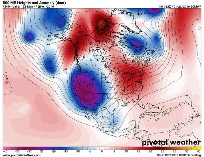
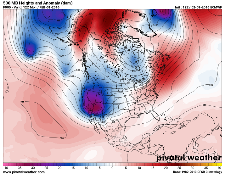
We begin with a brief review. Example 500 mb height anamoly maps are shown below. The maps show contours of 500 mb height as in the maps we have studied. The heights are labeled in decameters (dam), where 1 dam = 10 meters. To get the 500 mb height in meters, just add a zero on to the end of the number labeled on the contours. The labeled height lines show the 500 mb pattern of troughs, ridges, and closed contours. The color shading on the map shows the 500 mb height anomaly, which is the difference between the 500 mb height and the average 500 mb height for each point on the map. The height anomaly is very useful in determining where above and below average temperature is expected based on the 500 mb height pattern. Note that positive height anomalies (and expected warmer than average conditions) are generally associated with ridges, while negative height anamolies (and expected cooler than average conditions) are generally associated with troughs. The key at the bottom is in units of decameters. So a height anomaly of -20 dam means the 500 mb height in that region is 200 meters below average (and you would expect well below average temperature for that region). The time label is the second line in the upper left. "Fttt" gives the forecast time in hours. For example F240 on the map shown on the left indicates that the map is a forecast for 240 hours into the future. The time after "Valid" tells you the time and date of the forecast. For example, the map on the left indicates the forecast map is for 12Z on Monday, February 1, 2016. The label on top right of the image tells you the time the model forecast was initialized or when it began running, and which weather forecast model is displayed. The map on the left shows the initial time was for this model run 12Z on January 22, 2016 and that it is the ECMWF model.
An analysis of the map on the left side for the continental United States indicates a sharp and deep trough over the western United States with a large 5340 meter closed low centered over the state of Idaho. Some areas have 500 mb heights over 300 meters below average and well below average temperature would be forecasted based on this map. There is a ridge over the Great Lakes region with above average heights (and expected temperature) for much of the northeastern quarter of the continental United States. A good chance for precipitation would be forecasted for regions just downwind of the trough axis and in the vicintiy of the large closed low.
 |
 |
| Example of an ECMWF 240 hour forecast of 500 mb heights and height anomalies valid at 12UTC (12Z) Monday, February 1, 2016. |
True (actual) 500 mb heights and height anomalies at 12Z on Monday, February 1, 2016. This map can be used to evaluate the accuracy of the forecast map on the left. |
One way to evaluate the accuracy of a weather forecast is to compare the forecasted 500 mb height pattern for a specific time with the true or actual 500 mb height pattern that is measured at that time. For example, we can compare the forecasted 500 mb height pattern for 12Z, Monday, February 1, which is shown in left panel of the figure in the section above, with the measured 500 mb height pattern at 12Z, Monday, February 1, which is shown in the right panel of the figure. A perfect forecast would mean the maps would look identical. In this example the 240 hour (10 day) forecast was somewhat accurate in that it predicted a trough in the western US and a ridge in the eastern US, however, the placement and strength of those features are off. The actual trough (map on the right) was not as large as forecasted and the 5340 meter closed low is not there. Therefore, the forecasted patterns of temperature and precipitation would have been incorrect for the western US. The ECMWF forecast for the eastern US (map on the left) was too warm with a pronounced ridge over the great lakes. In reality (map on the right), the ridge was much weaker and was centered well to the east of its predicted position. In fact the true map indicates a trough over the northern Great Lakes and southern Canada (map on right), while the forecast (map on left) called for a ridge over this region.
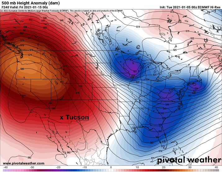
As mentioned above, it is also interesting to compare forecasts made by different numerical models. The images below show two forecasts that are valid at the same time (Friday, January 15, 2021). The image on the left is a 240 hour (10 day) forecast from the ECMWF model, while the image on the right is a 240 hour forecast from the GFS model. If weather forecasting were exact, then these two 10 day forecasts would be identical and we would not need more than one weather forecast model. Note, however, that there are large differences and some similarities between the ECMWF and GFS forecasts over the continental US. The ECMWF forecast has a ridge and closed high with above average 500 mb height over most of the western US and troughs with below average 500 mb heights over most of the eastern US. The GFS forecast also has a ridge over the northwestern US and a trough over the Great Lakes region, which are similar. However, the GFS forecasts near average 500 mb heights over much of the eastern US, in contrast to the below average heights forecasted by the ECMWF. The biggest difference is that the GFS forecasts a closed low over Baja California that extends up into the southwestern US.
 |
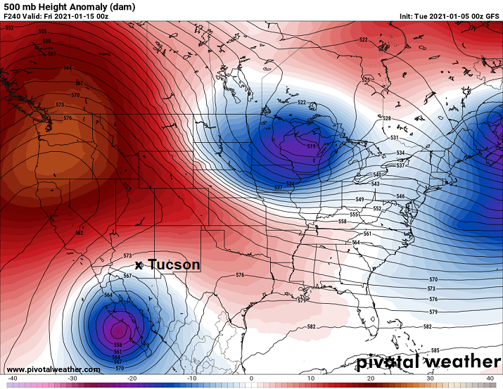 |
| ECMWF 240 hour forecast of 500 mb height anomaly valid for 00Z on Friday, January 15, 2021. The model run was initialized at 00Z on Tuesday, January 5, 2021. |
GFS 240 hour forecast of 500 mb height anomaly valid for 00Z on Friday, January 12, 2021. The model run was intialized at 00Z on Tuesday, January 5, 2021. |
Let's compare the differences in these forecasts for Tucson, AZ, which is marked on the maps. According to the ECMWF forecast, the 500 mb height over Tucson is about 5830 m, which is well above average for January. In addition, Tucson is located downwind of a ridge and near a closed high. Thus Tucson would expect well above average temperature with no chance of rain on January 15 based on the ECMWF 240 hour forecast. Conversely, according to the GFS forecast, the 500 mb height over Tucson is about 5700 m, which is nearly right on average for January. Tucson is also located within a large closed low. Thus, Tucson would expect near average temperature with a chance for rain based on the GFS 240 hour forecast.
The point in showing these 10 day forecasts from ECMWF and GFS is not to determine which is more accurate in this case. We could do this by comparing the forecasts with the true 500 mb height anomaly pattern for January 15 at 00Z. There is a good chance that both of the 10 day forecasts will have significant errors. This is related to the fact that there is a fundamental limit to how accurately the weather can be predicted into the future ... and the further out in time the forecast, the more inaccurate it is expected to be. This will be discussed further in an upcoming lecture. Based on current research, we expect weather forecasts to be pretty accurate out to 120 hours (5 days), noticeably less accurate for 6 to 9 days but still much better than guessing, inaccurate, but slightly better than guessing for 10 to 12 days, and to have no accuracy beyond 12 days, which means the forecast is no more accurate than an educated guess. We expect that different forecast models will agree well with each other for short forecasts (out to 5 days), but then spread apart as the forecast length and uncertainty increase. Based on current research, the ECMWF model is slightly more accurate than the GFS model for the same forecast length in a statistical sense. This is determined by comparing the accuracy of a large number of forecasts. However, for a single case, such as the example shown above, we don't know which, if either, model produced a more accurate 10 day forecast.
This section describes another free web site that can be used to produce 500 mb height anomaly maps and forecasts similar to those obtained from Pivotal Weather. Some people prefer using the Tropical Tidbits site over the Pivotal Weather site. There is no requirement or expectation that you will use Tropical Tidbits. We will use Pivotal Weather for this class. If you are interested in viewing another site, then please continue. Click on the following link to take you to the Tropical Tidbits home page for Numerical Model Prediction.
The first step is to specify the numerical forecasts maps that you want to view. The instructions that follow describe how to produce maps of the 500 mb height anomaly. The top banner on the Tropical Tidbits model page is shown below. The bold GFS on the left indicates the selected model. To select between GFS and ECMWF, click on "Global" button and make a selection from the drop down menu. For this class we are only going to consider the GFS and ECMWF models. There are many other model selections available from all of the five drop down menus if you would like to play around with looking at output from other models.

|
Once a model has been selected, the next steps are to choose a geographical region of interest and the weather information that you would like to view. The bottom banner under the map is shown below. Click on "Region" and select the geographical region that you would like to view. Most often in this class we will be using the "Conus" view (or region) under the United States category or the "North America" view and sometimes the "Northern Hemisphere" view. Finally, select the weather parameter that you want to display using the drop down menus associated with the four buttons along the bottom. For this class we are going to select a 500 mb height anomaly map. Click on the "Upper Dynamics" button and select "500mb Height Anomaly." You can now use the playback buttons along the top or on the right side of the map to play a movie of the forecast or to look at single frame images. Information about the initialization time for the model (time when model was started), the forecast hour (number of hours after the initialization time for the forecast), and valid time (exact time of the forecast) are shown above the images. Maps displayed at the initialization time (or earlier) will have "[Analysis]" shown as the forecast hour, which indicates that the map is not really a forecast, but based on direct measurements of the 500 mb height. One of the nice features about the Tropical Tidbits model loops is that loop goes back to 72 hours before the model initialization time. This allows you to visualize how the weather pattern has been changing prior to the start of the actual model forecast.

|
Again, we are only going to discuss maps and forecasts of the 500 mb height anomaly in this class. If interested, you are encouraged to look at different regions around the world and other weather parameters beside 500 mb height anomalies.
![]()
![]()
![]()
![]()