![]()
![]()
![]()
![]()
This page describes how to determine wind direction and relative wind speed using two common types of weather maps, 500 mb height maps, which we have already studied, and surface weather maps. The main reason to go over this material now is that we are going to try to describe both the surface winds and the 500 mb winds that are typical with middle latitude storm systems. Later in the semester we cover hurricanes and the winds both at the surface and at 500 mb are important in understanding hurricane strengthening and movement.
In describing weather, wind is generally taken to mean the horizontal movement of air. By convention, the wind direction is the direction from which the wind is blowing (e.g., a north wind means the air is moving from north toward south) and the windspeed is the speed at which the air is moving relative to the ground. Surface winds blow along the surface of the Earth where we live. But there are also winds blowing along horizontal paths at altitudes above the ground surface, for instance, the 500 mb winds that have been previously discussed. As shown in the skew-T diagrams, the horizontal winds often change considerably at different altitudes. Weather maps show the pattern of air pressure on horizontal surfaces. Using this information we can visually determine the approximate wind pattern.
On this page we will look at how wind information can be inferred from common weather maps, which depict how air pressure changes along horizontal surfaces.
There is more detail on this page than what is covered in course homework and exams. After studying this page, ATMO 336 students are expected to:
All winds result from horizontal differences in air pressure. Basically, air is forced or pushed from regions of higher air pressure toward lower air pressure. Consider a sealed box of air. The pressure of the air inside the box pushes outward on the box. One way to increase the air pressure inside the box is to pump more air into the box. This increases the force of air pushing out. If you pop a hole in the box, air will be forced outward, from higher pressure inside the box toward lower pressure outside the box. This is an example of wind on a small scale. This also explains why air rushes in when you open a vacuum sealed container (like a jar of food); it explains why air rushes out when you open a carbonated beverage sealed under high pressure (like soda or beer); and how it is that we breath (expanding our lungs initally lowers the air pressure inside, causing higher pressure air outside to rush in). In all cases, air is forced to move from high toward low pressure and the greater the difference in pressure, the stronger the force on the air, and the faster the air moves. For small scale air motions, like the soda can, the wind blows directly from higher toward lower pressure. For large scale motions, like those we are going to study with weather maps, the wind direction will not be directly from higher to lower pressure since other forces must be considered.
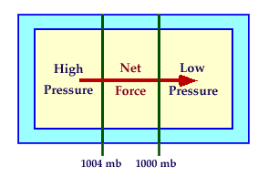
Recall that the average air pressure at an altitude of sea level is about 1000 mb. This is just an average as the air pressure changes with both time and location. At any given moment in time, there is a spatial pattern of sea level air pressure. Weather maps showing the pattern of sea level air pressure at specific times are constructed using contours of equal pressure, called isobars. The figure below on the left shows a small portion of a sea level weather map. Two labeled isobars 1004 mb and 1000 mb (contours of sea level air pressure) show the pressure pattern. The air pressure gets smaller as you move from left to right. Consider a box of air located between the 1004 and 1000 mb contours. The air pressure pushing inward on the left side of the box is stronger than the air pressure pushing inward on the right side of the box. Thus, there is a net force that pushes the box of air from higher toward lower pressure (left to right). This force is called the pressure gradient force. The root cause of all winds are horizontal changes in air pressure or pressure gradients.
| ![[pgf]](Pressure_gradient_force.png)
|
| A simple example of how contours of sea level pressure (isobars) are used to depict the spatial pattern of sea level air pressure. Since the pressure on the left side is greater than the pressure on the right side, there is a net force that pushes air from higher toward lower pressure. | Another example showing a pattern of sea level pressure using isobars. Since the pressure on the right side is greater, the direction of the Pressure Gradient (PG) and Pressure Gradient Force (PGF) points from right to left. The PG is calculated between isobars using the definition PG equal change in pressure divided by the change in distance. Since the PG (and hence the PGF) are stronger on the left side, the wind will be stronger on the left side. |
The pressure gradient is defined as the change in air pressure divided by the change in the distance over which the pressure change happens. The strength of the horizontal pressure gradient is the rate at which air pressure changes along a horizontal surface. The direction of the pressure gradient at a given location is from higher toward lower pressure in the direction that air pressure changes most rapidly. The direction of the pressure gradient can be easily determined from weather maps that depict the spatial pattern of air pressure on a horizontal surface. The pressure gradient is perpendicular to the contours of sea level pressure as shown in the figures above. The pressure gradient results in a pressure gradient force, which pushes air in the direction of the pressure gradient, i.e., from higher toward lower pressure. The stronger the pressure gradient, the stronger the pressure gradient force and the stronger the winds. The image above on the right side shows how pressure information that is plotted on surface weather maps can be used to determine the pressure gradient and thus the relative strength of the pressure gradient force. The most important point for now is that you understand what is meant by a pressure gradient and a pressure gradient force, not that you can calculate a number based on a weather map. You will not be asked to calculate the value of pressure gradients on weather maps. You do need to realize that horizontal pressure gradients are the root cause of horizontal winds. If there is no horizontal pressure gradient, i.e., no change in air pressure along a horizontal surface, then there will be no horizontal winds. The strength of the wind is determined by the strength of the pressure gradient. For large scale motions, like those inferred from common weather maps, the wind direction is NOT in the same direction as the pressure gradient force. This is because once the air starts to move in response to a pressure gradient force, there are other forces that come into play. These other forces change the direction of the wind away from the direction of the pressure gradient force. Some of these other forces are briefly described later on this page. ATMO 336 students are not responsible for understanding these other forces.
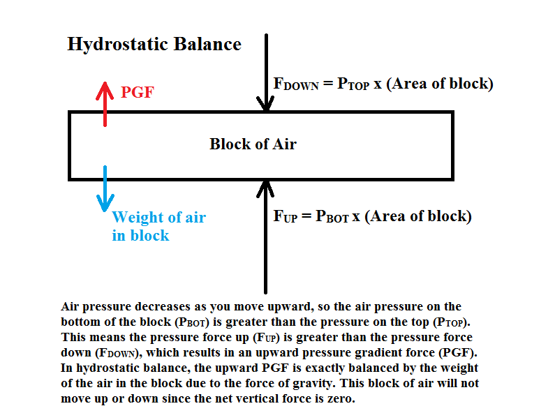
Since air pressure falls rapidly along the vertical direction, there is always a strong upward directed pressure gradient and pressure gradient force. For example, an average 500 mb height is 5.5 km above sea level, while the average sea level pressure is about 1000 mb. The average vertical pressure gradient (change in pressure divided by change in distance) is (500 mb)/(5.5 km), which is much larger than any horizontal pressure gradients that are ever measured in the atmosphere. The strong upward pressure gradient force, however, does not cause the air to move upward due to hydrostatic balance (click for figure), in which the upward pressure gradient force is balanced by the weight of the air above. The strong upward pressure gradient force is just enough to hold up the weight of the air above it. The near balance of forces in the vertical means that air does not easily move up or down in the atmosphere. However, even very small changes in air pressure along a horizontal surface (horizontal pressure gradients) result in winds (horizontal movement of air) since there is no balancing force acting against the pressure gradient. What is important in determining horizontal winds is to identify how the air pressure changes along a horizontal surface.
Station pressure is defined as the barometer reading observed at ground level at a given meteorological station. A barometer is an instrument used to measure air pressure. The surface level air pressures measured all around the world can be plotted on a weather map to show the pattern of air pressure changes. The problem with using measured station pressure though is that not all weather observation stations are located at the same altitude. Higher altitude locations will measure lower air pressure than lower altitude stations, since air pressure falls off so rapidly as one moves upward in elevation.
Recall that winds are caused by changes in air pressure along a horizontal (constant elevation) surface and that changes in pressure along a vertical direction are largely balanced by the weight of the air above and do not cause much wind. Cities separated by just a few kilometers might have very different station pressures due to differences in station altitude. Thus, to properly monitor horizontal changes in pressure, surface barometer readings must be adjusted to a common altitude to eliminate the pressure differences due to differences in station altitude. Again, the purpose of the altitude adjustment to the measured station pressure is to have all the pressure measurements be at the same altitude because it is the change in pressure along a horizontal surface that causes winds.
Altitude adjustments are made so that a barometer reading taken at one elevation can be compared with a barometer reading taken at another to compute the horizontal change in air pressure. Station pressures are normally adjusted to a altitude level of mean sea level and the adjusted pressure is called Sea level pressure. The size of the adjustment depends primarily on how high the station is above sea level. For example, Tucson is about 2500 feet (760 meters) above sea level. A typical station pressure for Tucson would be in the range 910-930 mb, which is much lower than a station pressure measured at a location near sea level, like San Diego, which is typically around 1013 mb. In order to eliminate the pressure difference that is due to elevation differences, i.e., the part that does not contribute to winds along the ground, the Tucson station pressure is converted to sea level pressure, which is basically what the air pressure would be in Tucson if Tucson were at the altitude of sea level. You should realize that for Tucson (and any other location located at an altitude above sea level) the sea level pressure will be greater than the station pressure. This is simply because air pressure will always decrease as one moves upward in the atmosphere.
Compare the current Tucson station pressure with the altitude-adjusted sea level pressure, which are shown in this link under the heading "Pressure". You may also wish to look at the sea level pressure graph over the last 24 hours, which was determined by adjusting the measure station air pressure on campus. Stations located at even higher altitudes will measure smaller station pressures and a larger adjustment is needed to convert to sea level pressure. A list of current station and the adjusted sea level pressures for cities near the Denver, Colorado area is shown in this link. Look at the column headed "mb or hpascals" and compare the first row (station pressure) with the third row (adjusted sea level pressure) for each of the observation stations listed. Notice that the higher elevation stations have a lower station pressure. The other columns in the table are just different units for measuring air pressure. The basic concept of adjusting the station pressure to account for pressure differences caused by stations being at different altitudes should make sense to you. However, the details of how exactly this is done can become complicated and you are not expected to know how to calculate sea level pressure from station pressure. You should understand why it is necessary though.
![[pgf]](sfcpress_example.jpg) |
Sea level pressure (in millibars) is what is plotted on surface weather charts. Isobars are lines connecting points of equal pressure. The analysis of the sea level pressure data allows for the pressure pattern to be visualized. Again, the reason we plot out the pressure pattern is that winds are forced by changes in pressure along horizontal surfaces. These "maps" are called sea level pressure charts or surface weather maps. An example of a surface weather map with isobars is shown on the left. The surface pressure map indicates a strong low (L, 985 mb) over Nebraska and a weak high (H, 1016 mb) near the Great Lakes. Lows mark where a center of lowest pressure is found and highs mark where a center of highest pressure is found. Note that the change in pressure along a horizontal direction can be determined by examining the pattern of isobars. The more closely packed the isobars, the greater the pressure gradient which is the change in pressure divided by the distance over which that pressure change happens. The stength of the pressure gradient is what determines the strength of the winds. The greater the pressure gradient, the stronger the windspeed. Thus, on surface weather maps, the strongest winds are happening where the isobars are closest together and the weakest winds are happening where the isobars are spaced furthest apart. You can see that the isobars on April 8 were tightly packed over Colorado, so the pressure changed rapidly over the relatively short distance from the center of the low to western Colorado. This strong pressure gradient produced wind gusts over 100 mph, and the storm caused $13.8 million in damage in Colorado in a two-day period. Meanwhile weak winds would be expected across much of the eastern United States where the isobars are spread apart and the pressure gradient is weak.
Here is a link to
A movie of the current and forecasted sea level pressure pattern from Pivotal Weather. The sea level pressure pattern
is depicted with isobar contours. The color shading indicates the near surface wind speed.
On most days, you will not find strong
pressure gradients (closely packed isobars) on surface weather maps as seen in the example above.
Fortunately, strong pressure gradients and strong winds at the surface only happen occasionally in
association with strong weather systems. However, the weather is more interesting when strong
weather systems are present, and I would like you to be able to identify strong weather systems
on surface weather maps. The links below show the surface weather maps on two days with strong storm
systems:
Sea level chart for August 29, 2005 (Hurricane Katrina)
Sea level chart for October 29, 2012 (Superstorm Sandy)
The tight packing of isobars is easily seen on the Superstorm Sandy map. At first glance Hurricane Katrina looks much weaker
in that the isobars are not as tightly packed. However, notice that the spacing of the isobars near Katrina is every
8 mb, instead of every 4 mb like it is on the rest of the map (and most other maps). So to properly compare the pressure gradients
on the maps, near Katrina there should be another isobar drawn between each of the isobars that encircle the center of the storm.
So far we have only discussed how to determine the relative strenth of the wind, but not the wind direction. The relationship between the pressure pattern and direction that surface winds are blowing is explained after the next section on upper air charts.
Horizonal winds blowing at different altitudes above sea level are also very important in determining what is going on with the weather. Upper air weather charts are drawn to visualize pressure patterns at different altitudes. We have also used the 500 mb upper air chart to get a picture of the large-scale weather pattern around the North America.
While surface weather charts depict the pressure pattern at a fixed altitude (sea level), upper air charts depict a pattern showing how the altitude of a fixed pressure surface changes. There are maps showing the height pattern at 850 mb, 700 mb, 500 mb, 300 mb, and so on. We have previously looked at 500 mb height maps and discussed 500 mb winds. It is very important to realize that the height patterns shown on upper air maps give you the same information about changes in pressure along a horizontal surface that surface maps do, just at different altitudes. Thus, the pattern of height contours indicate how air pressure varies along horizontal surfaces, for a horizontal surface located where the air pressure is 500 mb. Air is forced or pushed from higher heights toward lower heights and the more closely spaced the height contours, the stronger the pressure gradient and the stronger the winds. This is simply a re-statement of what was previously described about 500 mb winds. Again this only covers the strength of the wind, based on the pressure gradient information obtained from examining the upper air height contours on a weather map, but not the wind direction.
Because the driving force for all wind is the horizontal change in pressure, the greater the horizontal change in pressure (or more precisely the pressure gradient), the greater the windspeed. The pressure gradient is the horizontal change in pressure divided by the horizontal change in distance. On a weather chart, the magnitude of the pressure gradient can be seen by examining the spacing between the contour lines of the map (isobars on the surface map or height contours on the upper air map). Where the lines are closest together, the horizontal change in pressure is stronger, and the winds are stronger. In other words, higher windspeeds are found where the contour lines are closest together. The force exerted on air by changes in air pressure is known as the pressure gradient force. The direction of the pressure gradient force is from higher pressure toward lower pressure. Thus on weather maps, the pressure gradient force points most directly from higher contour values toward lower contour values and is perpendicular to the contours, i.e., if the pressure gradient were drawn on weather maps, it would be shown as arrows pointing from high toward low contour values on the map (examples are provided below). Since the pressure gradient force is the root cause of all winds, you might think the wind direction would be directly from high to low pressure, but this is not the case due to the Earth's planetary rotation.
Over short distance scales, air moves in the direction forced by the horizontal pressure changes, i.e., directly from high toward low pressure. This is the case for the examples of opening a jar of food or a can of soda mentioned above. However, for large-scale air motions (like the ones depicted on weather maps), the actual wind direction is turned away from this direction because the Earth is rotating. This phenonemon is called the Coriolis effect or Coriolis force. The details of the Coriolis effect are difficult to understand, so we will not go into them. Basically, it comes about because we are observing the wind from a rotating frame of reference. We are attached to the surface of the Earth and are rotating with it, while the air above is not attached and thus does not have to rotate with it. It is important to understand that the Coriolis effect is only important for motions that traverse long distances or last long enough for the Earth to move significantly in its rotation. Thus, the Coriolis effect is not significant when shooting a basketball and does NOT affect the direction that water swirls down a drain. The Coriolis effect is significant for determining the direction of large scale winds from weather charts, the direction of ocean currents, or the paths of long-range missles and airplanes.
See this basic description of the Coriolis effect. Play the merry-go-round video, which is a good demonstration for how the Coriolis force works. Here is a link to a YouTube Video of the merry-go-round that does not require Adobe Flash. Notice that for an observer looking down on the merry-go-round in a frame of reference that is not rotating sees the ball move in a straight line, which can be easily explained by the laws of motion, i.e., the ball was pushed in one direction and it moves in that direction. However, for someone observing the ball on the merry-go-round in a frame of reference that is spinning clockwise, the ball appears to curve to the left. In order to explain this using the laws of motion, there needs to be a force that causes the ball to curve. This force is known as the Coriolis Force and will be important when observing motions on a rotating frame of reference. Since the Earth is rotating and we are on it, we observe motions from a rotating frame of reference. The linked video shows the merry-go-round rotating clockwise. This is the situation in the southern hemisphere of the Earth. For observers in the northern hemisphere, the rotation is counterclockwise, and the Coriolis force will deflect objects to the right. Here is a link to a National Geographic Video demonstration of the Coriolis Effect on a merry-go-round and a longer video explaning the Coriolis Effect produced by Nova
Therefore, the Coriolis force turns the wind to the right (of the pressure gradient) in the northern hemisphere and to the left (of the pressure gradient) in the southern hemisphere. We will only worry about the northern hemisphere. At all altitude levels above the ground surface (includes all upper air charts, but not surface charts), the wind direction is 90° to the right of the direction of the pressure gradient force. The pressure gradient force is directed from high heights (or pressures) toward low heights (or pressures). Thus, on upper air charts the wind moves parallel to the height contours, with lower heights to the left of the wind direction. This was the basic rule given to estimate wind speed and direction on 500 mb charts in the previous reading page. Now you should understand a bit more about why the wind blows as it does at 500 mb. See figures below.
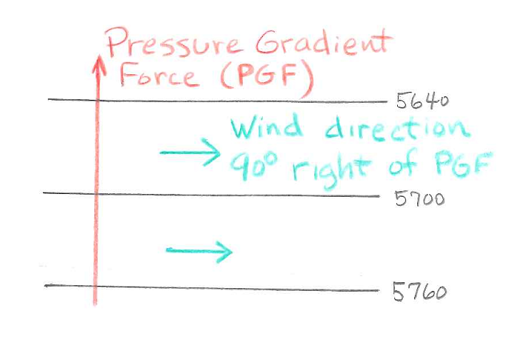
Sample 500 mb map showing height contours in black. The direction of the pressure gradient force (from high to low heights) is shown in red. The wind direction at 500 mb, shown in blue, is turned 90° to the right of the pressure gradient force due to the Coriolis Effect. |
Sample 500 mb map depicting a closed low. The direction of the pressure gradient force is inward toward the low. The wind direction is 90° to the right of the pressure gradient force and flows counterclockwise around the center of the closed low. |
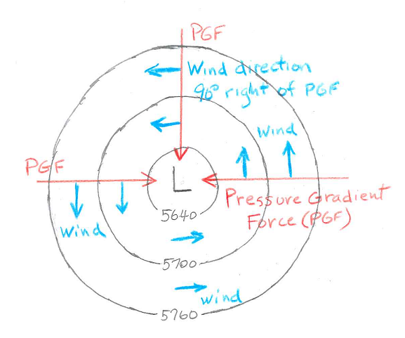
Because air moving along the ground surface is slowed by friction with the ground, there is a third important force, a frictional or drag force due to contact with the ground, which complicates the direction of air flow along the ground. A general rule of thumb is that the wind direction just above the ground surface is only turned about 60° to the right of the pressure gradient force, instead of 90° right of the pressure gradient force as it is on uppper air maps. Thus, on surface weather charts the wind direction, rather than being parallel to the isobars, points about 30° toward lower pressure. I suggest using a two step process to determine wind direction using a surface weather map. Step 1 is to find the direction that is parallel to the isobars with lower air pressure to the left and higher air pressure to the right. This is 90° to the right of the direction of the pressure gradient. This is the same as the wind direction on 500 mb maps. Step 2 is to take this direction and turn it 30° toward lower pressure. This is the wind direction. See figures below.
Sample surface map showing isobars of sea level pressure in black. The direction of the pressure gradient force (from high to low pressure) is shown in red. The direction 90° to the right of the pressure gradient force is shown in green. On surface maps the wind direction, shown in blue, is not parallel to the contours, but is 30° toward lower pressure as shown. |
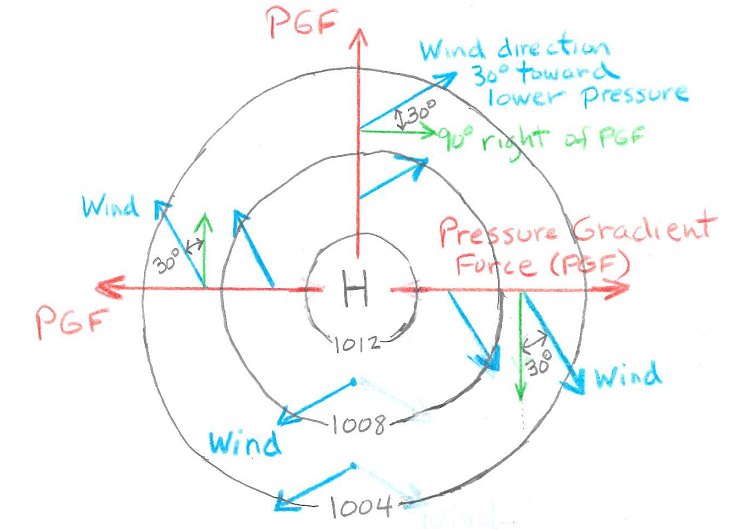
Sample surface map depicting a closed high. The direction of the pressure gradient force is outward away from the center of the high. As depicted in the caption under the figure to the left, to find the wind direction, first find the direction 90° to the right of the pressure gradient force, then the wind direction is 30° toward lower pressure. The wind pattern near a surface high pressure is clockwise around the high, but also spiraling outward away from the high. |
More detail was provided in the previous section than what ATMO 336 students are expected to know for homework and exam questions. This section is a review of the important points.
In our atmosphere, the horizontal movement of air is typically much greater than the vertical movement of air. Thus, when we speak of winds, we are generally referring to the horizontal movement of air. This does not mean that vertical motion is not important. It just means vertical motion is not as strong as horizontal motion. Vertical motion is very important in the formation of clouds and precipitation. As shown with skew-T diagrams, horizontal winds change in both speed and direction as you move vertically up and down. For example, there are surface winds that blow along the ground surface, 700 mb winds blow at the altitude where the air pressure is 700 mb, 500 mb winds that blow at the altitude where the air pressure is 500 mb, and so on. We have already used 500 mb height maps to determine the wind direction and relative wind speed of 500 mb winds. There are also 700 mb maps and so forth that we will not study in this class. We will only look at 500 mb height maps and sea level or surface maps. This section reviews how to determine wind information from the contour lines plotted on these maps.
Horizontal winds are caused by horizontal variations in air pressure, which are called horizontal pressure gradients. The horizontal pressure gradient is defined as the change in air pressure divided by the change in the distance over which the pressure change happens. The strength of the pressure gradient is the rate at which air pressure changes along a horizontal surface. The stronger the pressure gradient, the stronger the winds. On weather maps, the strength of the pressure gradient is indicated by the spacing of the contour lines, i.e., the closer the spacing of the contours, the stronger the pressure gradient force and the stronger the winds.
The contours on 500 mb maps represent the height of the 500 mb pressure level in meters above sea level. It is important to realize that the height contour pattern on 500 mb maps depicts the pressure gradient at the altitude where the air pressure is 500 mb just as the isobars on surface maps depict the sea level pressure pattern along the surface. (You can just accept this since we did not take the time to derive or explain why the 500 mb height contour pattern is basically equivalent to a contour pattern of air pressure at a fixed altitude. If you are interested, you may contact the instructor for more explanation.) The pressure gradient force points from higher toward lower 500 mb height. The strength of the pressure gradient (and the strength of the wind at the 500 mb height level) is determined by the spacing of the contour lines, i.e., the closer the spacing of the contours, the stronger the pressure gradient and the stronger the winds.
On surface weather maps, the contour lines are lines of equal sea level pressure, called isobars, rather than the height of an equal pressure surface, such as the 500 mb height on 500 mb maps. The average sea level air pressure is 1013.25 mb (roughly 1000 mb), but it varies with both time and location. A surface weather map shows a snapshot of the sea level air pressure pattern valid at the time indicated with the map label. The contoured pattern of sea level pressure is used to estimate surface winds. It is similar, but not exactly the same, as how 500 mb height contours are used to estimate 500 mb winds.
![[pgf]](sfcpress_example_annotated.png) |
Shown on the left is a surface weather map with isobars. The labeled contours in green represent the pattern of sea level air pressure. Two regions are circled on the map. The yellow circle highlights an area with a large pressure gradient, which is indicated by the tight spacing of the contour lines. Strong surface winds are expected in this area due to the large pressure gradient. The blue circle highlights an area with a much smaller pressure gradient, which is indicated by the large spacing between the contour lines. Weaker surface winds are expected in this area due to the smaller pressure gradient.
We will not routinely look at surface maps in this class. I want you to know what strong surface storms and hurricanes look like on surface weather maps. Strong surface storms typically show up as closed lows with a tight packing of the isobars (contour lines) around the center of the low. The low pressure system centered over the state of Nebraska on the map is an example of a strong surface storm. Examples of hurricanes are shown below.
The surface wind direction relative to the pattern of isobars is generally the same as it is for 500 mb wind direction and height contours. The surface wind direction is mostly parallel to the isobars with lower pressure to the left of the wind direction, but there is one very important difference: the surface wind is not fully parallel to the isobars, the surface wind slightly crosses the isobars toward lower pressure. The average angle between the surface winds and the isobars is about 30°. When I look at a surface map with isobars, I start by visualizing the winds pattern as parallel to the contours, then shift this pattern to point slightly toward lower pressure.
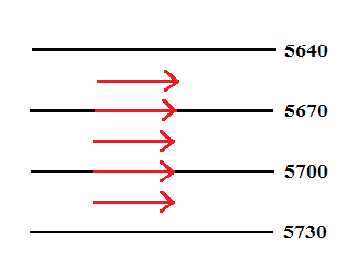
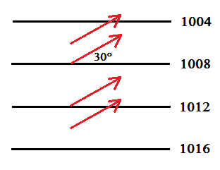
The figure below shows the wind direction for straight line contours of 500 mb height, like what you may see on a 500 mb map, on the left side and sea level pressure (isobars), like what you may see on a surface weather map on the right side. As described in previous reading material, the 500 mb winds blow parallel to the height contours (along the contour lines without crossing them) with lower heights to the left of the wind direction. For surface winds, the wind direction is nearly the same, however, it is not fully parallel to the contours. The surface wind moves slightly toward lower pressure such that the wind direction crosses the isobars at an average angle of about 30°.
 Portion of a 500 mb height map with straight line contours. The black lines are contours of 500 mb height.
Red arrows show the direction of the 500 mb wind, which is parallel to the height contours with lower heights to the left of the wind direction.
Portion of a 500 mb height map with straight line contours. The black lines are contours of 500 mb height.
Red arrows show the direction of the 500 mb wind, which is parallel to the height contours with lower heights to the left of the wind direction.
|
 Portion of a surface weather map with straight line contours. The black lines are isobars or contours of sea level pressure.
Red arrows show the direction of the surface wind, which crosses the isobars at an angle of 30° toward lower pressure.
Portion of a surface weather map with straight line contours. The black lines are isobars or contours of sea level pressure.
Red arrows show the direction of the surface wind, which crosses the isobars at an angle of 30° toward lower pressure.
|
The wind trajectories around closed lows in the contour pattern are shown below. The wind trajectory represents the path followed by air moving along with the flow. At the 500 mb height level, the winds are counterclockwise around the center of the low. Again this is parallel to the contours with lower contour values to the left of the wind direction. The surface wind pattern around a closed low is counterclockwise as well, but also crosses the contour lines toward lower pressure. Thus, the surface wind around closed lows moves counterclockwise and spirals in toward the center of the low.
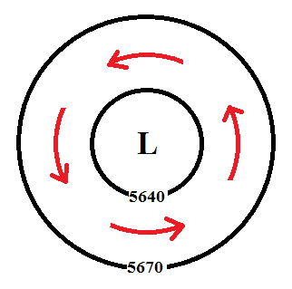 Portion of a 500 mb map with a closed low. The black lines are contours of 500 mb height. Red arrows show the wind
trajectory or air flow pattern. The air flow is parallel to the height contours and counterclockwise around the center of the closed low.
Portion of a 500 mb map with a closed low. The black lines are contours of 500 mb height. Red arrows show the wind
trajectory or air flow pattern. The air flow is parallel to the height contours and counterclockwise around the center of the closed low.
|
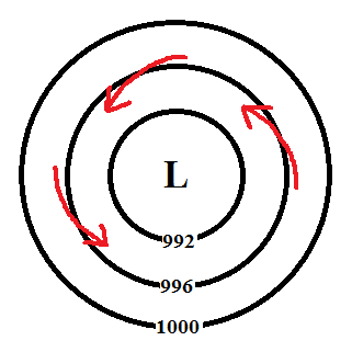 Portion of a surface map with a closed low. The black lines are isobars or contours of sea level pressure. Red arrows show the wind
trajectory or air flow pattern. The flow is counterclockwise and converging toward the center of the closed low.
Portion of a surface map with a closed low. The black lines are isobars or contours of sea level pressure. Red arrows show the wind
trajectory or air flow pattern. The flow is counterclockwise and converging toward the center of the closed low.
|
The fact that surface winds blow slightly toward low pressure is important in understanding why surface low pressure areas are associated with clouds and precipitation and why surface high pressure areas are associated with fair weather. This is discussed in the next section. ATMO 336 students are responsible for understanding the material below.
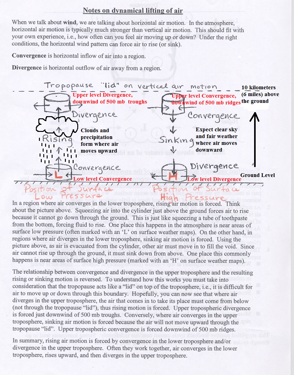
An important consequence of the fact that winds just above the ground surface do not blow parallel to the isobars, but slightly toward low pressure (and away from high pressure), is that sea level pressure pattern and winds can force air to move upward or downward. Later in the semester we will show that upward moving air is associated with cloud formation and precipiation, while downwarn moving air is assoicated with fair weather and a lack of clouds. First a couple of definitions. The wind pattern is said to be convergent in regions where there is a horizontal inflow of air toward the region and divergent in regions where there is a horizontal outflow of air away from a region. The pattern of the arrows in the figures below show examples examples of purely convergent and divergent air flow.
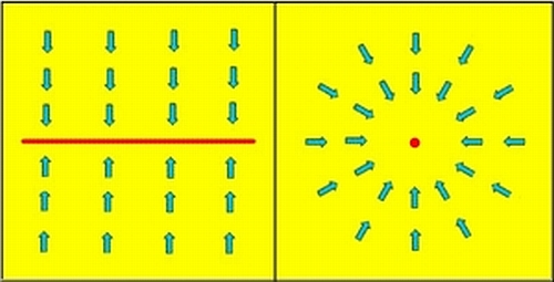
Instructive images for horizonal convergence of air. Arrows show horizontal wind pattern. Left side shows pure covergence toward a line, while right side shows pure convergence toward a point. In realistic surface air flow, the wind pattern is just slightly convergent toward lines or points of low pressure. |
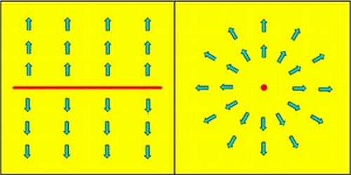
Instructive images for horizonal divergence of air. Arrows show horizontal wind pattern. Left side shows pure divergence away from a line, while right side shows pure divergence away from a point. In realistic surface air flow, the wind pattern is just slightly divergent away from lines or points of high pressure. |
Of importance for weather, when the horizontal air flow at the surface is convergent (flowing together), air is forced to rise (move vertically upward). Conversely, when the horizontal air flow at the surface is divergent (flowing away), air is forced to sink (move vertically downward). To help you understand this relationship, think of air as a fluid that flows, just as water or even a tube of toothpaste. Squeezing a tube of toothpaste from the bottom is horizonal convergence. Toothpaste is forced upward by the convergence, just like air will be forced upward when there is horizontal convergence of air at ground level. In other words, squeezing air together near the ground forces some air to rise upward, since it cannot go down into the ground. Conversely, if you could pull apart a tube of toothpaste from the bottom, then paste from above will move down to fill the space. In other words, when air is flowing out of a region at the surface of the earth (divergence), air will sink down from above to fill the space.
Since the winds at the surface flow toward lower pressure and away from higher pressure, surface low pressure areas are associated with surface convergence, forced rising air, and a good possibility for clouds and precipitation, while surface high pressure areas are assoicated with surface divergence, forced sinking air, and generally fair, cloud-free weather. The figure below also shows that rising and sinking air can be forced by convergence and divergence from the top of the troposphere as well. We previously showed that upper level divergence happens just downstream of 500 mb troughs and this forces rising air motion along with the possibility of clouds and rain, while upper level convergence happens just downstream of 500 mb ridges and this forces sinking air motion with fair weather expected. You should understand the relationships between the surface pressure pattern, surface winds, covergence or divergence, rising or sinking air, and the expected weather conditions. Following are two links that review this information, which you may find useful. One is a WORD document about winds and weather maps which includes figures and the other is an image document showing horizontal convergence, divergence, and vertical motion.
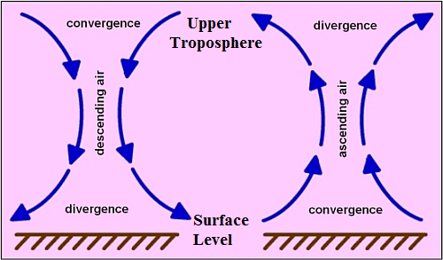 Relationship between horizontal covergence and divergence and vertical air motion.
 -- Left side shows that sinking air motion (downward moving air) is forced by horizontal covergence at the top of the troposphere and divergence at the surface or bottom of the troposphere. Convergence in the upper troposphere happens just downwind of 500 mb ridges. Divergence in the lower troposphere takes place near surface high pressure areas. -- Right side shows that rising air motion (upward moving air) is forced by divergence at the top of the troposphere and convergence at the surface or bottom of the troposphere. Divergence in the upper troposphere happens just downwind of 500 mb troughs. Convergence in the lower troposphere takes place near surface low pressure areas. Clouds and precipitation form in regions where air is ascending or moving upward. |
Look again at the surface map for April 8 shown above on this page. You should now realize that the winds near the surface low over Nebraska will be counterclockwise and inward (converging), which forces air to rise upward. The winds will also be relatively strong due to the strong pressure gradient force (tight packing of the isobars). In fact, weather systems that produce both strong surface winds and significant precipitation will have surface low pressure at their center. The tight pressure gradient results in strong winds and the convergence and forced rising motion produces clouds and precipitation. The strongest of these low pressure systems are the epic storms of history. These include winter storms as well as hurricanes. The surface map for 18Z on Thursday, January 4, 2018, which has an example of a strong winter storm just off the northeastern coast of the United States, is shown below.
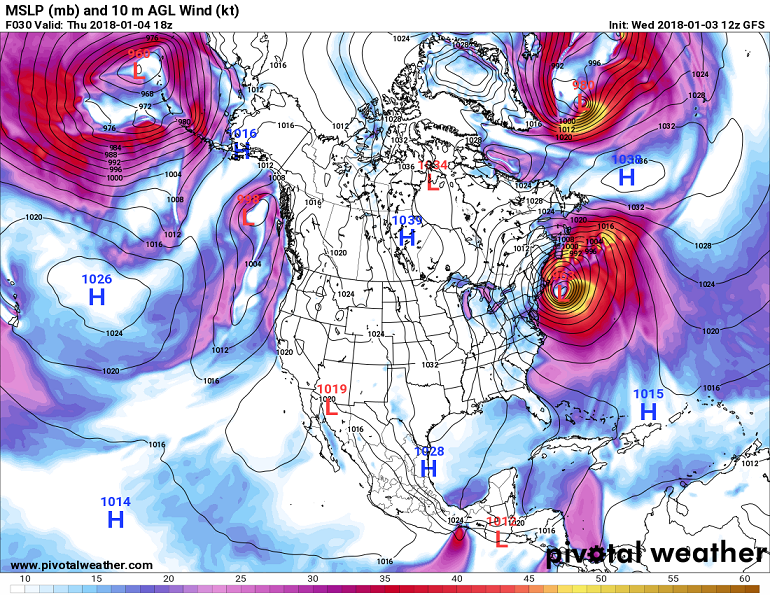 Surface map from 18Z on Thursday, January 4, 2018. The labeled contours are isobars or lines or equal sea level pressure.
Notice the strong surface low pressure (963 mb at center) just off the northeast coast of the United States, which
indicates a strong winter storm. The color shading represents the surface wind speed in nautical miles per hour (knots).
The strongest winds are found where the isobars are closely packed together. Note that winds are stronger over the
oceans and Great Lakes relative to land areas, even when the isobar spacing is the same. This is because there is less
frictional drag over the smooth water surface relative to the rougher land surface, which results in slower wind speeds
over land for the same pressure gradient.
Surface map from 18Z on Thursday, January 4, 2018. The labeled contours are isobars or lines or equal sea level pressure.
Notice the strong surface low pressure (963 mb at center) just off the northeast coast of the United States, which
indicates a strong winter storm. The color shading represents the surface wind speed in nautical miles per hour (knots).
The strongest winds are found where the isobars are closely packed together. Note that winds are stronger over the
oceans and Great Lakes relative to land areas, even when the isobar spacing is the same. This is because there is less
frictional drag over the smooth water surface relative to the rougher land surface, which results in slower wind speeds
over land for the same pressure gradient.
|
![]()
![]()
![]()
![]()