![]()
![]()
![]()
![]()
In describing weather, wind is generally taken to mean the horizontal movement of air. By convention, the wind direction is the direction from which the wind is blowing (e.g., a north wind means the air is moving from north toward south) and the windspeed is the speed at which the air is moving relative to the ground. Surface winds blow along the surface of the Earth where we live. But there are also winds blowing along horizontal paths at altitudes above the ground surface, for instance, the 500 mb winds that have been previously discussed.
Winds result from horizontal differences in air pressure. Basically, air is forced or pushed from high pressure toward lower pressure. This explains why air rushes in when you open a vacuum sealed container (like a jar of food); it explains why air rushes out when you open a carbonated beverage sealed under high pressure (like soda or beer); and how it is that we breath (expanding our lungs initally lowers the air pressure inside, causing higher pressure air outside to rush in). In all cases, air is forced to move from high toward low pressure and the greater the difference in pressure, the faster the air moves.
Although air pressure changes rapidly along the vertical direction, this does not cause the air to move upward due to hydrostatic balance, in which the upward pressure force is balanced by the weight of the air above. However, even small changes in air pressure along a horizontal surface result in winds (horizontal movement of air) since there is no balancing force to push back. As mentioned previously, air pressure gets lower as you move upward in elevation since it is caused by the weight of the air above a given point. What is important for understanding winds (the horizontal movement of air) is to identify how the air pressure changes along a horizontal surface.
On this page we will look at how wind information can be inferred from common weather maps, which depict how air pressure changes along horizontal surfaces.
Station pressure is defined as the barometer reading observed at ground level at a given meteorological station. A barometer is an instrument used to measure air pressure. But cities separated by just a few hundred kilometers might have very different station pressures. The differences between the station pressures are due primarily to the cities being at different altitudes above sea level. Thus, to properly monitor horizontal changes in pressure, barometer reading must be corrected for altitude.
Altitude adjustments are made so that a barometer reading taken at one elevation can be compared with a barometer reading taken at another. Station pressures are normally adjusted to a altitude level of mean sea level, and thus called Sea level pressure. The size of the correction depends primarily on how high the station is above sea level. For example, Tucson is about 2500 feet (760 meters) above sea level. A typical station pressure measurement is say 910-930 mb, which is much lower than a station pressure measured at a location near sea level, like San Diego, which is typically around 1013 mb. In order to eliminate the pressure difference that is due to elevation differences, i.e., the part that does not contribute to winds along the ground, the Tucson station pressure is converted to sea level pressure, which is basically what the air pressure would be in Tucson if Tucson were at the altitude of sea level. You should realize that for Tucson (and any other location located at an altitude above sea level) the sea level pressure will be greater than the station pressure. This is simply because air pressure will always decrease as one moves upward in the atmosphere.
Unfortunately, the barometer for our weather station on campus is currently under test and you may not get the correct station pressure information linked for Tucson, which should be near 920 mb. The Tucson plot of sea level pressure is not working as this page is written. The Denver area pressure links are working. Compare the current Tucson station pressure shown in this link with the sea level pressure graph over the last 24 hours in Tucson shown in this link (scroll down to the sea level pressure graph). Stations located at even higher altitudes will measure smaller station pressures and a larger adjustment is needed to convert to sea level pressure. A table of current station and the adjusted sea level pressures for the Denver area is shown in this link. Look at the column headed "millibars or hectopascals and compare the red value (station pressure) with the green value (properly adjusted sea level pressure). Notice that the higher elevation stations have a lower station pressure and that the difference between sea level pressure and station pressure is greater for higher elevation locations. If the green value is not available for a station, then the purple value (altimeter setting) provides a simple estimate of the sea level pressure, which will usually be very close to the true value. The other columns in the table are just different units for measuring air pressure.
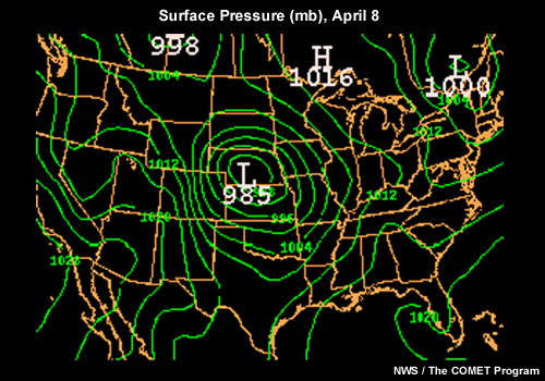
Sea level pressure (in millibars) is what is plotted on surface weather charts. Isobars are lines connecting points of equal pressure. The analysis of the sea level pressure data allows for the pressure pattern to be visualized. Again, the reason we plot out the pressure pattern is that winds are forced by changes in pressure along horizontal surfaces. These "maps" are called sea level pressure charts or surface weather maps. An example of a surface weather map with isobars is shown below.
The current sea level weather chart for the United States can be found at WW2010 at the University of Illinois (Click on the image labeled "isobars").
So far we have only discussed how to determine the relative strenth of the wind, but not the wind direction. The relationship between the pressure pattern and direction that surface winds are blowing is explained after the next section on upper air charts.
Horizonal winds blowing at different altitudes above sea level are also very important in determining what is going on with the weather. Upper air weather charts are drawn to visualize pressure patterns at different altitudes. We have also used the 500 mb upper air chart to get a picture of the large-scale weather pattern around the world.
While surface weather charts depict the pressure pattern at a fixed altitude (sea level), upper air charts depict a pattern showing how the altitude of a fixed pressure surface changes. There are maps showing the height pattern for 850 mb, 700 mb, 500 mb, 300 mb, and so on. We have previously looked at 500 mb height maps and discussed 500 mb winds. It is very important to realize that the height patterns shown on upper air maps give you the same information about changes in pressure along a horizontal surface that surface maps do, just at different altitudes. Thus, the pattern of height contours indicates how air pressure varies along horizontal surfaces. Air is forced or pushed from higher heights toward lower heights and the more closely spaced the height contours, the stronger the pressure gradient and the stronger the winds.
Because the driving force for all wind is the horizontal change in pressure, the greater the horizontal change in pressure (or more precisely the pressure gradient), the greater the windspeed. The pressure gradient is the horizontal change in pressure divided by the horizontal change in distance. On a weather chart, the magnitude of the pressure gradient can be seen by examining the spacing between the contour lines on the map (isobars on the surface map or height contours on the upper air map). Where the lines are closest together, the horizontal change in pressure is stronger, and the winds are stronger. In other words, higher windspeeds are found where the contour lines are closest together. The force exerted on air by changes in air pressure is known as the pressure gradient force. The direction of the pressure gradient force is from higher pressure toward lower pressure. Thus on weather maps, the pressure gradient force points most directly from higher contour values toward lower contour values and is perpendicular to the contours, i.e., the pressure gradient is most often depicted on weather maps as arrows pointing from high toward low pressure. Since the pressure gradient force is the root cause of all winds, you might think the wind direction would be directly from high to low pressure, but this is not the case due to the Earth's planetary rotation.
Over short distance scales, air moves in the direction forced by the horizontal pressure changes, i.e., directly from high toward low pressure. This is the case for the examples of opening a jar of food or a can of soda mentioned above. However, for large-scale air motions (like the ones depicted on weather maps), the actual wind direction is turned away from this direction because the Earth is rotating. This phenonemon is called the Coriolis effect or Coriolis force. The details of the Coriolis effect are difficult to understand, so we will not go into them. Basically, it comes about because we are observing the wind from a rotating frame of reference (we are attached to the surface of the Earth and are rotating with it), while the air above is not attached and thus does not have to rotate with it. I would like to point out that the Coriolis effect is only important for motions that traverse long distances or last long enough for the Earth to move significantly in its rotation. Thus, the Coriolis effect is not significant when shooting a basketball and does NOT affect the direction that water swirls down a drain. The Coriolis effect is significant for determining the direction of large scale winds from weather charts, the direction of ocean currents, or the paths of long-range missles and airplanes.
See this basic description of the Coriolis effect. Play the merry-go-round video, which is a good demonstration for how the Coriolis force works. Notice that an observer looking down on the merry-go-round in a frame of reference that is not rotating sees the ball move in a straight line, which can be easily explained by the laws of motion, i.e., the ball was pushed in one direction and it moved that way. However, for someone observing the ball on the merry-go-round in a frame of reference that is spinning clockwise, the ball appears to curve to the left. In order to explain this using the laws of motion, there needs to be a force that causes the ball to curve. This force is known as the Coriolis Force and is important when observing motions on a rotating frame of reference. Since the Earth is rotating and we are on it, we observe motions from a rotating frame of reference. The linked video shows the merry-go-round rotating clockwise. This is the situation in the southern hemisphere of the Earth. For observers in the northern hemisphere, the rotation is counterclockwise, and the Coriolis force will deflect objects to the right. You are only expected to understand the outcome of the Coriolis force, not the details of how it works.
Therefore, the Coriolis force turns the wind to the right (of the pressure gradient) in the northern hemisphere and to the left in the southern hemisphere. We will only worry about the northern hemisphere. At all altitude levels above the ground surface (includes all upper air charts, but not surface charts), the wind direction is 90° to the right of the pressure force. Recall the pressure force is directed from high heights (or pressures) toward low heights (or pressures). Thus, on upper air charts the wind moves parallel to the height contours, with lower heights to the left of the wind direction. I showed you how to estimate wind speed and direction on 500 mb charts in previous lectures. Now you should understand more clearly why the wind blows as it does at 500 mb.
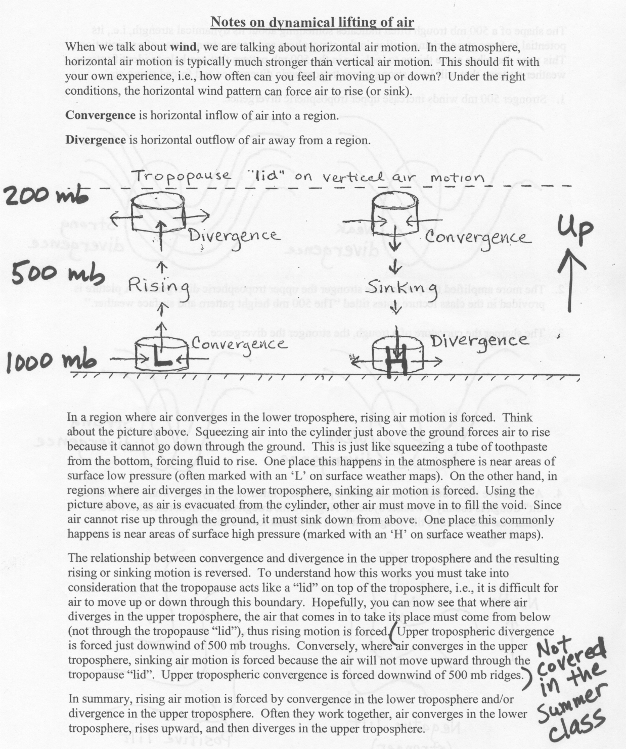
Because air moving along the ground surface is slowed by friction with the ground, the wind direction is only turned about 60° to the right of the pressure force. Thus, on surface weather charts the wind direction, rather than being parallel to the isobars, points about 30° toward lower pressure. Please look over the following WORD document about winds and weather maps which includes figures. An important consequence of the fact that winds do not blow exactly parallel to the isobars on a surface weather map, but slightly toward low pressure, is that surface winds cause air to converge toward surface low pressure (forcing rising motion) and to diverge away from surface high pressure (forcing sinking motion). Where rising motion is forced, clouds and possibly precipitation may be found, while where sinking motion is forced, fair weather and lack of cloud formation is most likely. Please look over these notes defining horizontal convergence and divergence of air and the relationship to rising and sinking motion. Look again at the surface map for April 8 shown above on this page. You should now realize that the winds near the surface low over Nebraska will be counterclockwise and inward (converging), which forces air to rise upward. The winds will also be relatively strong due to the large pressure gradient force (tight packing of the isobars).
![]()
![]()
![]()
![]()