Thursday, Feb. 08, 2018
Sergio
Mendoza y La Orkesta (currently Orchesta Mendoza) recorded
by NPR Music in Austin, Tx, during the 2014 SXSW Festival.
If you didn't see the successful launch of the Space X Falcon
Heavy rocket yesterday (and the return of two of its reusable
booster rockets) you should watch this
short video recap (especially the successful return of two of
the booster rockets to the launch site).
An In-class
Optional Assignment was handed out in class today. If
you weren't in class and want to download the assignment, answer
the questions, and turn in your work at the start of class next
Tuesday you will receive at least partial credit for the
assignment.
Experiment #2 materials were
distributed today for the first time. There are a few sets
of materials remaining, I'll have them in class next Tuesday.
Quiz #1 is one week from today (Thu., Feb. 15) and the Quiz #1 Study Guide is now available.
The 1S1P Scattering of Sunlight reports were collected today.
Surface weather maps
We're
starting a new topic today - weather maps and some
of what you can learn from them.
We will begin by learning how weather data
are entered onto surface weather maps.
Much of our weather is produced by relatively
large (synoptic scale) weather systems - systems
that might cover several states or a significant
fraction of the continental US. To be able
to identify and locate these weather systems you
must first collect weather data (temperature,
pressure, wind direction and speed, dew point,
cloud cover, etc) from stations across the country
and plot the data on a map. The large amount
of data requires that the information be plotted
in a clear and compact way. The station
model notation is what meteorologists use.
Station
model notation
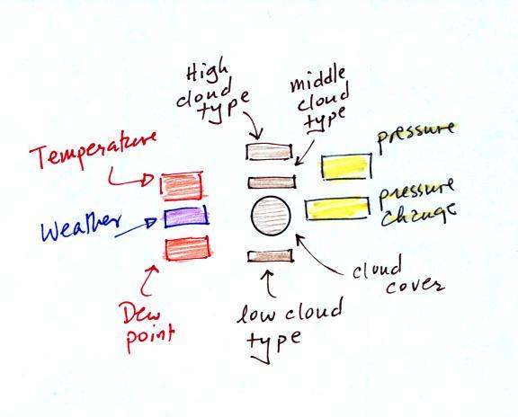
A small circle is plotted on the map at the
location where the weather measurements were made. The
circle can be filled in to indicate the amount of cloud
cover. Positions are reserved above and below the center
circle for special symbols that represent different types of
high, middle, and low altitude clouds. The air
temperature and dew point temperature are entered to the upper
left and lower left of the circle respectively. A symbol
indicating the current weather (if any) is plotted to the left
of the circle in between the temperature and the dew point;
you can choose from close to 100 different weather
symbols. The pressure is plotted to the upper right of
the circle and the pressure change (that has occurred in the
past 3 hours) is plotted to the right of the circle.
An
example of a surface map like was shown in class
today is shown above (this is the 3 pm MST map
from last Friday, Feb. 2 and differs from the one
shown in class today). Maps like this are
available here.
The entries for Arizona and Tucson have been cut
out, enlarged, and pasted in below. We'll be
learning how to decode information like this in
today's class.
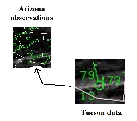
In
Tucson at 3 pm MST the temperature was 79 F and
the dew point temperature was 13 F. The
winds were from the NNW at 5 knots. Clear
skies were being reported (even though some high
clouds are visible on the satellite
photograph). The pressure (corrected to sea
level altitude) was 1017.3 mb (this is derived
from the 173 value to the upper right of the
circle).
We'll work through this
material one step at a time (refer to p. 37a in the
photocopied ClassNotes).
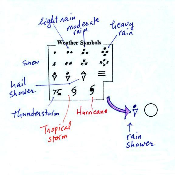
Meteorologists determine how much of the sky is covered
with clouds and try to identify the particular types of clouds
that are present.
Cloud cover and cloud type
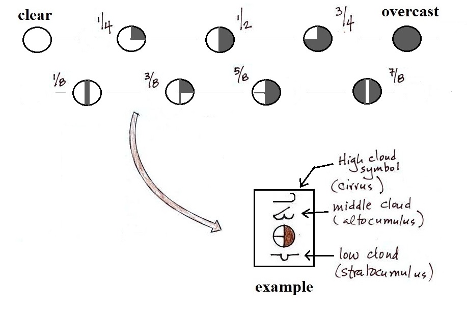
The center circle is filled in to indicate the portion of the
sky covered with clouds (to the nearest 1/8th of the sky) using
the code at the top of the figure (which I think you can mostly
figure out). 5/8ths of the sky is covered with clouds in the
example shown.
In addition to the amount of cloud coverage, the actual types
of clouds present (if any) can be important. Cloud types can
tell you something about the state of the atmosphere
(thunderstorms indicate unstable conditions, for example).
We'll learn to identify and name clouds later in the semester and
will just say that clouds are classified according to altitude and
appearance.
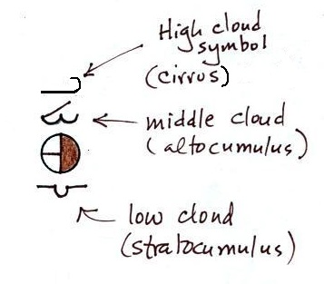
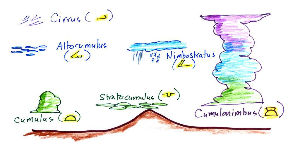
Positions are reserved above and below the center
circle for high, middle, and low altitude cloud symbols.
Six cloud types and their symbols are sketched
above. Purple represents high altitude in this
picture. Clouds found at high altitude are composed
entirely of ice crystals. Low altitude clouds are green
in the figure. They're warmer than freezing and are
composed of just water droplets. The middle altitude
clouds in blue are surprising. They're composed of both
ice crystals and water droplets that have been cooled below
freezing but haven't frozen.
There are many more cloud symbols than shown here
(click here for
a more complete list of symbols together with photographs of the
different cloud types)
Air temperature and dew point temperature
The air temperature and dew point temperature are found to the
upper left and lower left of the center circle,
respectively. These are probably these easiest data to read.
Dew point gives you an idea of the amount of moisture (water
vapor) in the air. The table below reminds you
that dew points range from the mid 20s to the mid 40s during much
of the year in Tucson. Dew points rise into the upper 50s
and 60s during the summer thunderstorm season and the dew point
was still pretty high this morning. The summer thunderstorm
should be coming to an end in the next week or so and we should
notice the drop in humidity when that occurs.
Dew Point
Temperatures (F)
|
|
70s
|
common in many parts of the US in
the summer
|
50s & 60s
|
summer T-storm season in Arizona
(summer monsoon)
|
20s, 30s, 40s
|
most of the year in Arizona
|
10s or below
|
very dry conditions
|
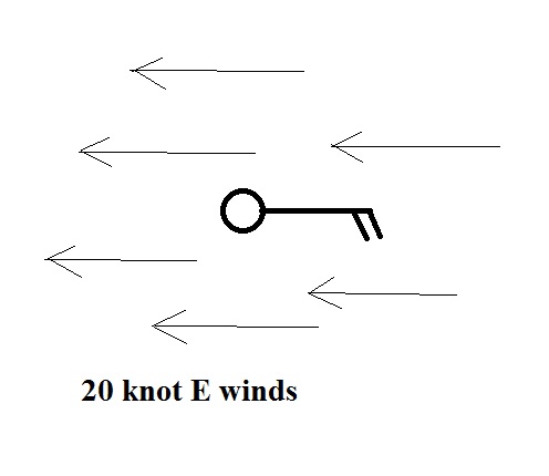
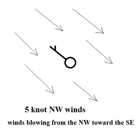
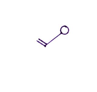
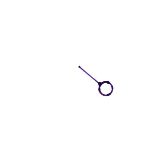
Wind direction and wind speed
We'll consider winds next. Wind direction and
wind speed are plotted.
A straight line extending out from the center circle
shows the wind direction. Meteorologists always give the
direction the wind is coming from. In the example above
the winds (the finely drawn arrows) are blowing from the NW toward
the SE at a speed of 5 knots. A meteorologist would call
these northwesterly winds.
Small "barbs" at the end of the straight line give the
wind speed in knots. Each long barb is worth 10 knots, the
short barb is 5 knots. The wind speed in this case is 5
knots. If there's just a short barb it's positioned in from
the end of the longer line (so that it wouldn't be mistaken for a
10 knot barb).
Knots are nautical miles per hour. One nautical mile per
hour is 1.15 statute miles per hour. We won't worry about
the distinction in this class, we will just consider one knot to
be the same as one mile per hour. It's fine with me in
an example like this if you say the winds are blowing toward the
SE as long as you include the word toward.
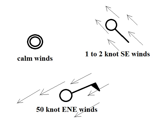
A few more examples of wind directions (provided the wind is
blowing) and wind speeds. Note how calm winds are indicated
(the winds were calm in Tucson at class time this morning).
Note also how 50 knot winds are indicated.
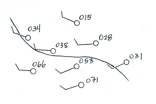
Here are four more examples to practice with. Determine
the wind direction and wind speed in each case. Click here
for the answers.
Weather (that may be occurring when the observations
were made)
And maybe the most interesting part.
A symbol representing the weather that is currently occurring
is plotted to the left of the center circle (in between the
temperature and the dew point). Some of the common weather
symbols are shown. There are about 100
different weather symbols that you can choose from.
There's no way I could expect you to remember all of
those weather symbols (I certainly don't know many of them
myself).
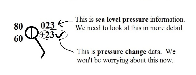
Pressure
The pressure data is usually the most confusing and most
difficult data to decode.
The sea level pressure is shown above and to the right of the
center circle. Decoding this data is a little "trickier"
because some information is missing. We'll look at this in
more detail momentarily.
Pressure change data (how the pressure has changed during
the preceding 3 hours) is shown to the right of the center
circle. Don't worry much about this now, but it may come up
in a week or two.
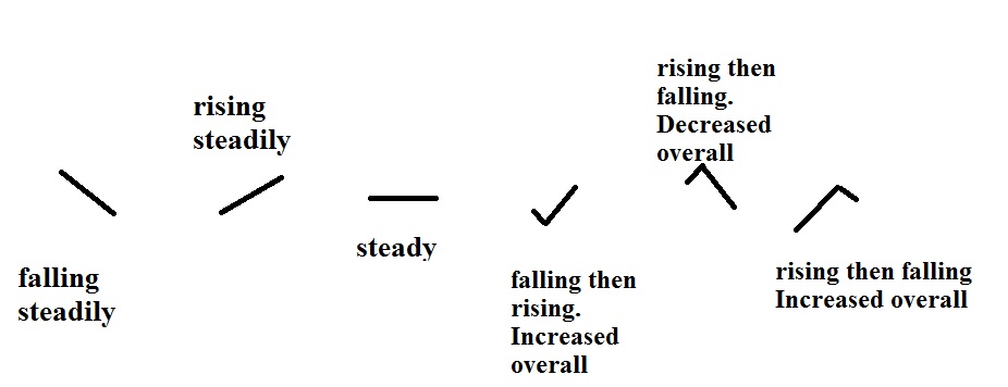
The figures below show the pressure tendency, the symbol following
the pressure change value. This is a visual record of how
pressure has been changing during the past 3 hours.
Again this is something we might use when trying to
locate warm and cold fronts on a surface weather map.
Don't worry too much about it now.
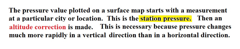
Sea level pressure
Before being plotted on a surface map, pressure data
must be corrected for altitude.
Some typical rates of pressure change are
shown below
Meteorologists hope to map out small horizontal
pressure differences on a surface map. It is the small
horizontal differences in pressure that cause the wind to blow
and create storms. If corrections for altitude were not
made, the large vertical changes in pressure caused by
altitude would dominate and would completely hide the
horizontal pressure variations.
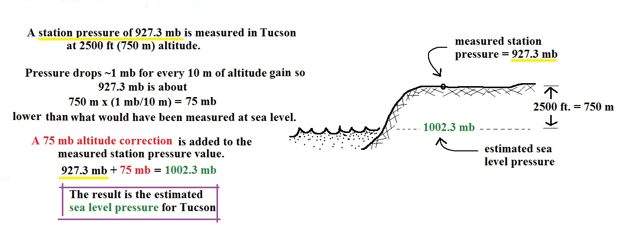
Here's an example of what would be done with a station
pressure measurement made in Tucson.
In the example above, a station
pressure value of 927.3 mb was measured in Tucson. Since
Tucson is about 750 meters above sea level, a 75 mb correction is added
to the station pressure (1 mb for every 10 meters of
altitude). The sea level pressure estimate for Tucson is
927.3 + 75 = 1002.3 mb.
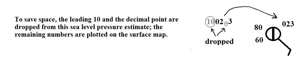
This sea level pressure estimate is the number that gets plotted
on the surface weather map. And actually there is one
additional complication:
To save space only a portion of the full sea level pressure value
is plotted on the map. When reading a weather map you need
to remember to replace the missing 9 or 10 and the decimal point.
Do you need to remember all
the details above and be able to calculate the exact
correction needed? No. You should
remember that a correction for altitude is
needed. And the correction needs to be added to the
station pressure. I.e. the sea-level pressure is
higher than the station pressure.
Coding and decoding pressure
Here are some examples of coding and decoding the pressure
data.
First of all we'll take some sea level
pressure values and show what needs to be done before the
data is plotted on the surface weather
map. Here are more examples than we did in
class.
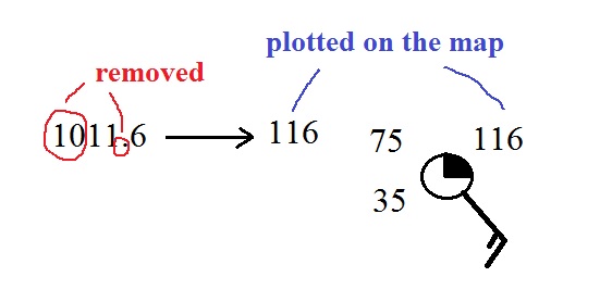
Sea level pressures generally fall between 950 mb and 1050
mb. The values always start with a 9 or a 10. To
save room, the leading 9 or 10 on the sea level pressure value
and the decimal point are removed before plotting the data on
the map. For example the 10 and the decimal
pt in 1011.6 mb would be removed; 116
would be plotted on the weather map (to the upper right of the
center circle). Some additional examples are shown
below.
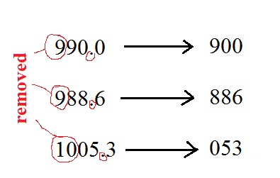
Here are 3 more examples for you to try (you'll
find the answers at the end of today's notes): 1035.6
mb, 990.1 mb, 1000 mb.
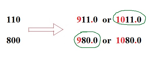
You'll mostly have to go the other direction. I.e.
read the 3 digits of pressure data off a map and figure out
what the sea level pressure actually was. This is
illustrated below.
Here are a few more examples to try on your own (answers are at
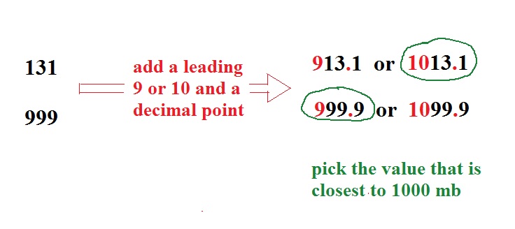
the end of today's notes): 422, 700, 990.
Caution: It is values like 990 where you are likely to make a
mistake. The 990 value looks reasonable, 990 mb. But
you do still have to add a leading 9 or 10.
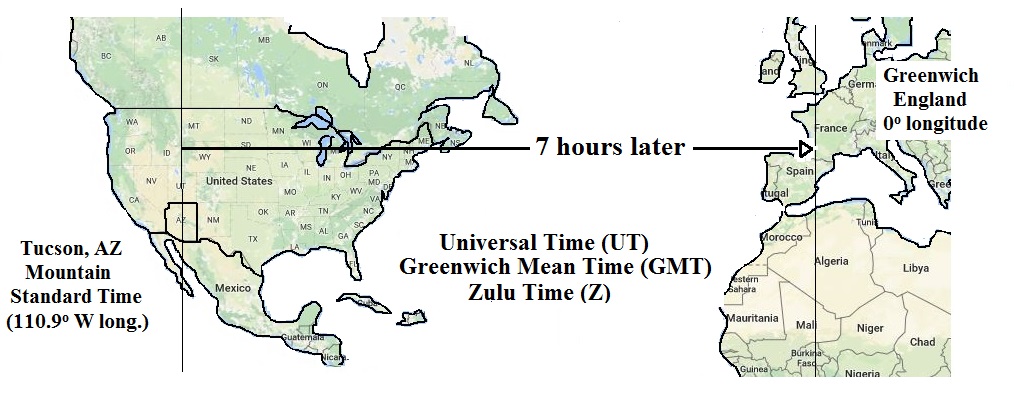
Time
Another important piece of information on a surface
map is the time the observations were collected.
Time on a surface map is converted to a universally agreed
upon time zone called Universal
Time (or Greenwich Mean Time, or Zulu time). That is
the time at 0 degrees longitude, the Prime
Meridian. There is a 7 hour time zone difference between
Tucson and Universal Time (this never changes
because Tucson stays on Mountain Standard Time year round).
You must add 7 hours to the time in Tucson to obtain
Universal Time.
Here are several examples of
conversions between MST and UT (these may differ from the
examples worked in class).
to convert from MST (Mountain Standard Time) to UT
(Universal Time)
10:20 am MST:
add the 7 hour
time zone correction ---> 10:20 + 7:00 = 17:20
UT (5:20 pm in Greenwich)
2:45 pm MST :
first convert to
the 24 hour clock by adding 12 hours 2:45 pm MST +
12:00 = 14:45 MST
then add
the 7 hour time zone correction ---> 14:45 + 7:00 =
21:45 UT (7:45 pm in England)
7:45 pm MST:
convert to the
24 hour clock by adding 12 hours 7:45 pm MST + 12:00 =
19:45 MST
add the 7 hour time zone correction ---> 19:45 + 7:00 =
26:45 UT
since this is greater than 24:00 (past midnight) we'll
subtract 24 hours 26:45 UT - 24:00 = 02:45 am the
next day
to convert from UT to MST
15Z:
subtract the 7
hour time zone correction ---> 15:00 - 7:00 = 8:00 am MST
02Z:
if we subtract
the 7 hour time zone correction we will get a negative
number.
So we will first add 24:00 to 02:00 UT then subtract 7 hours
02:00 + 24:00 = 26:00
26:00 - 7:00 = 19:00 MST on the previous day
2 hours past midnight in Greenwich is 7 pm the previous day
in Tucson
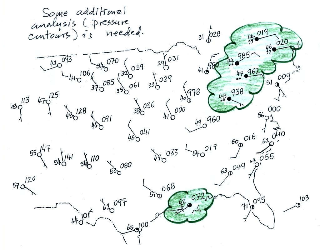
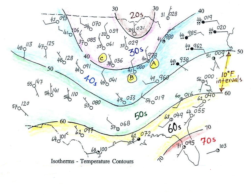
Surface weather map analyses
A bunch of weather data has been plotted (using the
station model notation) on the surface weather map in
the figure below (p. 39a in the ClassNotes).
A couple of stormy regions have been circled in
green.
Plotting the
surface weather data on a map is just the beginning. For
example you really can't tell what is causing the cloudy
weather with rain (the dot symbols are rain) and drizzle (the
comma symbols) in the NE portion of the map above or the rain
shower along the Gulf Coast. Some additional analysis is
needed.
1st step in surface map
analysis: draw in some contour lines to reveal the large
scale pressure pattern
Pressure
contours = isobars
( note the word bar
is in millibar, barometer, and now isobar ,
they all have something to do with pressure)
Temperature contours = isotherms
A meteorologist would usually begin by
drawing some contour lines of pressure (isobars) to map
out the large scale pressure pattern. We will look
first at contour lines of temperature, they are a little
easier to understand (the plotted data is easier to decode
and temperature varies across the country in a more
predictable way).
Isotherms
Isotherms, temperature contour
lines, are usually drawn at 10o F intervals. They do two things:
isotherms (1) connect points on the map with the same
temperature
(2)
separate regions warmer
than a particular temperature
from regions colder
than a particular temperature
The 40o F isotherm
above passes through a city which is reporting a temperature of
exactly 40o (Point A).
Mostly it goes between pairs of cities: one with a temperature
warmer than 40o (41o at
Point B) and the other colder than 40o (38o
F at Point C). The temperature pattern is also
somewhat more predictable than the pressure pattern: temperatures
generally decrease with increasing latitude: warmest temperatures
are usually in the south, colder temperatures in the north.
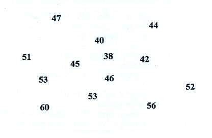
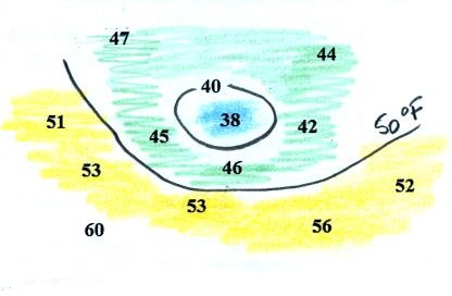
Here's another example starting with just a bunch of temperature
numbers
Our "job" is to try to make some sense of this data. To
do that we'll draw in an isotherm or two. Colors can help
you do this.
There is one temperature below 40 it has
been colored blue, temperatures
between 40 and 50 are green and temperatures in the
50s are colored yellow. It
should be pretty clear where the isotherms should go.
The isotherms have been drawn in at right; not how the
isotherms separate the colored bands. Note how the 40 F
isotherm goes through the 40 on the map.
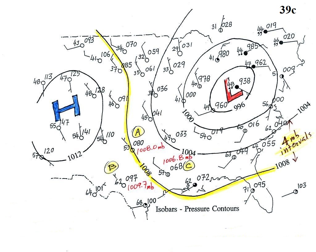
Isobars
These are a little harder to draw because you have to
be able to decode the pressure data
isobars (1) connect points on the map with equal pressure
(2) separate regions of high pressure from regions with lower pressure
and
identify and locate centers of high and low pressure
Here's the same weather map with isobars drawn in.
Isobars are generally drawn at 4 mb intervals (above and below a
starting value of 1000 mb).
The 1008 mb isobar (highlighted in yellow) passes through a city
at Point A where the
pressure is exactly 1008.0 mb. Most of the time the isobar
will pass between two cities. The 1008 mb isobar passes
between cities with pressures of 1009.7 mb at Point B and 1006.8 mb at Point C. You would
expect to find 1008 mb somewhere in between those two cites, that
is where the 1008 mb isobar goes.
The isobars separate regions of high and low pressure.
The pressure pattern is not as predictable as the isotherm
map. Low pressure is found on the eastern half of this map
and high pressure in the west. The pattern could just as
easily have been reversed.
This
site (from the American Meteorological Society) first shows
surface weather observations by themselves (plotted using the
station model notation) and then an analysis of the surface data
like what we've just looked at. There are links below each
of the maps that will show you current surface weather data.
Here's a little practice
A single isobar is shown. Is it the 1000, 1002, 1004, 1006,
or 1008 mb isobar? (you'll find the answer at the end of today's
notes)
Answers to the questions about coding and decoding
surface weather map pressure data embedded in today's notes:
Coding pressures (you must remove the leading 9 or 10 and the
decimal point.
1035.6 mb ---> 356
990.1 mb ---> 901
1000 mb = 1000.0 mb ---> 000
Decoding pressures (you must add a 9 or a 10 and a decimal
point) and pick the value closest to 1000 mb.
422 --->
942.2 mb or 1042.2 mb --->
1042.2 mb
700 ---> 970.0 mb or 1070.0 mb
---> 970.0 mb
990 ---> 999.0 mb or 1099.0 mb
---> 999.0 mb
Here is the answer to a question about
isobars
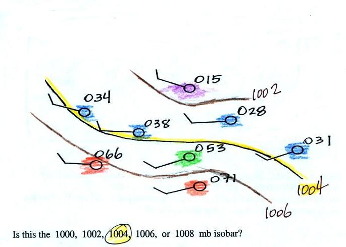
Pressures lower than 1002 mb are colored purple.
Pressures between 1002 and 1004 mb are blue. Pressures
between 1004 and 1006 mb are green and pressures greater than
1006 mb are red. The isobar appearing in the question is
highlighted yellow and is the 1004 mb isobar. The 1002 mb
and 1006 mb isobars have also been drawn in (because isobars are
drawn at 4 mb intervals starting at 1000 mb, the 1002 mb and
1006 mb isobars wouldn't normally be drawn on a map)


