Mon., Feb. 17, 2014
Songs by Crooked Still "American Tune"
and a Robert Plant & Alison Krauss collaboration "Sister Rosetta
goes Before Us" while the Optional Assignment was being
collected before class this morning.
Answers to the Optional Assignment will appear online later today.
The 1S1P reports on radon
have been graded and were returned today. The Stratospheric
Ozone and Carbon Dioxide reports haven't been graded yet.
A new Optional
Assignment is now available and is your first chance to earn
a Green Card. The
assignment is due by the start of class next Monday, Feb. 24.
Quiz #1 is Wednesday this week. You'll find times and
locations of the two reviews at the end of the Quiz #1 Study Guide.
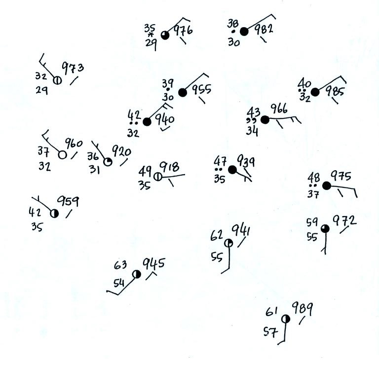
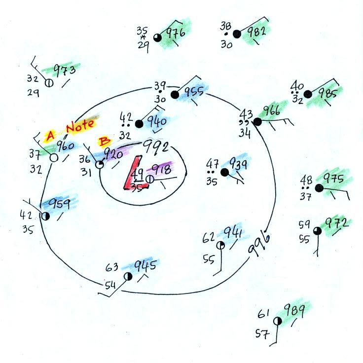
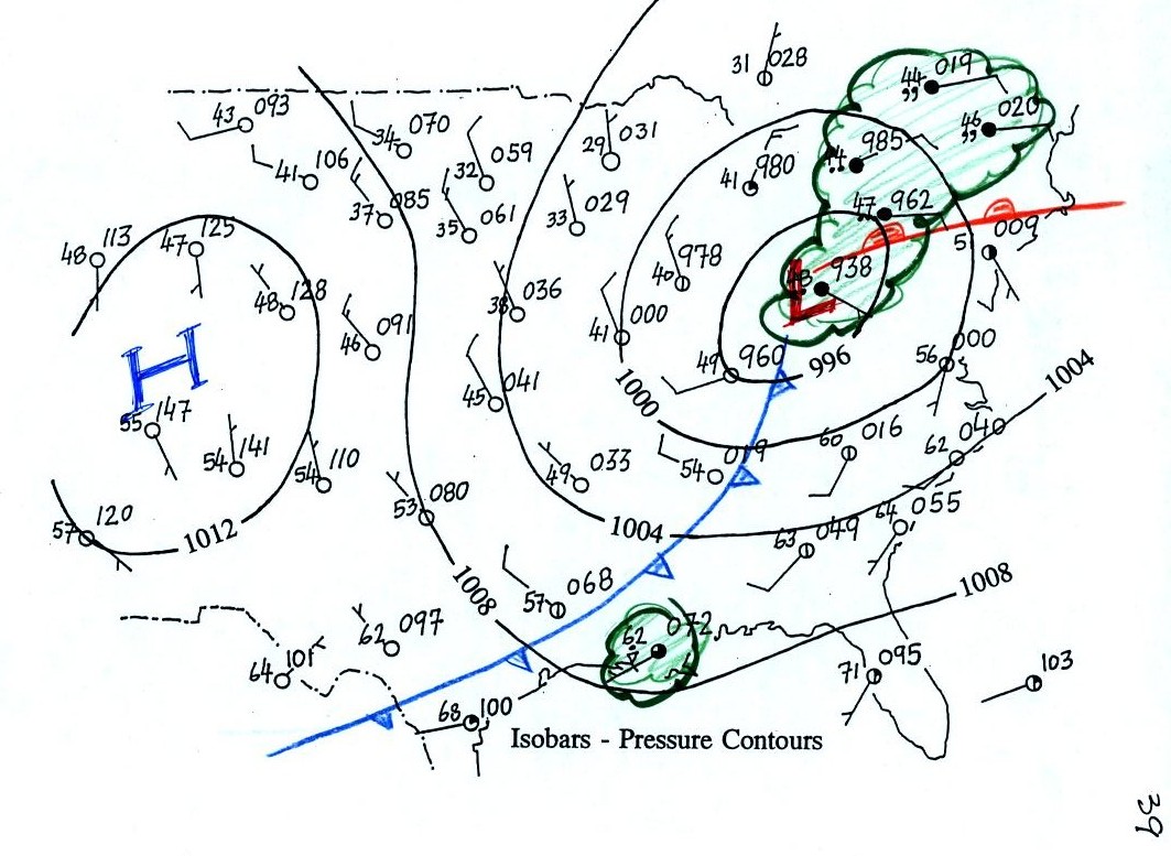
We need to finish our study of surface weather maps by trying
to located a warm front.
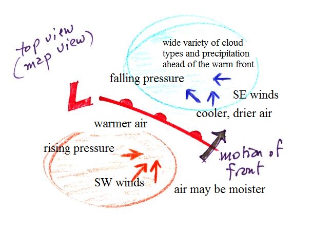
This is the map we will be working with (see p. 149b in the
ClassNotes). First though the figure below reviews some of
the weather conditions you would expect to find in front of and
behind a warm front.
Step #1
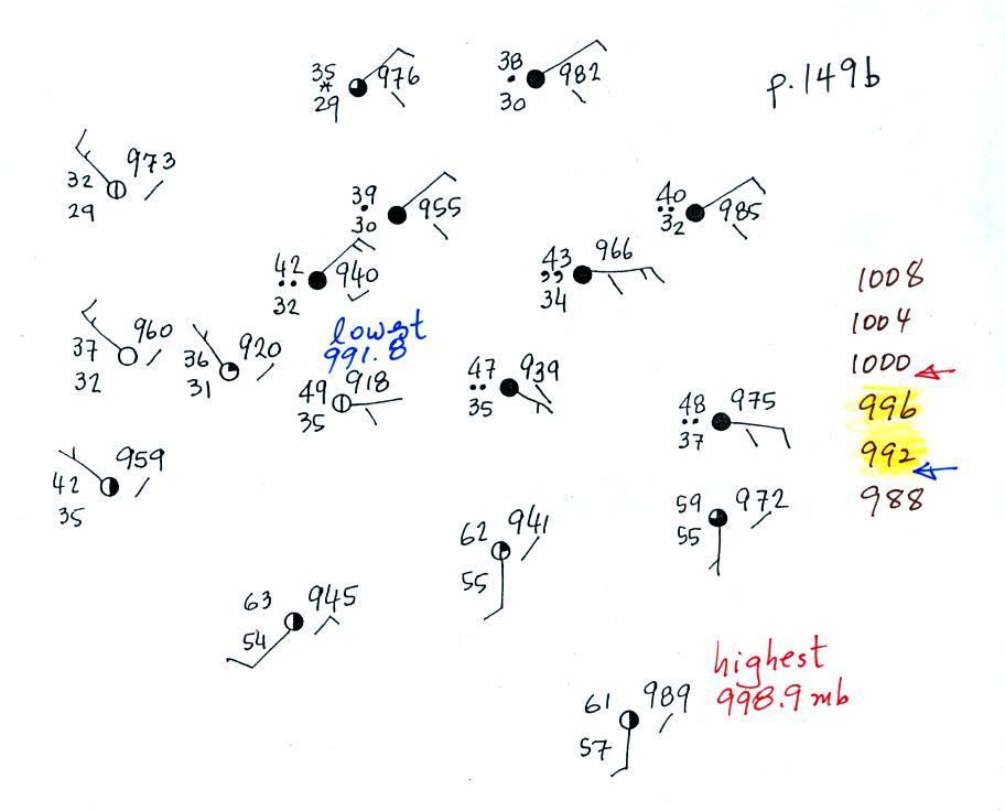
We'll start by drawing some isobars to map out the pressure
pattern. A partial list of allowed isobars is shown at the
right side of the map above (increments of 4 mb starting at 1000
mb). We've located located the highest and lowest pressure
values on the map. Then we choose allowed isobar values that
fall between these limits. In this case we'll need to draw
992 mb and 996 mb isobars.
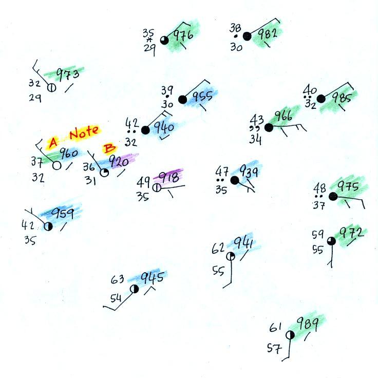
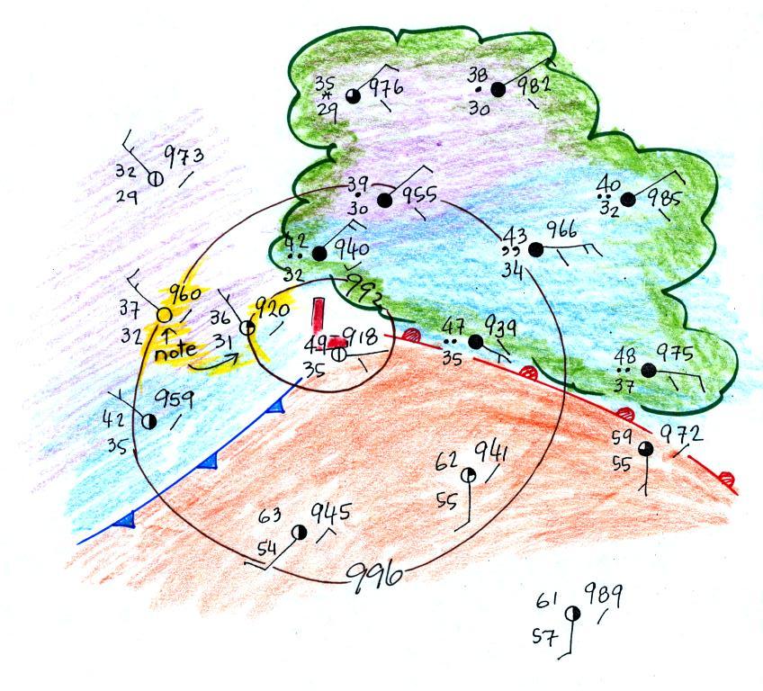
Here's the map with color coded pressures. Pressures less
than 992 mb are purple,
pressures between 992 and 996 mb are blue,
and pressures greater than 996 mb are green.
Note that station B has a pressure of exactly 992.0 mb, the 992 mb
isobar will go through that station. The 996 mb isobar will
go through station A because it has a pressure of exactly 996.0
mb.
Here's the map with the isobars drawn in. On the map below
we use colors to locate the warm and cooler air masses.
Step #2
The warm air mass has been colored in orange. Cooler air
east of the low pressure center is blue. Can you see
where the warm front should go?
Step #3
Here's the map with a warm front drawn in (the map was redrawn so
that the edge of the warm (orange) air mass would coincide with
the warm front). The change in wind directions was probably
more noticeable that the temperature change. Most of the
cloud outlined in green are probably being produced by the warm
front. You can see how more extensive cloud coverage is with
a warm front.
Step #4
Two of the stations near the right edge of the picture and on
opposite sides of the front are redrawn below.
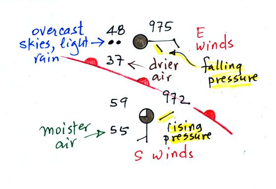
The station north of the front has cooler and drier air, winds are
from the east, skies are overcast and light rain is falling.
The pressure is falling as the warm front approaches. These
are all things you'd expect to find ahead of a warm front.
Behind the front at the southern station pressure is rising, the
air is warmer and moister, winds have shifted to the south and the
skies are starting to clear.
Step #5
Finally it's worth looking at the left, western, side of the
map. There's pretty good evidence of a cold front.
There's a big temperature change (low 60s to low 40s and 30s)
and a very noticeable wind shift (SW ahead of the cold front and
NW behind).
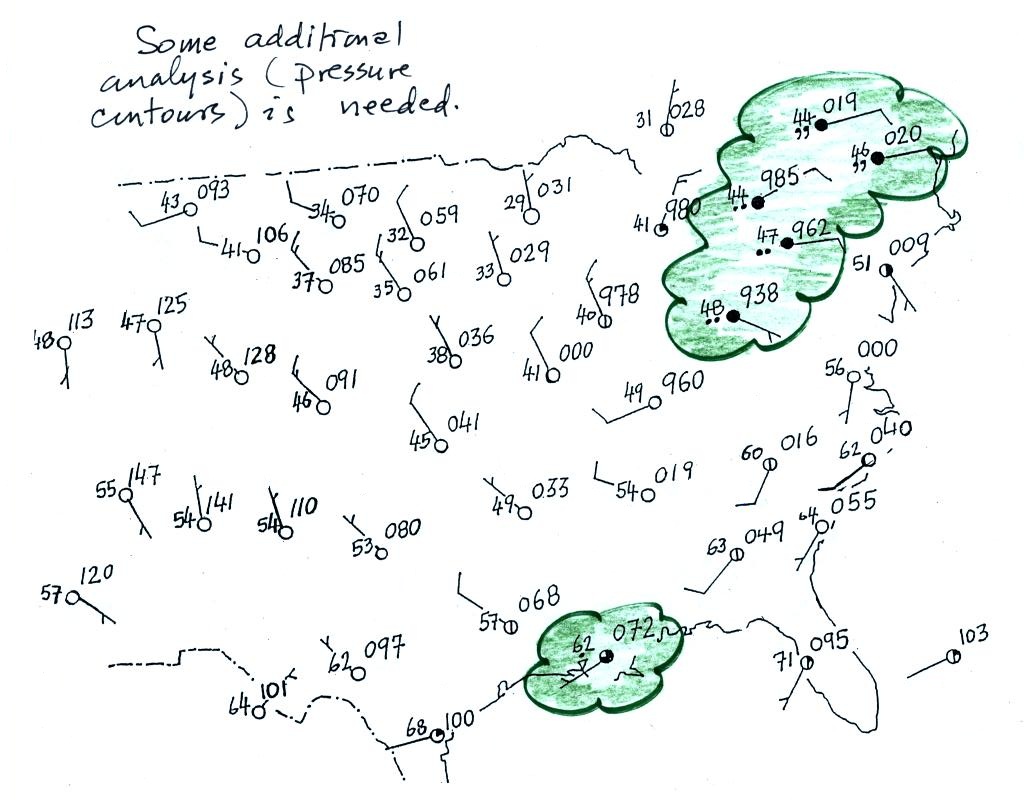
We need to go back to the figure
where this mostly all began
After learning how weather data are plotted on a map using the
station model notation we found that the data,, by themselves,
were not enough to really be able to say what was causing the
cloudy, rainy weather in the NE and along the Gulf Coast.
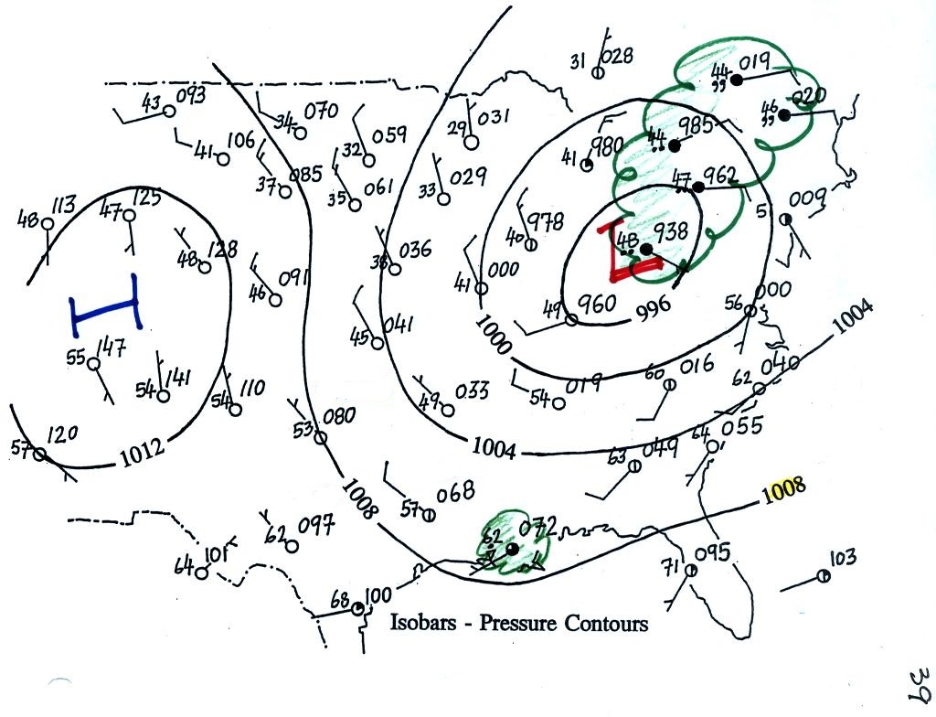
We added some isobars to reveal the pressure pattern and to
locate large centers of high and low pressure. Winds
converging into the center of low pressure cause air to rise and
might be part of the explanation for the unsettled weather in the
NE. That would explain the rain shower along the Gulf Coast
however.
Now we've added cold and warm fronts to the picture. The
approaching cold front is almost certainly the cause of the shower
along the Gulf Coast. The clouds in the NE are probably
being produced by the warm front.
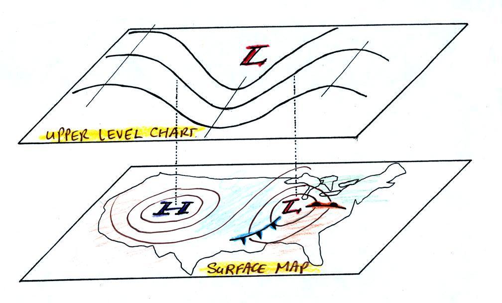
Up to this point we've been learning about surface
weather maps. Maps showing conditions at various altitudes
above the ground are also drawn. Upper level conditions can
affect the development and movement of surface features (and vice
versa).
Here we'll mostly just learn 3 basic facts about upper level
charts. The Optional
Assignment that I mentioned in class will go much further
than we went in class.
First the overall appearance is somewhat different from a
surface weather map. The pattern on a surface map can be
complex and you generally find circular (more or less) centers
of high and low pressure (see the bottom portion of the figure
below). You can also find closed high and low pressure
centers at upper levels, but mostly you find a relatively simple
wavy pattern like is shown on the upper portion of the figure
below (sort of a 3-dimensional view). You'll find this
basic picture on p. 41 in the ClassNotes.
A simple upper
level chart pattern is sketched below (a map view).
There are two basic features: wavy lines that dip southward
and have a "u-shape" and
lines that bend northward and have an "n-shape".
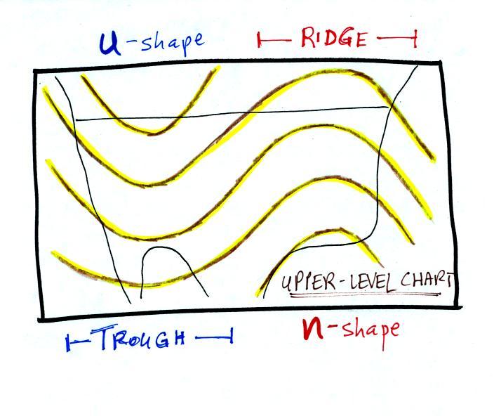
The u-shaped portion
of the pattern is called a trough. The n-shaped portion is called
a ridge.
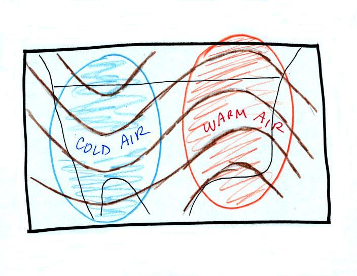
Troughs are produced by large volumes of cool or cold
air (the cold air is found between the ground and the upper
level that the map depicts). The western half of the
country in the map above would probably be experiencing colder
than average temperatures. Large volumes of warm or hot
air produce ridges. You can find out why this is true by
reading "Upper level
charts pt. 2".
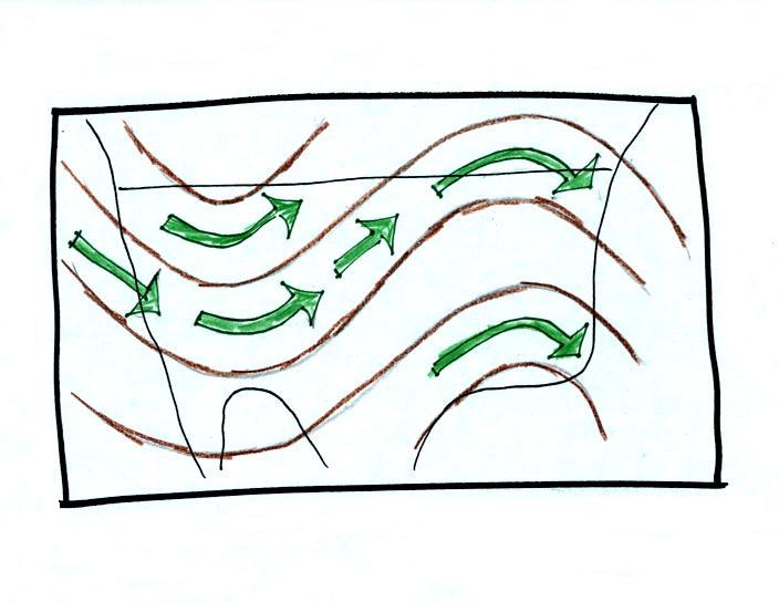
The winds on
upper level charts blow parallel to the contour lines
generally from west to east. This is a little different
from surface winds which blow across the isobars toward low
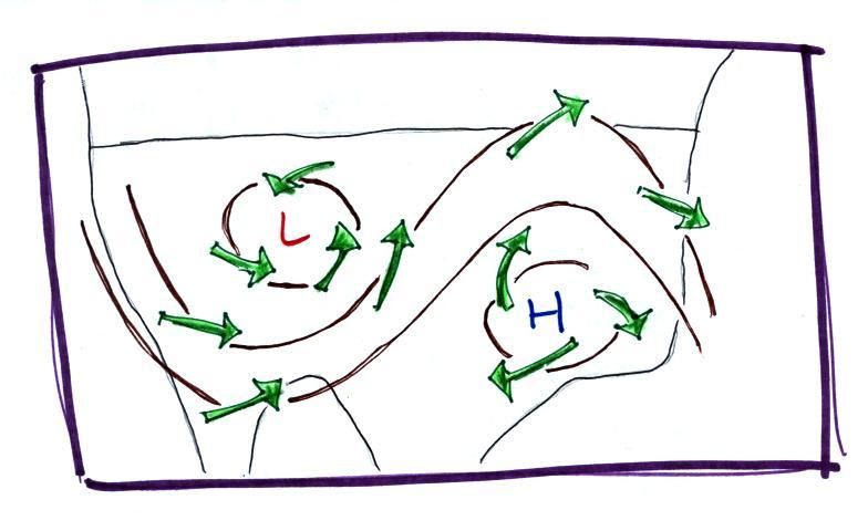
pressure. An example of surface winds is shown below.
That's it for this first
section. Really all you need to be able to do is
1. identify troughs and ridges,
2. remember that troughs are associated with cold air &
ridges with warm air, and
3. remember that upper level winds blow parallel to the
contour lines from west to east.
The next two figures weren't discussed quickly in
class. They go beyond what you will near to worry
about on this week's quiz. I've included them here
just to give you some idea of the interaction between
weather at ground level and conditions above the ground.
Here's the earlier picture again overlaying surface and
upper-level maps.
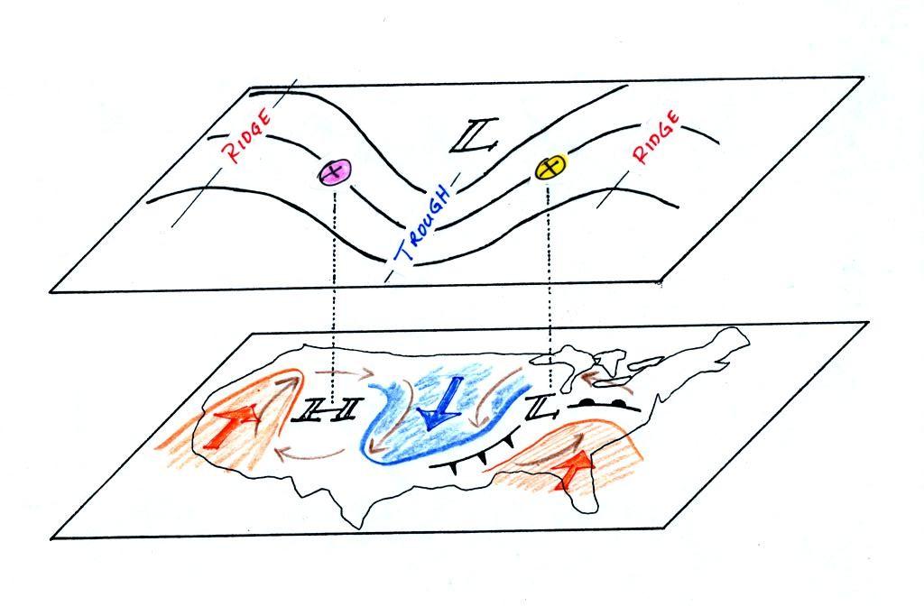
On the surface map above you see centers
of HIGH and LOW pressure. The surface low pressure
center, together with the cold and warm fronts, is a
middle latitude storm.
Note how the counterclockwise winds spinning around the
LOW move warm air northward (behind the warm front on the
eastern side of the LOW) and cold air southward (behind
the cold front on the western side of the LOW).
Clockwise winds spinning around the HIGH also move warm
and cold air. The surface winds are shown with thin
brown arrows on the surface map.
Note the ridge and trough features on the upper level
chart. We learned that warm air is found below an
upper level ridge. Now you can begin to see where
this warm air comes from. Warm air is found west of
the HIGH and to the east of the LOW. This is
where the two ridges on the upper level chart are also
found. You expect to find cold air below an upper
level trough. This cold air is being moved into the
middle of the US by the northerly winds that are found
between the HIGH and the LOW.
Note the yellow X marked on the upper level chart directly
above the surface LOW. This is a good location for a
surface LOW to form, develop, and strengthen
(strengthening means the pressure in the surface low will
get even lower than it is now. This is also called
"deepening"). The reason for this is that the yellow
X is a location where there is often upper level
divergence. Similary the pink X is where you often
find upper level convergence. This could cause the
pressure in the center of the surface high pressure to get
even higher. You can read more about this in Upper level charts
pt. 3. The upper level
winds could also cause the surface storm to weaken (the low
pressure would get higher).
.
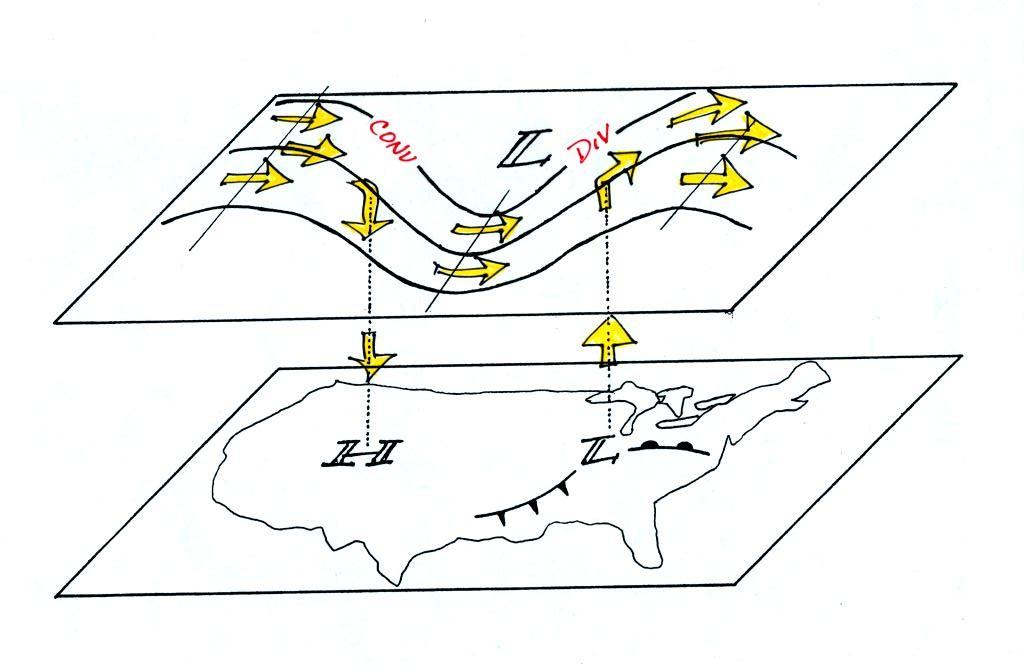
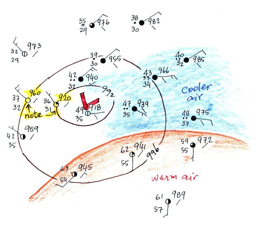
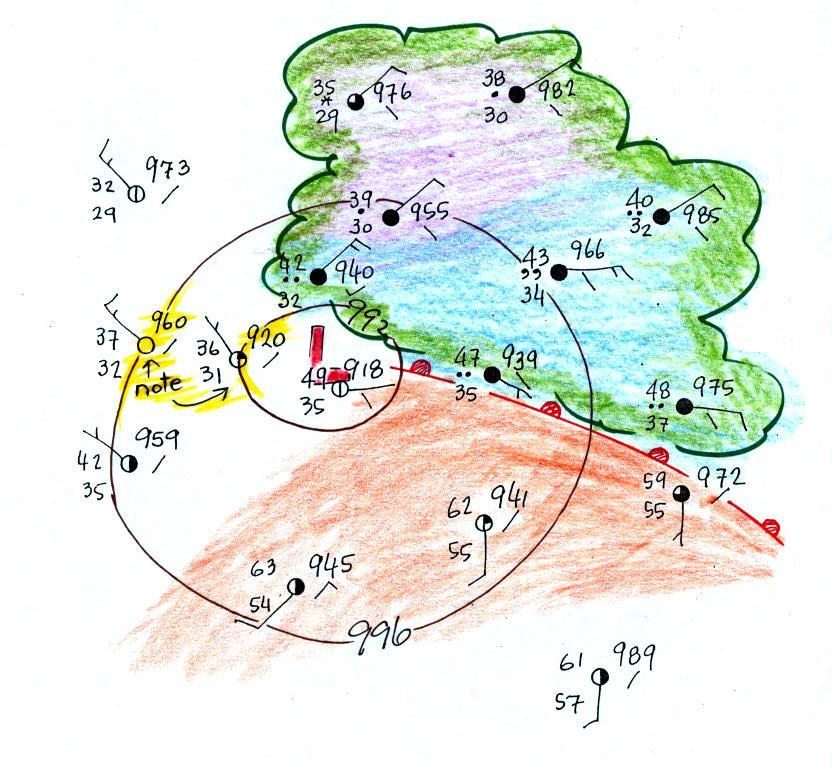
One of the things we have learned about surface
LOW pressure is that the converging surface winds create rising
air motions. The figure above gives you an idea of what
can happen to this rising air (it has to go somewhere).
Note the two arrows of air coming into the point "DIV" and three
arrows of air leaving (more air going out than coming in), this
is upper level divergence). The rising air can, in effect,
supply the extra arrow's worth of air.
Three arrows of air come into the point marked "CONV" on the
upper level chart and two leave (more air coming in than going
out = upper level convergence). What happens to the extra
arrow? It sinks, it is the source of the sinking air found
above surface high pressure.