![]()
![]()
![]()
![]()
One of the nice things about being able to interpret 500 mb height maps is that one can can easily visualize the large-scale weather patterns that are forecasted by computer-generated numerical weather prediction models. There are dozens of groups worldwide that run different numerical models for weather forecasting and hundreds of web sites that display this data. The fact that each model produces different forecasts indicates that there is uncertainty in making numerical weather forecasts. You probably realize from your own experiences that weather forecasts are not exact and can sometimes be way off. When different forecast models make different predictions of future weather, your local weather forecaster has to decide which to believe in making his personal forecast. Generally numerical weather forecast models in the winter season are quite accurate for 1-5 days into the future, somewhat less accurate for 6-9 days into the future, sometimes helpful for 10-12 day forecasts, and have little skill in forecasting more than 12 days into the future. We will cover material discussing limitations on the accuracy of numerical weather forecasting in later lectures.
On this page you will learn how to get numerical weather forecasts from two different sources and how to interpret the 500 mb height maps produced. We will also use maps from these sources for a homework set.
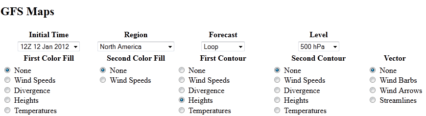
This site was mentioned on the introductory lecture page on 500 mb maps. You may wish to open this link http://weather.uwyo.edu/models/ in a new tab or browser window so that you can follow these instructions. You must first select a model. In class we will use either the GFS (Global Forecast System) or Medium Range Forecast (MRF) both run in the US by NOAA. You must fill in the drop-down menus and dots to select the maps you want to display. For now select the latest possible initial time (default value) and set the other items as shown below
If you are interested you can use this site to produce other forecast images. We will not have time to do much of this as part of the class, but feel free to explore and ask questions. One item that I sometimes choose to add to the 500 mb maps is to select precipitation as one of the color fills to see where and how much precipitation is forecast by the model.
This site will be used to get 500 mb height forecasts from the ECMWF (European Centre for Medium Range Forecasting) model. There are many weather forecasters who consider the ECMWF the best performing weather forecast model on Earth. Again you may wish to open this link in a new tab so that you can follow the instructions http://raleighwx.americanwx.com/models/ecmwf.html. The ECMWF model is started from measured data twice per day at 00Z and 12Z. There are two tables within which you can select various model forecast maps. One table is the latest 00Z run, i.e., started based on data collected at 00Z (local Tucson time is 5 PM one day earlier) and the other table is the latest 12Z run, i.e., model began based on data collected at 12Z (5 AM local Tucson time). The maps we are going to discuss in this class are the 500mb Height Anomalies for the Northern Hemisphere and North America (these are in the 3rd and 4th rows of the tables). If you select loop you will get a movie of the 500 mb height forecast, otherwise you will get a single frame. Note. I am having trouble getting the loop to work on Firefox. However, I can still click on the individual images. The individual images have time stamps at the bottom. You need only look at the first set of numbers (before the first colon) to get the time of the forecast. For example "Fri 120928/0000V072" means the forecast is valid for Friday, September 28, 2012 / at 0000Z and is a 072 hour forecast.
The contour lines on these maps are the 500 mb heights, which are labeled in meters above sea level. The color shading is of the 500 mb height anomaly, which is defined at the difference between the forecasted 500 mb height and the average 500 mb height. The color scale for the height anomaly is shown to the left of the image. The H's and L's labeled with numbers are point values of the 500 mb height anomaly. This is meant to show centers of high and low 500 mb height anomalies. The nice thing about these maps is that you can immediately see how the 500 mb height compares to average, which makes it much easier to interpret the maps in terms of expected temperature relative to average. Places where the 500 mb height is forecasted to be below average (blue and purple shading) are places where below average temerature is expected, places where it is above average (green, yellow, and red) shading are places where above average temperature is expected. If the height anomaly over a region is within 40 meters of average, expect near average temperatures for that region; if the height anomaly is 40-100 meters above (or below) average, expect temperatures to be moderately above (or below) average for that region; and if the height anomaly is 100 or more meters above (or below) average, expect well above (or below) average temperatures for that region. The H's and L's indicate local regions of maximum and minimum height anamolies.
The 500 mb height anomaly map is a nice way to see where the model predicts that it will be relatively cold and where it predicts that it will be relatively warm. The following link from the US National Weather Service, http://www.hpc.ncep.noaa.gov/medr/mrfmeans.shtml, provides maps of the 500 mb height anomaly forecasted over North America for 3, 5, 8, and 11 days into the future from the United States operational weather forecast model. On these maps, the 500 mb height pattern is drawn using solid green contour lines, while the height anomalies are drawn using dotted red and blue contour lines, where blue indicates below average 500 mb heights and red indicates above average 500 mb heights.
![]()
![]()
![]()
![]()