Monday Sep. 17, 2012
click here to
download today's notes in a more printer friendly format
A couple of songs from The Be Good Tanyas before class this
afternoon. You heard "Rowdy Blues" and
"When
Doves
Cry". I heard a song during an old episode of Breaking
Bad that I liked. It turned out to be their version of "Waiting Around to Die".
Both Optional
Assignments have been graded and were returned in class
today. If your paper doesn't have a grade it means you earned
full credit. Be sure to check the online answers as not all of
the questions are always graded. Here are answers to
Asst. #1 and here
are answers to the in-class assignment from last Friday.
Quiz #1 is Wednesday this week. The quiz will cover material
on both the Quiz #1 Study Guide and the Practice Quiz Study Guide. Reviews are
scheduled for Monday and Tuesday afternoon (and Wednesday afternoon for
the T Th class). See either study guide for times and locations.
The Experiment #1 reports were collected
today. It takes about 1 week to grade the reports. If you
haven't returned your materials please do so as soon as you can.
The graduated cylinders are used in Experiment #2 and need to be
cleaned before they can be checked out. Experiment
#2
materials will be distributed in class on Friday.
Last Friday we leanred how weather data is plotted on a surface
map using the station model notation. Today we'll start to see
what analysis of that data can tell you about the weather.
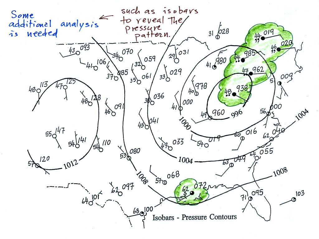
A bunch of weather data has been
plotted (using the station model notation) on a surface weather map in
the figure
below (p. 38 in the ClassNotes).
Plotting the surface weather
data
on a map is
just the
beginning.
For example you really can't tell what is causing the cloudy weather
with rain (the dot symbols are rain) and drizzle (the comma symbols) in
the NE portion of the map above or the rain
shower along the Gulf Coast. Some additional
analysis is needed. A meteorologist would usually begin by
drawing some contour lines of pressure (isobars) to map out the large
scale
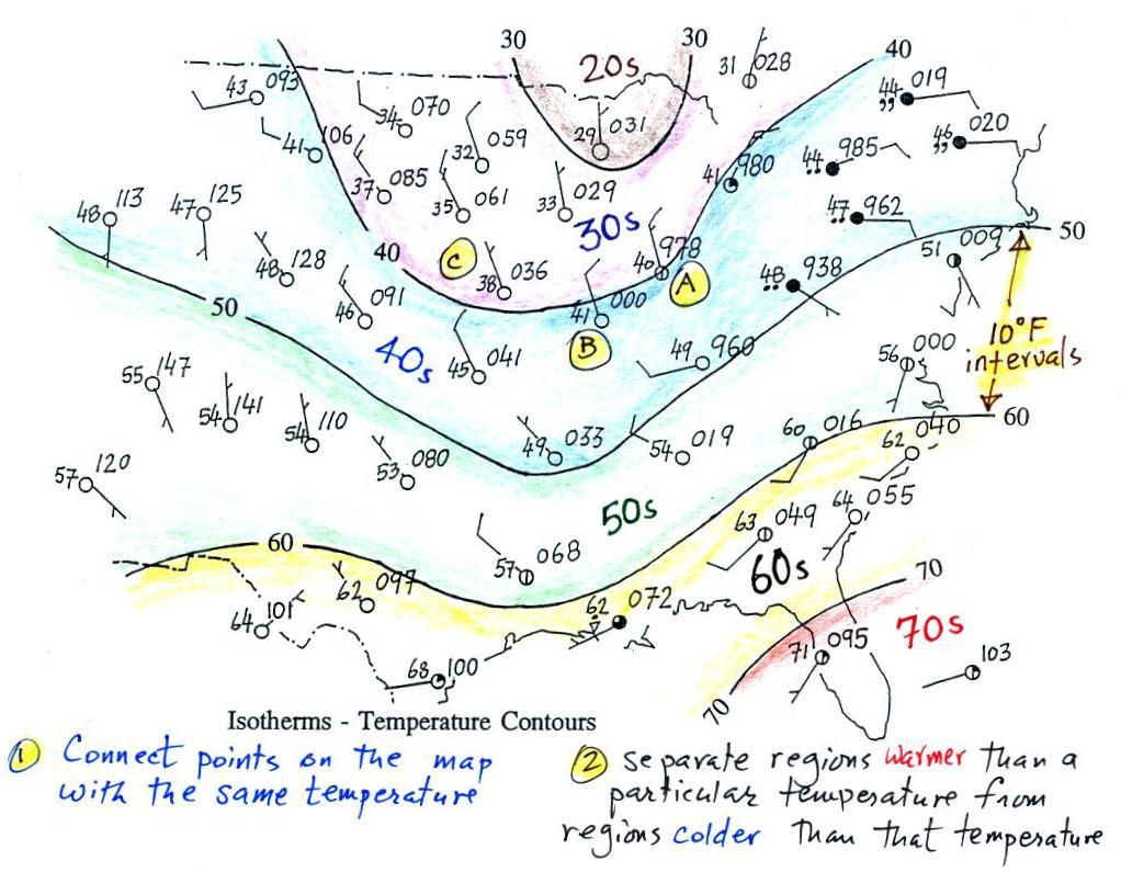
pressure pattern. We will look first at contour lines of
temperature, they are a little easier to understand (the plotted data
is easier to decode and temperature varies across the country in a more
predictable way).
Isotherms, temperature
contour lines, are usually drawn at 10o F
intervals.
They do two things: (1) connect points on the map that all
have the same temperature, and (2) separate regions that are warmer
than a particular temperature from regions that are colder. The
40o F isotherm above passes
through
a city which is reporting a temperature of exactly 40o (Point A).
Mostly
it
goes
between
pairs
of
cities:
one
with
a
temperature
warmer
than
40o (41o at Point B) and
the other
colder
than 40o (38o F at Point C).
Temperatures
generally decrease with
increasing
latitude: warmest temperatures are usually in the south, colder
temperatures in the north.
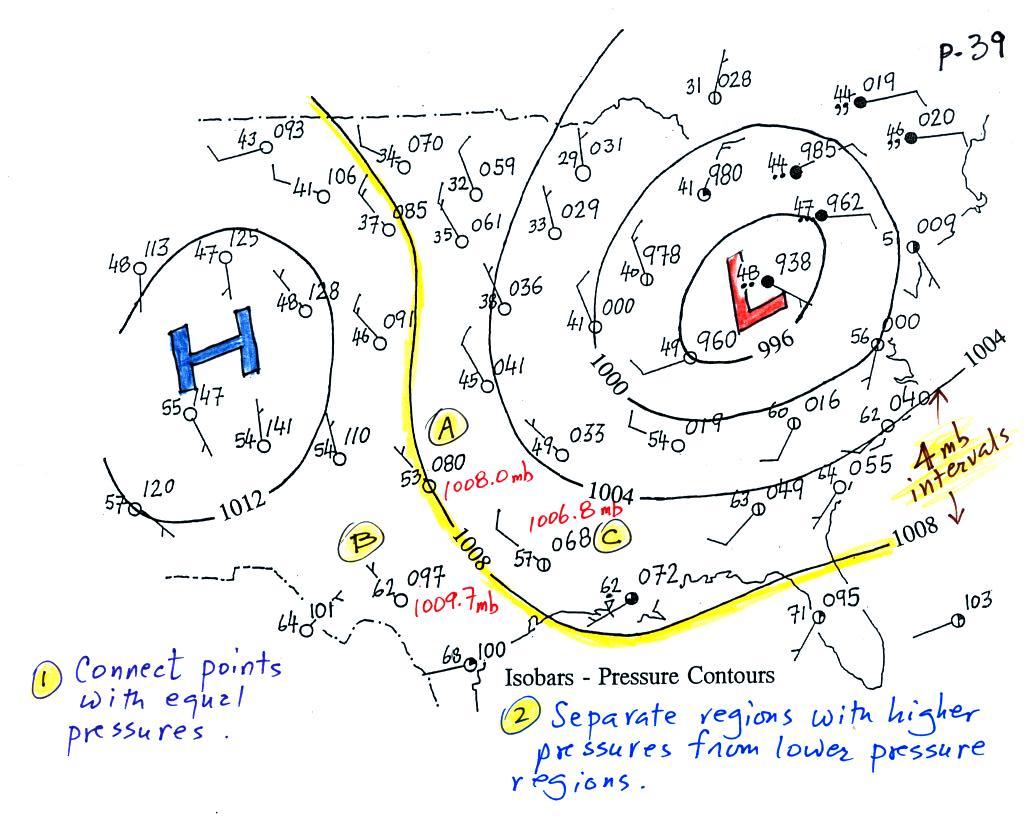
Now the same data with isobars
drawn in. Again they
separate
regions with pressure higher than a particular value from regions with
pressures lower than that value.
The isobars also enclose areas of high pressure and low pressure.
Isobars are generally drawn at 4 mb intervals (starting with a base
value of 1000 mb). Isobars
also connect points on the map
with the same pressure. The 1008 mb isobar (highlighted in
yellow) passes through a city at Point
A where the pressure is exactly
1008.0 mb. Most of the time the isobar
will pass between two
cities. The 1008 mb isobar passes between cities with
pressures
of 1009.7 mb at Point B and
1006.8 mb at Point C.
You would
expect to find 1008 mb somewhere in between
those two cites, that is where the 1008 mb isobar goes.
The pressure pattern is not as predictable as the isotherm
map. Low pressure is found on the eastern half of this map and
high pressure in the west. The pattern could just as easily have
been reversed.
This
site (from the American Meteorological Society) first shows surface
weather observations by themselves (plotted using the station model
notation) and then an analysis of the surface data like what we've just
looked at. There are links below each of the maps that will show
you current surface weather data.
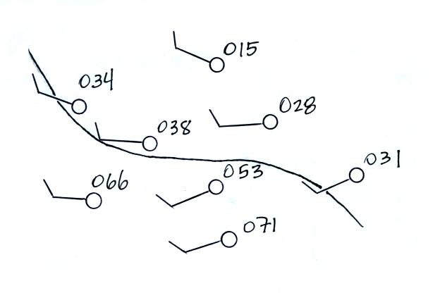
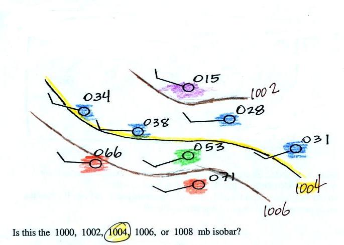
Here's a little practice (this figure wasn't
shown in class).
Is this the 1000, 1002, 1004,
1006, or 1008 mb isobar? (you'll find the answer at the end of today's
notes)
Now we'll look at what you can learn about the weather once you've
drawn in some isobars and mapped out the pressure pattern.
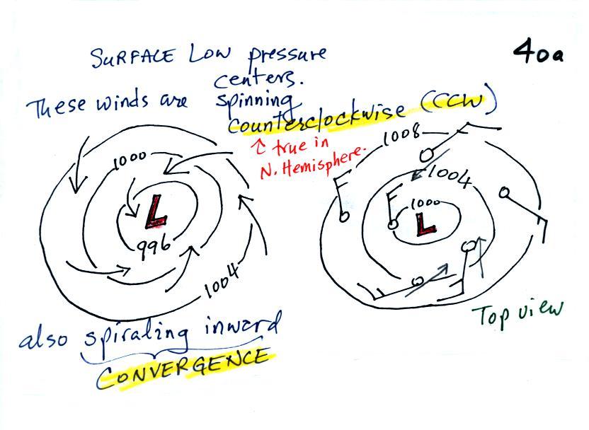
1.
We'll start with the large nearly circular centers of High and Low
pressure. Low pressure is drawn below. These figures are
more neatly drawn versions of what we did in class.
Air will start moving
toward low
pressure (like a rock sitting on a hillside that starts to roll
downhill), then something called the Coriolis force will cause
the
wind to start to spin (we'll learn more about the Coriolis force later
in the semester). In the northern hemisphere winds spin in a
counterclockwise (CCW) direction
around surface
low pressure
centers. The winds also spiral inward toward the center of the
low, this is called convergence. [winds spin clockwise around low
pressure centers in the southern hemisphere but still spiral inward,
don't worry about the southern hemisphere until later in the semester]
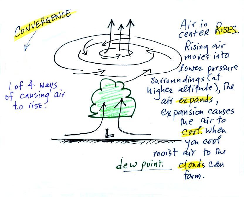
When the converging air reaches the
center of the low it starts to rise.
Rising air expands (because it is moving into lower pressure
surroundings at higher altitude), the expansion causes it to
cool. If the air is moist
and it is cooled enough (to or below the dew point temperature) clouds
will form and may then begin to rain or snow. Convergence is 1 of 4 ways of causing air
to rise (we'll learn what the rest are soon, and, actually, you
already know what one of them is - warm air rises, that's called
convection).
You
often
see
cloudy
skies
and
stormy
weather
associated with surface low pressure.
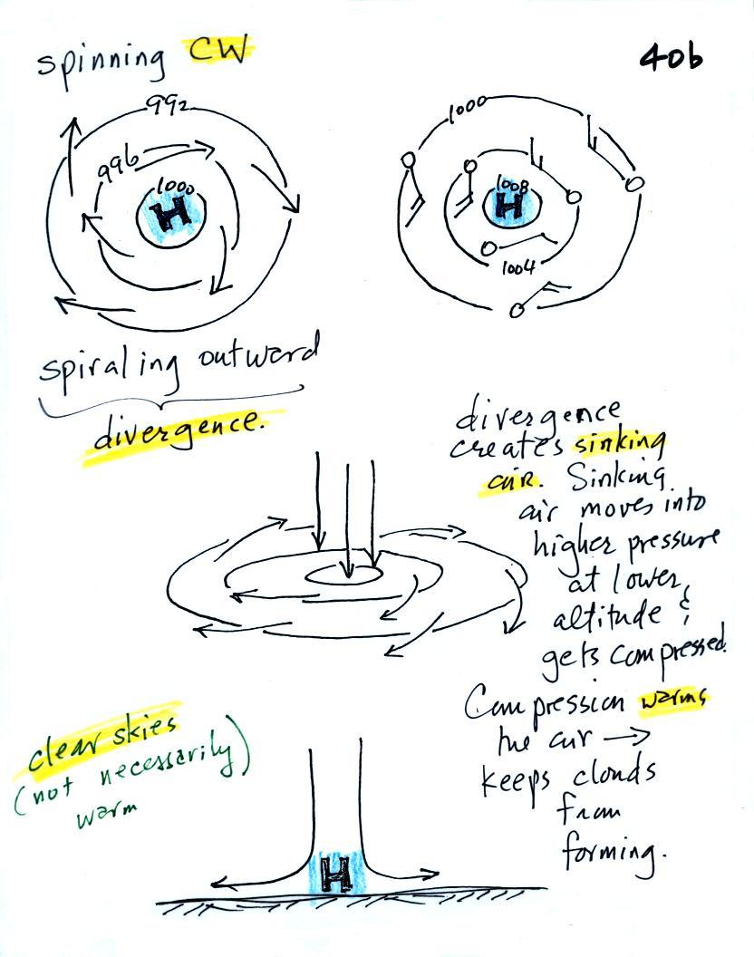
Everything is pretty much the exact opposite in the case of surface
high pressure.
Winds
spin
clockwise
(counterclockwise
in
the
southern
hemisphere)
and spiral outward.
The
outward motion is called divergence.
Air sinks in the center of
surface high pressure to
replace the diverging air. The sinking air is compressed and
warms. This keeps clouds from forming so clear
skies are normally found with high pressure.
Clear skies doesn't necessarily mean warm weather, strong surface high
pressure often forms when
the air is very cold.
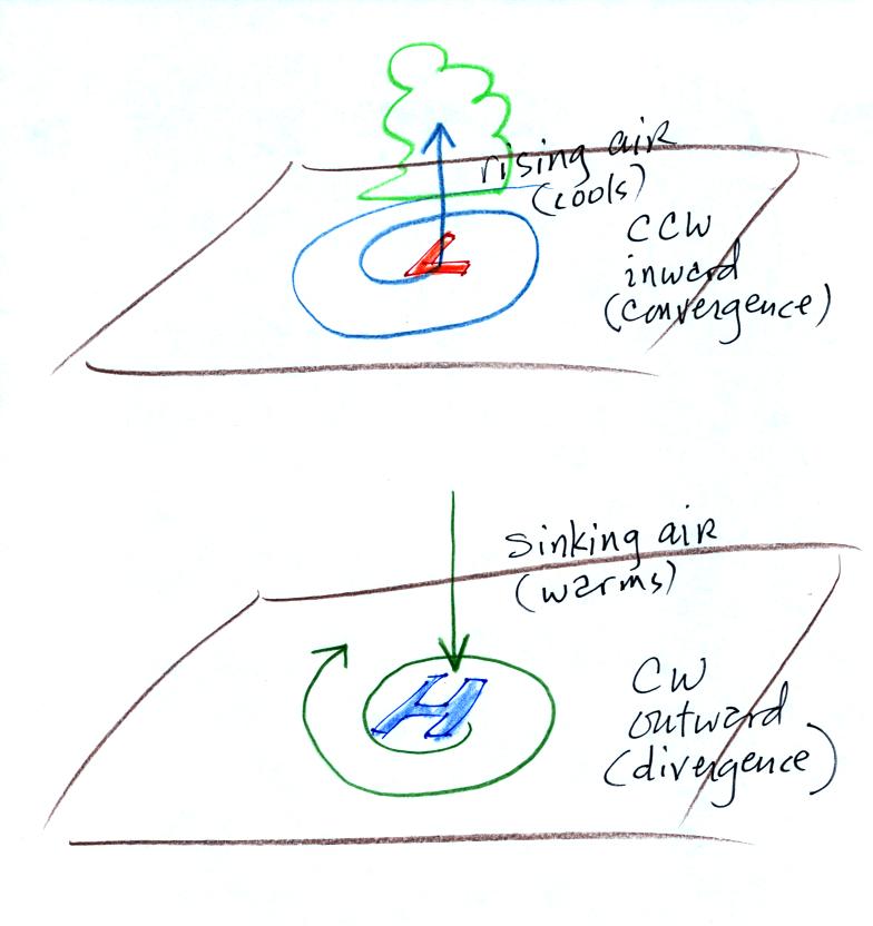
Here's a picture summarizing what we've learned so far. It's
a slightly different view of wind motions around surface highs and low
and wasn't
shown in class.
2.
The
pressure pattern will also tell you something about where you might
expect to find fast or slow winds. In this case we look for
regions where
the isobars are either closely spaced together or widely spaced.
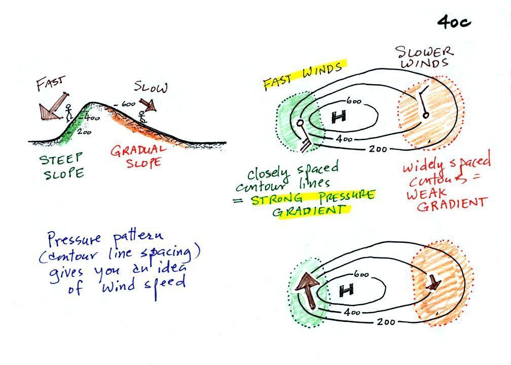
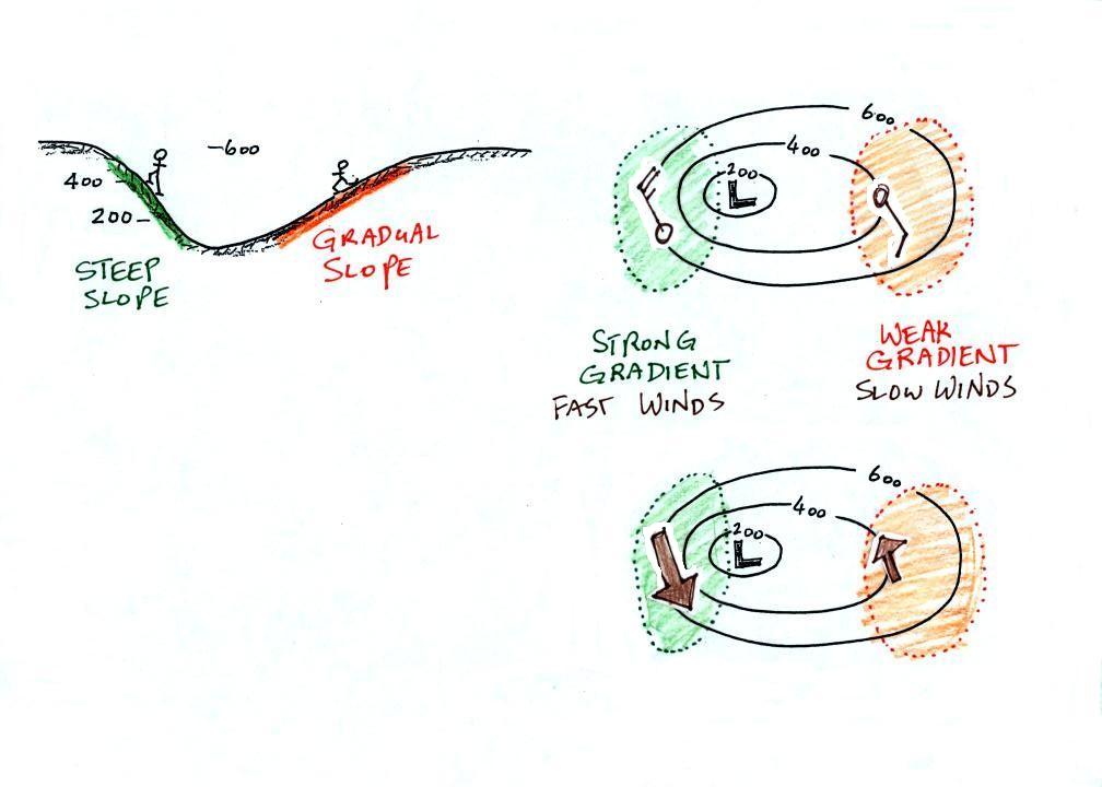
A picture of a hill is shown above
at left. The maps at right are actually topographic maps that
depict the hill (the numbers on the contour lines are altitude).
A center of high pressure on a weather map could have exactly the same
appearance (the numbers on the contour lines would be different, they'd
be pressures instead of altitudes and would have values close to 1000
mb).
On a weather map, closely spaced contours (isobars) means
pressure is changing
rapidly
with
distance. This is known as a strong pressure gradient and
produces fast winds. It is analogous to a steep slope on a
hillside. If you trip walking on a hill, you will roll rapidly
down a steep
hillside, more slowly down a gradual slope.
The winds around a high pressure
center are shown above using both the
station model notation and arrows. The winds are spinning clockwise and
spiraling outward slightly. Note the different wind speeds (25
knots and 10 knots plotted using the station model notation).
Fast winds where to contours are close together and slower winds where
they are further apart.
Winds spin counterclockwise and
spiral inward around
low
pressure
centers. The fastest winds are again found where the pressure
gradient is strongest.
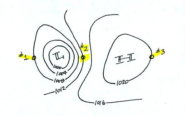
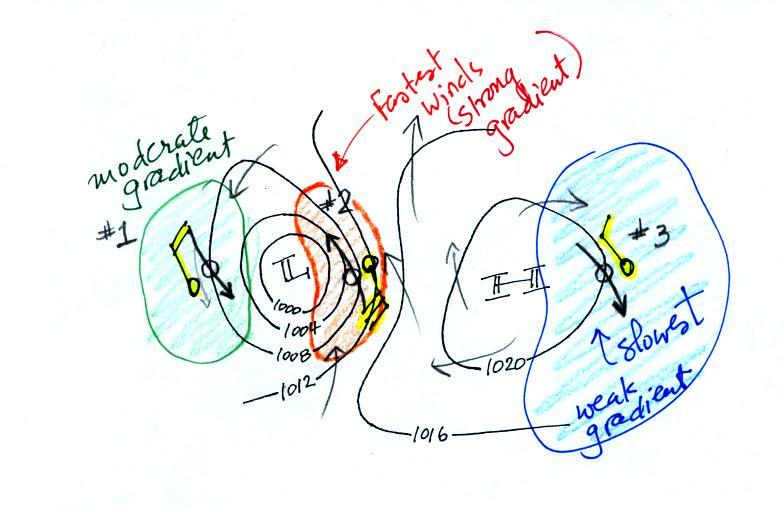
This figure is found at the bottom
of p. 40 c in the photocopied ClassNotes. You should be able to
sketch in the direction of the wind at each of the three
points and determine where the fastest and slowest winds would be
found. (you'll find the answer at the end of today's notes).
Here are the answers to the two questions found earlier in the
notes.
Pressures lower than 1002 mb are colored purple. Pressures
between 1002 and 1004 mb are blue. Pressures between 1004 and
1006 mb are green and pressures greater than 1006 mb are red. The
isobar appearing in the question is highlighted yellow and is the 1004
mb isobar. The 1002 mb and 1006 mb isobars have also been drawn
in (because isobars are drawn at 4 mb intervals starting at 1000 mb,
1002 mb and 1006 mb isobars wouldn't normally be drawn on a map)
And here's the answer to the question about wind directions and
wind speeds.
The winds are blowing from the NNW
at Points 1 and 3. The winds are blowing from the SSE at Point
2. The fastest winds (30 knots) are found at Point 2 because that
is where the isobars are closest together (strongest pressure
gradient). The slowest winds (10 knots) are at Point 3.
Notice also how the wind direction can affect the temperature
pattern. The winds at Point 2 are coming from the south and are
probably warmer than the winds coming from the north at Points 1 &
3.