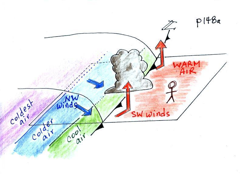
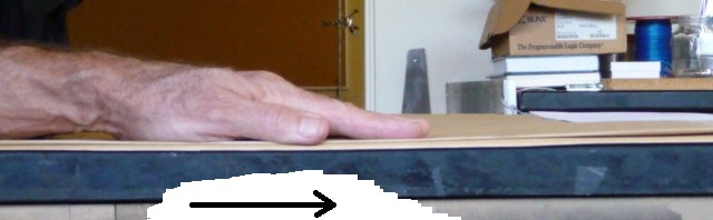
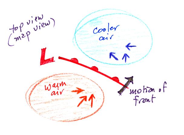
The person in the
figure is positioned ahead of an approaching
cold front. Time wise, it might be the day before
the front actually passes through. There
are 3 fairly important features to notice in this
picture.
1. The
front edge of the approaching air mass has a
blunt, rounded shape. A vertical slice
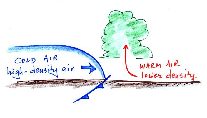
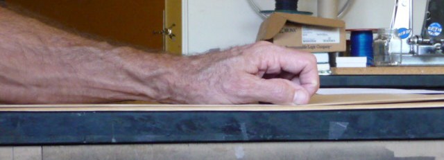
through a cold front is shown below at left.
Here are the kinds
of weather changes that usually precede and follow
passage of a warm front.
Weather
Variable
|
Behind
(after)
|
Passing
|
Ahead
(before)
|
Temperature
|
warmer
|
|
cool
|
Dew point
|
may be moister
|
|
drier
|
Winds
|
SW, S, SE
|
|
from the East or SE,
maybe even the S
|
Clouds,
Weather
|
clearing
|
|
wide
variety of clouds that may precede arrival of the front
by a day or two
clouds may produce a wide variety of types of
precipitation also
(snow, sleet, freezing rain, and rain)
|
Pressure
|
rising
|
minimum
|
falling
|
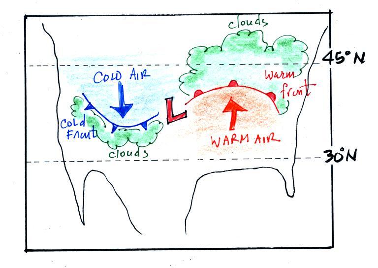
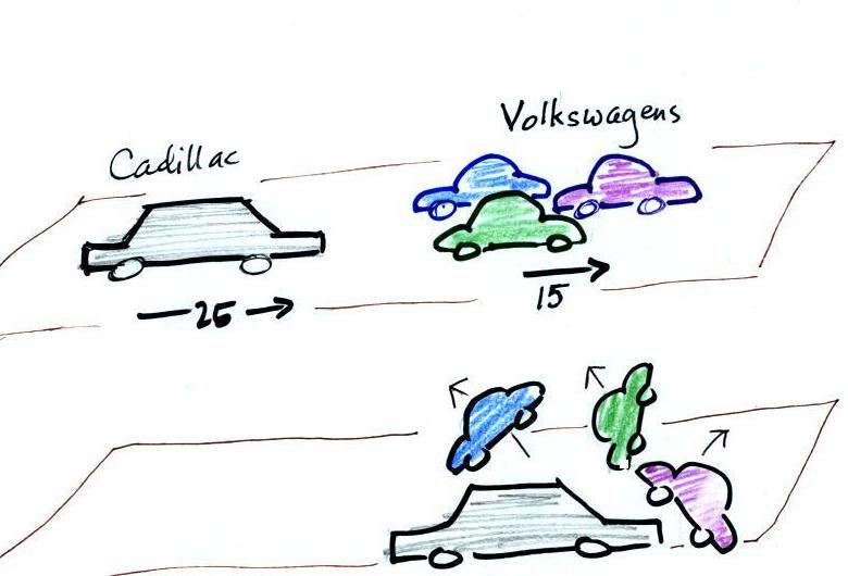
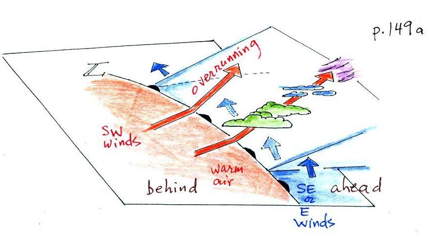
Probably the key difference
between warm and cold fronts (other than a cold-to-warm
rather than a warm-to-cold change) is the wide variety of
clouds that a warm front cause to form cover a much larger
area out ahead of the front. That's why it's
highlighted above. This happens because the warm air
rises more gradually and moves out over a wider area ahead
of the warm front as it rises.
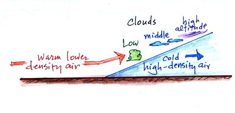
Clouds associated with a cold front are
usually found in a fairly narrow band along the
front. The warm air is pushed up abruptly. All
of the lifting is confined to a fairly narrow band.
Locating
a warm front on a weather map
We need to finish our study of surface weather
maps by trying to located a warm front.
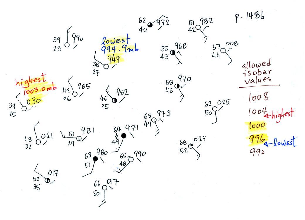
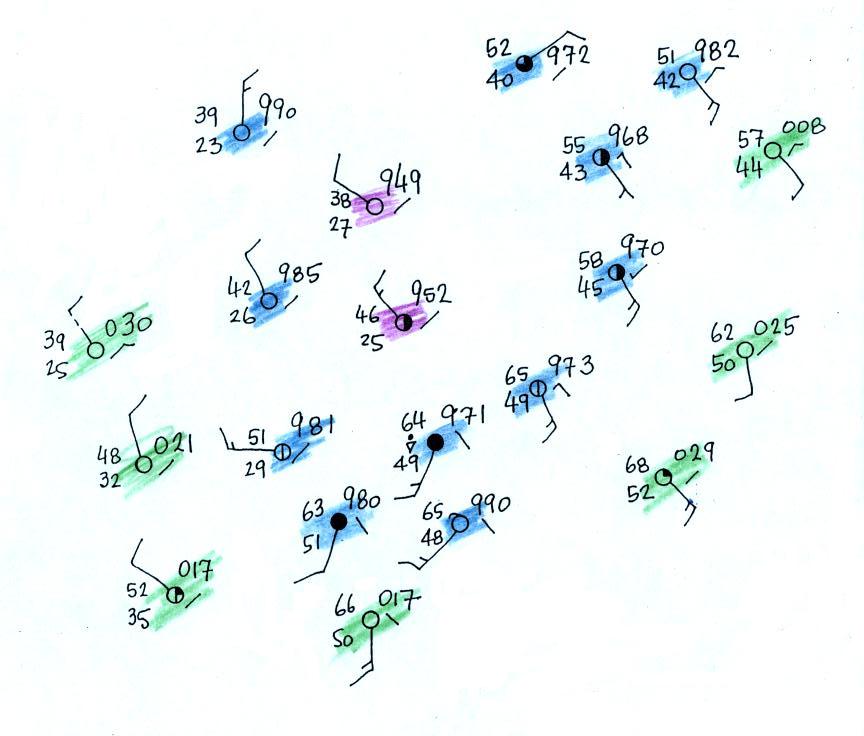
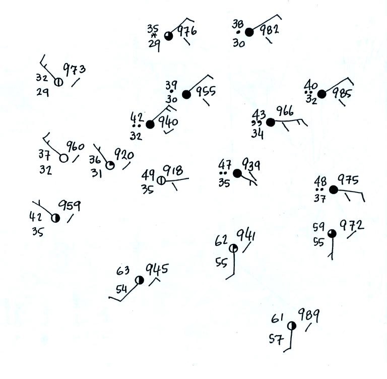
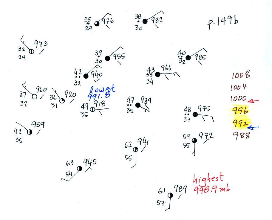
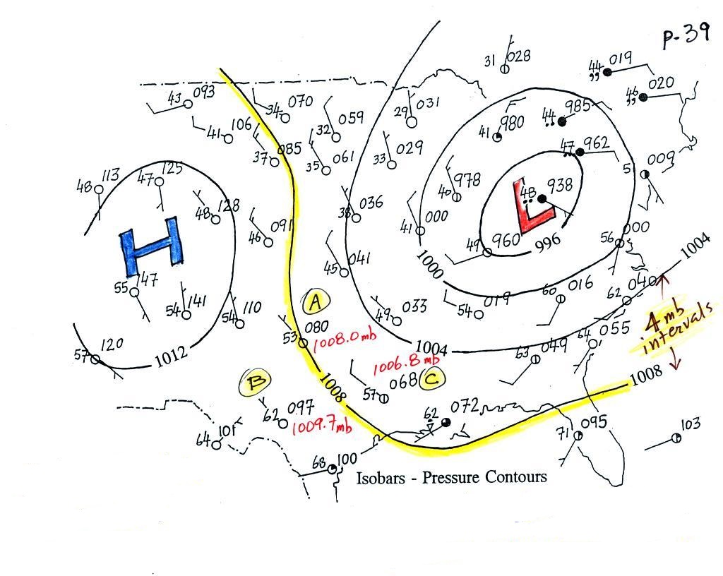
This is the map we will be working with
(see p. 149b in the ClassNotes). It's worth pausing
and noting that you really can't make any sense out of this
jumble of weather data at this point.
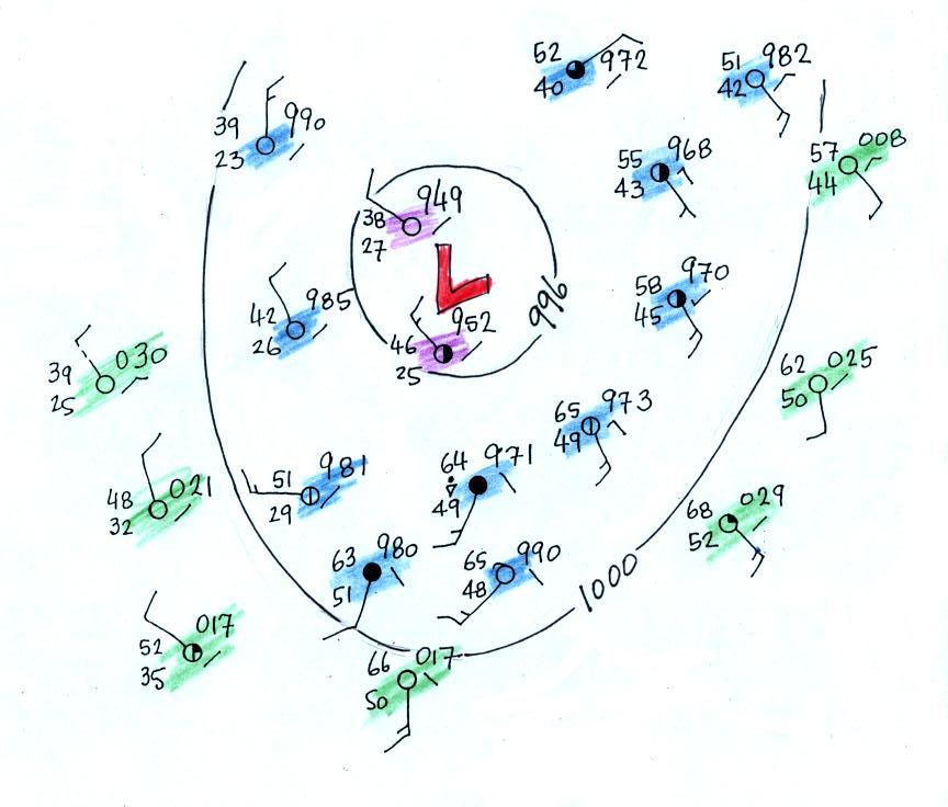
Step #1
We'll start by drawing some isobars to map out the
pressure pattern. A partial list of allowed isobars is
shown at the right side of the map above (increments of 4 mb
starting at 1000 mb).
We've located located the highest and
lowest pressure values on the map. Then we choose
allowed isobar values that fall between these limits.
In this case we'll need to draw 992 mb and 996 mb isobars.
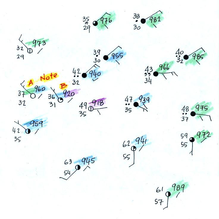
Here's the map with color coded pressures.
Pressures less than 992 mb are purple,
pressures between 992 and 996 mb are blue, and pressures greater
than 996 mb are green.
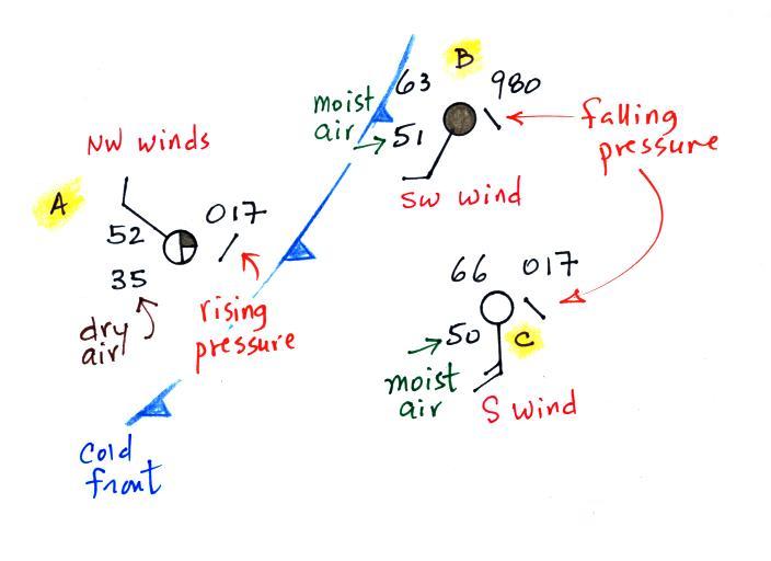
Note that station B has a pressure of exactly 992.0 mb, the
992 mb isobar will go through that station. The 996 mb
isobar will go through station A because it has a pressure
of exactly 996.0 mb.
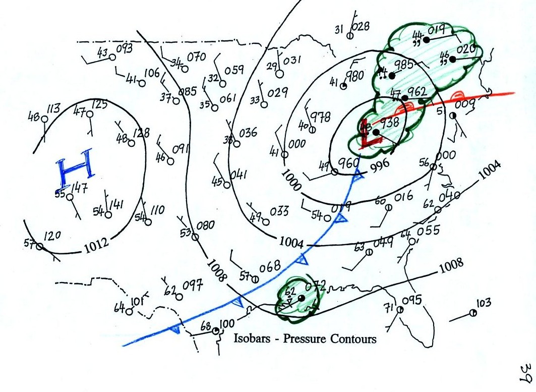
Here's the map with the isobars drawn
in. On the map below we use colors to locate the warm
and cooler air masses.
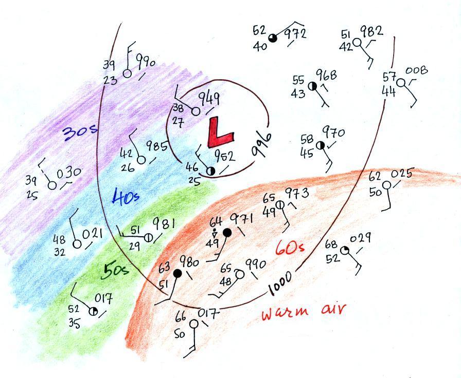
Step #2
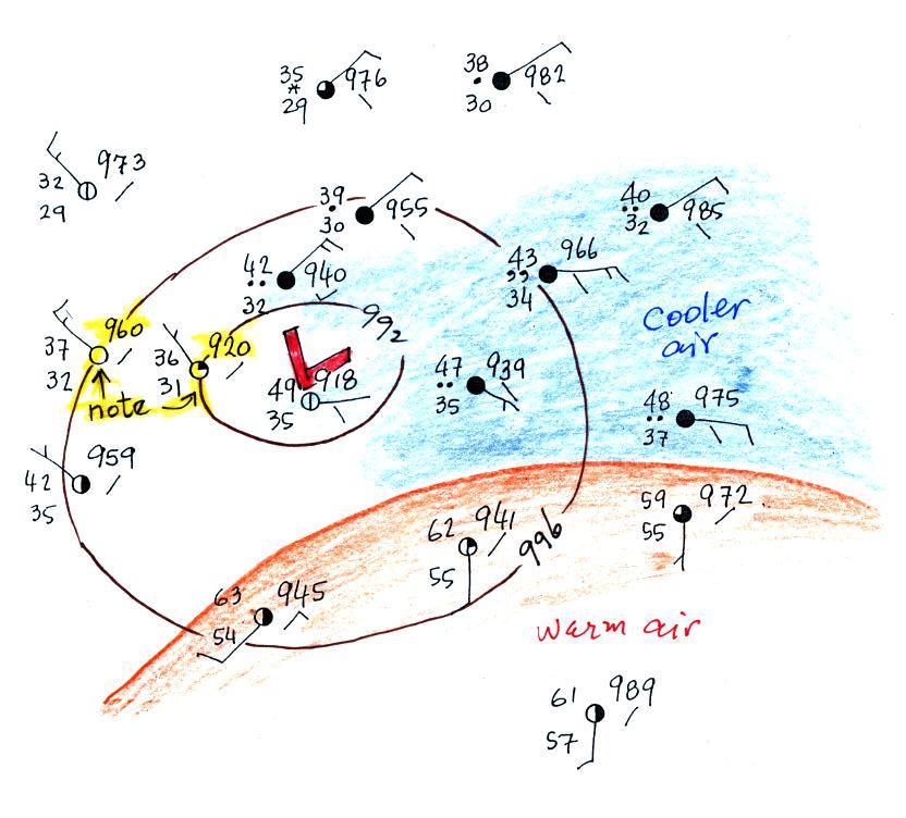
The warm air mass has been colored in orange.
Cooler air east of the low pressure center is blue.
Can you see where the warm front should go?
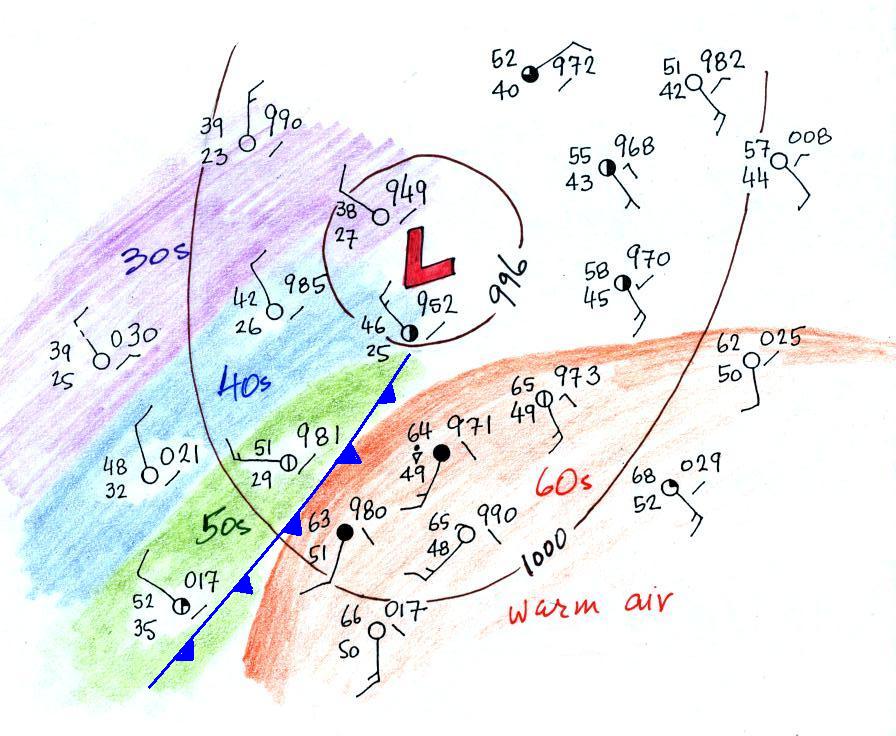
Step #3
Here's the map with a warm front drawn in
(the map was redrawn so that the edge of the warm
(orange) air mass would coincide with the warm
front).

The change in wind directions was probably
more pronounced than the temperature change. Most of the
clouds outlined in green are probably being produced by the
warm front. You can see how more extensive cloud
coverage is with a warm front.
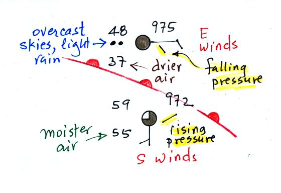
Step #4
Two of the stations near the right edge of the
picture and on opposite sides of the front are redrawn below.
The station north of the front has cooler and drier air,
winds are from the east, skies are overcast and light rain is
falling. The pressure is falling as the warm front
approaches. These are all things you'd expect to find
ahead of a warm front. Behind the front at the southern
station pressure is rising, the air is warmer and moister,
winds have shifted to the south and the skies are starting to
clear.
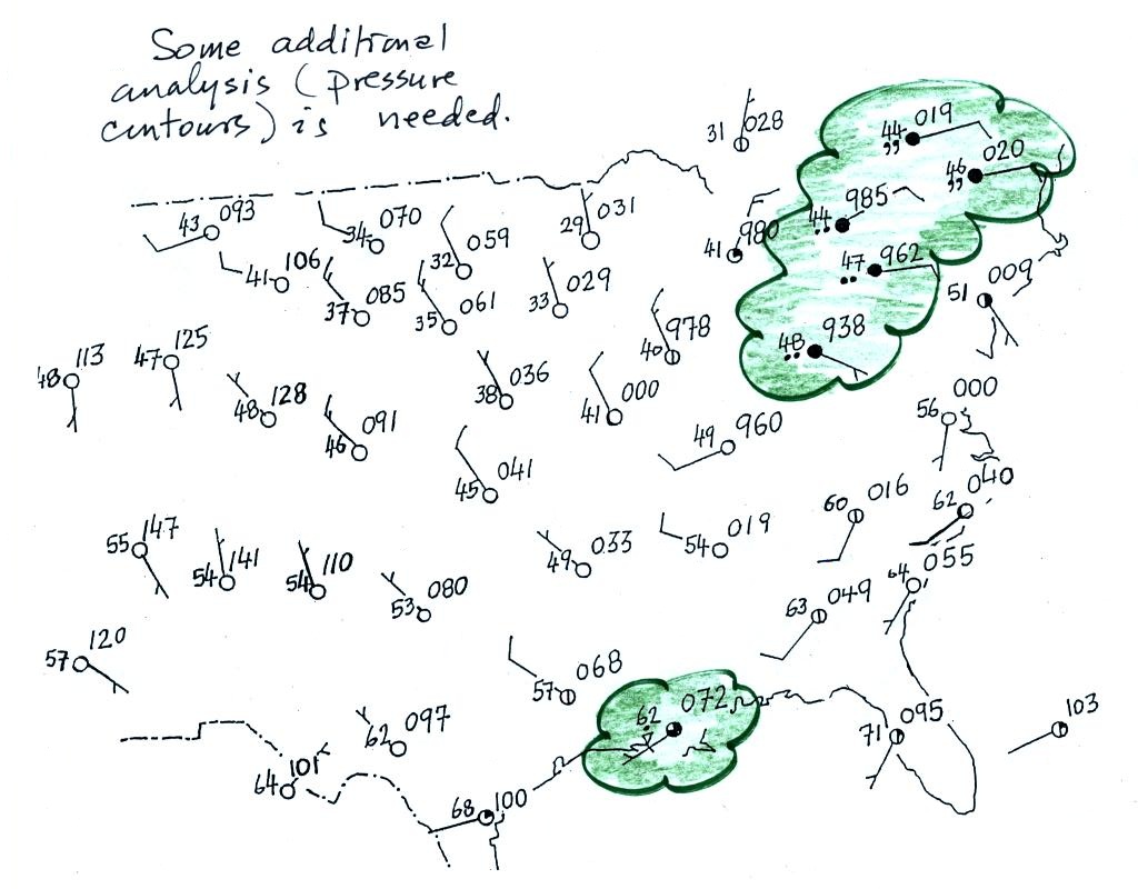
In this case there is a Step #5
Have a look at the left, western, side of the
map. There's pretty good evidence of a cold front.
There's a big temperature change (low 60s
to low 40s and 30s) and a very noticeable wind shift (SW ahead
of the cold front and NW behind).
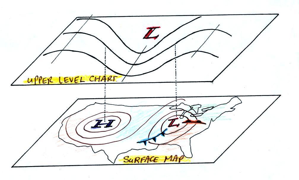
We need to go back to the figure where this
section on surface weather maps all began.
After learning how weather data are plotted
on a map using the station model notation we found that the
data, by themselves, were not enough to really be able to say
what was causing the cloudy, rainy weather in the NE and along
the Gulf Coast.
We added some isobars to reveal the pressure pattern and to
locate large centers of high and low pressure. Winds
converging into the center of low pressure cause air to rise
and might be part of the explanation for the unsettled weather
in the NE. That would explain the rain shower along the
Gulf Coast however.