Monday Feb. 4, 2013
click here to download
today's notes in a more printer friendly format
Eva Cassidy singing "Bridge Over
Troubled Water" from the Live at Blues Alley recording
(1996).
The Experiment #1 reports were collected today. It generally
takes about 1 week to get them all graded so you should expect to
get them back sometime next week.
I'm hoping to have the 1S1P Radon reports graded this week.
Here's another way of trying to understand why warm air rises
and cold air sinks - Archimedes Law. It's a
perhaps simpler way of understanding the topics. A bottle of
water can help you to visualize the law.
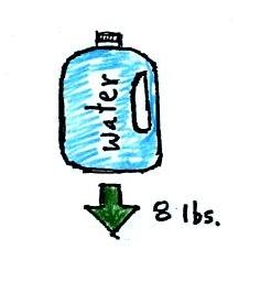
A gallon of water weighs about 8
pounds (lbs). I would want to carry a gallon of water on a
hike unless I really thought I would need it.
If you submerge the gallon jug of water in a swimming pool,
the jug becomes, for all intents and purposes, weightless.
That seems kind of amazing. Archimedes' Law (see figure
below, from p. 53a in the photocopied ClassNotes) explains why
this is true.
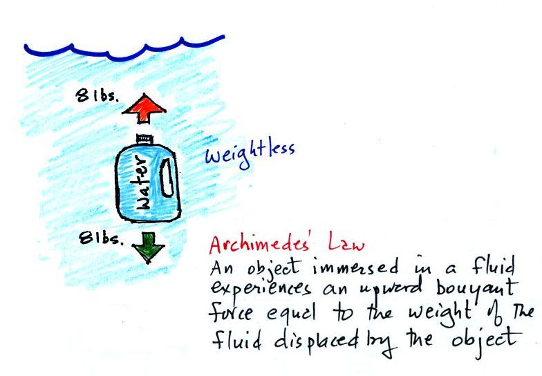
Archimedes first of all tells
you that the surrounding fluid will exert an upward pointing
buoyant force on the submerged water bottle. That's why
the submerged jug can become weightless.
Archimedes law also tells you how to figure out how strong the
buoyant force will be. In this case the 1
gallon bottle will displace 1 gallon of pool water. One
gallon of pool water weighs 8 pounds. The upward buoyant
force will be 8 pounds, the same as the downward force.
The two forces are equal and opposite.
What Archimedes law doesn't really tell you is what causes
the upward buoyant force. If you're really on top of this
material you will recognize that it is really just another name
for the pressure difference force that we covered last week
(higher pressure pushing up on the bottle and low pressure at
the top pushing down, resulting in a net upward force).
Now we imagine pouring out all the water and filling the 1
gallon jug with air. Air is about 1000 times less dense
than water; compared to water, the jug will weigh
practically nothing.
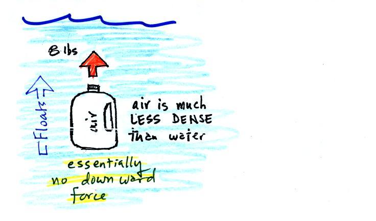
If you submerge the jug of air
in a pool it will displace 1 gallon of water and experience an 8
pound upward bouyant force again. Since there is no
downward force the jug will float.
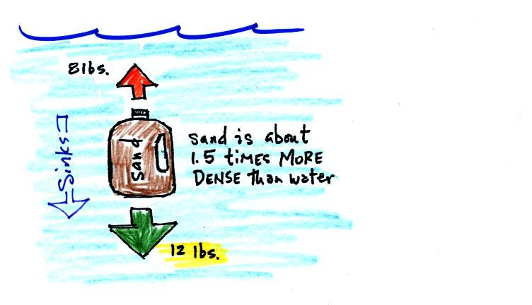
One gallon of sand (which is about 1.5 times denser than
water) jug weighs 12 pounds (I checked this out because I like
to try to give you accurate information).
The jug of sand will sink
because the downward force is greater than the upward force.
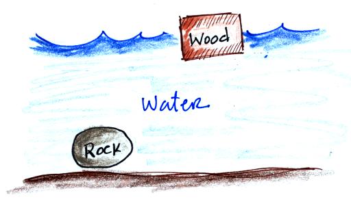
You can sum all of this up by saying anything that is
less dense than water will float in water, anything that is more
dense than water will sink in water.
Most types of wood will float. Most rocks sink (pumice
is an example and often floats).
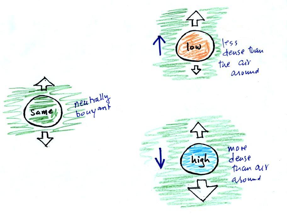
The same reasoning applies to air in the atmosphere though it's
harder to appreciate because air is invisible.
Air that is less dense (warmer)
than the air around it will rise. Air that is more dense
(colder) than the air around it will sink.
Here's a little more
information about Archimedes that I didn't mention in class.
There's a colorful demonstration that shows how small
differences in density can determine whether an object floats or
sinks.
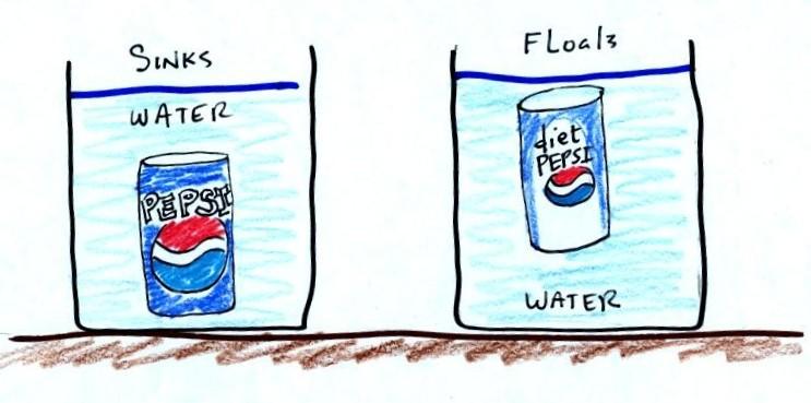
A can of regular Pepsi (actually
it was Cherry Pepsi) was placed in a beaker of water. The
can sank. A can of Diet Pepsi on the other hand floated.
Both cans are made of aluminum which has a density almost
three times higher than water; aluminum by itself would
sink. The drink itself is largely water. The regular
soda also has a lot of high-fructose
corn syrup, the diet soda doesn't. The mixture of
water and corn syrup has a density greater than plain
water. There is also a little air (or perhaps carbon
dioxide gas) in each can.
The average density of the can of regular soda (water &
corn syrup + aluminum + air) ends up being slightly greater than
the density of water. The average density of the can of
diet soda (water + aluminum + air) is slightly less than the
density of water.
I sometimes repeat the "demonstration" with a can of Pabst
Blue Ribbon beer (to keep with the red white and blue color
scheme). This also floats because the beer doesn't contain
any corn syrup (I don't think).
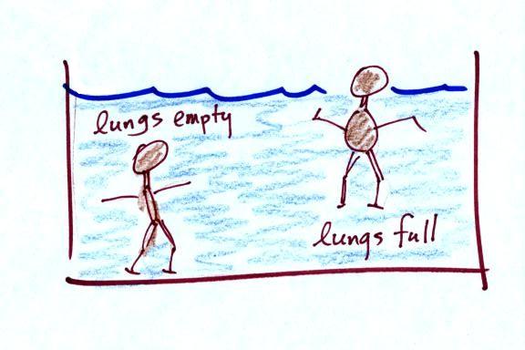
In some respects people in swimming pools are like cans of
regular and diet soda. Some people float (they're a little
less dense than water), other people sink (slightly more dense
than water). The following picture wasn't shown in class.
We had time to start a big new topic - weather maps and some of
what you can learn from them.
We began by learning how weather data are entered onto surface
weather maps.
Much of our weather is produced by relatively large
(synoptic scale) weather systems - systems that might cover
several states or a significant fraction of the continental
US. To be able to identify and characterize these weather
systems you must first collect weather data (temperature,
pressure, wind direction and speed, dew point, cloud cover, etc)
from stations across the country and plot the data on a map.
The large amount of data requires that the information be plotted
in a clear and compact way. The station model notation is
what meteorologists use.
We worked
through this material one step at a time (refer to p. 36 in
the photocopied ClassNotes). The figures below were
borrowed from a previous semester or were redrawn and may
differ somewhat from what was drawn in class.
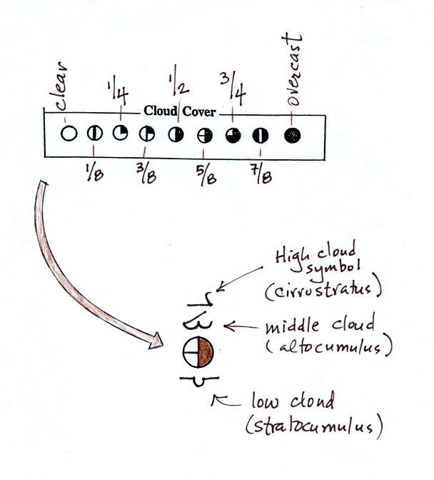
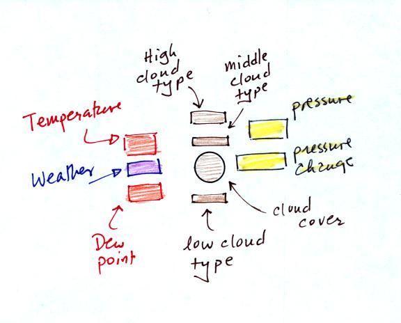
The center circle is filled in to indicate the portion of the sky
covered with clouds (estimated to the nearest 1/8th of the sky)
using the code at the top of the figure (which you can quickly
figure out). 3/8ths of the sky is covered with clouds in the
example above.
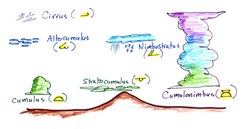
Then symbols are used to identify the actual types of high,
middle, and low altitude clouds observed in the sky. Later
in the semester we will learn the names of the 10 basic cloud
types. Six of them are sketched above and symbols for them
are shown. Purple represents high altitude in this
picture. Clouds found at high altitude are composed of ice
crystals. Low altitude clouds are green in the figure.
They're warmer than freezing are composed of just water
droplets. The middle altitude clouds in blue are
surprising. They're composed of both ice crystals and water
droplets that have been cooled below freezing but haven't frozen.
A complete list of cloud symbols can be found here and
here
is a list of symbols and pictures of the clouds they represent.
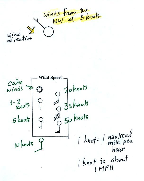
A straight line extending out from the center circle shows the
wind direction. Meteorologists always give the direction the
wind is coming from.
In this example the winds are blowing from the NW toward the SE at
a speed of 5 knots. A meteorologist would call these
northwesterly winds.
Small barbs at the end of the straight line give the wind speed
in knots. Each long barb is worth 10 knots, the short barb
is 5 knots. Knots are nautical miles per
hour. One nautical mile per hour is 1.15 statute miles per
hour. We won't worry about the distinction in this class, we
will just consider one knot to be the same as one mile per hour.
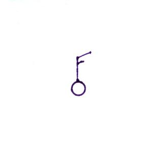
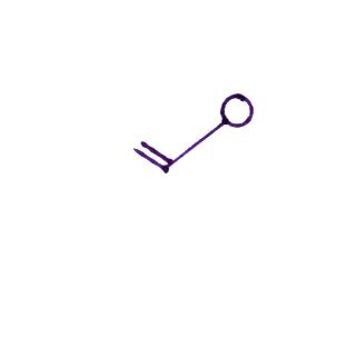
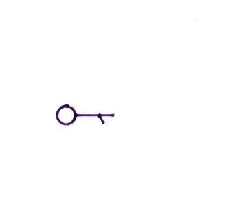
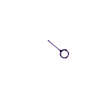
Here are four more examples. What is the wind direction
and wind speed in each case. Click here for the answers.
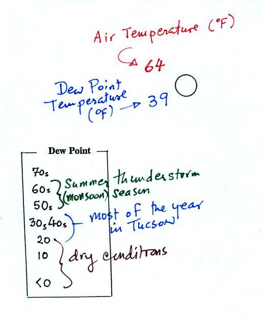
The air temperature and the dew point temperature are probably
the easiest data to decode.
The air temperature in this
example was 64o F (this is plotted above and to the
left of the center circle). The dew point temperature was
39o F and is plotted below and to the left of the
center circle. The box at lower left reminds you that dew
points range from the mid 20s to the mid 40s during much of the
year in Tucson. Dew points rise into the upper 50s and 60s
during the summer thunderstorm season (dew points are in the 70s
in many parts of the country in the summer). Dew points
are in the 20s, 10s, and may even drop below 0 during dry
periods in Tucson.
And maybe the most interesting part.
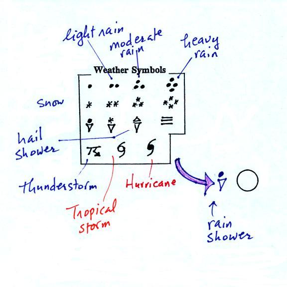
A symbol representing the weather that is currently occurring
is plotted to the left of the center circle (in between the
temperature and the dew point). Some of the common weather
symbols are shown. There are about 100 different
weather symbols that you can choose from (here's a nicer
version of the list). There's no way
I could expect you to remember all of those weather symbols.
The pressure data is usually the most confusing and most
difficult data to decode.
The sea level pressure is shown above and to the right of the
center circle. Decoding this data is a little "trickier"
because some information is missing. We'll look at this in
more detail momentarily.
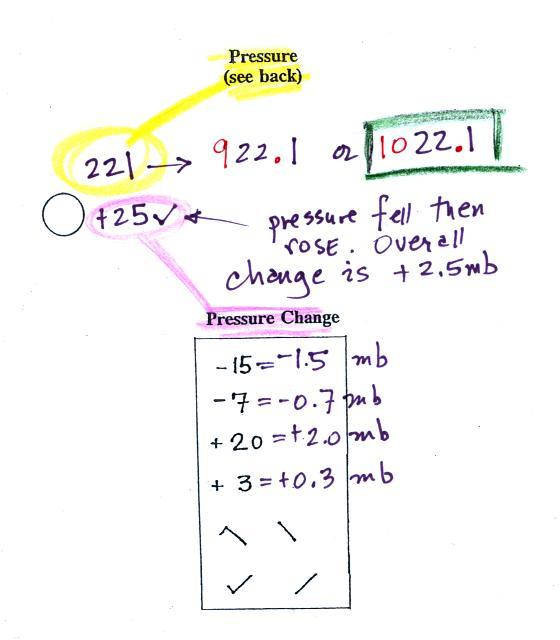
Pressure change data (how the pressure has changed during
the preceding 3 hours) is shown to the right of the center
circle. We didn't discuss this in class. You must
remember to add a decimal point. Pressure changes are
usually pretty small.
Here's what you need to know about the pressure data.
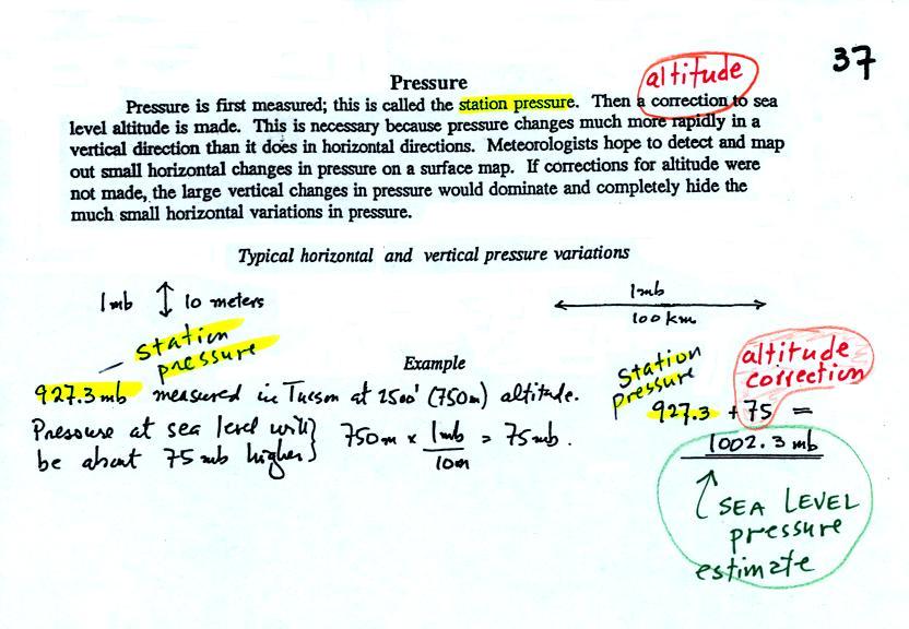
Meteorologists hope to map out small horizontal pressure changes
on surface weather maps (that produce wind and storms).
Pressure changes much more quickly when moving in a vertical
direction. The pressure measurements are all corrected to
sea level altitude to remove the effects of altitude. If
this were not done large differences in pressure at different
cities at different altitudes would completely hide the smaller
horizontal changes.
In the example above, a station pressure value of 927.3 mb was
measured in Tucson. Since Tucson is about 750 meters above
sea level, a 75 mb correction is added to the station pressure (1
mb for every 10 meters of altitude). The sea level pressure
estimate for Tucson is 927.3 + 75 = 1002.3 mb. This sea
level pressure estimate is the number that gets plotted on the
surface weather map.
Do you need to remember all the
details above and be able to calculate the exact correction
needed? No. You should remember that a
correction for altitude is needed. And the correction needs
to be added to the station pressure. I.e. the sea-level
pressure is higher than the station pressure.
The calculation above is shown in a picture below
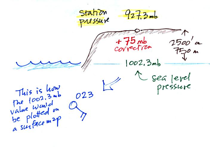
Here are some examples of
coding and decoding the pressure data.
First of all we'll take
some sea level pressure values and show what needs to be
done before the data is plotted on the surface weather map.
These should be the same numbers that we used in class.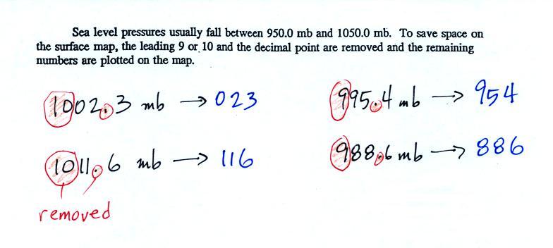
To save room, the leading 9 or
10 on the sea level pressure value and the decimal point are
removed before plotting the data on the map. For example
the 10 and the decimal pt in 1002.3 mb would be removed; 023
would be plotted on the weather map (to the upper right of the
center circle). Some additional examples are shown
above.
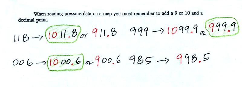
You'll mostly have to go the other way - read data off a
map and figure out what the sea level pressure is. This
is illustrated below. We only had time to do the first
of these, I gave you an assignment to figure out the remaining
three.
When reading pressure values off a map you must remember to add
a 9 or 10 and a decimal point. For example
118 could be either 911.8 or 1011.8 mb. You pick the value that falls closest
to 1000 mb average sea level pressure. (so 1011.8 mb would be the
correct value, 911.8 mb would be too low).
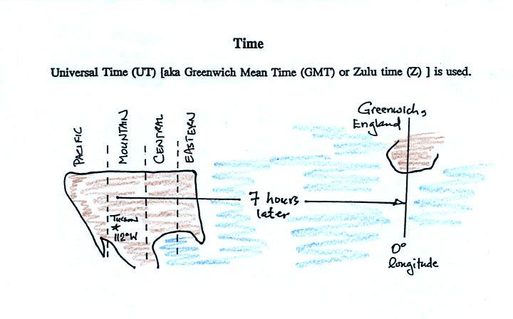
Another important piece of information on a surface map is the
time the observations were collected. We didn't have
time for this in class. Time on a surface map is
converted to a universally agreed upon time zone called Universal Time (or Greenwich Mean Time, or Zulu time). That is the
time at 0 degrees longitude, the Prime
Meridian. There is a 7 hour time zone difference between
Tucson and Universal Time (this never changes because
Tucson stays on Mountain Standard Time year round).
You must add 7 hours to the time in Tucson to obtain Universal
Time.
Here are several examples of conversions between MST and UT
to convert from MST (Mountain Standard Time) to UT (Universal
Time)
10:20 am MST:
add the 7 hour time zone correction
---> 10:20 + 7:00 = 17:20 UT (5:20 pm in
Greenwich)
2:45 pm MST :
first convert to the 24 hour
clock by adding 12 hours 2:45 pm MST + 12:00 = 14:45 MST
add the 7 hour time zone correction
---> 14:45 + 7:00 = 21:45 UT (7:45 pm in England)
7:45 pm MST:
convert to the 24 hour clock by
adding 12 hours 7:45 pm MST + 12:00 = 19:45 MST
add the 7 hour time zone correction ---> 19:45 + 7:00 = 26:45
UT
since this is greater than 24:00 (past midnight) we'll subtract
24 hours 26:45 UT - 24:00 = 02:45 am the next day
to convert from UT to MST
18Z:
subtract the 7 hour time zone correction
---> 18:00 - 7:00 = 11:00 am MST
02Z:
if we subtract the 7 hour time
zone correction we will get a negative number.
So we will first add 24:00 to 02:00 UT then subtract 7 hours
02:00 + 24:00 = 26:00
26:00 - 7:00 = 19:00 MST on the previous day
2 hours past midnight in Greenwich is 7 pm the previous day
in Tucson