Wednesday Feb. 8, 2012
Music from a group that I just learned about, The Little
Willies. The group is named after Willie Nelson; the female
vocalist was Norah Jones. You heard "It's Not You, It's Me",
"Best of All
Possible Worlds", and "Night Life".
The Quiz #1 Study Guide is now
available. Quiz #1 is one week from today (Wed., Feb. 15) and
will cover material on both the Practice Quiz
Study Guide and the new Quiz #1 Study Guide.
Experiment #2 materials should be available in class on Friday.
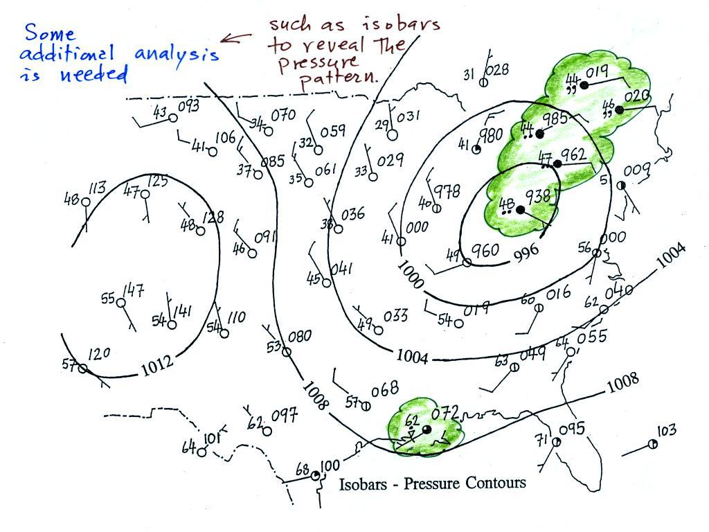
A bunch of weather data has been
plotted (using the station model notation) on a surface weather map in
the figure
below (p. 38 in the ClassNotes).
Plotting the surface weather
data
on a map is
just the
beginning.
For example you really can't tell what is causing the cloudy weather
with rain (the dot symbols are rain) and drizzle (the comma symbols) in
the NE portion of the map above or the rain
shower along the Gulf Coast. Some additional
analysis is needed. A meteorologist would usually begin by
drawing some contour lines of pressure (isobars) to map out the large
scale
pressure pattern. We will look first at contour lines of
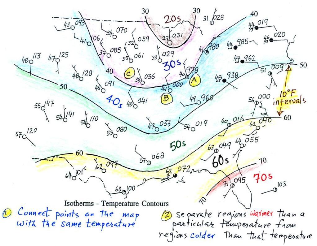
temperature, they are a little easier to understand (the plotted data
is easier to decode and temperature varies across the country in a more
predictable way).
Isotherms, temperature
contour lines, are usually drawn at 10o F
intervals.
They do two things: (1) connect points on the map that all
have the same temperature, and (2) separate regions that are warmer
than a particular temperature from regions that are colder. The
40o F isotherm above passes
through
a city which is reporting a temperature of exactly 40o (Point A).
Mostly
it
goes
between
pairs
of
cities:
one
with
a
temperature
warmer
than
40o (41o at Point B) and
the other
colder
than 40o (38o F at Point C).
Temperatures
generally decrease with
increasing
latitude: warmest temperatures are usually in the south, colder
temperatures in the north.
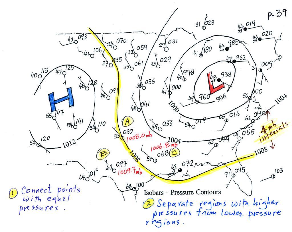
Now the same data with isobars
drawn in. Again they
separate
regions with pressure higher than a particular value from regions with
pressures lower than that value.
The isobars also enclose areas of high pressure and low pressure.
Isobars are generally drawn at 4 mb intervals (starting with a base
value of 1000 mb). Isobars
also connect points on the map
with the same pressure. The 1008 mb isobar (highlighted in
yellow) passes through a city at Point
A where the pressure is exactly
1008.0 mb. Most of the time the isobar
will pass between two
cities. The 1008 mb isobar passes between cities with
pressures
of 1009.7 mb at Point B and
1006.8 mb at Point C.
You would
expect to find 1008 mb somewhere in between
those two cites, that is where the 1008 mb isobar goes.
The pressure pattern is not as predictable as the isotherm
map. Low pressure is found on the eastern half of this map and
high pressure in the west. The pattern could just as easily have
been reversed.
This
site (from the American Meteorological Society) first shows surface
weather observations by themselves (plotted using the station model
notation) and then an analysis of the surface data like what we've just
looked at. There are links below each of the maps that will show
you current surface weather data.
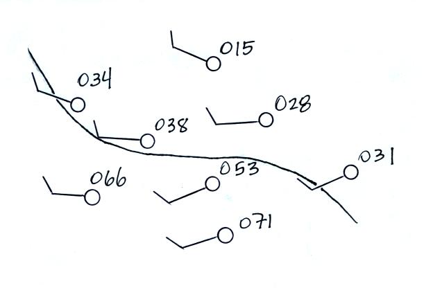
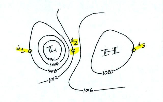
Here's a little practice (this figure wasn't
shown in class).
Is this the 1000, 1002, 1004,
1006, or 1008 mb isobar? (you'll find the answer at the end of today's
notes)
Now we'll look at what you can learn about the weather once you've
drawn in some isobars and mapped out the pressure pattern.
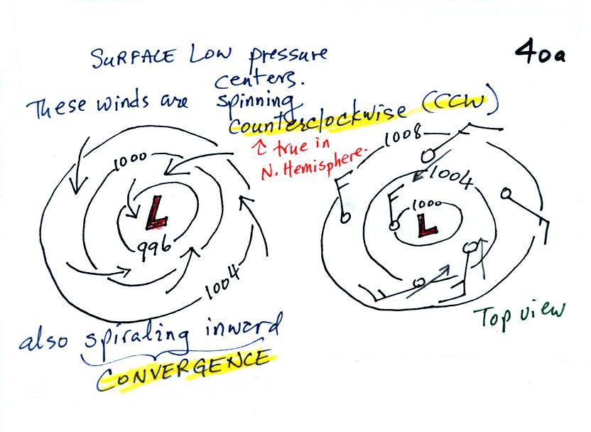
1.
We'll start with the large nearly circular centers of High and Low
pressure. Low pressure is drawn below. These figures are
more neatly drawn versions of what we did in class.
Air will start moving
toward low
pressure (like a rock sitting on a hillside that starts to roll
downhill), then something called the Coriolis force will cause
the
wind to start to spin (we'll learn more about the Coriolis force later
in the semester). In the northern hemisphere winds spin in a
counterclockwise (CCW) direction
around surface
low pressure
centers. The winds also spiral inward toward the center of the
low, this is called convergence. [winds spin clockwise around low
pressure centers in the southern hemisphere but still spiral inward,
don't worry about the southern hemisphere until later in the semester]
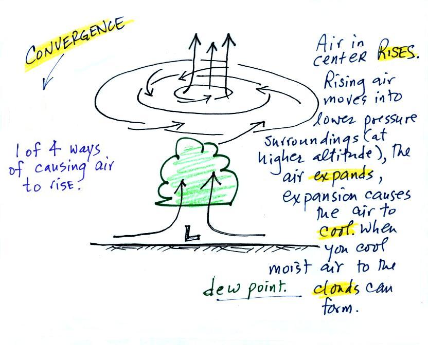
When the converging air reaches the
center of the low it starts to rise.
Rising air expands (because it is moving into lower pressure
surroundings at higher altitude), the expansion causes it to
cool. If the air is moist
and it is cooled enough (to or below the dew point temperature) clouds
will form and may then begin to rain or snow. Convergence is 1 of 4 ways of causing air
to rise (we'll learn what the rest are soon, and, actually, you
already know what one of them is).
You
often
see
cloudy
skies
and
stormy
weather
associated with surface low pressure.
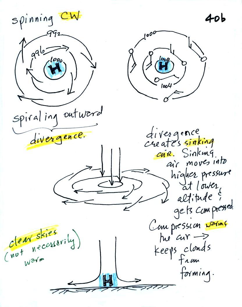
Everything is pretty much the exact opposite in the case of surface
high pressure.
Winds
spin
clockwise
(counterclockwise
in
the
southern
hemisphere)
and spiral outward.
The
outward motion is called divergence.
Air sinks in the center of
surface high pressure to
replace the diverging air. The sinking air is compressed and
warms. This keeps clouds from forming so clear
skies are normally found with high pressure.
Clear skies doesn't necessarily mean warm weather, strong surface high
pressure often forms when
the air is very cold.
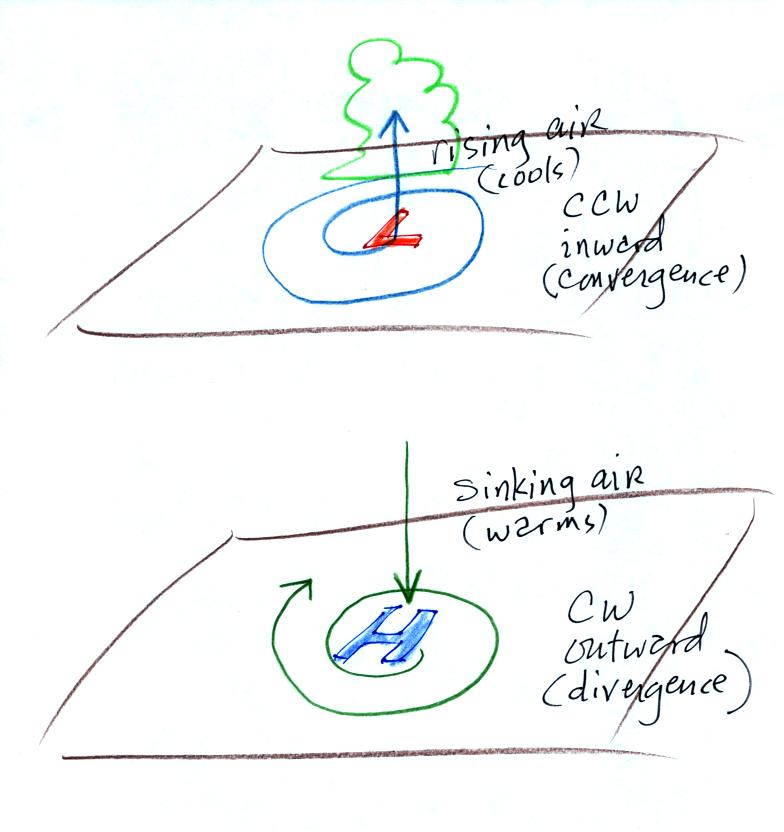
Here's a picture summarizing what we've learned so far. It's
a slightly different view of wind motions around surface highs and low
and wasn't
shown in class.
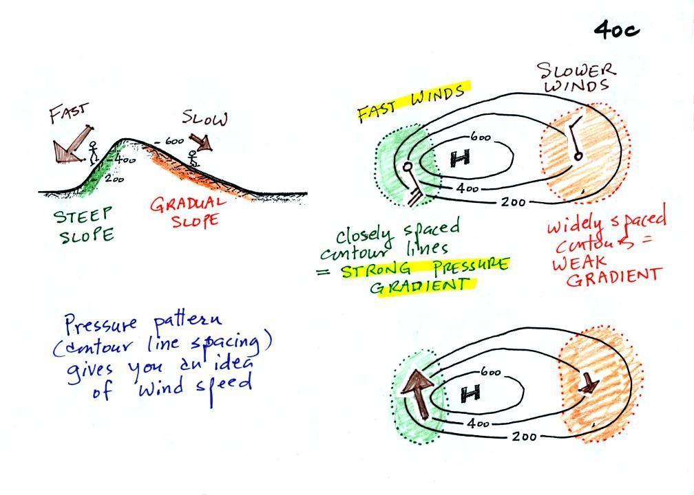
2.
The
pressure pattern will also tell you something about where you might
expect to find fast or slow winds. In this case we look for
regions where
the isobars are either closely spaced together or widely spaced.
Closely spaced contours means
pressure is changing
rapidly
with
distance. This is known as a strong pressure gradient and
produces fast winds. It is analogous to a steep slope on a
hillside. If you trip walking on a hill, you will roll rapidly
down a steep
hillside, more slowly down a gradual slope.
The winds around a high pressure
center are shown above using both the
station model notation and arrows. The winds are spinning clockwise and
spiraling outward slightly. Note the different wind speeds (25
knots and 10 knots plotted using the station model notation)
Winds spin counterclockwise and
spiral inward around
low
pressure
centers. The fastest winds are again found where the pressure
gradient is strongest.
This figure is found at the bottom
of p. 40 c in the photocopied ClassNotes. You should be able to
sketch in the direction of the wind at each of the three
points and determine where the fastest and slowest winds would be
found. (you'll find the answer at the end of today's notes).
3.
The
pressure pattern determines the wind direction and wind
speed. Once the winds start to blow they can affect and change
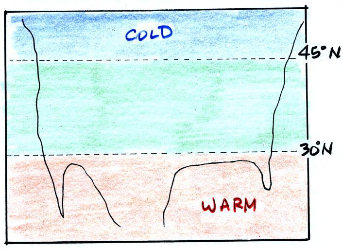
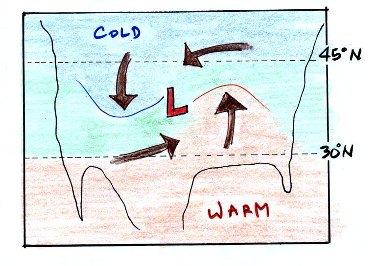
the temperature pattern. The figure below shows the
temperature pattern you would
expect to see if the wind wasn't blowing at all or if the wind was
just blowing straight from west to east. The bands of different
temperature are aligned parallel to the lines of latitude.
Temperature changes from south to north but not from west to
east.
This
picture
gets a
little
more interesting if you put centers of high or low pressure in the
middle.
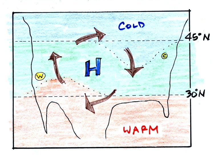
In the case of high pressure, the
clockwise spinning winds
move warm air to
the north on
the western
side of the High. The front edge of this northward moving air is
shown with a dotted line (at Pt. W) in the picture above. Cold
air moves toward the south on the eastern
side of the High (another dotted line at Pt. C). The diverging
winds also move the warm and cold
air away from the center of the High. Now you would experience a
change in temperature if you traveled from west to east across the
center of the picture.
The transition from warm to cold along the boundaries (Pts. W and
C) is spread out over a fairly long distance and is gradual. This
is because the winds around high pressure blow outward away from the
center of high pressure. There is also some mixing of the
different temperature air along the boundaries.
This is as far
as we got in class today. I've added a little bit of more
material below to finish this topic.
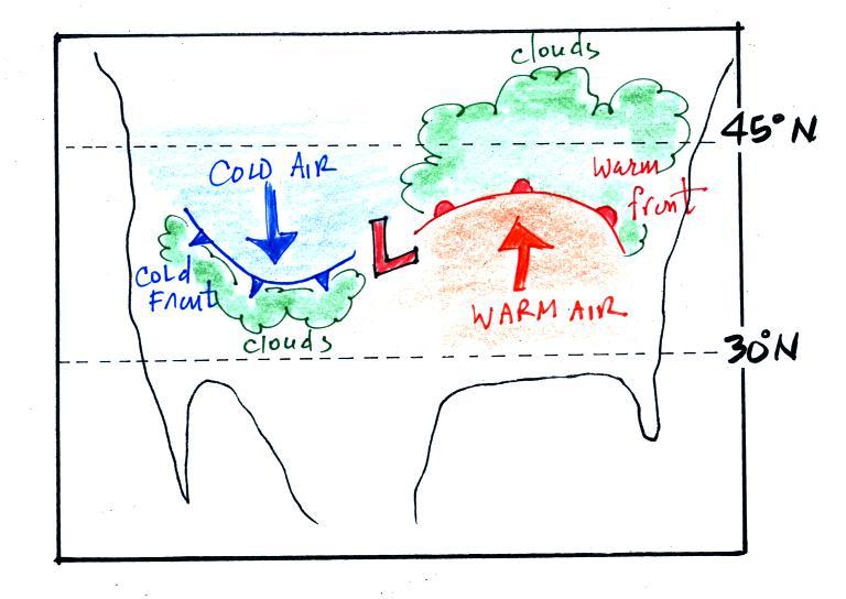
The converging winds in the case of low pressure will move the air
masses of different temperature in toward the center of low
pressure. The transition zone between different temperature air
gets squeezed and compressed. The change from warm to cold occurs
in a shorter distance and is more abrupt. Solid lines have been
used to delineate the boundaries above. These sharper and more abrupt
boundaries between are called fronts.
A cold front is drawn at the front edge of the southward moving
mass of cold air on the west side of the Low. Cold fronts are
generally drawn in blue on a surface weather map. The small
triangular symbols on the side of the front identify it as a
cold front and show what direction it is moving. The fronts are
like spokes on a wheel. The "spokes" will spin counterclockwise
around the low pressure center (the axle).
A warm front (drawn in red with half circle symbols) is shown on
the
right hand side of the map at front edge of the northward moving mass
of. A warm front is usually drawn in red and has half circles on
one side of the front to identify it and show its direction of motion.
Both types of fronts cause rising air motions. Fronts are
another way of causing air to rise. Rising air expands and
cools. If the air is moist and cools enough, clouds can form.
The storm system
shown in the picture above (the Low together with the fronts) is
referred to
a middle latitude storm or an extratropical cyclone
(extra tropical means outside the tropics, cyclone means winds spinning
around low pressure). These storms form at middle latitudes
because that is where air masses coming from the polar regions to the
north and the more tropical regions to the south can collide.
Large
storms that form in the tropics (where this mostly just warm air) are
called tropical cyclones or, in our part of the
world, hurricanes.
I apologize for the poor time management at the end of
class. We were left with about 6 minutes of classtime to watch
almost 8 minutes of video tape. It was the last of the "Piccard
videos".
Here you saw the launch of the Cable & Wireless Balloon
(Feb. 17, 1999 from Almeria, Spain) with Andy Elsen and Colin Prescot
aboard.
The Breitling Orbiter 3 balloon was launched almost a week later (Mar.
1, 1999 from Chateau d'Oex, Switzerland) with Brian Jones and Bertrand
Piccard in command.
The Cable and Wireless balloon had almost a 10-day lead on the Piccard
balloon as it headed out over the Pacific Ocean. But the Cable
& Wireless balloon ran into some severe weather. The balloon
"iced up" which means it became coated with ice. The ice made the
balloon so heavy that it crash landed in the Sea of Japan (both pilots
were quickly picked up by search and rescue boats).
The Breitling Orbiter stayed in the air and was able, on Mar. 20, 1999,
to complete the first non-stop trip around the globe in a balloon.
Here are the answers to the questions found earlier in the notes.
Pressures lower than 1002 mb are colored purple. Pressures
between 1002 and 1004 mb are blue. Pressures between 1004 and
1006 mb are green and pressures greater than 1006 mb are red. The
isobar appearing in the question is highlighted yellow and is the 1004
mb isobar. The 1002 mb and 1006 mb isobars have also been drawn
in.
And here's the answer to the question about wind directions and
wind speeds.
The winds are blowing from the NNW
at Points 1 and 3. The winds are blowing from the SSE at Point
2. The fastest winds (30 knots) are found at Point 2 because that
is where the isobars are closest together (strongest pressure
gradient). The slowest winds (10 knots) are at Point 3.
Notice also how the wind direction can affect the temperature
pattern. The winds at Point 2 are coming from the south and are
probably warmer than the winds coming from the north at Points 1 &
3.