In addition to surface weather maps, maps
showing conditions at various altitudes above the ground are also
routinely made. We'll spend some
time
learning about these upper level charts. Upper level conditions
can affect the development and movement of
surface
features (and vice versa).
We'll start with some basic features then have a more careful and
detailed look at
upper level charts.
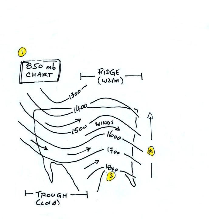
First the overall appearance is somewhat different from a surface
weather
map. The pattern on a surface map can be complex and you
generally find circular (more or less)
centers
of high and low pressure. You can also find closed high and low
pressure
centers at upper levels, but mostly you find a relatively simple wavy
pattern like
sketched
below.
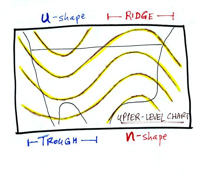
The u-shaped
portion of the pattern is called a trough. The n-shaped portion
is called
a ridge.
Troughs
are
produced
by
large
volumes
of
cool
or
cold air
(the cold air is found between the ground and the upper level that the
map
depicts). The western half of the country in the map above would
probably
be experiencing colder than average temperatures. Large volumes
of warm
or hot air produce ridges.
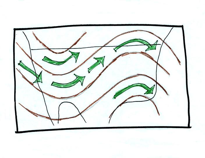
The
winds on upper level charts blow parallel to the contour lines (on a
surface map the winds cross the isobars slightly, spiralling into
centers of
low pressure and outward away from centers of high pressure). The
upper
level winds generally blow from west to east.
Now on to a little more in depth look at upper-level charts.
By the end of this section you should better
understand what the title "850
mb Chart" on the upper level map above refers to.
You should also
understand what the numbers on the contour lines represent and what
their units are. On a surface map contours of pressure, isobars,
are normally drawn. That is usually not the case on upper level
charts. You'll also have a better idea of where the names trough
and
ridge come from and why they are associated with cold and warm air
masses, respectively.
Note that the values on the contours
decrease as
you move from the equator toward higher latitude. You
should be able to explain why that happens.
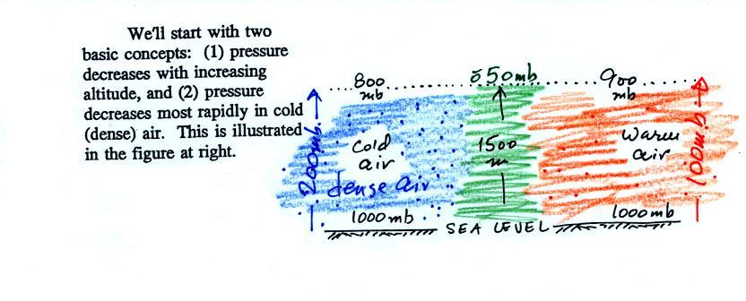
You really only need to remember two things from earlier in the
course: (1) pressure decreases with increasing
altitude, and
(2) pressure decreases more rapidly in cold high-density air than
it
does in warm low density air.
Pressure drops
from 1000 mb to 800 mb, a 200 mb change, when moving upward 1500 meters
in the cold
air in the picture above. It decreases from 1000 mb to 900 mb,
only 100 mb, in
the same distance in
the warm low density air.
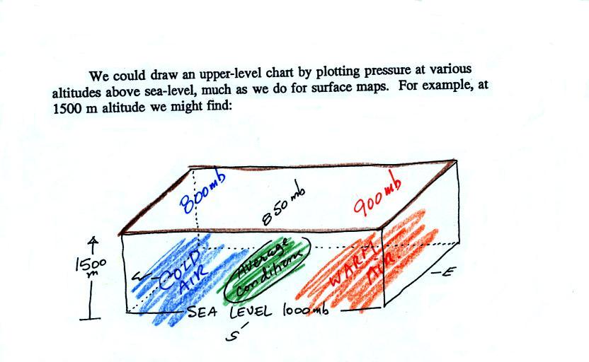
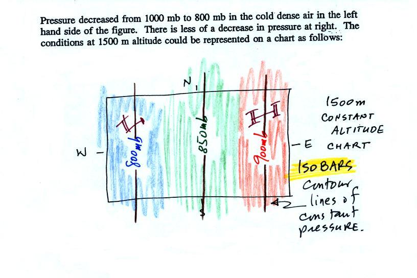
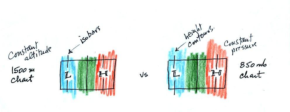
Isobars
on constant altitude upper level charts
One way of depicting upper level conditions would be
to measure
pressure values at some fixed altitude above the ground.
This
approach is shown above. Pressures range from 800 mb to 900 mb at
1500 meters altitude. The
pressure pattern could then be plotted on a constant altitude chart
using isobars (figure below). Note the lowest pressures are found
in the
cold air, higher pressures would be found in the warm air.
That would
seem to be a logical way of mapping upper level atmospheric
conditions. Unfortunately that isn't how things are done.
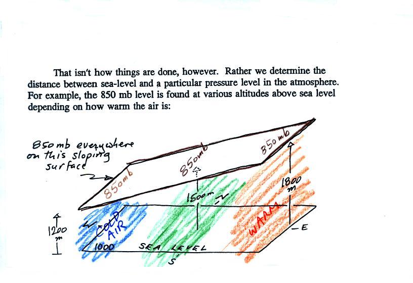
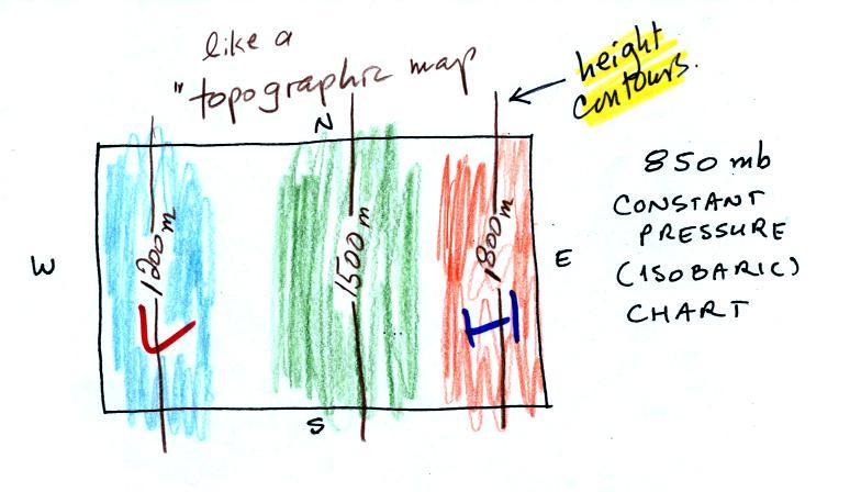
Height
contours
on constant pressure (isobaric) upper level charts
Just to make life difficult meterologists do
things differently. Rather than plotting conditions
at a constant altitude
above the
ground, meterologists measure and plot conditions at a particular
reference pressure level above the ground.
In the picture above you start at the ground (where the pressure is
1000 mb) and travel upward until you reach 850 mb pressure. You
make a note of the altitude at which that occurs. In the cold
dense air at the left pressure decreases rapidly so you wouldn't need
to go very
high, only 1200 meters. In the warm air at right pressure
decreases more
slowly, you would have to go quite a bit higher, to 1800 m.
Every point on the
sloping surface above has the same pressure, 850 mb. The altitude
above the ground is what is changing. You could draw a
topographic map of the sloping constant pressure surface by
drawing contour lines of altitude or height.
The L and H on this map represent low and high altitude, respectively.
The two kinds of charts (constant altitude or constant pressure) are
redrawn below.
The numbers on the
contour lines have been left off in order to clearly see that both
types of maps have
the same overall pattern (they should because they're both depicting
the same
upper level atmospheric conditions).
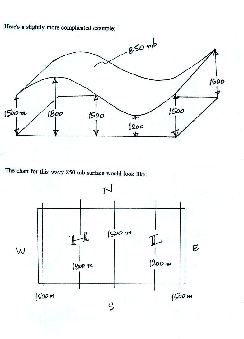
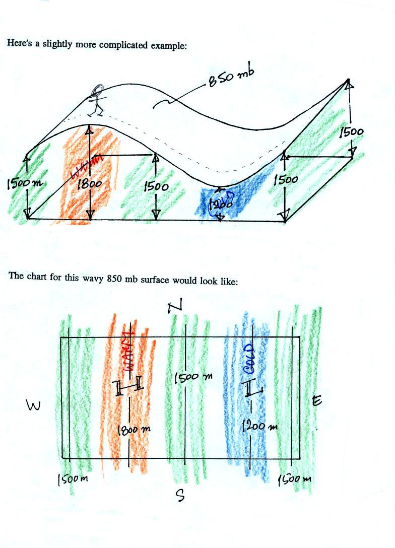
In the example above temperature changed smoothly from cold to warm as
you move from left to right (west to east).
See if you can figure out what temperature pattern is producing the
wavy 850 mb constant pressure surface below.
This shouldn't be too hard if you remember that the 850 mb level will
be
found at relatively high altitude in the warm air where pressure
decreases slowly with increasing altitude. The 850 mb level will
be found closer to the ground in cold air where pressure decreases
rapidly with increasing altitude. The temperature pattern is
shown below.
Temperatures
change from average, to warm, back to average, to cold, and then to
average again at the eastern edge of the picture.
If you imagine hiking along the 850 mb surface you can begin to
understand where the term ridge comes from. In a ridge the
reference pressure is found at higher than average altitude above the
ground. A trough is in effect a valley where the reference
pressure is found at lower altitude, closer to the ground.
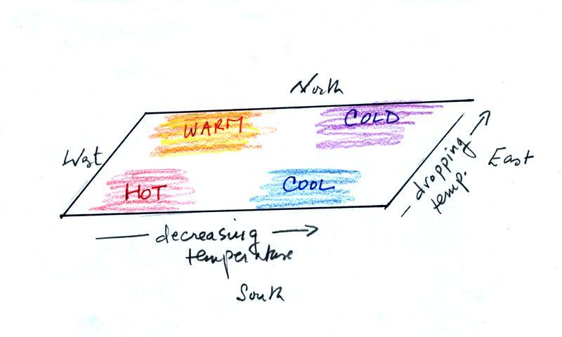
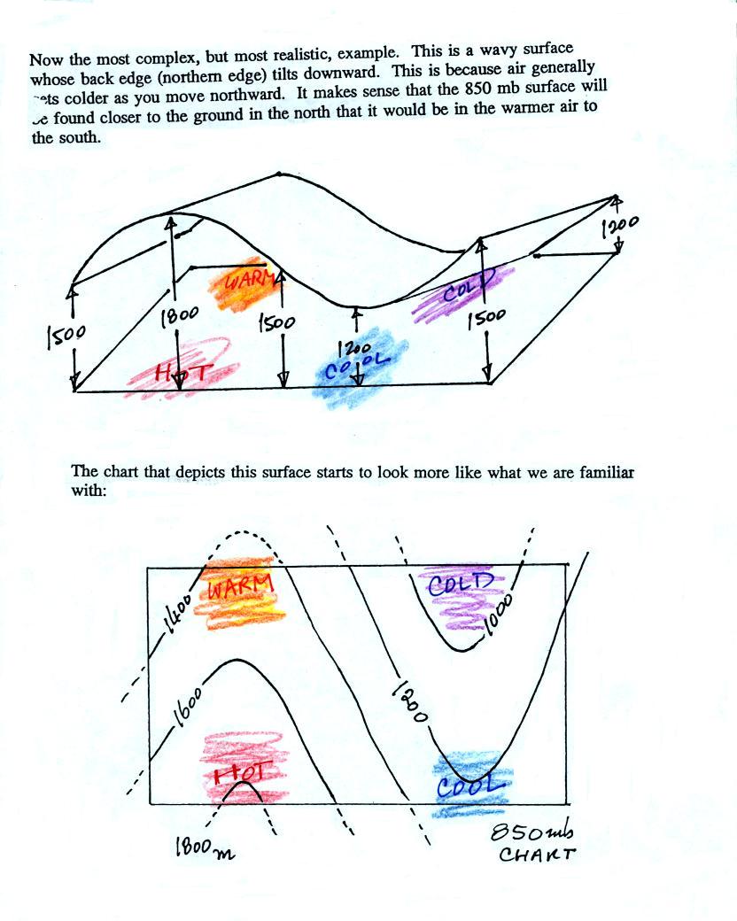
In the next figure we will add south to north
temperature
changes in addition to the west to east temperature gradient.
Here's what the temperature pattern will look like.
Temperature drops as you move from west to east (as it did in the
previous pictures) and now it drops as you move from south to
north. What will the wavy 850 mb constant pressure surface look
like now?
It's the wavy surface that we had in the previous example (where
there was just a west to east temperature change) with the northern
edge tilted downward because there is colder air in the
north. That's not much of a change. But look at how
the map has changed. We now see an "n" shaped ridge and a "u"
shaped trough.
The highest point on the 850 mb surface (1800 meters or so) is found
above the hot air near the SW corner of the picture. The lowest
point (a little less than 1000 meters) is found in the coldest air near
the NE corner of the picture.
Now let's go back to the figure that we started this section with.
1. The title tells you this is a map showing the altitude of the
850 mb constant
pressure level in the atmosphere.
2. Height contours are drawn on the chart. They show the
altitude, in meters, of the 850 mb pressure level at different points
on the map.
3. The numbers get smaller as you head north because the air up
north is colder. The 850 mb level is closer to the ground in the
north where the air is colder, denser, and where pressure decreases
more rapidly with increasing altitude.
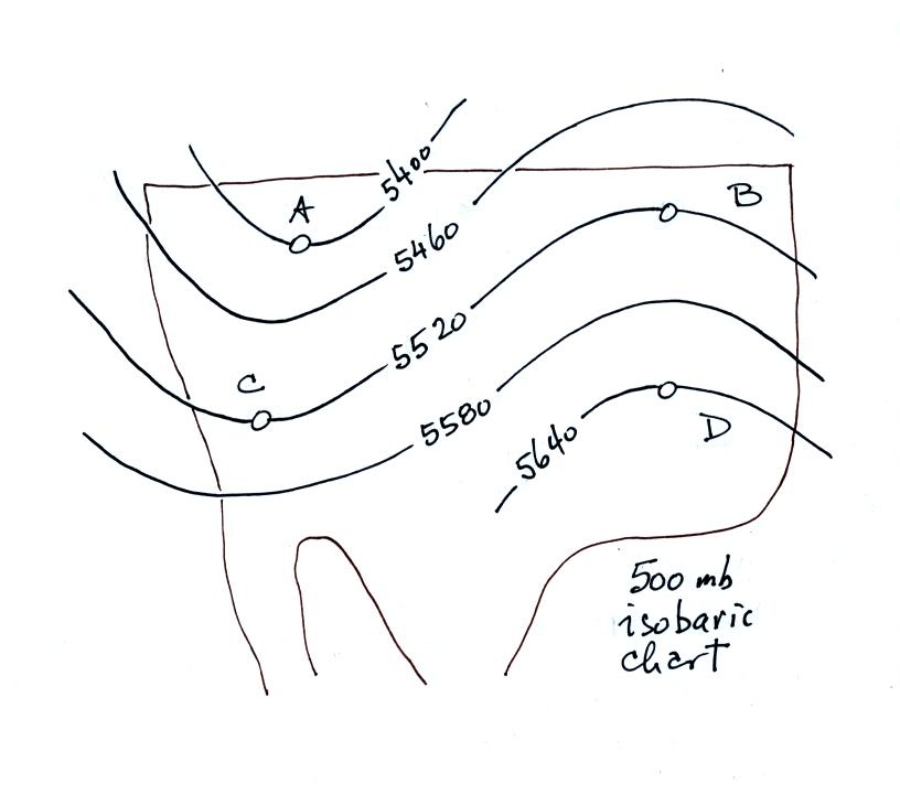
Here's
a figure with some questions to test your understanding of this
material.
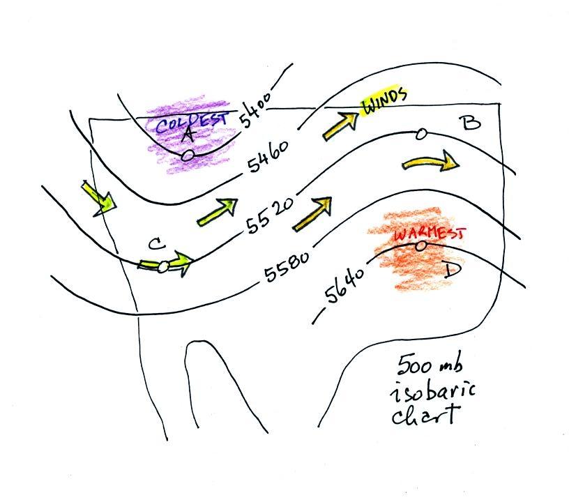
This is a 500 mb constant
pressure chart not an 850 mb chart like in the previous examples.
The 500 mb pressure is found higher in the atmosphere than the 850 mb
level.
Is the pressure at Point C greater than, less
than, or equal to the pressure at Point D (you can assume that Points C
and D are at the same latitude)? How do the pressures at Points A
and C compare?
Which of the four points (A, B, C, or D) is found at the lowest
altitude above the
ground, or are all four points found at the same altitude?
The coldest air would probably be found below which of the four
points? Where would the warmest air be found?
What direction would the winds be blowing at Point C?
You'll find the answers to these questions at the end of this lecture.
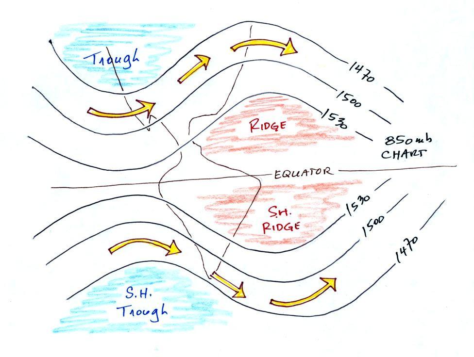
Here is a quick comparison of upper level charts in
the northern and southern hemispheres.
The contour values get smaller as you move toward colder
air. The
cold air is in the north in the northern hemisphere and in the south in
the southern hemisphere (the pattern is effectively flipped in the
southern hemisphere compared to the northern hemisphere). The
winds blow parallel to the contour
lines and from west to east in both hemispheres.
We'll finish this lecture by looking,
in a little more detail, at how upper level winds can
affect the
development or intensification of a surface storm. This material might be a little difficult and
confusing at this point. Don't worry if that is the case.
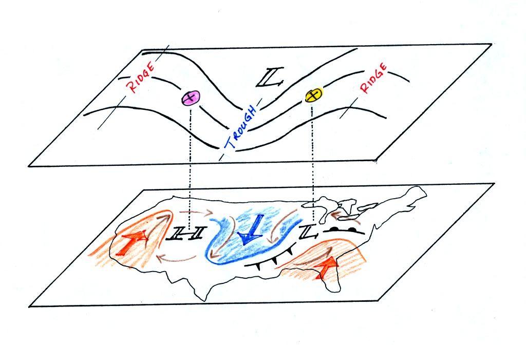
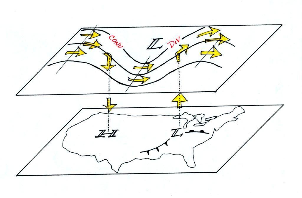
Surface and upper level maps
are superimposed in the figure above. On
the surface map you see centers of HIGH and LOW pressure. The
surface low
pressure center, together with the cold and warm fronts, is a middle
latitude
storm.
Note how the counterclockwise winds spinning around the LOW move warm
air
northward (behind the warm front on the eastern side of the LOW) and
cold air
southward (behind the cold front on the western side of the LOW).
Clockwise winds spinning around the HIGH also move warm and cold
air. The
surface winds are shown with thin brown arrows on the surface map.
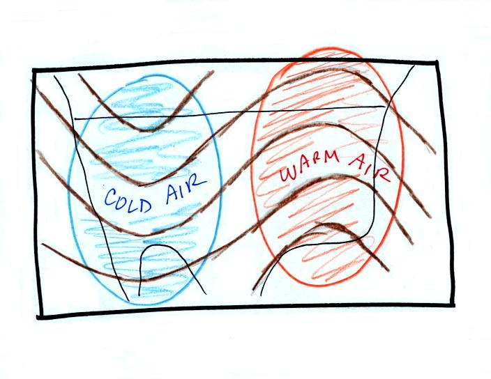
Note the ridge and trough features on the upper level chart. We
learned
that warm air is found below an upper level ridge. Now you can
begin to
see where this warm air comes from. Warm air is found west of the
HIGH
and to the east of the LOW. This is where the two ridges on
the
upper level chart are also found. You expect to find cold air
below an
upper level trough. This cold air is being moved into the middle
of the
US by the northerly winds that are found between the HIGH and the
LOW.
Note the yellow X marked on the upper level chart directly above the
surface
LOW. This is a good location for a surface LOW to form, develop,
and
strengthen (strengthening means the pressure in the surface low will
get even
lower; this is also called "deepening"). The
reason for this is that the yellow X
is a
location where there is often upper level divergence. Similary
the pink X
is where you often find upper level convergence. This could cause
the
pressure in the center of the surface high pressure to get even higher.
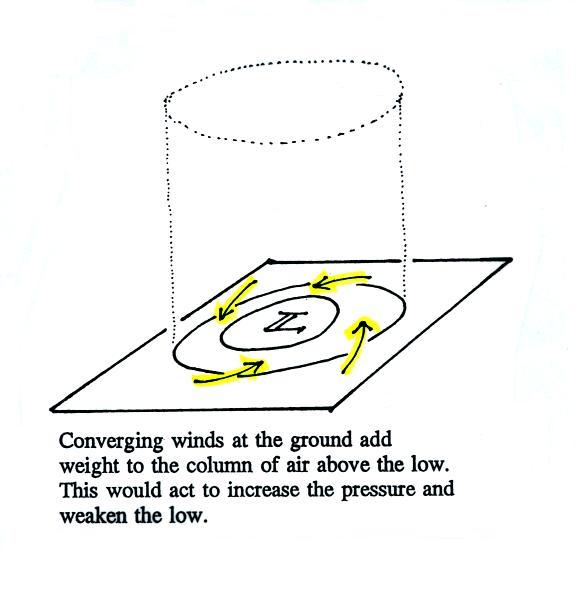
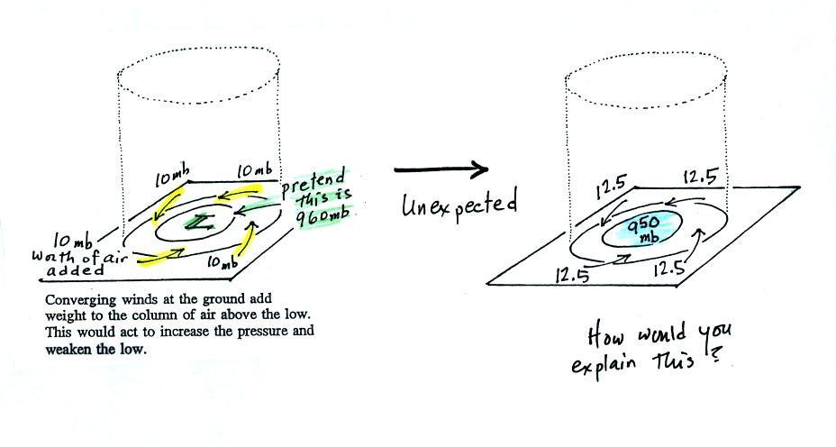
This
figure shows a cylinder of
air
positioned above a surface low pressure center. The pressure at
the
bottom of the cylinder is determined by the weight of the air
overhead.
The surface winds are spinning counterclockwise and spiraling in toward
the center
of the surface low. These converging surface winds add air to the
cylinder. Adding air to the cylinder means the cylinder will
weigh more
and you would expect the surface pressure at the bottom of the cylinder
to
increase with time (the low would be "filling" ).
We'll just make up some numbers, this might make things clearer.
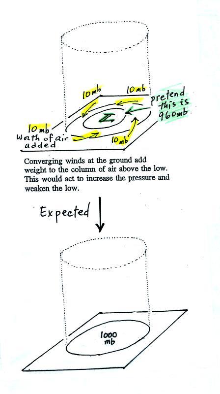
We will assume the
surface
low has 960 mb pressure. Imagine that each of the surface
wind
arrows brings in enough air to increase the pressure at the center of
the LOW
by 10 mb. You would expect the pressure at the center of the LOW
to
increase from 960 mb to 1000 mb.
This is just like a bank account. You have $960 in the bank and
you make
four $10 dollar deposits. You would expect your bank account
balance to
increase from $960 to $1000.
But what if the surface pressure decreased from 960 mb to 950 mb as
shown in
the following figure? Or in terms of the bank account, wouldn't
you be
surprised if, after making four $10 dollar deposits, the balance went
from
$960 to $950.
The
next figure shows us what could be happening.
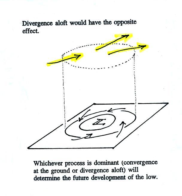
There
may be some upper level divergence (more arrows leaving the cylinder at
some
point above the ground than going in). Upper level divergence
removes
air from the cylinder and would decrease the weight of the cylinder
(and that
would lower the surface pressure)
We need to determine which of the two (converging winds at the surface
or
divergence at upper levels) is dominant. That will determine what
happens
to the surface pressure.
Again some actual numbers might help
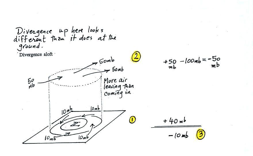
The
40 millibars worth of surface convergence is shown at Point 1. Up
at
Point 2 there are 50 mb of air entering the cylinder but 100 mb
leaving.
That is a net loss of 50 mb. At Point 3 we see the overall
result, a net
loss of 10 mb. The surface pressure should decrease from 960 mb
to 950
mb. That change is reflected in the next picture.
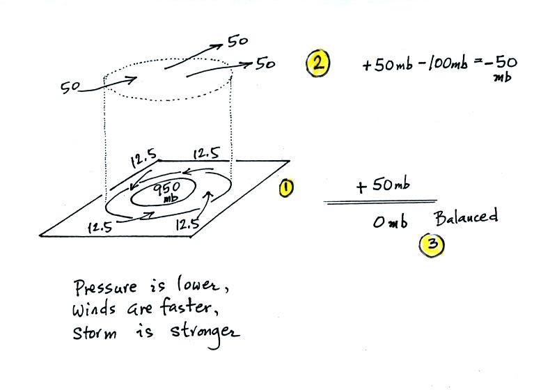
The
surface
pressure
is
950
mb.
This
means
there is
more of a pressure difference between the low pressure in the center of
the
storm and the pressure surrounding the storm. The surface storm
has
intensified and the surface winds will blow faster and carry more air
into the
cylinder (the surface wind arrows each now carry 12.5 mb of air instead
of 10
mb). The converging surface winds add 50 mb of air to the
cylinder (Point
1), the upper level divergence removes 50 mb of air from the cylinder
(Point
2). Convergence and divergence are in balance (Point 3).
The storm
won't intensify any further.
Now
that you have some idea of what upper level divergence looks like (more
air
leaving than is going in) you are in a position to understand another
one of
the relationships between the surface and upper level winds.
One of the things we have learned about surface LOW pressure is that
the
converging surface winds create rising air motions. The figure
above
gives you an idea of what can happen to this rising air (it has to go
somewhere). Note the upper level divergence in the figure: two
arrows of
air coming into the point "DIV" and three arrows of air leaving (more
air going out than coming in is what makes this divergence). The
rising
air can, in effect, supply the extra arrow's worth of air.
Three arrows of air come into the point marked "CONV" on the upper
level chart and two leave (more air coming in than going out).
What
happens to the extra arrow? It sinks, it is the source of the
sinking air
found above surface high pressure.
Here are the answers to the "test your
understanding" question found earlier in this lecture.
1. This is a constant pressure
chart. The pressures at Points A, B, C, and D are all the same -
500 mb.
2. Point A is found at the lowest altitude - 5400 meters.
Point D
is found at the highest altitude - 5640 meters.
3. The coldest air is found below Point A, the warmest air is
below
Point D.
4. The winds blow parallel to the contours from west to east as
shown
on the map above. The winds at Point C are blowing from the west.