Tuesday Feb. 12, 2008
The Practice Quiz was returned today. Answers to the Practice Quiz questions have
been posted online. If you didn't take the Practice Quiz, pick up
a copy in class so that you can become familiar with the format and
level of difficulty.
The Expt #1 reports were collected
today. Several people still haven't returned their
materials. Please do so as quickly as you can, the graduated
cylinders are needed for Expt. #2. Some Expt.
#2 materials should be available in class on Thursday.
The first Optional Assignment was collected. A new
Optional Assignment was handed
out. It will be due at the beginning of class next Tuesday (Feb.
19).
The Quiz #1 Study Guide should appear
online in the next day or two. Quiz #1 is Thursday Feb. 21.
We started
with some practice at decoding surface weather observations plotted
using the station model notation.

The value of the relative humidity (RH) is not
plotted. When the
air temperature and the dew point temperature are equal, however, you
can say the relative humidity is 100%.
Now we
will put what we have learned to use and plot a bunch of weather data
on a surface map:
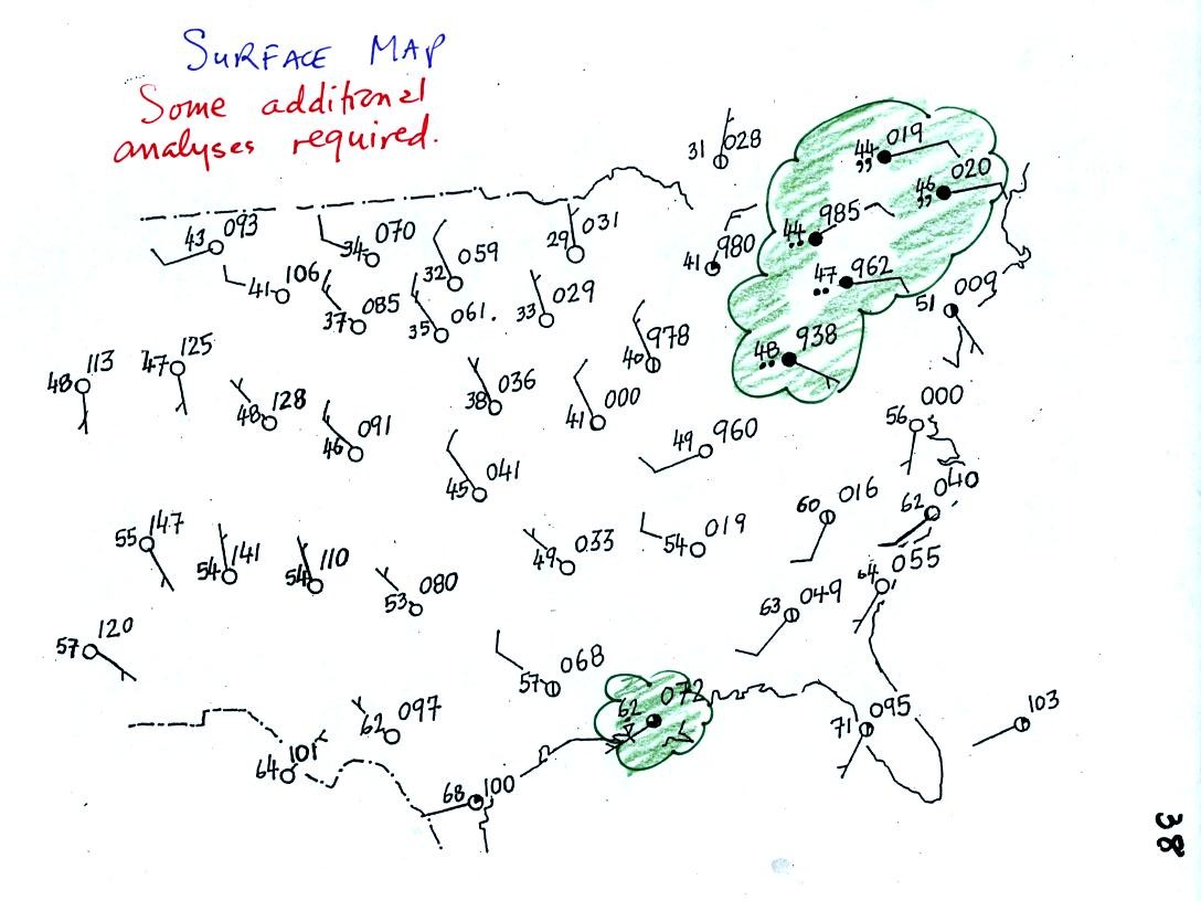
Plotting the surface weather data on a map is
just the
beginning.
For example you really can't tell what is causing the cloudy weather
with rain (the dot symbols are rain) and drizzle (the comma symbols) in
the NE portion of the map above or the rain
shower along the Gulf Coast. Some additional
analysis is needed. A meteorologist would usually begin by
drawing some contour lines of pressure to map out the large scale
pressure pattern. We will look first at contour lines of
temperature, they are a little easier to understand.
Isotherms, temperature contour lines, are drawn at 10 F
intervals.
They do two things: (1) connect points on the map that all
have the same temperature, and (2) separate regions that are warmer
than a particular temperature from regions that are colder. The
40o F isotherm highlighted in yellow above passes through
City A which is reporting a temperature of exactly 40o.
Mostly it goes
between pairs of
cities: one with a temperature warmer than 40o and the other
colder
than 40o (such as near Point B). Temperatures
generally decrease with
increasing
latitude.
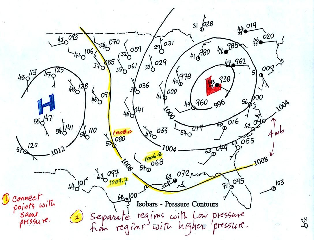
Now the same data with isobars drawn in. Again they
separate
regions with pressures higher than a particular value from regions with
pressures lower than that value.
Isobars are generally drawn at 4 mb intervals. Isobars also connect points on the map
with the same pressure. The 1008 mb isobar passes
through a city where the pressure is exactly
1008.0 mb. Most of the time the isobar
will pass between two
cities. The 1008 mb isobar passes between two cities with
pressures
of 1006.8 mb and 1009.7 mb. You would
expect to find 1008 mb about halfway between
those two cites, that is where the 1008 mb isobar goes.
The pattern on this map is very different from the pattern of
isotherms. On this map the main features are the circular low and
high pressure centers.
1.
Let's first look at the wind motions associated with a surface low
pressure center (the figures were
redrawn after class for clarity):
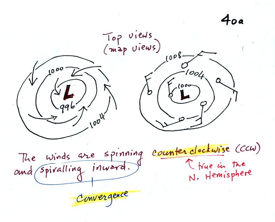
The pressure differences will first start air moving
toward low
pressure (like a rock sitting on a hillside that starts to roll
downhill). Then something called the Coriolis force will cause
the
wind to start to spin (we'll learn more about the Coriolis force later
in the semester). Winds spin in a counterclockwise (CCW) direction
around surface
low pressure
centers. The winds also spiral inward toward the center of the
low, this is called convergence. [winds spin clockwise around low
pressure centers in the southern hemisphere but still spiral inward]
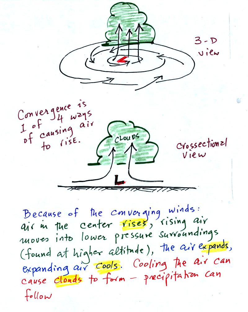
The convergence causes the air to rise at the center of the low.
Rising air expands and cools. If the air is sufficiently moist
clouds can form and then begin to rain or snow. Thus you often
see
cloudy skies and stormy weather associated with surface low pressure.
With surface high pressure everything is pretty much just the opposite:
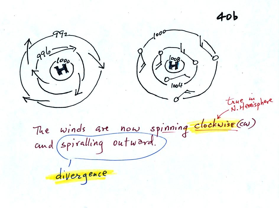
Winds spin clockwise and spiral outward. The
outward motion is called divergence.
Air sinks in the center of
surface high pressure to
replace the diverging air. The sinking air is compressed and
warms. This keeps clouds from forming so clear
skies are normally found with high pressure. The clear eye in the
center of a hurricane is produced by sinking air.
2.
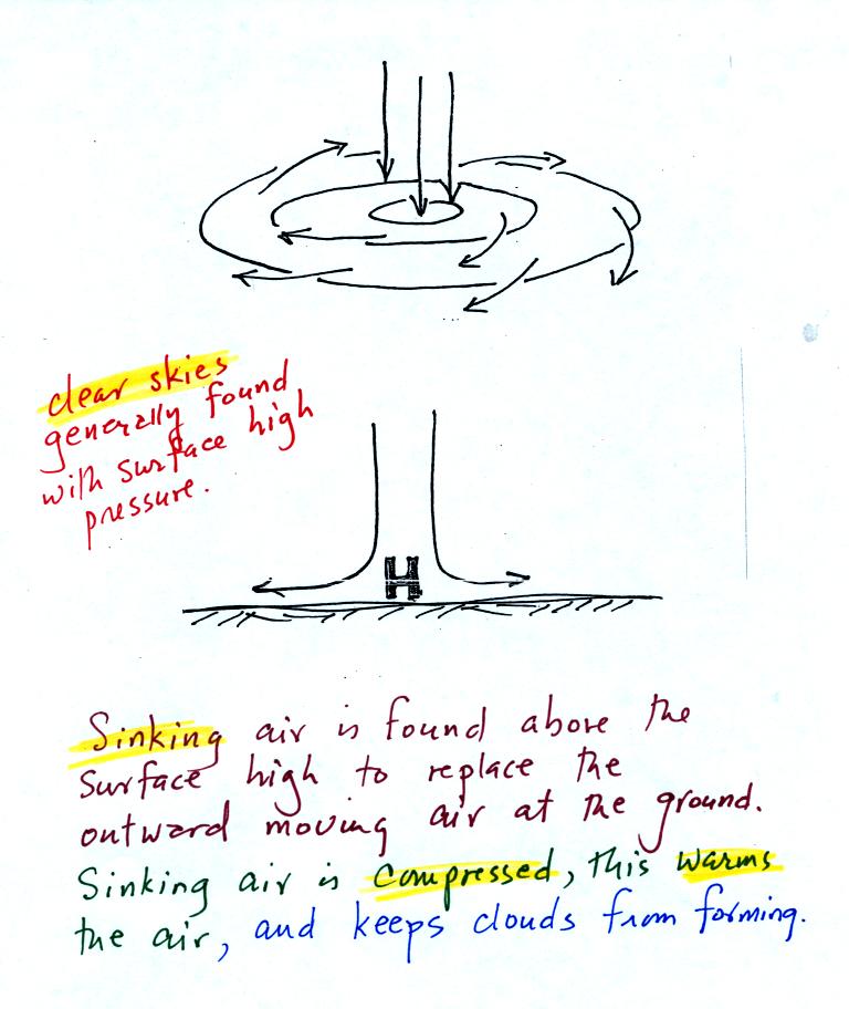
The
pressure pattern will also tell you something about how fast you might
expect the wind to blow. In this case we look for regions where
the isobars are either closely spaced together or widely spaced. (the following figures were redrawn
after class)
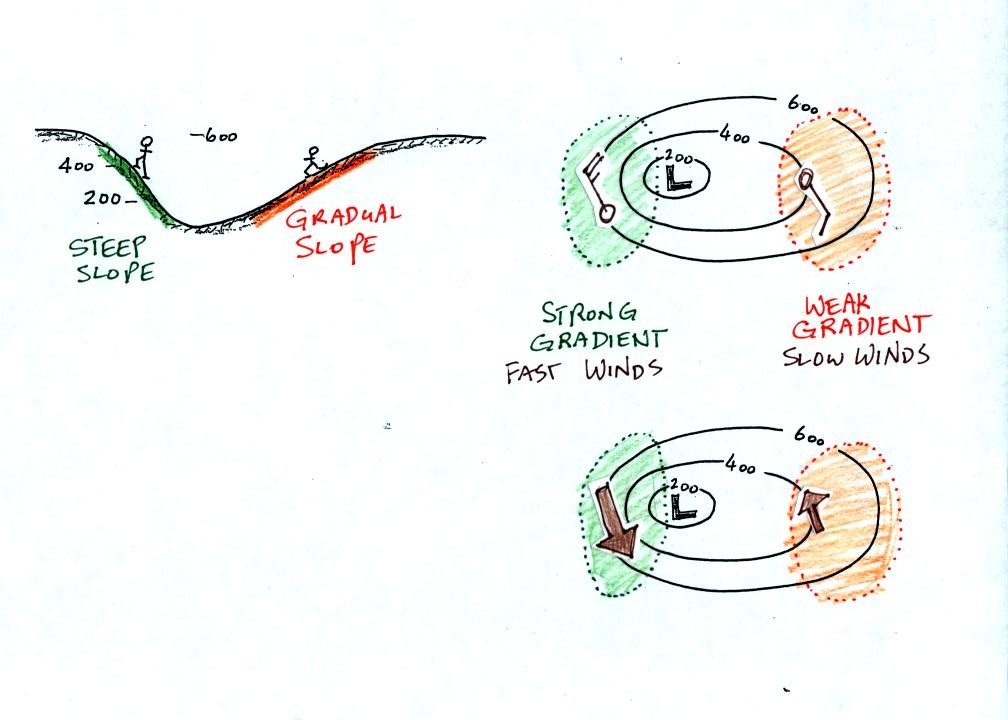
Closely spaced contours means pressure is changing rapidly
with
distance. This is known as a strong pressure gradient and
produces fast winds. It is analogous to a steep slope on a
hillside. If you trip, you will tumble rapidly down a steep
hillside, more slowly down a gradual slope.
The winds around a high pressure center are shown above using both the
station model notation and arrows. The winds are spinning clockwise and
spiralling inward slightly.
Winds spin counterclockwise and spiral inward around low
pressure
centers.
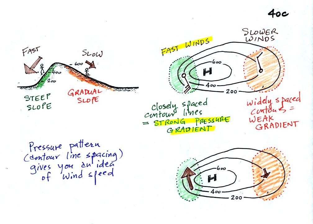
Try to determine the directions of the winds at Points 1, 2, and 3 in
the figure below (found at the bottom of p. 40c in the photocopied
Class Notes). Where will the fastest and slowest winds be
found? Would you expect to find that the temperatures at Points
1, 2, and 3 were equal or different?
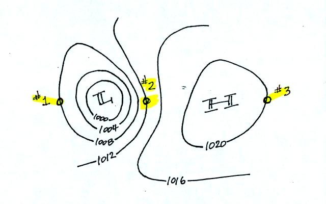
When you thought about these questions for awhile, click here to see the
answers.
3.
The pressure pattern determines the wind direction and wind
speed. Once the winds start to blow they can affect and change
the temperature pattern. The figure below shows the
temperature pattern you would
expect to see if the wind wasn't blowing at all or if the wind was
blowing straight from west to east. The bands of different
temperature are aligned parallel to the lines of latitude.
Temperature changes from south to north but not from west to east.
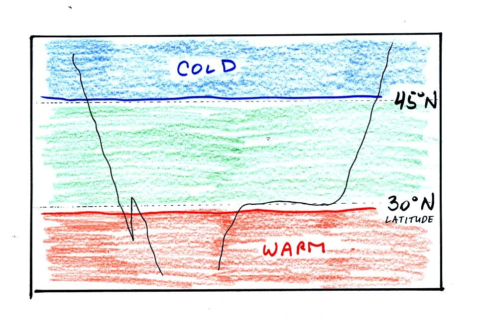
This isn't a very interesting
picture. It gets a
little
more interesting if you put centers of high or low pressure in the
middle.
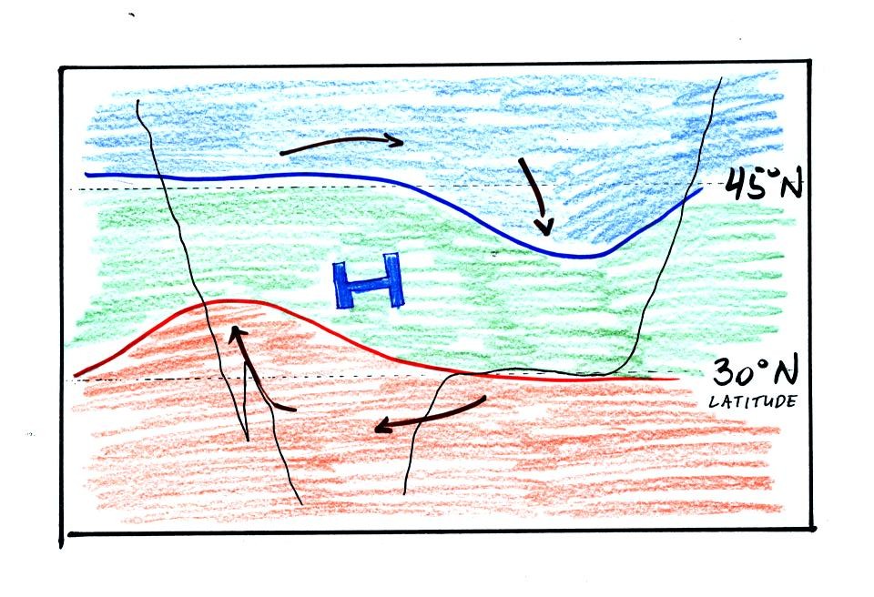
The clockwise spinning winds move warm air to
the north on
the western
side of the High. Cold air moves toward the south on the eastern
side of the High. The diverging winds also move the warm and cold
air away from the center of the High.
Counterclockwise winds move cold air toward the south on the
west side
of the Low. Warm air advances toward the north on the eastern
side of the low.
The converging winds in the case of low pressure will move the air
masses of different temperature in toward the center of low pressure
and cause them to collide with each other. The boundaries between
these colliding air masses are called fronts. Fronts are a second
way
of causing rising air motions (rising air expands and cools, if the air
is moist clouds can form)
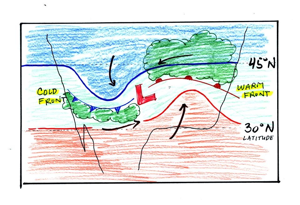
Cold air is moving from north toward the south on the
western side of
the low. The leading edge of the advancing cold air mass is a
cold front. Cold fronts are drawn in blue on weather maps.
The small triangular symbols on the side of the front identify it as a
cold front and show what direction it is moving. The fronts are
like spokes on a wheel. The "spokes" will spin counterclockwise
around the low pressure center (the axle).
A warm front (drawn in red with half circle symbols) is shown on the
right hand side of the map at the advancing edge of warm air. It
is also rotating counterclockwise around the Low.
Clouds can form along fronts (often in a fairly narrow band along a
cold front and over a larger area ahead of a warm front). We need
to look at the crossectional structure of warm and cold fronts to
understand better why this is the case.
This type of storm system is referred to as an extratropical cyclone
(extra tropical means outside the tropics, cyclone means winds spinning
around low pressure) or a middle latitude storm. Large
storms also
form in the tropics, they're called tropical cyclones or more commonly
hurricanes.
The top picture below shows a crossectional
view of a cold front
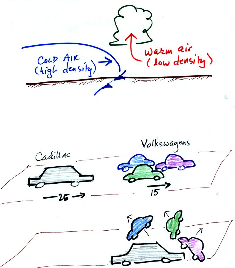
At the top of the figure, cold dense air on the left is
advancing into
warmer lower density air
on the right. We are looking at the front edge of the cold air
mass. The warm low density air is lifted out of the way
by the cold air.
The lower figure shows an analogous situation, a big heavy Cadillac
plowing into a bunch of
Volkswagens. The VWs are thrown up into the air by the Cadillac.
Here's a crossectional view of a warm front, the structure is a
little different.
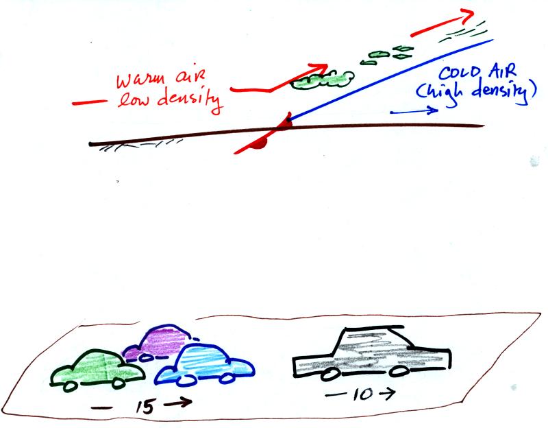
In the case of a warm front we are looking at
the
back,
trailing edge of cold air (moving slowly to the right). Note the
ramp
like shape of the cold air mass. Warm air overtakes the cold
air. The warm air is still less dense than the cold air, it can't
wedge its way underneath the cold air. Rather the warm air
overruns the cold air. The warm air rises again (more gradually)
and clouds form. The clouds generally are spread out over a
larger area than with cold fronts.
In the automobile analogy, the VWs are catching a Cadillac. What
happens
when they overtake the Cadillac?
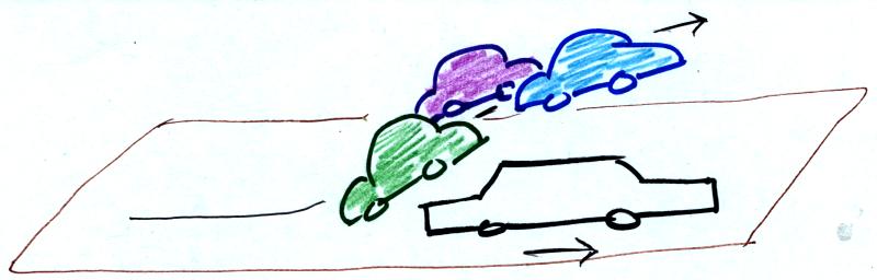
The Volkswagens aren't heavy
enough to lift the
Cadillac.
They run up and over the Cadillac.
Fronts are another way of
causing air to rise. Rising air cools and if the
warm air
is moist, clouds and precipitation can form.
Now we will return to the surface weather map we have been analyzing.
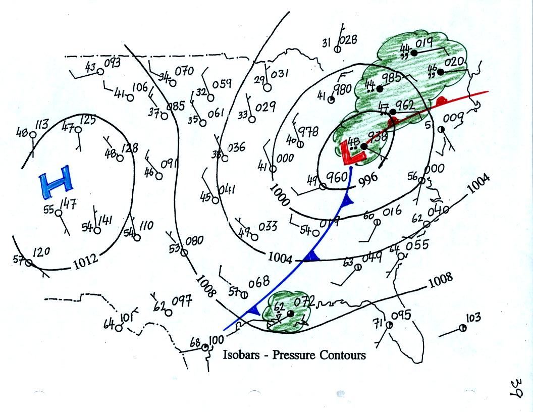
The weather data plotted on the map indicate clearly the
presence of
cold and a
warm fronts (we learn later about some of the criteria used to located
fronts). Now we can begin to understand what is causing the rain
shower along the Gulf Coast (clouds caused by an approaching cold
front) and the cloudy rainy weather in the Northeast (an approaching
warm front and also perhaps some convergence into the low pressure
center).