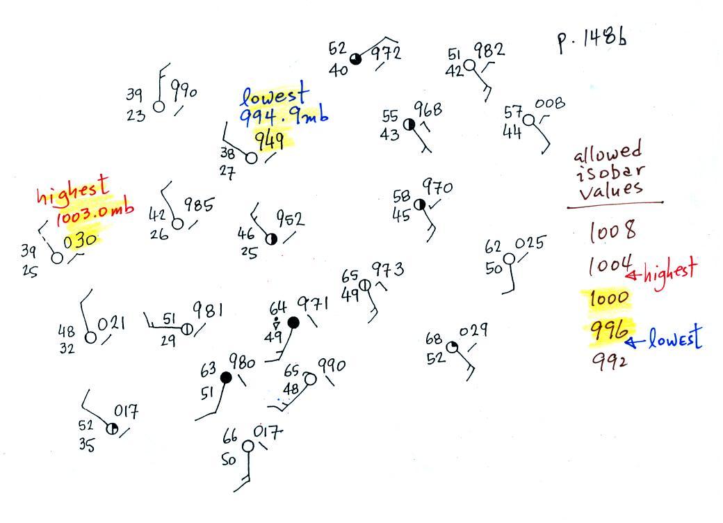
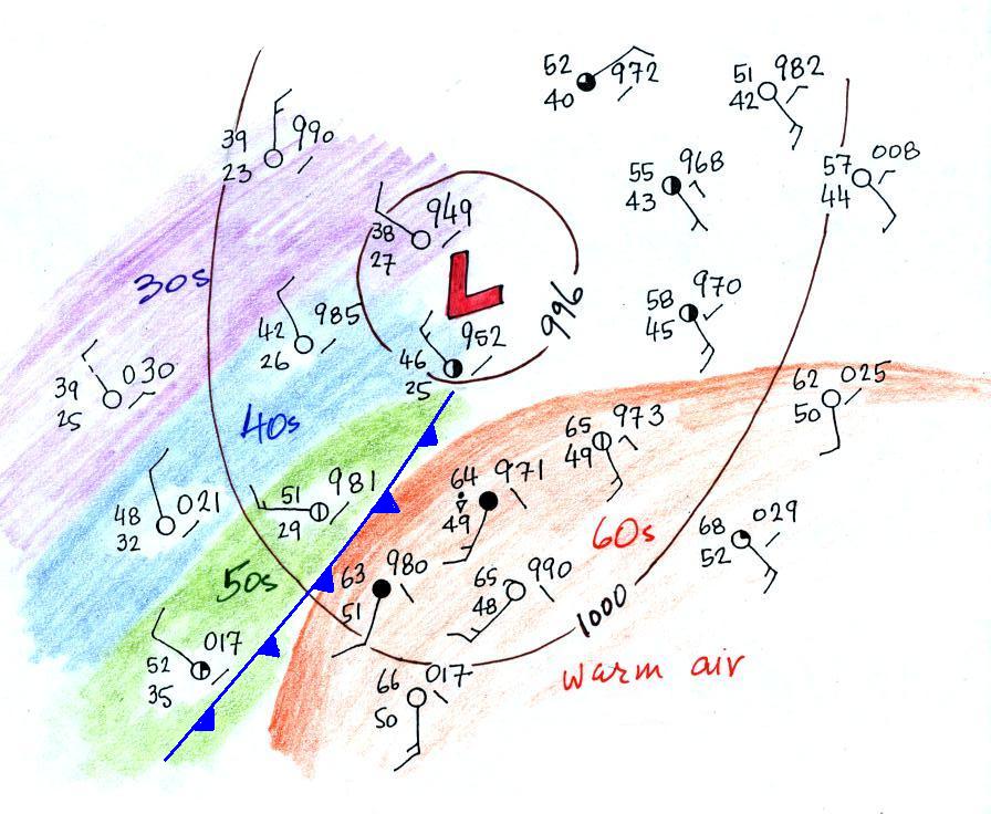
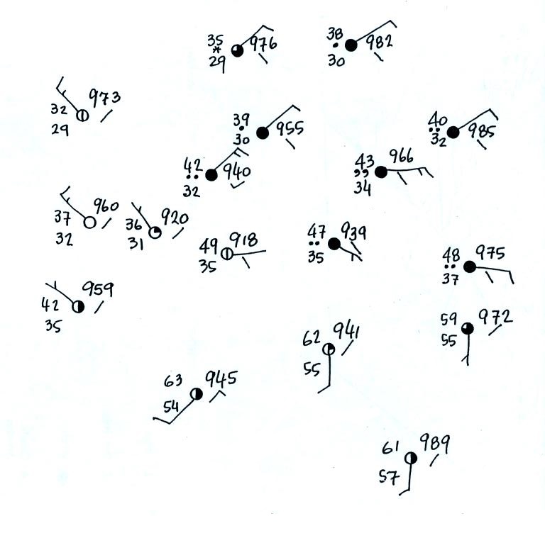
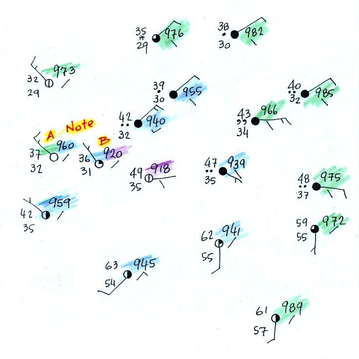
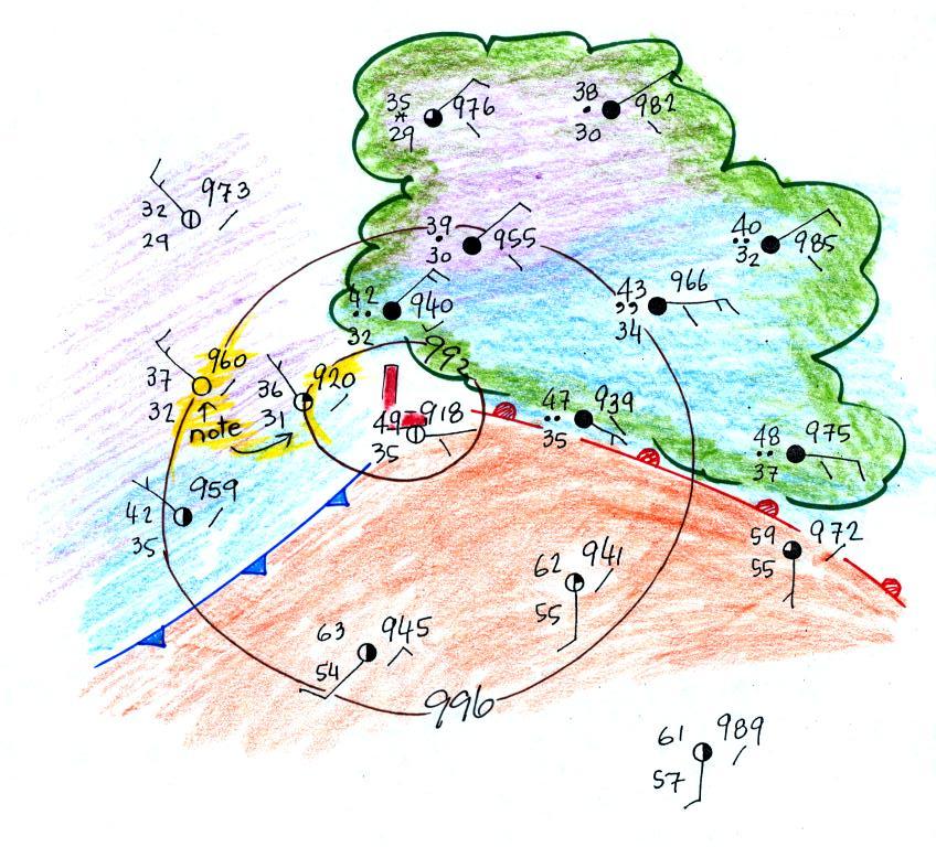
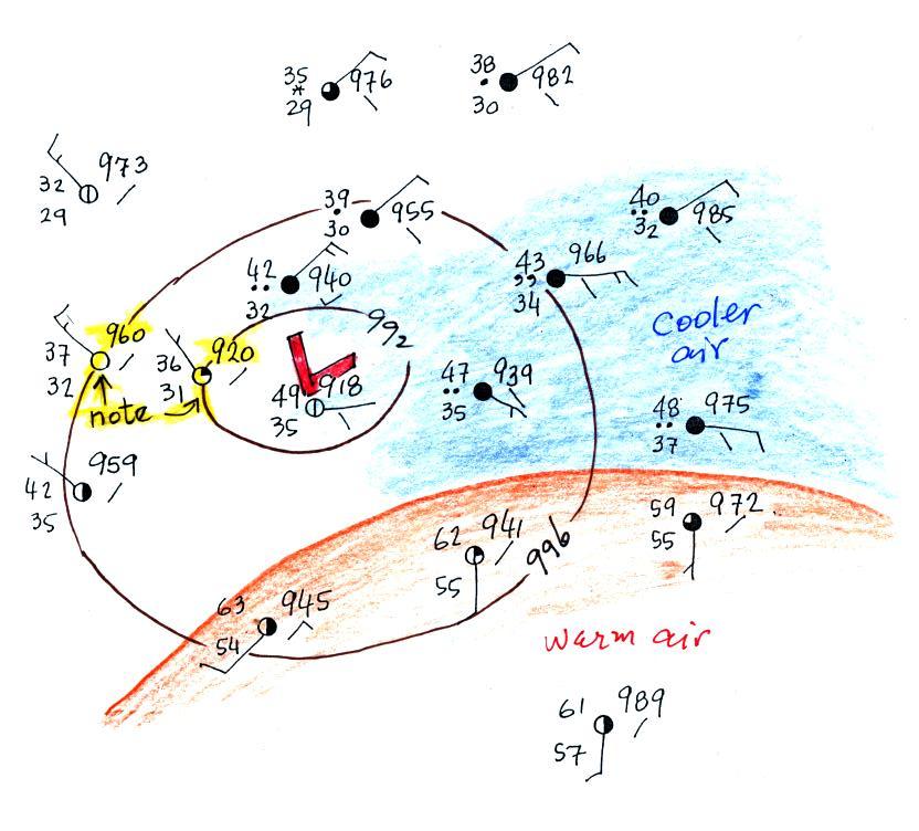
This is the map we will be working with
(see p. 149b in the ClassNotes). It's worth pausing
and noting that you really can't make any sense out of this
jumble of weather data at this point.
Step #1 - draw in some
isobars and locate the low pressure center
We'll start by drawing some isobars to map out the
pressure pattern. A partial list of allowed isobars is
shown at the right side of the map above (increments of 4 mb
starting at 1000 mb).
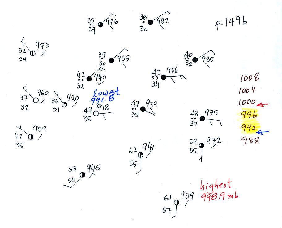
We've located located the highest and
lowest pressure values on the map. Then we choose
allowed isobar values that fall between these limits.
In this case we'll need to draw 992 mb and 996 mb isobars.
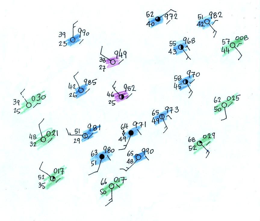
Here's the map with color coded pressures.
Pressures less than 992 mb are purple,
pressures between 992 and 996 mb are blue, and pressures greater
than 996 mb are green.
Note that station B has a pressure of exactly 992.0 mb, the
992 mb isobar will go through that station. The 996 mb
isobar will go through station A because it has a pressure
of exactly 996.0 mb.
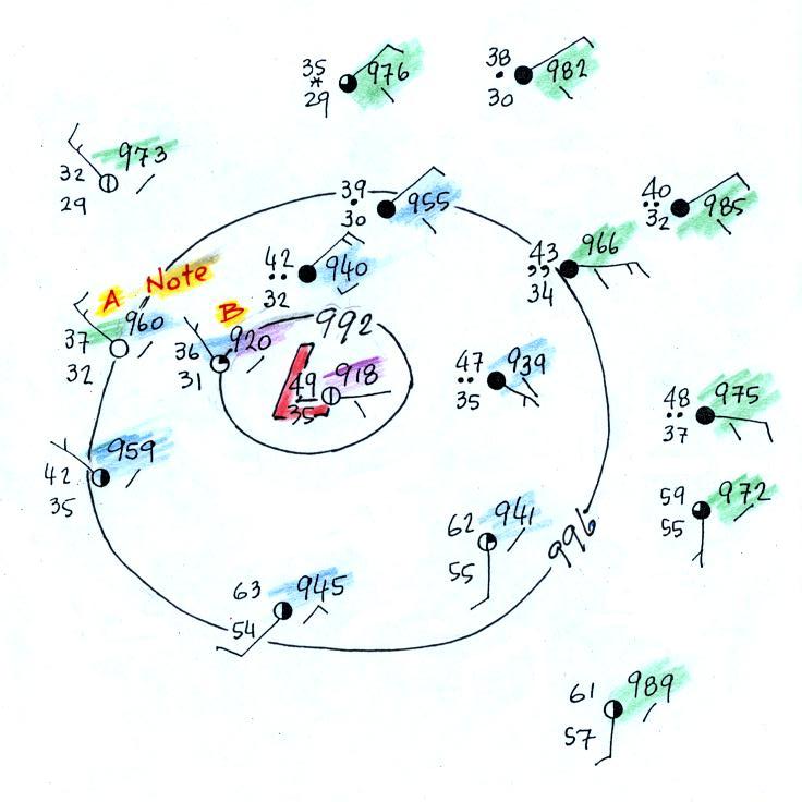
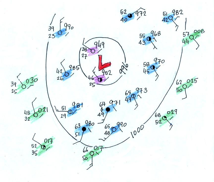
Here's the map with the isobars drawn
in. On the map below we use colors to locate the warm
and cooler air masses.
Step #2 - locate the warm air mass
The warm air mass has been colored in orange.
Cooler air east of the low pressure center is blue.
Can you see where the warm front should go?
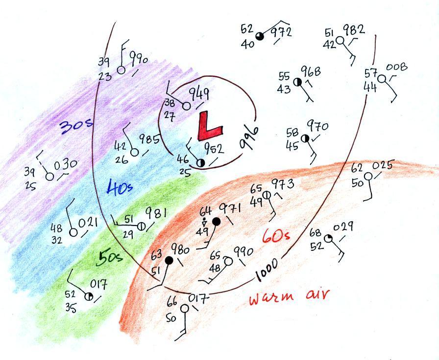
Step #3 - draw in a tentative warm
front location
Here's the map with a warm front drawn in
(the map was redrawn so that the edge of the warm
(orange) air mass would coincide with the warm
front).

The change in wind directions was probably
more pronounced than the temperature change. Most of the
clouds outlined in green are probably being produced by the
warm front. You can see how more extensive cloud
coverage is with a warm front.
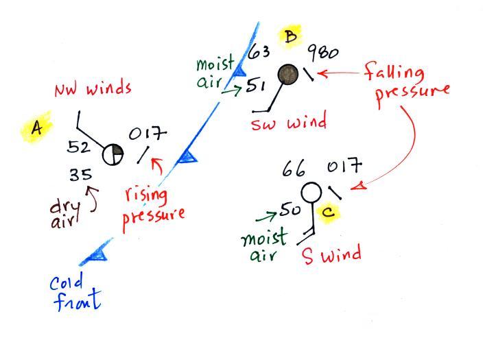
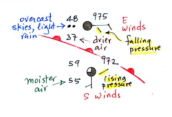
Step #4 - double check the
front location
Two of the stations near the right edge of the
picture and on opposite sides of the front are redrawn below.
The station north of the front has cooler and drier air,
winds are from the east, skies are overcast and light rain is
falling. The pressure is falling as the warm front
approaches. These are all things you'd expect to find
ahead of a warm front. Behind the front at the southern
station pressure is rising, the air is warmer and moister, winds
have shifted to the south and the skies are starting to clear.
In this case there is a Step #5 -
have a look at the rest of the surface map
Have a look at the
left, western, side of the map. There's pretty good
evidence of a cold front.