Tuesday Feb. 17, 2015
Music selected from the following list before class this
morning: Copenhagen Philharmonic Symphony "Bolero";
Hot Club of San Francisco "Don't
Panic", Jazz from
the Tip; Black Prairie "Taraffa";
Naturally 7 Live in the Paris Metro "I Can
Feel it Coming in the Air Tonight".
The Take
Home Optional Assignment was collected today. I
won't be able to get that back to you before Thursday's quiz
so I have posted some answers
online.
The 1S1P reports on Carbon Dioxide have been graded and were
returned in class today. You can check to see whether a
particular 1S1P topic has been graded and returned here.
I am hoping to have the Experiment #1 reports graded in time
to return before the quiz on Thursday.
A reminder: Students in the 8 am section that normally attend
the 9:30 class must take the quiz with their fellow Sect. 2
students at 8 am on Thursday this week. That is to avoid
overcrowding during the quiz in the 9:30 class.
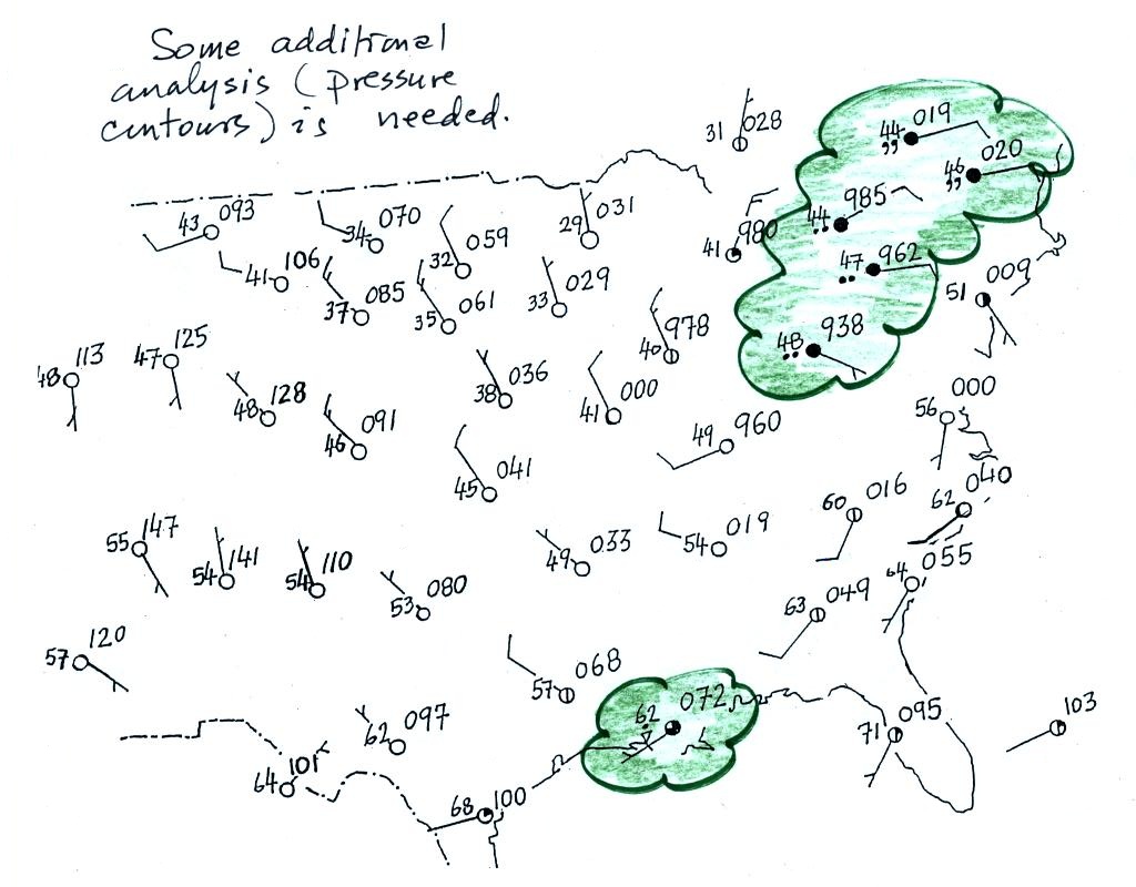
A bunch of weather data has
been plotted (using the station model notation) on the
surface weather map in the figure below (p. 38 in the
ClassNotes). A couple of stormy
regions have been circled in green.
Plotting the surface weather data on a map is just
the beginning. For example you really can't tell what is
causing the cloudy weather with rain (the dot symbols are
rain) and drizzle (the comma symbols) in the NE portion of the
map above or the rain shower along the Gulf Coast. Some
additional analysis is needed.
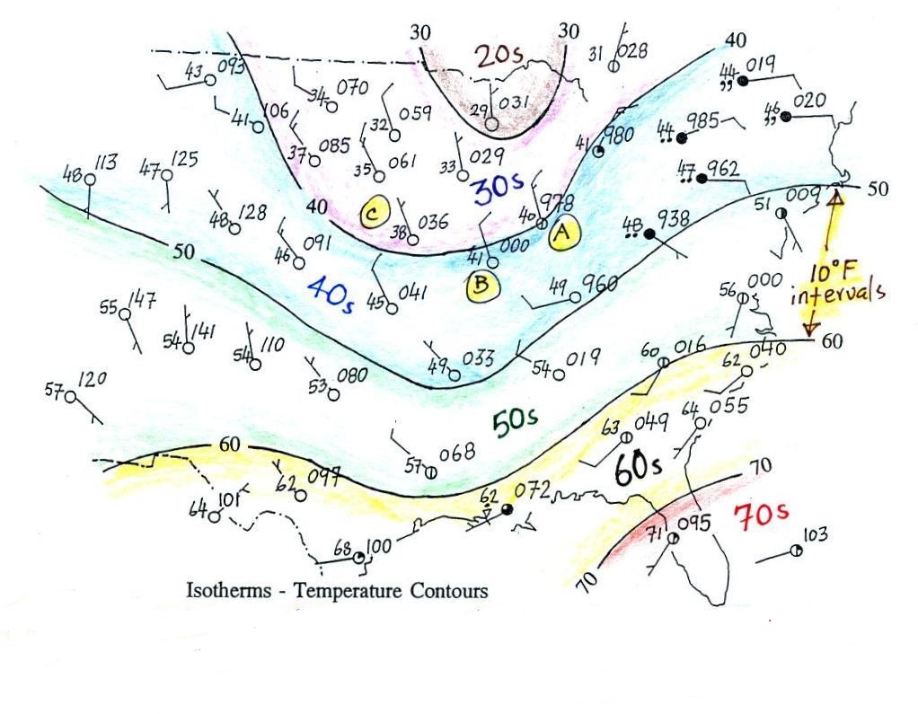
1st step in surface map
analysis: draw in some contour lines to reveal the large
scale pressure pattern
Pressure
contours = isobars
( note the word bar
is in millibar, barometer, and now isobar )
Temperature contours = isotherms
A meteorologist would usually begin by
drawing some contour lines of pressure (isobars) to map
out the large scale pressure pattern. We will look
first at contour lines of temperature, they are a little
easier to understand (the plotted data is easier to decode
and temperature varies across the country in a more
predictable way).
Isotherms
Temperature contours (isotherms) are
easier to plot.
Isotherms, temperature contour
lines, are usually drawn at 10o F intervals. They do two things:
isotherms (1) connect points on the map with the same
temperature
(2) separate
regions warmer
than a particular temperature
from regions colder
than a particular temperature
The 40o F isotherm
above passes through a city which is reporting a temperature of
exactly 40o (Point A).
Mostly it goes between pairs of cities: one with a temperature
warmer than 40o (41o at
Point B) and the other colder than 40o (38o
F at Point C). The temperature pattern is also
somewhat more predictable than the pressure pattern: temperatures
generally decrease with increasing latitude: warmest temperatures
are usually in the south, colder temperatures in the north.
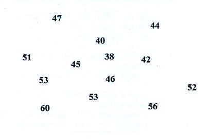
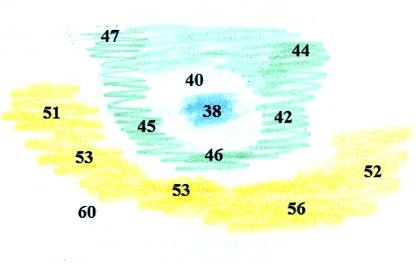
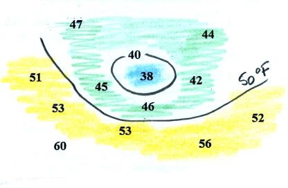
Question #13 from the Optional Assignment is shown below at left (these figures weren't shown in class).
You were supposed to draw in 40 F and 50 F isotherms. Colors
can help you do this. In the center picture below
temperatures below 40 are colored blue,
temperatures between 40 and 50 are green
and temperatures in the 50s are colored
yellow.
The isotherms have been drawn in at right; not how the
isotherms separate the colored bands. Note how the 40 F
isotherm goes through the 40 on the map.
Isobars
a little harder to draw because you have to be able
to decode the pressure data
isobars (1) connect points on the map with equal
pressure
(2) separate regions of high
pressure from regions with lower
pressure
and
identify and locate centers of high and low pressure
Here's the same weather map with isobars drawn in.
Isobars are generally drawn at 4 mb intervals (above and below a
starting value of 1000 mb).
The 1008 mb isobar (highlighted in yellow) passes through a city
at Point A where the
pressure is exactly 1008.0 mb. Most of the time the isobar
will pass between two cities. The 1008 mb isobar passes
between cities with pressures of 1009.7 mb at Point B and 1006.8 mb at Point C. You would
expect to find 1008 mb somewhere in between those two cites, that
is where the 1008 mb isobar goes.
The isobars separate regions of high and low pressure.
The pressure pattern is not as predictable as the isotherm
map. Low pressure is found on the eastern half of this map
and high pressure in the west. The pattern could just as
easily have been reversed.
This
site (from the American Meteorological Society) first shows
surface weather observations by themselves (plotted using the
station model notation) and then an analysis of the surface data
like what we've just looked at. There are links below each
of the maps that will show you current surface weather data.
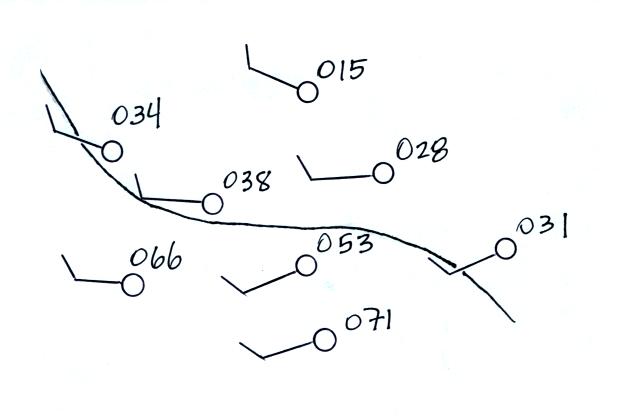
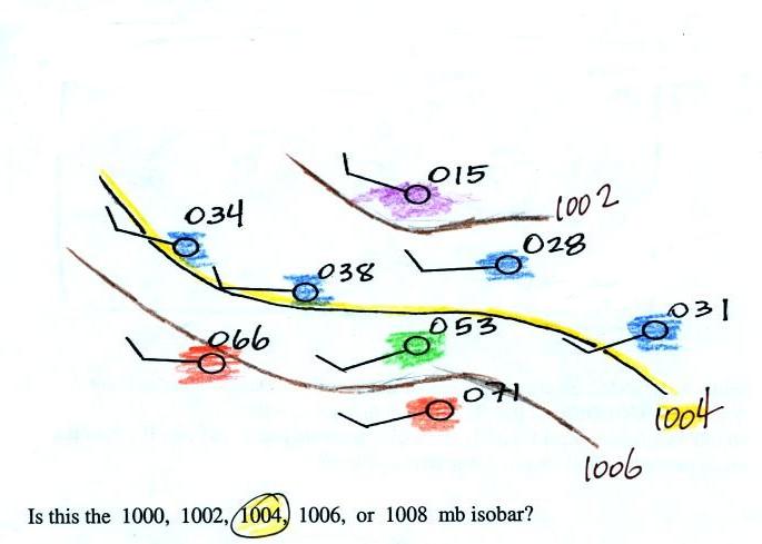
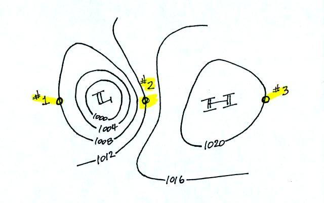
Here's a little practice (this figure wasn't shown in
class).
A single isobar is shown. Is it the 1000, 1002, 1004, 1006,
or 1008 mb isobar? (you'll find the answer at the end of today's
notes)
What can you begin to learn about the weather once you've
mapped out the pressure pattern?
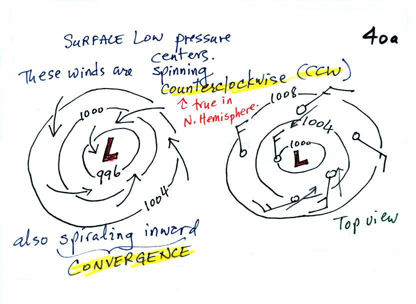
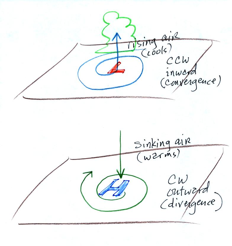
1a. Surface centers of low pressure
We'll start with the large nearly circular centers of High and
Low pressure. Low pressure is drawn below. These
figures are more neatly drawn versions of what we did in class.
Air will start moving toward low
pressure (like a rock sitting on a hillside that starts to roll
downhill), then something called the Coriolis force will cause
the wind to start to spin (I didn't
mention the Coriolis force in class, we'll learn
more about it later in the semester).
In the northern hemisphere winds spin in a counterclockwise
(CCW) direction around surface low pressure centers. The
winds also spiral inward toward the center of the low, this is
called convergence. [winds spin clockwise around low
pressure centers in the southern hemisphere but still spiral
inward, don't worry about the southern hemisphere until later in
the semester]
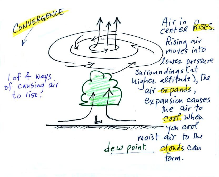
When the converging air reaches the center of the low it starts to
rise.
Convergence
causes air to rise (1 of 4 ways)
rising
air e-x-p-a-n-d-s
(it moves into lower pressure surroundings at
higher altitude)
The expansion causes the air to cool
If you cool moist air enough (to
or below its dew point temperature) clouds can form
Convergence
is 1 of 4 ways of causing air to rise (we'll learn
what the rest are soon, and, actually, you already know what
one of them is - warm air rises, that's called convection). You often see
cloudy skies and stormy weather associated with surface low
pressure.
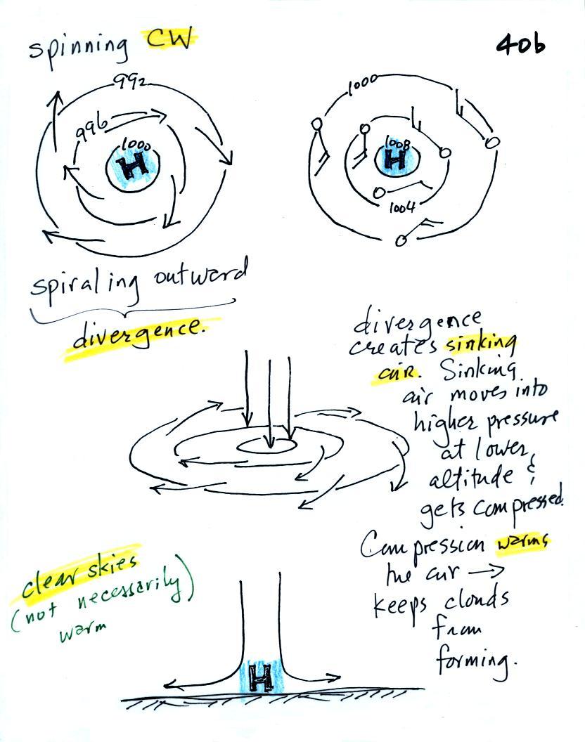
1b. Surface centers of high
pressure
Everything is pretty much the exact
opposite in the case of surface high pressure.
Winds spin clockwise (counterclockwise in the
southern hemisphere) and spiral outward. The outward
motion is called divergence.
Air sinks in the center of surface high pressure to
replace the diverging air. The sinking air is compressed
and warms. This keeps clouds from forming so clear skies
are normally found with high pressure.
Clear skies doesn't necessarily mean warm weather, strong
surface high pressure often forms when the air is very
cold.
Divergence causes air to sink
sinking air is compressed and warms
warming air keeps clouds from forming - clear
skies
Here's a picture summarizing what we've
learned so far. It's a slightly different view of wind
motions around surface highs and low that tries to combine all
the key features in as simple a sketch as possible.
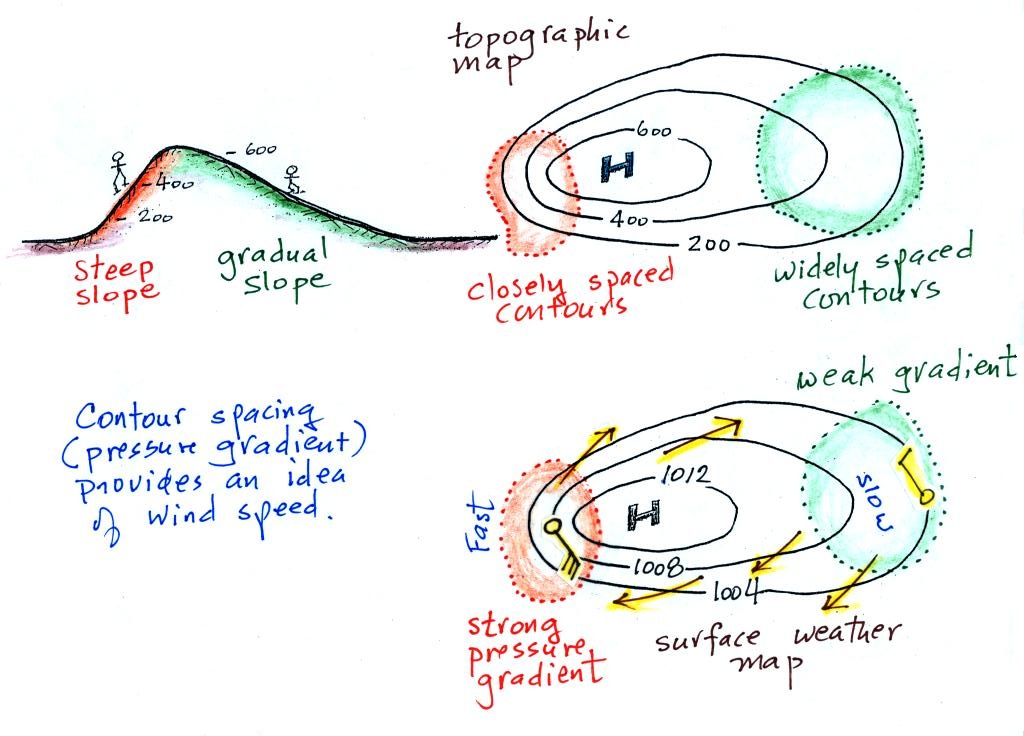
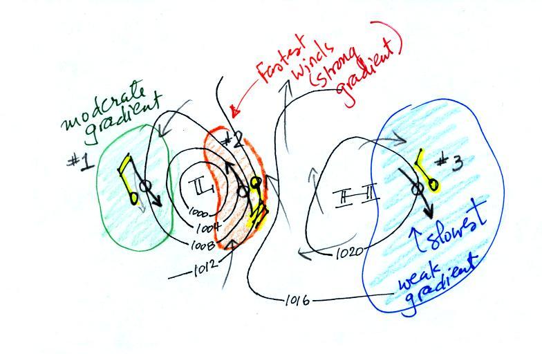
2. Strong and weak
pressure gradients
The pressure pattern will also tell you something about
where you might expect to find fast or slow winds. In this
case we look for regions where the isobars are either closely
spaced together or widely spaced. Portions of the two
figures that follow can be found on p. 40c in the ClassNotes.
A picture of a hill is shown above at left. The map at
upper right is a topographic map that depicts the hill
(the numbers on the contour lines are altitude). A center
of high pressure on a weather map, the figure at the
bottom, has the same overall appearance. The numbers on
the contours are different. These are contours (isobars)
of pressure values in millibars.
Closely spaced contours on a topographic map indicate a steep
slope. More widely spaced contours mean the slope is more
gradual. If you roll a rock downhill on a
steep slope it will roll more quickly than if it is on a gradual
slope. A rock will always roll downhill, away from the
summit in this case toward the outer edge of the topographic
map. Air will always start to move toward low pressure
On a weather map, closely spaced contours (isobars) means
pressure is changing rapidly with distance. This is known
as a strong pressure gradient and produces fast winds (a 30 knot
wind blowing from the SE is shown in the orange shaded region
above). Widely spaced isobars indicate a weaker pressure
gradient and the winds would be slower (the 10 knot wind blowing
from the NW in the figure).
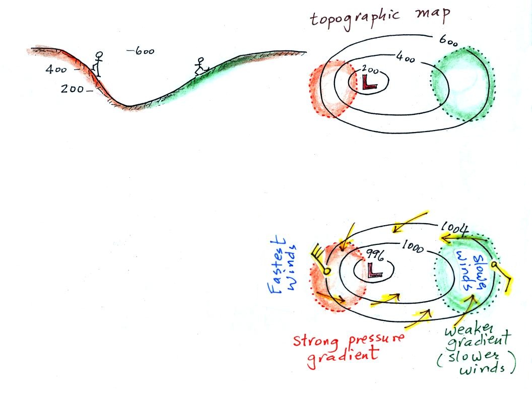
Winds spin counterclockwise and spiral inward around low
pressure centers. The fastest winds are again found where
the contour lines are close together and the pressure gradient
is strongest.
Contour spacing
closely
spaced isobars = strong pressure gradient
(big change in pressure with distance) - fast
winds
widely spaced isobars = weak
pressure gradient (small change in pressure
with distance) - slow winds
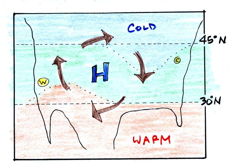
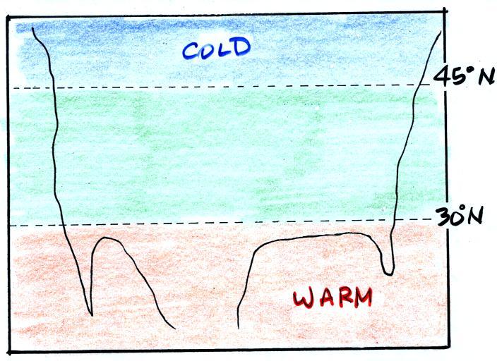
3. Temperature patterns and fronts
The pressure
pattern causes the wind to start to blow; the wind then can
affect and change the temperature pattern. The
figure below shows the temperature pattern you would expect to
see if the wind wasn't blowing at all or if the wind was just
blowing straight from west to east. The bands of
different temperature are aligned parallel to the lines of
latitude. Temperature changes from south to north but
not from west to east.
This picture gets a
little more interesting if you put centers of high or low
pressure in the middle.
In the case of high pressure,
the clockwise spinning winds move warm air to the north on the
western side of the High. The front edge of this
northward moving air is shown with a dotted line (at Pt. W) in
the picture above. Cold air moves toward the south on
the eastern side of the High (another dotted line at Pt.
C). The diverging winds also move the warm and cold air
away from the center of the High. Now you would
experience a change in temperature if you traveled from west
to east across the center of the picture.
The transition from warm to cold along the boundaries (Pts.
W and C) is spread out over a fairly long distance and is
gradual. This is because the winds around high pressure
diverge and blow outward away from the center of high
pressure. There is also some mixing of the different
temperature air along the boundaries.
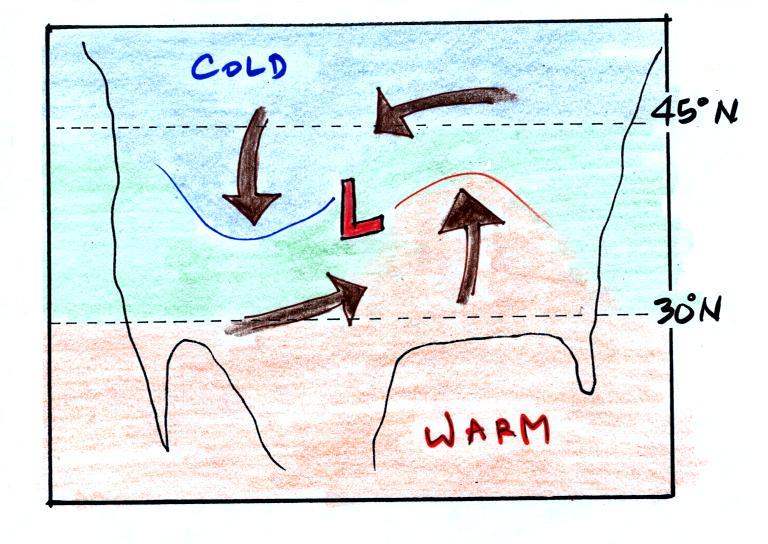
Counterclockwise winds move cold air toward the south on the
west side of the Low. Warm air advances toward the north
on the eastern side of the low. This is just the opposite
of what we saw with high pressure.
The converging winds in the case of low pressure will move
the air masses of different temperature in toward the center of
low pressure. The transition zone between different
temperature air gets squeezed and compressed. The change
from warm to cold occurs in a shorter distance and is sharper
and more distinct. Solid lines have been used to delineate
the boundaries above. These sharper and more abrupt boundaries
are called fronts.
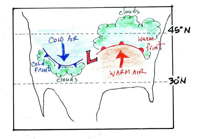
Warm and cold fronts, middle
latitude storms (aka extratropical cyclones)
A cold front is drawn at the front edge of the southward moving
mass of cold air on the west side of the Low. Cold fronts
are generally drawn in blue on a surface weather map. The
small triangular symbols on the side of the front identify it as a
cold front and show what direction it is moving.
A warm front (drawn in red with half circle symbols) is shown
on the right hand side of the map at front edge of the northward
moving mass of. A warm front is usually drawn in red and has
half circles on one side of the front to identify it and show its
direction of motion.
The fronts are like spokes on a wheel. The "spokes" will
spin counterclockwise around the low pressure center (the axle).
Both types of fronts cause rising air motions. Fronts are
another way of causing air to rise. That's important because
rising air expands and cools. If the air is moist and cools
enough, clouds can form.
The storm system shown in the picture above (the Low together with
the fronts) is referred to a middle latitude storm or an
extra-tropical cyclone. Extra-tropical means outside the
tropics, cyclone means winds spinning around low pressure
(tornadoes are sometimes called cyclones, so are
hurricanes). These storms form at middle latitudes because
that is where air masses coming from the polar regions to the
north and the more tropical regions to the south can collide.
Large storms that form in the tropics (where this mostly just warm
air) are called tropical cyclones or, in our part of the world,
hurricanes.
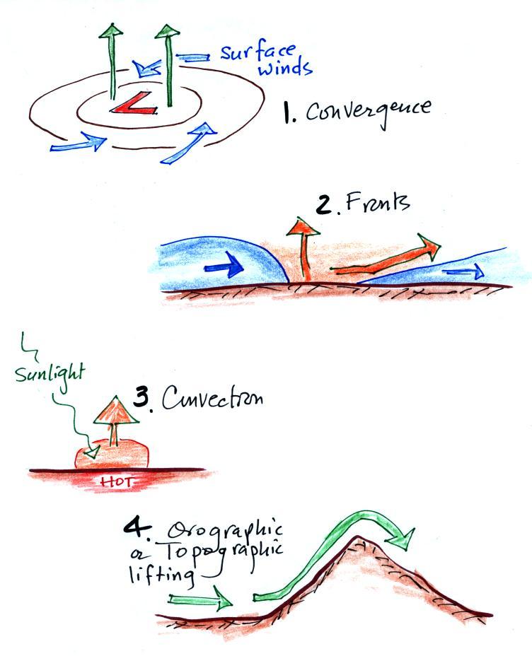
Fronts are another way of causing air to
rise. There are a total of 4 processes that
cause air to rise. They are all sketched below.
1. Convergence, winds spiraling in toward centers of low
pressure was mentioned earlier in class.
2. Fronts we've just learned cause air to rise. The two
fronts are shown in crossection above. You'll better
understand what is going on here after class on Thursday.
3. Sunlight striking and being absorbed at the ground warms the
ground. Air in contact with the ground warms and becomes
buoyant. If it is warm enough (low enough density) it will
float upward on its own. This is called free convection.
4. Finally when winds encounter a mountain they must move upward
and over the mountain. You might expect to see clouds and
precipitation on the upwind side of the mountain because that is
where the air is rising and cooling. You'll sometimes find a
"rainshadow" (lack of rain) on the dry downslope side of a
mountain.
Here are answers to the two questions embedded in today's notes
Pressures lower than 1002 mb are colored purple.
Pressures between 1002 and 1004 mb are blue. Pressures
between 1004 and 1006 mb are green and pressures greater than 1006
mb are red. The isobar appearing in the question is
highlighted yellow and is the 1004 mb isobar. The 1002 mb
and 1006 mb isobars have also been drawn in (because isobars are
drawn at 4 mb intervals starting at 1000 mb, the 1002 mb and 1006
mb isobars wouldn't normally be drawn on a map)
Winds from the NW at 20 knots at Point #1,
SE winds at 30 knots at Point #2, and NW winds at 10 knots at
Point #3.
The southerly winds in the middle of the picture at Point
#2 would probably be the warmest. You would find colder
air coming from the north at Points #2 and #3.