Wed., Feb. 12, 2014
One of my favorite groups Calexico before class today.
You heard "Quattro World
Drifts In". Calexico is a local group. The video
you saw was filmed at the Barbican Theater in London and included
Mariachi Luz de Luna also from Tucson. There was time in the
2 pm class for "Alone Again Or".
The 1S1P reports on Scattering of Sunlight were returned in
class today. Just that single topic was returned. I
hope to have the Radon reports ready to return next Monday.
Quiz #1 is one week from today and the Quiz #1 Study Guide is now online.
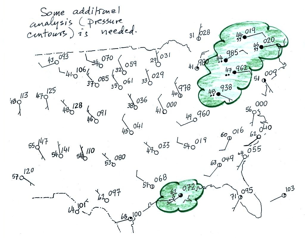
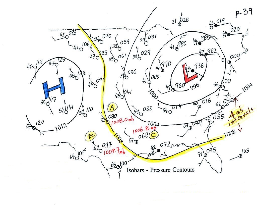
Here's about where we left off on Monday: a bunch of weather
data has been plotted (using the station model notation) on a
surface weather map (p. 38 in the ClassNotes).
Plotting the surface weather data on a map is just the
beginning. For example you really can't tell what is
causing the cloudy weather with rain (the dot symbols are
rain) and drizzle (the comma symbols) in the NE portion of the
map above or the rain shower along the Gulf Coast. Some
additional analysis is needed:
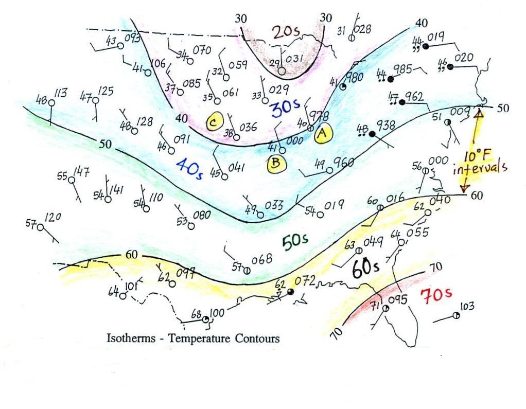
1st step in surface map
analysis: draw in some contour lines to reveal the large
scale pressure pattern
Pressure
contours are called isobars
Temperature contours = isotherms
A meteorologist would usually begin by drawing some
contour lines of pressure (isobars) to map out the large scale
pressure pattern. We will look first at contour lines of
temperature, they are a little easier to understand (the
plotted data is easier to decode and temperature varies across
the country in a more predictable way).
Isotherms, temperature contour lines, are
usually drawn at 10o
F intervals. They do two things:
isotherms (1) connect points on the map
with the same temperature
(2) separate
regions warmer
than a particular temperature
from regions colder
than a particular temperature
The 40o F isotherm
above passes through a city which is reporting a temperature of
exactly 40o (Point A).
Mostly it goes between pairs of cities: one with a temperature
warmer than 40o (41o at
Point B) and the other colder than 40o (38o
F at Point C). The temperature pattern is also
somewhat more predictable than the pressure pattern: temperatures
generally decrease with increasing latitude: warmest temperatures
are usually in the south, colder temperatures in the north.
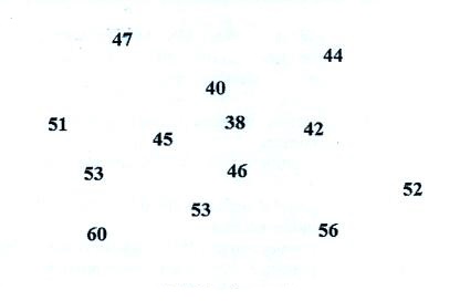
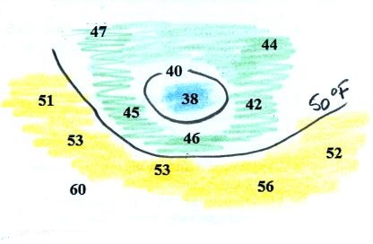
The figure from Question #13 on the current Optional Assignment is
shown below at far left. You are supposed to draw in the 40
F and 50 F isotherms. Colors can help you do this. In
center picture temperatures below 40 are colored blue, temperature
between 40 and 50 are green and temperatures in the 50s are
colored yellow.
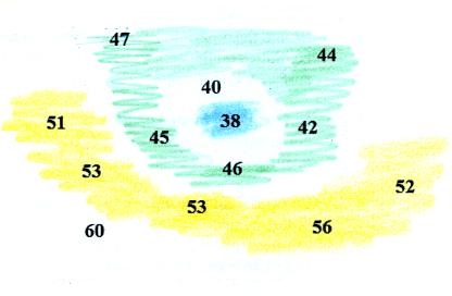
The isotherms have been drawn in at right and separate the
different color bands. Note how the 40 F isotherm goes
through the 40 on the map.
isobars (1) connect
points on the map with equal pressure
(2)
separate regions of high
pressure from regions with lower
pressure
identify
and locate centers of high and low pressure
Isobars also often enclose areas of high pressure and low
pressure. Isobars are generally drawn at 4 mb intervals
(starting with a base value of 1000 mb).
The 1008 mb isobar (highlighted in yellow) passes through a city
at Point A where the
pressure is exactly 1008.0 mb. Most of the time the isobar
will pass between two cities. The 1008 mb isobar passes
between cities with pressures of 1009.7 mb at Point B and 1006.8 mb at Point C. You would
expect to find 1008 mb somewhere in between those two cites, that
is where the 1008 mb isobar goes.
The pressure pattern is not as predictable as the isotherm
map. Low pressure is found on the eastern half of this map
and high pressure in the west. The pattern could just as
easily have been reversed.
This
site (from the American Meteorological Society) first shows
surface weather observations by themselves (plotted using the
station model notation) and then an analysis of the surface data
like what we've just looked at. There are links below each
of the maps that will show you current surface weather data.
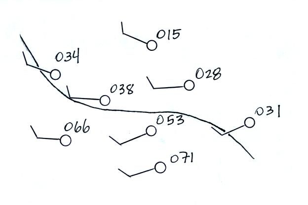
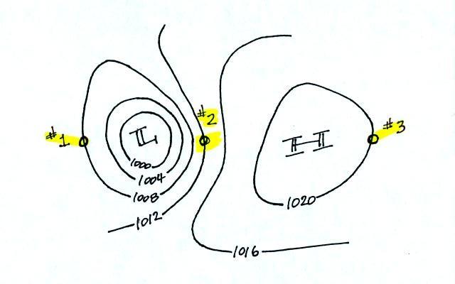
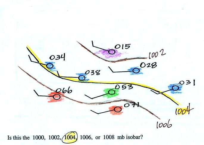
Here's a little practice (this figure wasn't shown in class).
A single isobar is shown. Is it the 1000, 1002, 1004, 1006,
or 1008 mb isobar? (you'll find the answer at the end of today's
notes)
What can you begin to learn about the weather once you've
mapped out the pressure pattern?
1.
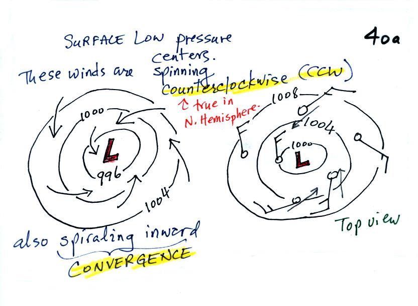
We'll start with the large nearly circular centers of High and Low
pressure. Low pressure is drawn below. These figures
are more neatly drawn versions of what we did in class.
Air will start moving toward low
pressure (like a rock sitting on a hillside that starts to roll
downhill), then something called the Coriolis force will cause
the wind to start to spin (I didn't
mention the Coriolis force in class, we'll learn
more about it later in the semester).
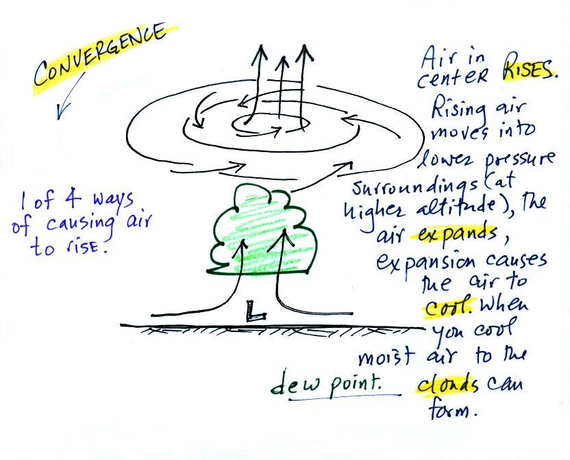
In the northern hemisphere winds spin in a counterclockwise
(CCW) direction around surface low pressure centers. The
winds also spiral inward toward the center of the low, this is
called convergence. [winds spin clockwise around low
pressure centers in the southern hemisphere but still spiral
inward, don't worry about the southern hemisphere until later in
the semester]
When the converging air reaches the center of the low it starts to
rise.
Convergence causes air to rise
rising air e-x-p-a-n-d-s (it moves into
lower pressure surroundings at higher altitude)
The expansion causes the air to cool
If you cool moist air enough (to or below its
dew point temperature) clouds
can form
Convergence is 1 of 4 ways of
causing air to rise (we'll learn what the rest are soon,
and, actually, you already know what one of them is - warm air
rises, that's called convection).
You often see cloudy skies and stormy weather associated with
surface low pressure.
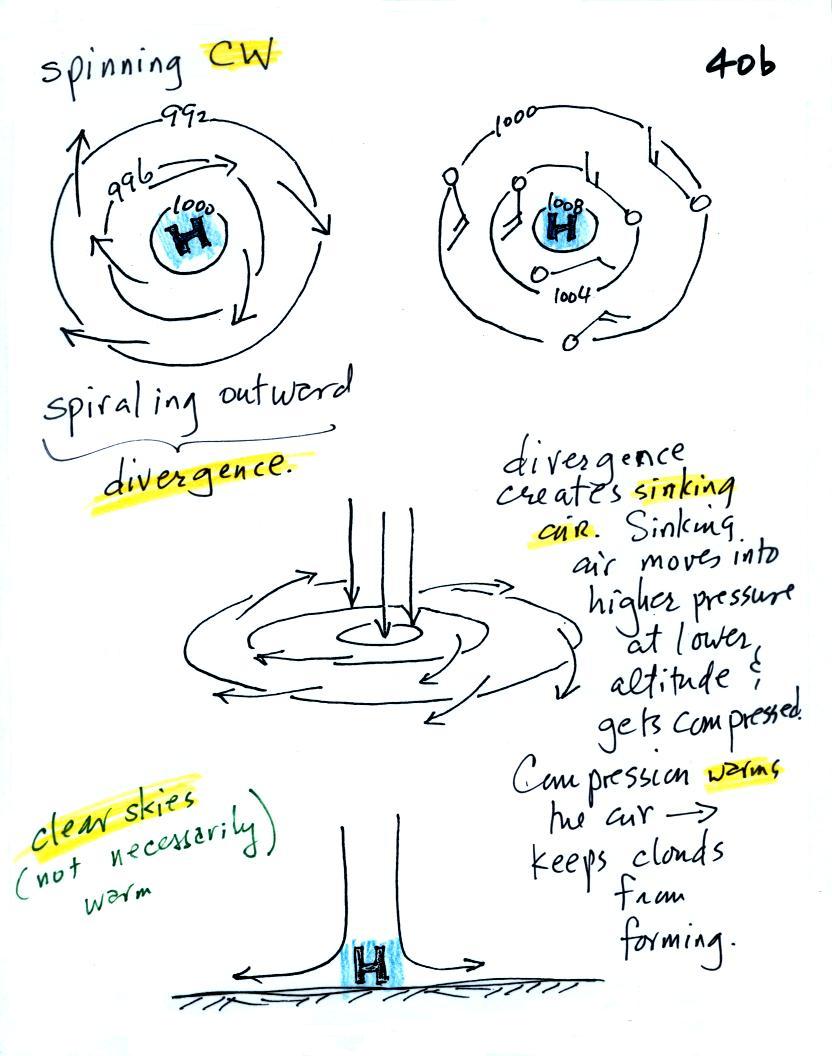
Everything is pretty much the exact opposite in the case
of surface high pressure.
Winds spin clockwise (counterclockwise in the southern
hemisphere) and spiral outward. The outward motion is called
divergence.
Air sinks in the center of surface high pressure to
replace the diverging air. The sinking air is compressed and
warms. This keeps clouds from forming so clear skies are
normally found with high pressure.
Clear skies doesn't necessarily mean warm weather, strong surface
high pressure often forms when the air is very cold.
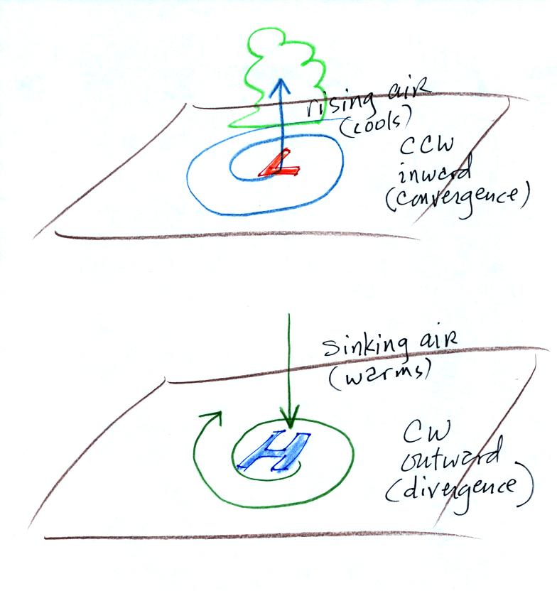
Here's a picture summarizing what we've learned so far.
It's a slightly different view of wind motions around surface
highs and low that tries to combine all the key features in as
simple a sketch as possible.
2.
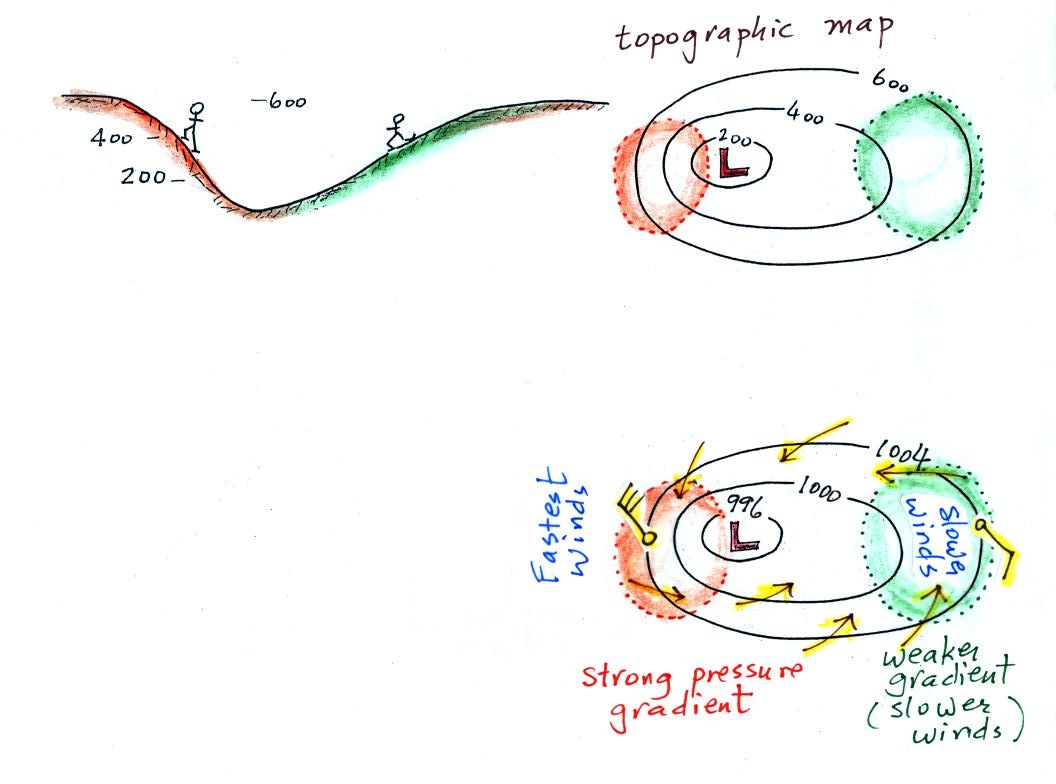
The pressure pattern will also tell you something about where
you might expect to find fast or slow winds. In this case
we look for regions where the isobars are either closely spaced
together or widely spaced. Portions of the two figures
that follow can be found on p. 40c in the ClassNotes.
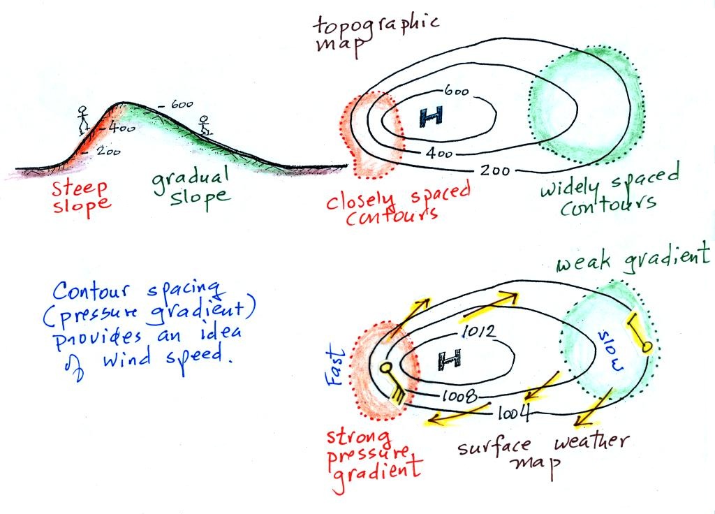
A picture of a hill is shown above at left. The maps at
upper right is a topographic map that depicts the hill (the
numbers on the contour lines are altitude). A center of
high pressure on a weather map, the figure at bottom left, could
have exactly the same appearance. The numbers on the
contours lines (isobars) would be pressure values in millibars.
Closely spaced contours on a topographic map indicate a steep
slope. More widely spaced contours mean the slope is more
gradual. If you stumble and fall while walking
on a hill, you will roll rapidly down a steep hillside, more
slowly down a gradual slope. You'd roll away from the
summit toward the outer edge of the topographic map.
On a weather map, closely spaced contours (isobars) means
pressure is changing rapidly with distance. This is known
as a strong pressure gradient and produces fast winds (a 30 knot
wind blowing from the SE is shown in the orange shaded region
above). Widely spaced isobars indicate a weaker pressure
gradient and the winds would be slower (the 10 knot wind blowing
from the NW in the figure).
The winds around a high pressure
center are shown above using both the station model notation and
arrows. The winds are spinning clockwise and spiraling outward
slightly (the outward motion away from high is analogous to the
hiker rolling downhill and away from the summit on a
hill). Note the different wind speeds (30 knots and 10
knots plotted using the station model notation). Fast
winds where to contours are close together and slower winds
where they are further apart.
Winds spin counterclockwise and
spiral inward around low pressure centers. The fastest
winds are again found where the pressure gradient is strongest.
Contour spacing
closely spaced isobars =
strong pressure gradient (big change in
pressure with distance) - fast winds
widely spaced isobars = weak pressure gradient
(small change in pressure with distance) - slow
winds
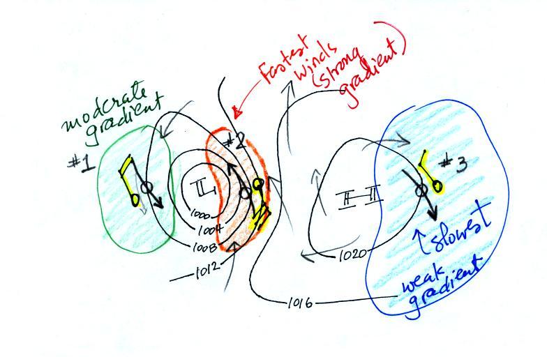
This figure is found at the bottom of p. 40 c in the
photocopied ClassNotes. You should be able to sketch in the
direction of the wind at each of the three points and determine
where the fastest and slowest winds would be found. (you'll find
the answer at the end of today's notes).
3.
The pressure pattern causes the wind to start to blow; the wind
then can affect and change the temperature pattern. The
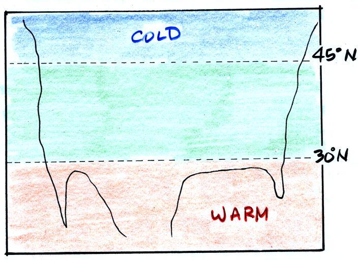
figure below shows the temperature pattern you would expect to see
if the wind wasn't blowing at all or if the wind was just blowing
straight from west to east. The bands of different
temperature are aligned parallel to the lines of latitude.
Temperature changes from south to north but not from west to
east.
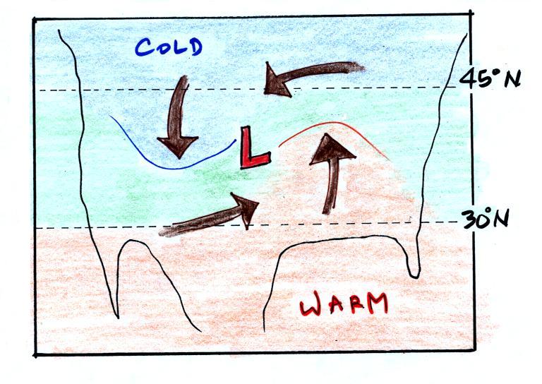
This picture gets a little more interesting if you put
centers of high or low pressure in the middle.
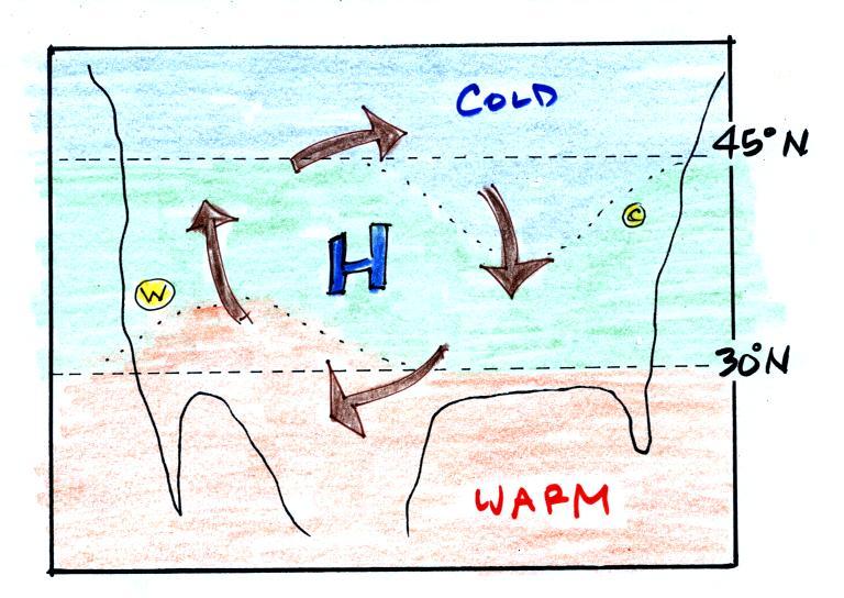
In the case of high pressure,
the clockwise spinning winds move warm air to the north on the
western side of the High. The front edge of this northward
moving air is shown with a dotted line (at Pt. W) in the picture
above. Cold air moves toward the south on the eastern side
of the High (another dotted line at Pt. C). The diverging
winds also move the warm and cold air away from the center of
the High. Now you would experience a change in temperature
if you traveled from west to east across the center of the
picture.
The transition from warm to cold along the boundaries (Pts. W
and C) is spread out over a fairly long distance and is
gradual. This is because the winds around high pressure
diverge and blow outward away from the center of high
pressure. There is also some mixing of the different
temperature air along the boundaries.
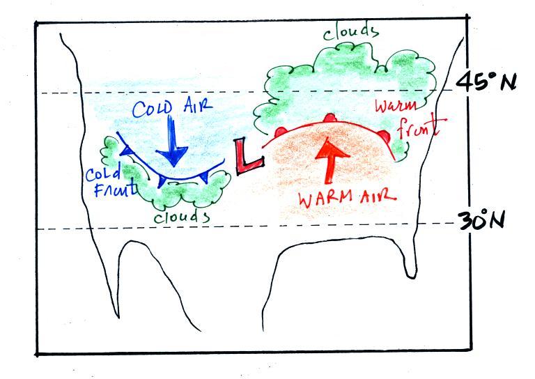
The converging winds in the case of low pressure will move the
air masses of different temperature in toward the center of low
pressure. The transition zone between different temperature
air gets squeezed and compressed. The change from warm to
cold occurs in a shorter distance and is sharper and more
distinct. Solid lines have been used to delineate the
boundaries above. These sharper and more abrupt boundaries are
called fronts.
A cold front is drawn at the front edge of the southward moving
mass of cold air on the west side of the Low. Cold fronts
are generally drawn in blue on a surface weather map. The
small triangular symbols on the side of the front identify it as a
cold front and show what direction it is moving.
A warm front (drawn in red with half circle symbols) is shown
on the right hand side of the map at front edge of the northward
moving mass of. A warm front is usually drawn in red and has
half circles on one side of the front to identify it and show its
direction of motion.
The fronts are like spokes on a wheel. The "spokes" will
spin counterclockwise around the low pressure center (the axle).
Both types of fronts cause rising air motions. Fronts are
another way of causing air to rise. Rising air expands and
cools. If the air is moist and cools enough, clouds can
form.
The storm system shown in the picture above (the Low together with
the fronts) is referred to a middle latitude storm or an
extra-tropical cyclone. Extra-tropical means outside the
tropics, cyclone means winds spinning around low pressure
(tornadoes are sometimes called cyclones, so are
hurricanes). These storms form at middle latitudes because
that is where air masses coming from the polar regions to the
north and the more tropical regions to the south can collide.
Large storms that form in the tropics (where this mostly just warm
air) are called tropical cyclones or, in our part of the world,
hurricanes.
Answers to the two questions embedded in today's notes are
shown below
Pressures lower than 1002 mb are colored purple. Pressures
between 1002 and 1004 mb are blue. Pressures between 1004
and 1006 mb are green and pressures greater than 1006 mb are
red. The isobar appearing in the question is highlighted
yellow and is the 1004 mb isobar. The 1002 mb and 1006 mb
isobars have also been drawn in (because isobars are drawn at 4 mb
intervals starting at 1000 mb, 1002 mb and 1006 mb isobars
wouldn't normally be drawn on a map)