Monday September 23
We'll be using page
39a, page 39b, page 39c, page 40a, page 40b, page 40c, page 40d,
(these are mostly pictures, we'll add some
written details in class)
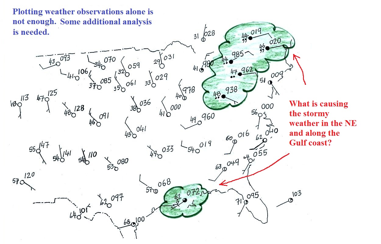
Surface weather map analyses
A bunch of weather data has been plotted (using the
station model notation) on the surface weather map in
the figure below (page
39a in the ClassNotes). A
couple of stormy regions have been circled in green.
Plotting the
surface weather data on a map is just the beginning. For
example you really can't tell what is causing the cloudy
weather with rain (the dot symbols are rain) and drizzle (the
comma symbols) in the NE portion of the map above or the rain
shower along the Gulf Coast. Some additional analysis is
needed.
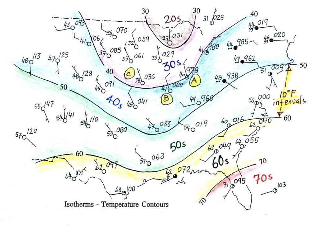
1st step in surface map
analysis: draw in some contour lines to reveal the large
scale pressure pattern
Pressure
contours = isobars
( note the word bar
is in millibar, barometer, and now isobar ,
they all have something to do with pressure)
Temperature contours = isotherms
A meteorologist would usually begin by
drawing some contour lines of pressure (isobars) to map
out the large scale pressure pattern. We will look
first at contour lines of temperature, they are a little
easier to understand (the plotted data is easier to decode
and temperature varies across the country in a more
predictable way).
Isotherms
Isotherms, temperature contour
lines, are usually drawn at 10o F intervals. They do two things:
isotherms (1) connect points on the map with the same
temperature
(2)
separate regions warmer
than a particular temperature
from regions colder
than a particular temperature
The 40o F isotherm
above passes through a city which is reporting a temperature of
exactly 40o (Point A).
Mostly it goes between pairs of cities: one with a temperature
warmer than 40o (41o at
Point B) and the other colder than 40o (38o
F at Point C). The temperature pattern is also
somewhat more predictable than the pressure pattern: temperatures
generally decrease with increasing latitude: warmest temperatures
are usually in the south, colder temperatures in the north.
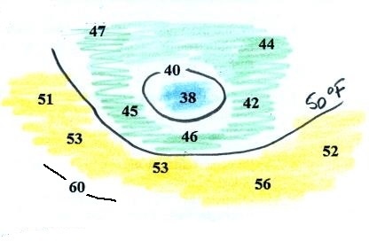
Here's another example starting with just a bunch of temperature
numbers (you'll find this figure on the in-class Optional
Assignment)
Our "job" is to try to make some sense of this data. To
do that we'll draw in 2 or 3 isotherms (40 F, 50 F isotherms and
maybe a small segment of a 60 F isotherm). Colors can help
you do this.
There is one temperature below 40 it has
been colored blue, temperatures
between 40 and 50 are green and temperatures in the
50s are colored yellow. It
should be pretty clear where the isotherms should go.
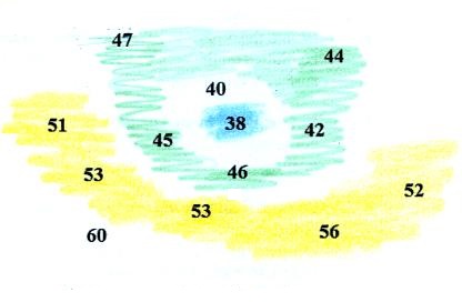
The isotherms have been drawn in at right; not how the
isotherms separate the colored bands. Note how the 40 F
isotherm goes through the 40 on the map. There is one city
with a temperature of exactly 60 F so a little piece of a 60 F
isotherm is drawn through that city.
Isobars
These are a little harder to draw because you have to
be able to decode the pressure data
isobars (1) connect points on the map with equal pressure
(2) separate regions of high pressure from regions with lower pressure
and
identify and locate centers of high and low pressure
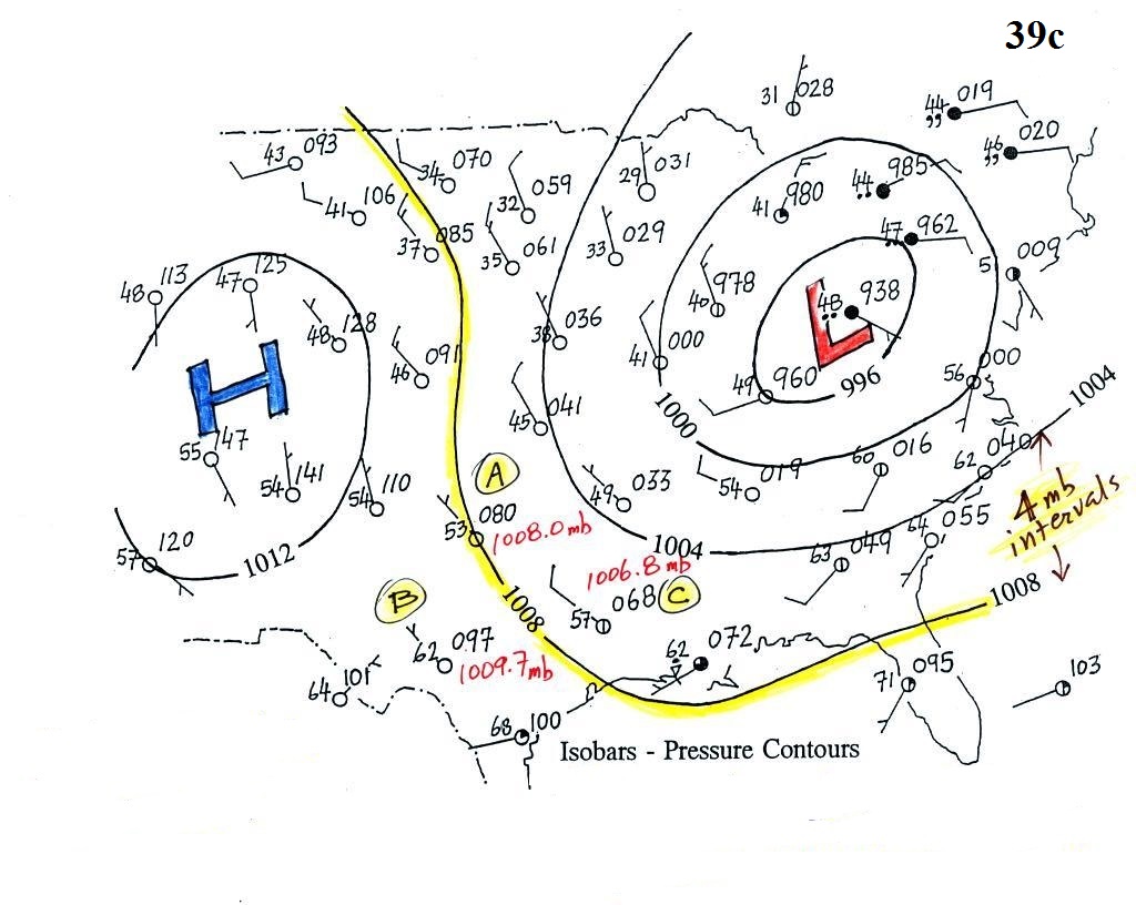
Here's the same weather map with isobars drawn in.
Isobars are generally drawn at 4 mb intervals (above and below a
starting value of 1000 mb).
The 1008 mb isobar (highlighted in yellow) passes through a city
at Point A where the
pressure is exactly 1008.0 mb. Most of the time the isobar
will pass between two cities. The 1008 mb isobar passes
between cities with pressures of 1009.7 mb at Point B and 1006.8 mb at Point C. You would
expect to find 1008 mb somewhere in between those two cites, that
is where the 1008 mb isobar goes.
The isobars separate regions of high and low pressure.
The pressure pattern is not as predictable as the isotherm
map. Low pressure is found on the eastern half of this map
and high pressure in the west. The pattern could just as
easily have been reversed.
This
site (from the American Meteorological Society) first shows
surface weather observations by themselves (plotted using the
station model notation) and then an analysis of the surface data
like what we've just looked at. There are links below each
of the maps that will show you current surface weather data.
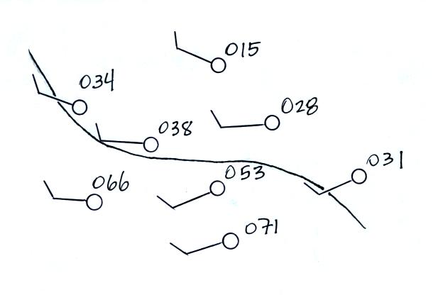
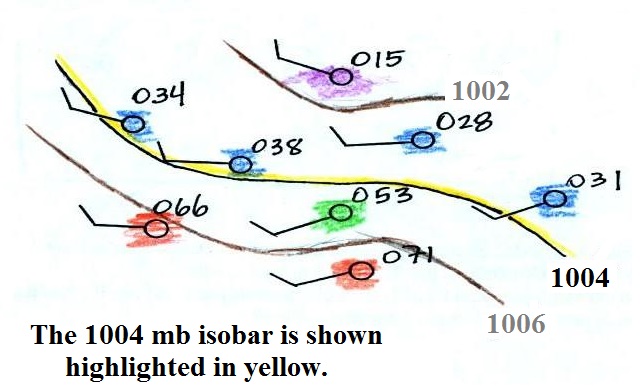
Here's a little practice
A single isobar is shown. Is it the 1000, 1002, 1004, 1006,
or 1008 mb isobar? You'll need to decode the pressure data (add
either a 9 or 10 and a decimal point). You'll find the
answer at the end of today's notes.
What can you begin to learn about the weather once you've draw
isobars on a surface weather map and revealed the pressure
pattern?
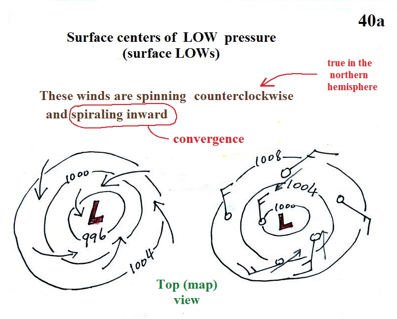
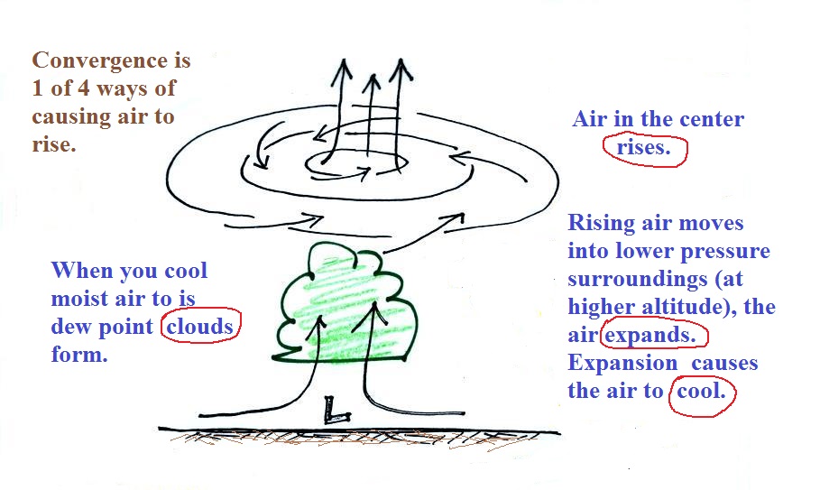
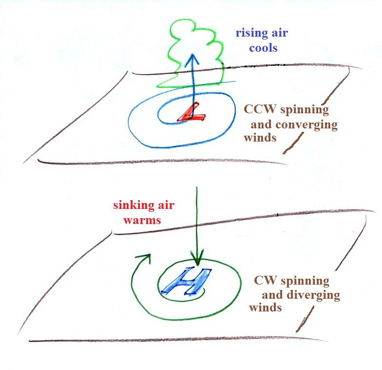
1a. Surface centers of low pressure
We'll start with the large nearly circular centers of High and
Low pressure. Low pressure is drawn below. These
figures are more neatly drawn versions of what we did in class.
Air will start moving toward low
pressure (like a rock sitting on a hillside that starts to roll
downhill), then something called the Coriolis force will cause
the wind to start to spin (don't worry about the Coriolis force
at this point, we'll learn more about it later in the semester).
In the northern hemisphere winds spin in a counterclockwise
(CCW) direction around surface low pressure centers. The
winds also spiral inward toward the center of the low, this is
called convergence. [winds spin clockwise around low
pressure centers in the southern hemisphere but still spiral
inward, we won't worry about the southern hemisphere until later
in the semester]
When the converging air reaches the center of the low it starts to
rise.
Convergence
causes air to rise (1 of 4 ways)
rising
air e-x-p-a-n-d-s
(it moves into lower pressure surroundings at
higher altitude)
The expansion causes the air to cool
If you cool moist air enough
(to or below its dew point temperature) clouds can form
Convergence
is 1 of 4 ways of causing air to rise (we'll learn
what the rest are soon, and, actually, you already know what
one of them is - warm air rises, that's called convection). You often see
cloudy skies and stormy weather associated with surface low
pressure.
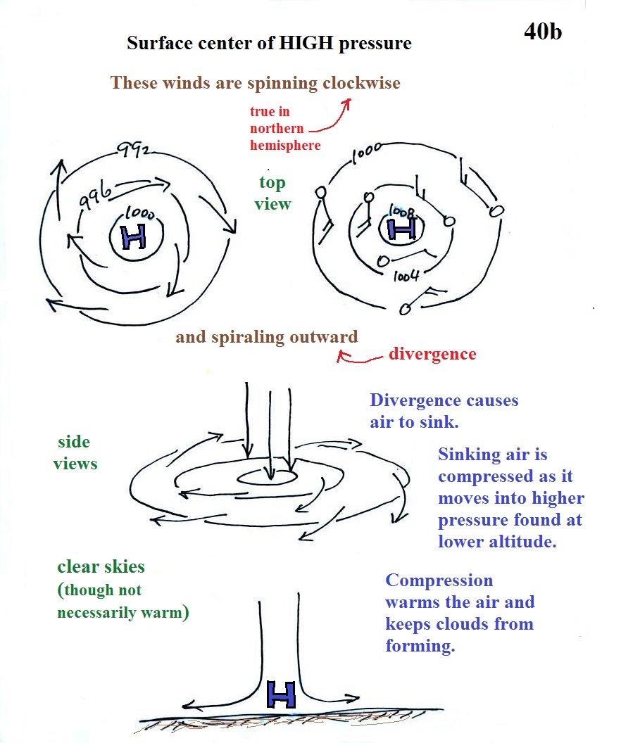
1b. Surface centers of high
pressure
Everything is pretty much the exact
opposite in the case of surface high pressure.
Winds spin clockwise (counterclockwise in the
southern hemisphere) and spiral outward. The outward
motion is called divergence.
Air sinks in the center of surface high pressure to
replace the diverging air. The sinking air is compressed
and warms. This keeps clouds from forming so clear skies
are normally found with high pressure.
Clear skies doesn't necessarily mean warm weather, strong
surface high pressure often forms when the air is very
cold.
Divergence causes air to sink
sinking air is compressed and warms
warming air keeps clouds from forming - clear
skies
Here's a picture summarizing what we've
learned so far. It's a slightly different view of wind
motions around surface highs and low that tries to combine all
the key features in as simple a sketch as possible.
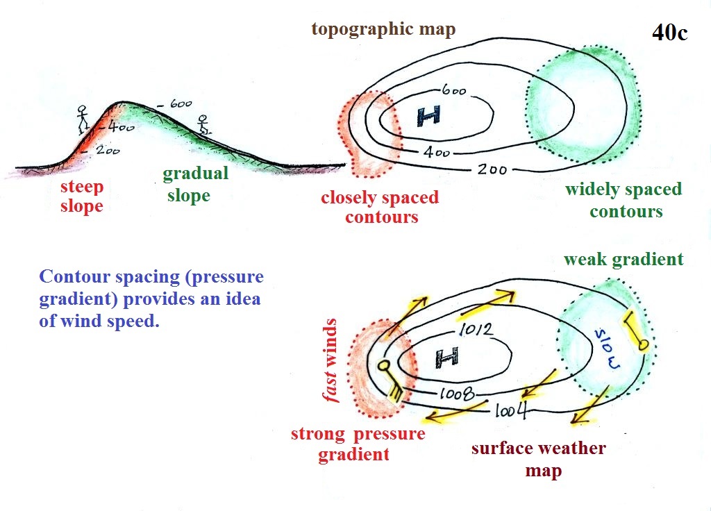
2. Strong and weak
pressure gradients - fast or slow winds
The pressure pattern will also tell you something about
where you might expect to find fast or slow winds. In this
case we look for regions where the isobars are either closely
spaced together or widely spaced. I handed out a
replacement for p. 40c in the ClassNotes (don't throw p. 40c
away).
A picture of a hill is shown above at left. The map at
upper right is a topographic map that depicts the hill
(the numbers on the contour lines are altitudes). A center
of high pressure on a weather map, the figure at the
bottom, has the same overall appearance. The numbers on
the contours are different. These are contours (isobars)
of pressure values in millibars.
Closely spaced contours on a topographic map indicate a steep
slope. More widely spaced contours mean the slope is more
gradual. If you roll a rock downhill on a
steep slope it will roll more quickly than if it is on a gradual
slope. A rock will always roll downhill, away from the
summit in this case toward the outer edge of the topographic
map. Air will always start to move toward low pressure
On a weather map, closely spaced contours (isobars) means
pressure is changing rapidly with distance. This is known
as a strong pressure gradient and produces fast winds (a 30 knot
wind blowing from the SE is shown in the orange shaded region
above). Widely spaced isobars indicate a weaker pressure
gradient and the winds would be slower (the 10 knot wind blowing
from the NW in the figure).
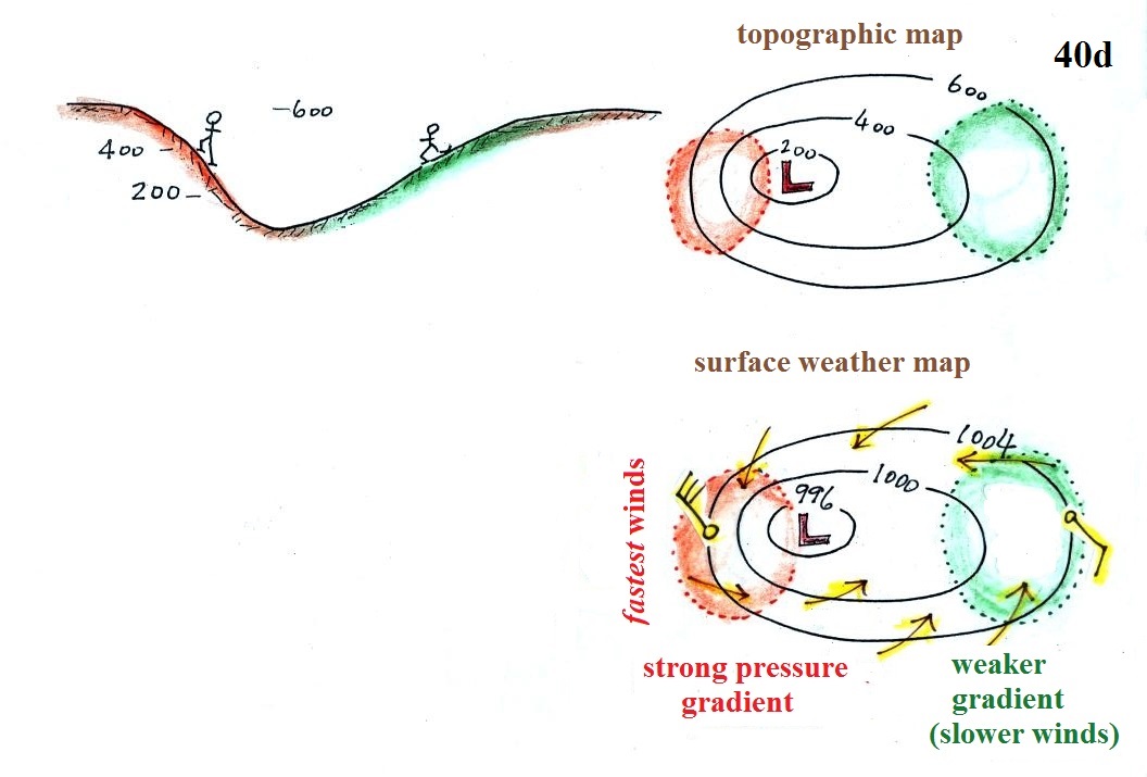
Winds spin counterclockwise and spiral inward around low
pressure centers. The fastest winds are again found where
the contour lines are close together and the pressure gradient
is strongest.
The following figure is on the in-class Optional Assignment.
Contour spacing
closely
spaced isobars = strong pressure gradient
(big change in pressure with distance) - fast
winds
widely spaced isobars = weak
pressure gradient (small change in
pressure with distance) - slow winds
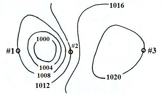
You should be able to sketch in the
direction of the wind at each of the three points and
determine where the fastest and slowest winds would be found.
(you'll find the answer at the end of today's notes).
Once you know which directions the winds are blowing you
should be able to say whether the air at each of the points
would be warmer or colder than normal.
Temperature patterns and fronts
The
pressure pattern causes the wind to start to blow; the wind
can then affect and change the temperature pattern.
The figure below shows the temperature pattern you would
expect to see if the wind wasn't blowing at all or if the wind
was just blowing straight from west to east. The bands
of different temperature are aligned parallel to the lines of
latitude. Temperature changes when moving from south to
north but not moving from west to east.

This picture gets a little more interesting if you place a
center of high or low pressure in the middle.
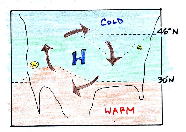
In the case of high pressure,
the clockwise spinning winds move warm air to the north on the
western side of the High. The front edge of this
northward moving air is shown with a dotted line (at Pt. W) in
the picture above. Cold air moves toward the south on
the eastern side of the High (another dotted line at Pt. C,
it's a little hard to distinguish between the blue and green
in the picture). The diverging winds also move the warm
and cold air away from the center of the High. Now you
would experience a change in temperature if you traveled from
west to east across the center of the picture.
The transition from warm to cold along the boundaries (Pts.
W and C) is spread out over a fairly long distance and is
gradual. This is because the winds around high pressure
diverge and blow outward away from the center of high
pressure. There is also some mixing of the different
temperature air along the boundaries.
Now we'll replace the H pressure center with a L pressure
center.
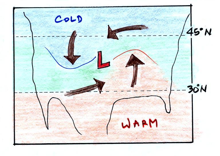
Counterclockwise winds move cold air toward the south on the
west side of the Low. Warm air advances toward the north
on the eastern side of the low. This is just the opposite
of what we saw with high pressure.
There's another difference - converging winds in the case of
low pressure will move the air masses of different temperature
in toward the center of low pressure. The transition zone
between different temperature air gets squeezed and
compressed. The change from warm to cold occurs in a
shorter distance and is sharper and more distinct. Solid
lines have been used to delineate the boundaries above. These
sharper and more abrupt boundaries are called fronts.
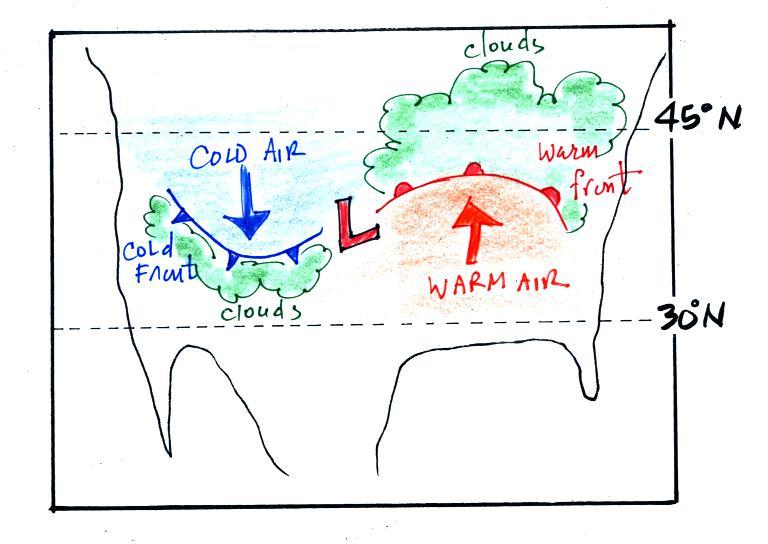
Warm and cold fronts, middle latitude storms (aka
extratropical cyclones)
A cold front is drawn at the front edge of the southward moving
mass of cold air on the west side of the Low. Cold fronts
are generally drawn in blue on a surface weather map. The
small triangular symbols on the side of the front identify it as a
cold front and show what direction it is moving.
A warm front (drawn in red with half circle symbols) is shown
on the right hand side of the map at front edge of the northward
moving mass of. A warm front is usually drawn in red and has
half circles on one side of the front to identify it and show its
direction of motion.
The fronts are like spokes on a wheel. The "spokes"
will spin counterclockwise around the low pressure center (the
axle).
Both types of fronts cause rising air motions.
Fronts are another way of causing air to rise. That's
important because rising air expands and cools. If the air
is moist and cools enough, clouds can form.
The storm system shown in the picture above (the Low together with
the fronts) is referred to a middle latitude storm or an
extra-tropical cyclone. Extra-tropical means outside the
tropics, cyclone means winds spinning around low pressure
(tornadoes are sometimes called cyclones, so are
hurricanes). These storms form at middle latitudes because
that is where air masses coming from the polar regions to the
north and the more tropical regions to the south can collide.
Large storms that form in the tropics (where this mostly just warm
air) are called tropical cyclones or, in our part of the world,
hurricanes.
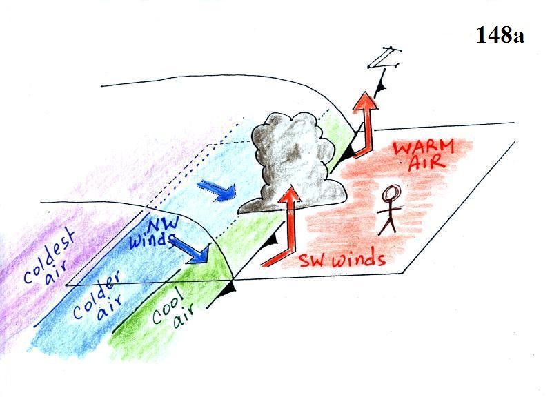
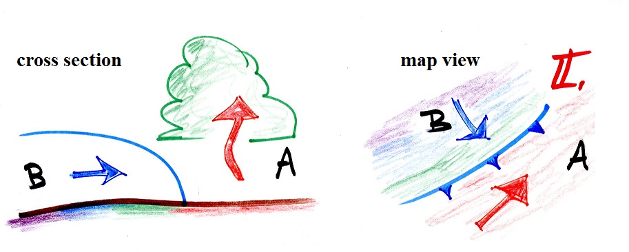
3-dimensional structure of cold fronts
A
3-dimensional cross-sectional view of a cold front is
shown below. We've jumped to page
148a in the online version of the ClassNotes.
The person in the
figure is positioned ahead of an approaching
cold front. Time wise, it might be the day before
the front actually passes through. There
are 3 fairly important features to notice in this
picture.
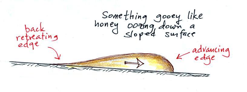
1. The
front edge of the approaching air mass has a
blunt, rounded shape. A vertical slice
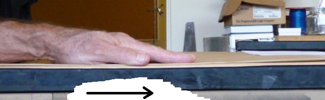
through a cold front is shown below at left.
Friction with
the ground causes the edge to "bunch up" and gives
it the blunt shape it has. You'd see
something similar if you were to pour something
thick and gooey on an inclined surface and watched
it roll downhill. Or, as
shown in class, you can lay your arm and hand on a
flat surface.
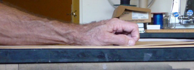
Slide your arm to the right.
Your fingers
will drag on the table surface and will curl up
and your hand will make a fist.
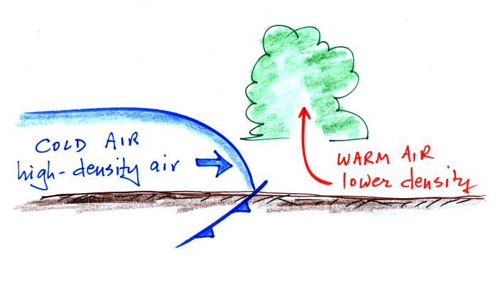
2. A cold front, the leading edge
of a cold air mass is kind of like a fist slamming into a
bunch of warmer air. Because it is denser, the cold
air lifts the warm air out of the way.
The cold dense air mass behind a cold
front moves into a region occupied by warm air. The
warm air has lower density and will be displaced by the
cold air mass. In some ways its analogous to a big
heavy Cadillac plowing into a bunch of Volkswagens.
At this point, just 15 to 20 minutes into today's class, we're in
a position to better appreciate a video recording of the cold
front passing through Tucson. The first video is a time
lapse movie of a cold front that came through Tucson on on Easter
Sunday morning, April 4, 1999. Click here
to see the cold front video (it may take a minute or two to
transfer the data from the server computer in the Atmospheric
Sciences Dept., be patient). Remember this is a time
lapse movie of the frontal passage. The front seems to
race through Tucson in the video, it wasn't moving as fast as the
video might lead you to believe. Cold fronts typically move
15 to 25 MPH.
The 2nd
video was another cold front passage that occurred on
February 12, 2012.
In the past I've had trouble playing the videos using Firefox
on the classroom computer. If that is the
case, you can right click on each link, then click on the Save
Link As... option, and choose to save to the Desktop.
Then double click on the icon on your desktop to view the
video. If you use
Chrome or Internet Explorer you should be able to watch the
videos.
3. Note
the cool, cold, colder bands of air behind
the cold front.
The warm air
mass ahead of the front has just been sitting
there and temperatures are pretty uniform
throughout. Cold fronts are found at the
leading edge of a cold air mass. The air
behind the front might have originated in
Canada. It might have started out very cold
but as it travels to a place like Arizona it can
change (warm) considerably. The air right
behind the front will have traveled the furthest
and warmed the most. That's the reason for
the cool,
cold,
and colder
temperature bands (temperature gradient) behind
the front. The really cold air behind a cold
front might not arrive in Arizona until 1 or 2
days after the passage of the front.
Weather
changes that precede and follow passage of
a cold front
Here are some of the specific weather changes
that might precede and follow a cold
front.
Weather
variable
|
Behind
|
Passing
|
Ahead
|
Temperature
|
cool, cold,
colder*
|
|
warm
|
Dew
Point
|
usually much
drier**
|
|
may be moist
(though that is often
not the case here in the desert southwest)
|
Winds
|
northwest
|
gusty winds (dusty)
|
from the southwest
|
Clouds,
Weather
|
clearing
|
rain clouds,
thunderstorms
in a narrow band along the front
(if the warm air mass is moist)
|
might see some high
clouds
|
Pressure
|
rising
|
reaches a minimum
|
falling
|
* as mentioned
above, the coldest air might follow passage of a cold front by
a day or two.
**nighttime temperatures drop much more quickly in dry air
than in moist or cloudy air. This is part of the reason
it can get very cold a day or two after passage of a cold
front.
Gusty winds and a shift in wind direction are often one of the
most obvious change associated with the passage of a cold
front in Tucson.
The pressure changes that precede and follow a cold front are
not something we would observe or feel but are very useful
when trying to locate a front on a weather map.
Answers
To a couple questions embedded in the today's notes.
The isobar in the earlier figure is the 1004 mb contour.
It separates pressures less than 1004 mb (colored blue and violet)
from pressures greater than 1004 (green and orange). The
1002 mb and 1006 mb isobars have also been drawn in (isobars are
normally drawn at 4 mb intervals, so the 1002 mb and 1006 mb
contours wouldn't normally be included).
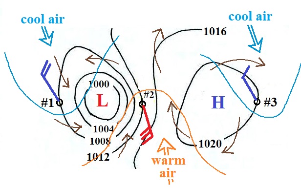
First the Low and High pressure centers
have been labeled. The brown arrows show the winds
blowing counterclockwise and inward around the Low, clockwise
and outward around the High. Winds are shown using the
station model notation at Points #1, #2, and #3 so that an
idea of wind speed could be included. The isobars are
most tightly spaced (strong pressure gradient) at Point
#3. That's where the fast winds are shown. The
wind at Point #2 is coming from the south, that's where the
warmest air would most likely be found. Colder winds
coming from the NW are found at Points #1 and #3.