![]()
![]()
![]()
![]()
We will now take a look at the global average surface temperature record since 1850. This record is constructed from actual measurements and thus can be considered more accurate than the proxy reconstructions we previously studied. However, there are issues with the measured temperature record that make it uncertain as well and you will sometimes see spirited debates about the details of the recent temperature record constructed from measurements. Several of these issues will be mentioned in the next couple of paragraphs, however, we will not go into the specific details of the arguments about possible errors in the recent temperature record.
Ideally, we would like to have accurate thermometers whose measurement characteristics do not change with time and which remain in the same location and surrounding environment for a long period of time. This would allow us to measure real changes in temperature without influence from changes in the instrument or the local environment. Unfortunately, this is not generally the case. At most observing locations, the instrumentation is changed over time and adjustments must be made to account for differences in how different thermometers measure temperature. For many observing locations, urbanization (city building) has happened around the measuring site. Urban areas are generally warmer than nearby rural areas because many of the building materials effectively retain heat better than the natural land surface and also due to the heat generated within cities. This urban heat island effect can look like a real warming (or increase in temperature over time) unless adjustments are made to remove the effect. In fact any change in the local environment around a thermometer location needs to be considered, even something as simple as putting up new buildings or installing an air conditioner near the thermometer. In many cases, the actual location of the thermometer was moved (say within the same city) and corrections for things like changes in the altitude of the location must be made.
Another set of issues have to do with the geography of the available thermometer locations. Ideally we would sample the entire globe evenly since we want to measure changes in global average temperature. In actuality, there is a dense network of measurements in a few developed areas on Earth and rather sparse coverage over unpopulated land areas and oceans. Thus, adjustments must also be made to properly represent the global average from this observing network. In places where there is only sparse coverage of observations, it can be difficult to determine the true average temperature over a large region from just a few observations.
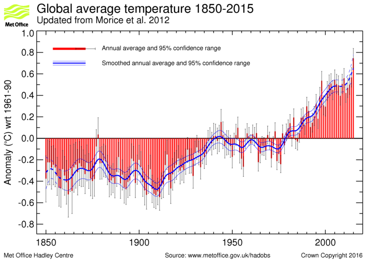
The figure below shows one reconstruction of the changes in global average temperature based on physical measurements from the UK Met Office Hadley Center. According to the figure, the global average surface temperatures on Earth have risen by about 0.9°C (1.6°F) since 1850. The red bars indicate the global average temperature each year relative to the average temperature over the period 1961-1990. Thus, the plot shows the difference in temperature between each individual year and the 1961-1990 average. The blue line is a smoothed version of the plot drawn to highlight trends in temperature. Even though there is some uncertainty in determining global average temperatures from the available measurements due to instrumental errors, changes in instrumentation over the record, changes in the local environment surrounding the thermometers, and the fact that measurements are quite sparse over some areas of the world, even the most conservative estimates indicate that the surface temperature has risen at least 0.5°C (0.9°F) since 1850.
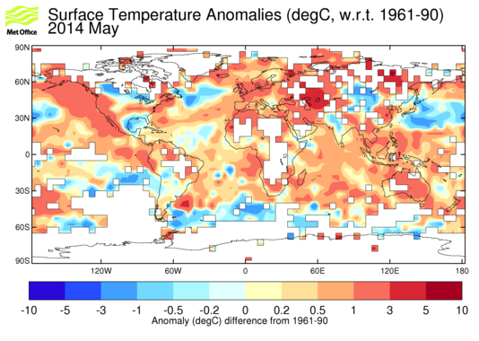
While there are arguments about how much global average temperature has increased over the period of the instrumental record, most everyone agrees that global average temperature has increased. One more point to make in this section. While we often talk in terms of global average temperature changes, keep in mind that there will be variation in the temperature changes at regional scales and over seasonal and yearly timescales at a particular location. It is important to understand this when considering the potential impacts of the temperature changes. As an example, the figure below shows the temperature differences for the month of May 2014 compared to the 1961-1990 average temperature. Even though the average global temperature for 2014 was about 0.57°C higher than the 1961-1990 average, note that some regions of the world showed much larger warm anomalies (greater than 5°C in some areas), while other regions actually had lower than aveage temperatures (by more than 3°C in some areas) for May 2014. This shows that even if the global average temperature goes up, there is quite a bit of variability expected at regional spatial scales. Thus, it would be incorrect to argue that global warming is not happening because there are small regions that show cooling. Also notice that there are large areas of the surface where there were not sufficient observations to estimate the change in temperature that are shown as white in the figure, which indicates one of the sampling problem with measuring and determining changes in global average temperature.
We need to consider the question: Is the recently measured warming of global average surface temperature mostly caused by the increasing amounts of greenhouse gases in the atmosphere, or is it mostly part of a natural cycle? The current climate today is is dependent on both factors and it is basically impossible to separate the effects as they are interlinked. It would be very nice to know what Earth's climate would be today without anthropogenic greenhouse emissions, but we will never really know.
According to climate models the warming is largely due to the additional greenhouse gases. If greenhouse gas concentrations are left fixed at pre-industrial levels, the models show little if any warming during the twentieth century and beyond, while the same models do predict warming when they include the observed increases in greenhouse gases. Some of the fundamental problems with climate models have previously been discussed. There are also concerns about the ability of the models to properly simulate the observed temperature changes since 1900. In particular, climate models are unable to reconstruct the irregular pattern of the observed warming since 1860.
The irregular warming from 1850 though today has been used by opponents of athropogenic global warming (those who do not think the recent warming has much to do with human-added greenhouse gases) as evidence that natural climate fluctuations dominate over the effects caused by increased greenhouse gases. We will consider arguments based on the temperature changes for several specific time periods.
There was a rather sharp warming trend that occurred from 1910 to 1940. This warming is too rapid and too large to be explained by the rather small increases in greenhouse gas concentrations that occurred up until the year 1940. In other words, this warming period was most likely a natural change in global average temperature and not caused by increases in greenhouse gases. There just were not enough emissions of greenhouse gases during this period to explain the warming. Thus, the 1910 to 1940 warming actually argues against changes in greenhouse gases being the most important factor for changes in global average temperature.
The global average temperature cooled slightly during this period even though greenhouse gas concentrations continued to increase. This again argues against the assertation that changes in global average temperature are dominated by changes in greenhouse gas concentatration.
Proponents of global warming caused by greenhouse gas increases contend that even during the general warming trend expected as greenhouse gases increases, there will be fluctuations (natural variability) along the way. They also claim that the cooling period from 1940-1970s can be explained by high aerosol concentrations in the atmosphere during this period related to "dirty" coal burning. Coal contains sulfur and when it is burned sulfur dioxide gas is released. The sulfur dioxide undergoes a gas to particle conversion to become a sulfate aerosol. Sulfate aerosols cool the Earth's surface because they reflect some of the incoming radiation from the sun toward outer space. Sulfate aerosols also dissolve in raindrops forming a solution of sulfuric acid known as acid rain. Acid rain is quite damaging to natural lakes and forests and accelerates the decay of some building materials including culturally important statues. Prior to 1980 the US and Europe engaged in "dirty" coal burning, resulting in high amounts of sulfate aerosols, which may have acted as a cooling influence on global average temperature. After 1980 regulations were put in place to reduce acid rain and we started cleaning up our coal burning operations by reducing the amount of sulfur dioxide gas released. This reduced the amount of sulfate aerosols in the atmosphere after 1980 and according to this explanation, once the aerosols cleared, we started to again see global warming caused by increasing greenhouse gases.
While this explanation for the "unexpected" cooling that took place from about 1940 through 1980 seems plausible, it is difficult to believe that most of the recent changes in global average temperature are mainly due to increases in greenhouse gases and changes in sulfate aerosols. Similar cooling and warming periods are seen all throughout history regardless of human acitivity. Additionally, even though the western world cleaned up its coal burning after 1980, new coal fired power plants continue to be built throughout China and other parts of the developing world. The increase in sulfate aerosols produced by the developing world probably more than makes up for the reductions in the western world. By the way the cooling during the period 1940-1980 is "unexpected" only if you believe that recent changes in global average temperature are dominated by increases in greenhouse gases. If you believe that natural fluctuations in temperature are dominating over human factors, then the cooling period is not unexpected. Finally, the acid rain issue provides another example of a large-scale environmental problem that was improved through regulation (at least in the western world), similar to the international agreements to eliminate production of ozone destroying CFCs. In the case of acid rain, cause and effect was easily established and it was relatively easy to reduce sulfur emissions by burning low sulfur coal or scrubbing the emissions. This is different from the global warming issue where we do not have a clear cause and effect relationship and we have no current substitute to using fossil fuels to meet the current energy demands of the world.
The warming (increase in global average temperature) from 1980 through about 2002 is more consistent with the theory that recent temperature changes are largely the result the increasing greenhouse gases. During this period, the global average temperature was increasing sharply, coninciding with large increases in the amount of greenhouse gases in the atmosphere. Keep in mind this correlation does not prove cause and effect, and this is not proof that increasing greenhouse gases have been responsible for most of the warming. This warming period could just be a natural warming period similar to past warming periods and just happens to coincide with a period with increasing greenhouse gas concentrations. Just as the previous cooling period does not prove that increased greenhouse gases do not lead to global warming, this warming period does not in itself prove that this temperature increase was mostly the result of the rapidly increasing greenhouse gases.
Based on the historical temperature record, some claim that the warming since 1980 appears to be the fastest rate of increase over the last 10,000 years, but we cannot prove that since we would be unable to resolve all short term temperature variations that have occurred over the last 10,000 years. In other words, because we cannot resolve year to year variations in global average temperature from proxy records, temperature reconstructions based on proxy records are a "smoothed" version of the real temperature changes. Also, note in the global average temperature reconstruction shown above that the rate of increase in global average temperature between 1910 and 1940 is not that much different from the rate of warming between 1980 and 2002. Thus, it is difficult to conclude that the rate of temperature increase today is faster than any other time in the last 10,000 years.
Note also that even though the rate of warming slowed considerably at the start of the 2000s, the global average temperature has remained relatively warm. In fact the 15 warmest years in the measured temperature record have all happened since 1998. For many, this is convincing evidence that the recent temperature increases are not simply part of some natural cycle, and must be due to human activity, caused by increasing greenhouse gas concentrations in the atmosphere. While this is compelling, the connection cannot be scientifically proven.
![[Satellite Temperature from UAH]](UAH_LT_1979_thru_September_2016_v6.png)
|
| Global average lower tropospheric temperature anomaly relative to the 1981 to 2010 average based on satellite observations. There is a blue data circle for each month, while the red circle is a smoothed version of the monthly points, which is drawn to highlight trends. |
During the period from about 2002 to at least 2013, there was no statistically significant increase in global average temperature. Some have called this period "the pause" in global warming. The "pause" from 2002 to 2013 can be clearly seen in the plot above, which shows changes in global average temperature as derived from satellite observations from space. In one sense, global average temperature did not increase during this period, which argues against the theory that recent changes in temperature can be mostly explained by changes in greenhouse gases, since we know greenhouse gases have increased during this period. However, this period was the warmest 12 year period in the record (prior to 2015) and it coincided with the highest concentrations of greenhouse gases in the atmosphere, so in that sense it does support the connection between higher global average temperature and higher amounts of greenhouse gases in the atmosphere. "The pause" could simply have been a near balance between what might have been a natural cooling period without anthropogenic greenhouse gas emissions and the warming influence of increased greenhouse gases. It will be interesting to see if the global average temperature is beginning a new period of rapid warming starting with the warm year of 2015.
The plot at the top of this page shows that 2015 was easily the warmest year in terms of global average temperature since 1850. In fact it was about 0.18°C warmer than any other year. 2015 was also the first year that the global average surface temperature was significantly higher than it was in the year 1998 (based on the global average temperatures reported by the Hadley Centre). The monthly satellite-derived temperature during late 2015 and early 2016 also reached values that were 0.1°C higher than the previous high temperature anomalies in 1998 as shown in the plot above. In fact the the highest month was February 2016 in the satellite data. Current indications are that the year 2016 may actually turn out slightly warmer than 2015. The current warmest year on record coincides with the highest levels of greenhouse gases in the atmosphere for at least thousands of years. However, it is likely that the high global average temperature over the last two years is largely influenced by the strong El Nino event of 2015. Unfortunately, we do not have the time to go through a description of El Nino / La Nina and its associated influence on surface temperature, but we will make comparisons with recent events.
Typically, the global average surface temperature spikes upward during a strong El Nino event. A good example is the year 1998 as can be seen in the plot above. There was a weaker El Nino in 2010. It is also common for a rapid transition to a strong La Nina in the following year with an associated drop in global average surface temperature. The plot above has a good example of this as well as it shows a big drop in global average temperature from 1998 to 1999. However, every El Nino event is different, and we will have to wait and see how global average temperature changes after this year. Will the temperature remain warm, which may signal a return to rapid warming? Will the temperature fall rapidly next year, which may signal "the pause" is not over?
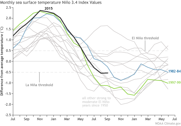
If you are interested in reading more about this issue, you may be interested to read (this is not required at all), COLUMN: How much clarity do we have on transition to La Niña?" by Karen Braun and published by Reuters. The purpose of the article is to discuss the possible impacts of El Nino / La Nina transitions on commodity markets, so it is not overly technical. The article contains a very interesting figure showing analogue El Nino years, showing that as of March 2016, this El Nino was similar to the 1998 El Nino, which hints that next year (2017) may be cooler in terms of global average temperature. The number plotted is Nino 3.4 Index, which is based on sea surface temperatures in the Pacific Ocean and is used to identify El Nino and La Nina conditions. Here is a link to an updated figure from NOAA showing analogue El Nino years through September 2016. This figure indicates the thresholds for El Nino and La Nina conditions based on the Nino 3.4 Index. It shows that the 2015 El Nino is no longer transitioning as quickly to La Nina conditions as happened in the 1998 El Nino. In terms of global average temperature, this could mean that the temperature will be slower to cool than previously thought. Again, we will just have to wait and see what happens as all El Ninos are different.
If we go back 800 years to the Medieval warm period (or Little Climatic Optimum), the global average temperature during this period may have been close to (or perhaps slightly colder or warmer) than today. If we go back 6,000 years to the Holocene Optimum, global average temperature was most likely warmer than it is today. Although it is uncertain to compare the absolute global average temperature today with what it was hundreds of thousands of years ago, it is very likely that today is not the warmest period in the Holocene Epoch, which is the current interglacial period following the last true Ice Age. There are some who simply argue that the Earth was warmer in the recent past and life thrived, so why should we be concerned about the current global average temperature?
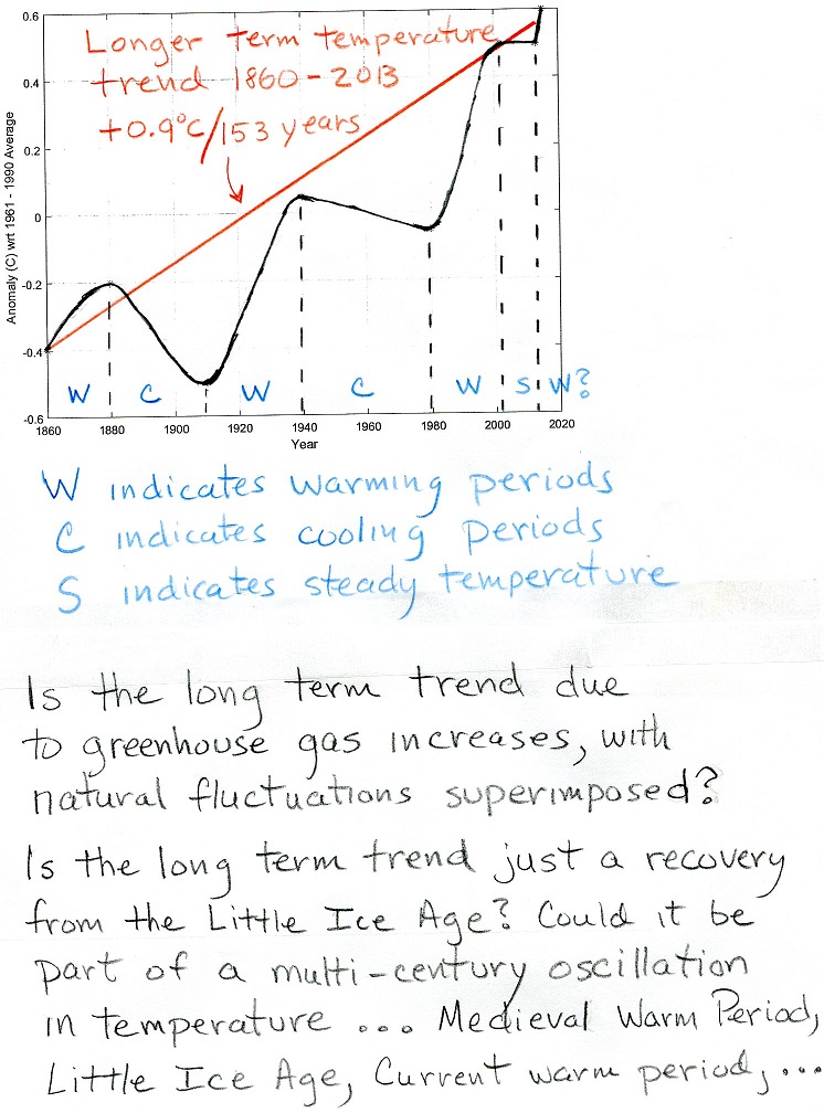
On the other hand, after about three decades of warming (or steady) global average temperature (1980 to 2015), it is possible that the Earth could enter another multi-decadal period of cooling global average temperature. There is evidence for a multi-decadal oscillations in global warming and global cooling since 1860 as indicated in the figure and discussion of the observed changes global average surface temperature presented above. In fact, several multi-decadal natural oscillations have been identified in climate records. For example the Pacific Decadal Oscillation (PDO) contains identifiable warm and cold phases in sea surface temperature in the north Pacific Ocean (a similar North Atlantic Oscillation [NAO] has also been identified), which correspond with periods of global warming and cooling. Although the mechanism is not well understood, these cycles are related to periods of heat storage within and heat release from the oceans, which has a strong impact on changes in the global average near surface air temperature. Several researchers have gone out on a limb to predict global cooling over the next 20-40 years based on a reversal of the PDO from warm phase, which began in 1977, to cold phase, which may have begun around the mid 2000s. Please take a look at my hand-drawn figure showing different (see perspectives on recent temperature changes.) The black curve in the figure shows a smoothed version of the measured temperature changes from 1860 to 2015 with short term warming and cooling periods indicated. Note "the pause" in global average temperature from 2002 to 2013. 2014 and 2015 were warmer years, which may (or may not) signal the start of another period of warming ... only time will tell. Thus, there remains the question as to what will happen as we move toward 2020 and beyond. Supposing that over the next few decades the Earth begins a period of decreasing global average temperatures, what might this mean in terms of answering the question of whether or not global average temperature is significantly warmer due to anthropogenic greenhouse gas increases? What if instead, the Earth begins another period of increasing global average temperature? What if the global average temperature remains steady? The linked figure also brings up the possibility of even longer timescale natural fluctuations in global average temperature. Perhaps in addition to the multi-decadal fluctuations shown in the figure there are also multi-century fluctuations, which may include the Medieval Warm Period (900 - 1100), the Little Ice Age (1650 - 1850), the modern warm period (1980 - ?), perhaps followed by another cool period.
For those convinced that our emissions of greenhouse gases are significantly warming global averge surface temperature, a cooling period (or even a period of steady temperature) is simply explained as a natural climate variation sitting on top of a longer term rise in global average temperature due to increased greenhouse gases. It is difficult to dismiss this possibility.
For those convinced that recent increases in greenhouse gases are not significantly changing global average temperature, natural variations dominate over higher greenhouse gas concentrations. The longer term rise in global average temperatures on top of the multi-decadal oscillation is simply a recovery from the little ice age cold. Some point to a possible longer term multi-century oscillation between warm and cold peroids, i.e., medieval warm period, little ice age, current warm period, etc. It is difficult to dismiss these possibilities.
You should realize that even if we enter a period of 30 years of global cooling, this would not prove or disprove anthropogenic global warming. However, 30 years of global cooling is not predicted by climate models or the 2013 IPCC report, so if it does occur, it may be seen as a failure of current climate models to predict future climate changes. You should also realize that even if we are at the start of a new period of rapid global warming, this would not prove or disprove anthropogenic global warming. However, another 30 years of global warming is consistent with the predictions of climate models that increases in greenhouse gases will result in large increases in global average surface temperature.
![]()
![]()
![]()
![]()