![]()
![]()
![]()
In this class we will be viewing and interpreting what are called 500 mb height maps (mb stands for millibars, which is a unit for measuring air pressure). These maps are very good for getting a large-scale picture of the "weather pattern" over the United States, North America, or even the Northern Hemisphere. 500 mb maps are probably most useful for studying cool season weather patterns in the middle latiutudes (between about 30° and 60° latitude). However, it is important to look at current maps and this class begins during the summer season, so we will first focus on using the maps to help visualize the wind shift that occurs during the southwest monsoon season and to tell us something about the chances for monsoon season thunderstorms in Arizona. We will return to 500 mb maps again later in the semester to study cooler season weather patterns. As we go through the first part of this course, you will better understand what is plotted on the maps and why the maps look like they do. The purpose of this page is to begin to show you how to interpret the height patterns (contour lines) that are plotted on the maps (see sample 500 mb height map).
With experience one can easily visualize the large scale weather pattern by looking at the 500 mb height pattern. This is nice when looking at computer-generated forecast maps of the 500 mb height pattern predicted for some time into the future to get an idea of what the computer model predicts the future weather to be. All weather forecasting today relies on computer models. This is the main purpose for including the next section, which gives you a link and instructions for looking at forecast of 500 mb height maps as predicted by United States' operational weather forecast models. Don't worry, I do not expect you to be able to easily visualize the weather pattern based on 500 mb maps in the short time we are going to cover the topic at the beginning of this semester.
After studying over the first couple of reading pages, you should:
There are many web sites that provide 500 mb weather forecast maps. One will be introduced in this section, and we will use a few others during the semester. If you become interested in looking at 500 mb weather forecast maps, then you are encouraged to check out some other sites. The purpose of this exercise is simply for you to produce a set of 500 mb height maps that are forecast by a computer weather model. Other than very short term weather forecasting, all weather forecasting beyond about six hours into the future is based on computer model forecasts.
You should attempt to go through this exercise of paging through some 500 mb forecast maps. There is no need to panic if you have trouble following the instructions below and/or understanding the maps that you do see. You will not be tested on your ability to use the web site described below. The material on how to interpret the 500 mb height maps is not covered until the next section below. You should pay attention to the information on Greenwich Mean Time (GMT) given below. All weather products are standardized and labeled in GMT. You should realize that Tucson local time is always 7 hours EARLIER than GMT.
We will use the University of Wyoming's weather model plotting page for this exercise.
Some directions on how to use the plotting software to generate
500 mb maps height maps are given below. You may wish to left click on the link below to open it in another
tab or browser window so that you can follow the instructions below:
University of Wyoming's weather model page
(http://weather.uwyo.edu/models/ ).
If you selected "loop" you can control the movie using the buttons at the bottom of the screen. Pause the movie on a single frame. The time label under the 500 mb height map gives information about the forecast. The first part of the label "TTT Hour 500 hPa Forecast" tells you how many hours into the future this forecast was made. For example 120 Hour Forecast means the forecast map is 120 hours (5 days) after the computer model began running its forecast. The 00 Hour Forecast map is not really a forecast at all, but shows the measured conditions at the time the model started. 500 hPa stands for 500 hectopascals, which is the internationally standard unit for air pressure, and is the same the millibar (mb) that is used in the United States and in this course. The second part of the label at the bottom of each map, "Valid HHZ date", gives the date and time in GMT for the forecast. Remember HHZ is Zulu time (same as GMT) in hours, from 00Z (midnight) to 23Z (11 PM). You need to realize that the local time in Tucson is 7 hours earlier than the time labeled on weather maps.
The contours on the map are actually the altitude of the 500 mb pressure surface in meters above sea level (mb stands for millibars, which is a unit for measuring pressure, just like meters is a unit for measuring distance). The average air pressure near the ground at an elevation of sea level is about 1000 mb (you should remember this number), and since air pressure decreases as one moves upward in the atmosphere above the ground (you should remember this as well), at some altitude the air pressure will fall to 500 mb. At the top of the atmophere the air pressure is zero. The height above sea level where the air pressure falls 500 mb is measured at many locations around the globe by sending instrumented weather balloons upward. The data from around the world is collected and maps of the current 500 mb height are generated. Computer weather forecast models predict the future pattern of 500 mb heights. The actual pattern of the 500 mb heights changes (evolves) daily.
The details of air pressure will be further explained in subsequent lectures, so don't worry if you don't fully understand it right now. A simple analogy with liquid water may help. Water pressure is the force per area exerted by water on any object submerged and surrounded by water. As you dive downward into water, the water pressure increases since there is an increasing weight of water above you (think about swimming downward in a pool of water). The same basic concept happens with air. The highest air pressure is found at the bottom of the atmosphere (at the ground surface) because the weight of all the air in the atmosphere sits above the ground (like at the bottom of a pool of water). Moving upward in the atmosphere, the air pressure decreases since there is less weight of air above (just like swimming upward from the bottom of a pool of water). At the top of the atmosphere, where it merges with outer space, the air pressure falls to zero since there is no longer any weight of air above the top, just like water pressure will fall to zero as you emerge from the top of a pool of water. So again, since the total weight of the air in the atmosphere results in about 1000 mb of air pressure at sea level, there will be some height above sea level where the air pressure is 500 mb.
The air pressure at any point in the atmosphere is caused by the weight of the air above that point. Thus, the weight of the total atmosphere results in an average air pressure of 1000 mb at sea level. Since 500 mb is one half of 1000 mb, this means the weight of air above the 500 mb pressure level is one half of the total weight of the atmosphere. Another way to think about this is that the 500 mb height is a measure of the height of the lower half of the atmosphere, i.e., the lower half in terms of weight. The 500 mb height varies with both location on Earth and time. A given 500 mb height map is a snapshot of the 500 mb height pattern at the time specified on the time label on the map. Note there is not a time stamp label at the bottom of the sample 500 mb height map shown below. The pattern of the 500 mb heights can be used to interpret weather conditions at the surface.
![[sample]](500mb_contour_ex1_small.png)
|
| Example 500 mb map showing height contours |
The height contours on a 500 mb map will generally be in the range from 4600 - 6000 meters. Most commonly, the contour interval (height difference from one contour line to the next) on 500 mb height maps is 60 meters as in the figure above. Contour maps of 500 mb height are interpreted in the same way as topographic maps of ground surface elevation. The line highlighted in pink on the sample map above is the 5700 meter contour line. The height of the 500 mb surface is 5700 for all points along the line. Above (or generally north) of the line the 500 mb heights are lower than 5700 meters and below (or generally south) of the line the 500 mb heights are higher than 5700 meters. I expect that you can determine the 500 mb height at any point on a map like this. Four points A - D are marked on the map. Point A is located about halfway between the 5760 m line and the 5820 m line, so a good estimate of the 500 mb height at that point would be 5790 m. Point B marks the location of Tucson. All we can say here is that the height at point B is greater than 5820 m, but less than 5880 m. The contour lines on these plots are spaced every 60 m. Point B is definitely higher than 5820 m, but is not enclosed by a 5880 m line. Point C is located between the 5640 m and 5700 m lines, but much closer to the 5640 m line, so the height at point C is about 5650 m. Point D is located in the center of a closed low (described below). The 500 mb height at point D is certainly lower than 5580 m, but not at low as 5520 m, since that contour does not show up inside the closed 5580 contour, which is called a closed low since the lowest heights in region near point D are inside the 5580 m contour.
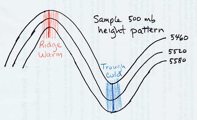
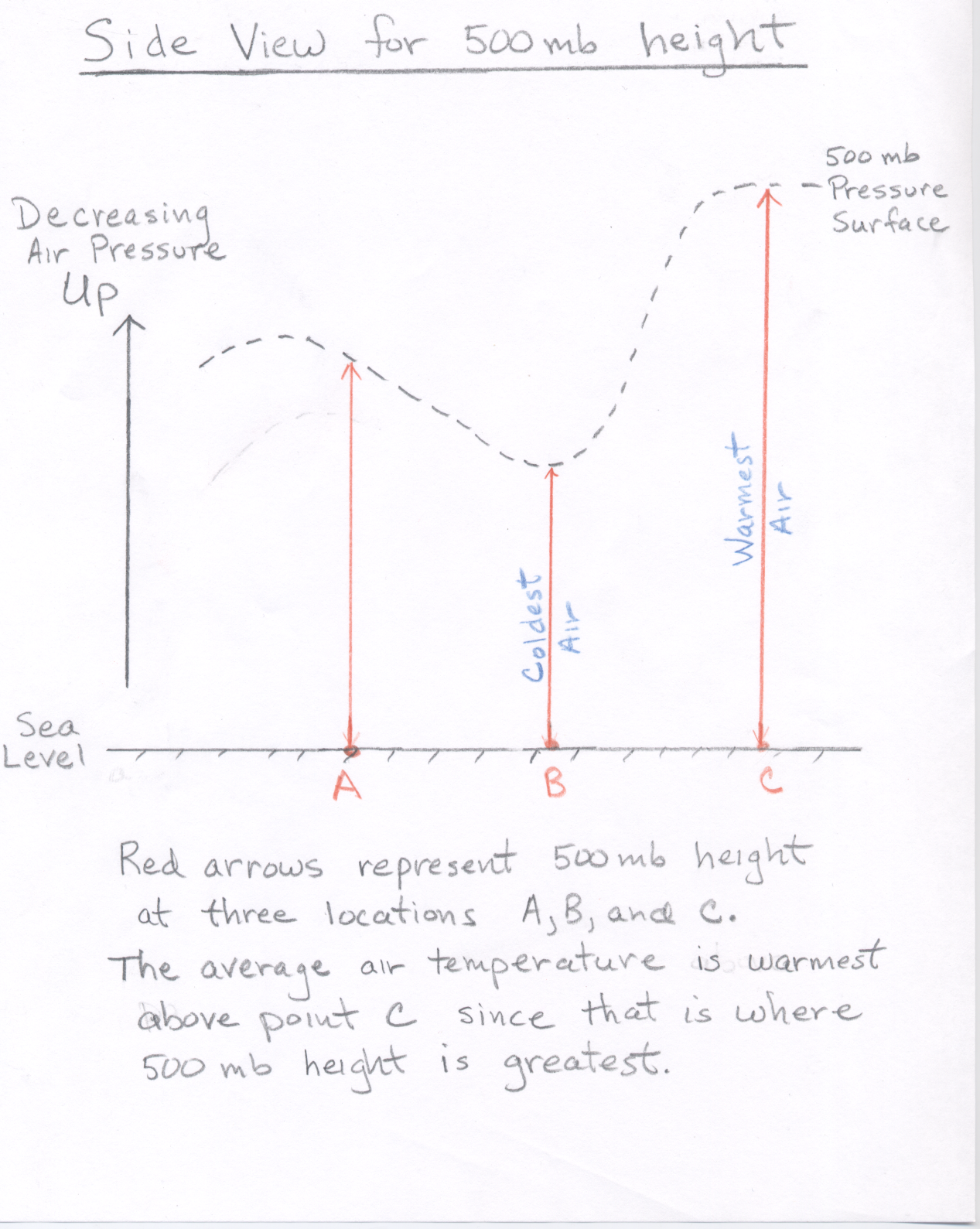
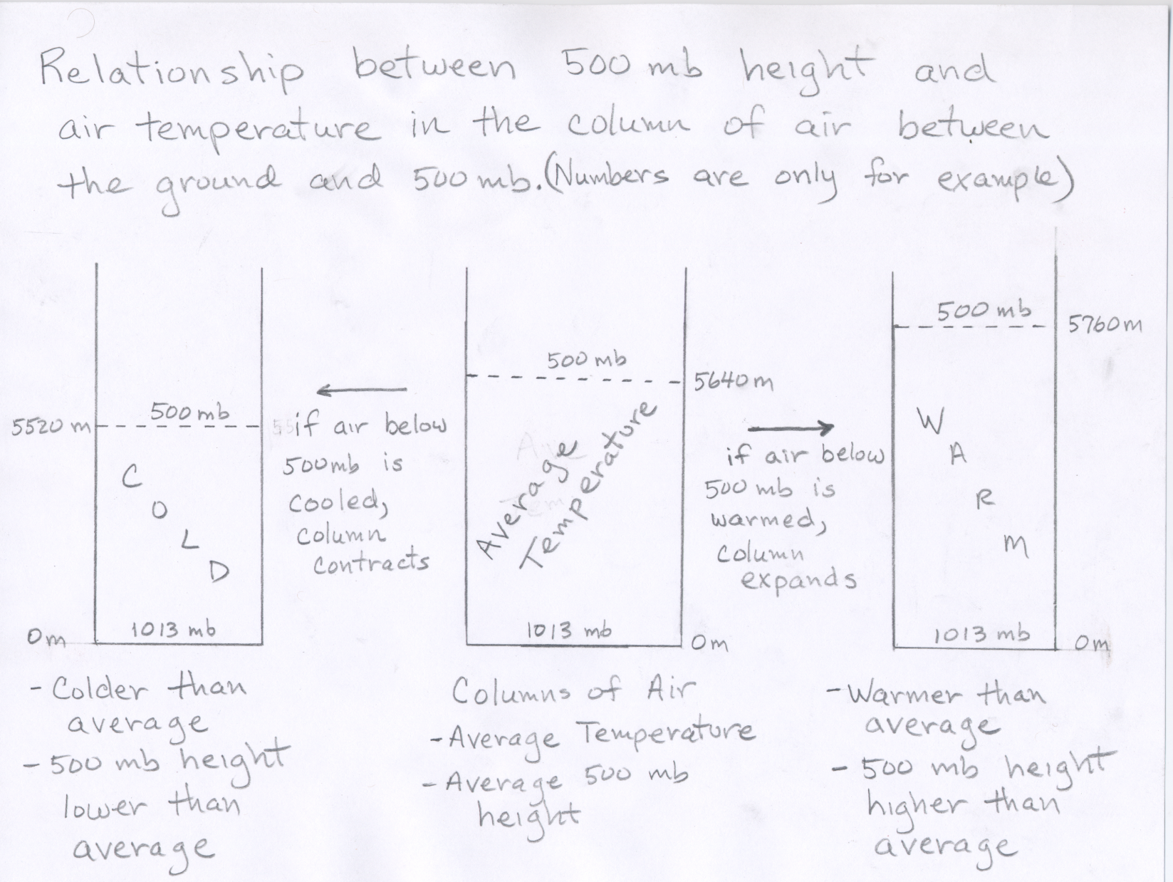
We will now use the 500 mb height contour pattern to estimate the pattern of air temperature. The height of the 500 mb surface is related to the temperature of the atmosphere below 500 mb -- the higher the temperature, the higher the height of the 500 mb level. In other words, the 500 mb height at any point on the map tells us about the average air temperature in the vertical column of air between the ground surface and the 500 mb height plotted at that point. The height pattern tells us where the air is relatively cold and where it is relatively warm (see 500 mb side view.) Another way to think about it is that as air is warmed, it expands, and if the air in a vertical column of air is warmed, the column expands upward, which raises the 500 mb height (and increases the height of the bottom half of the atmosphere) Therefore air pressure decreases more slowly as you ascend through a warm column of air, compared to a cold column of air. (See Figure showing air expands when warmed and contracts when cooled). Conversely, when air is cooled, it contracts, and if the air in a vertical column gets colder, the column contracts downward, which lowers the 500 mb height (and decreases the height of the lower half of the atmosphere).
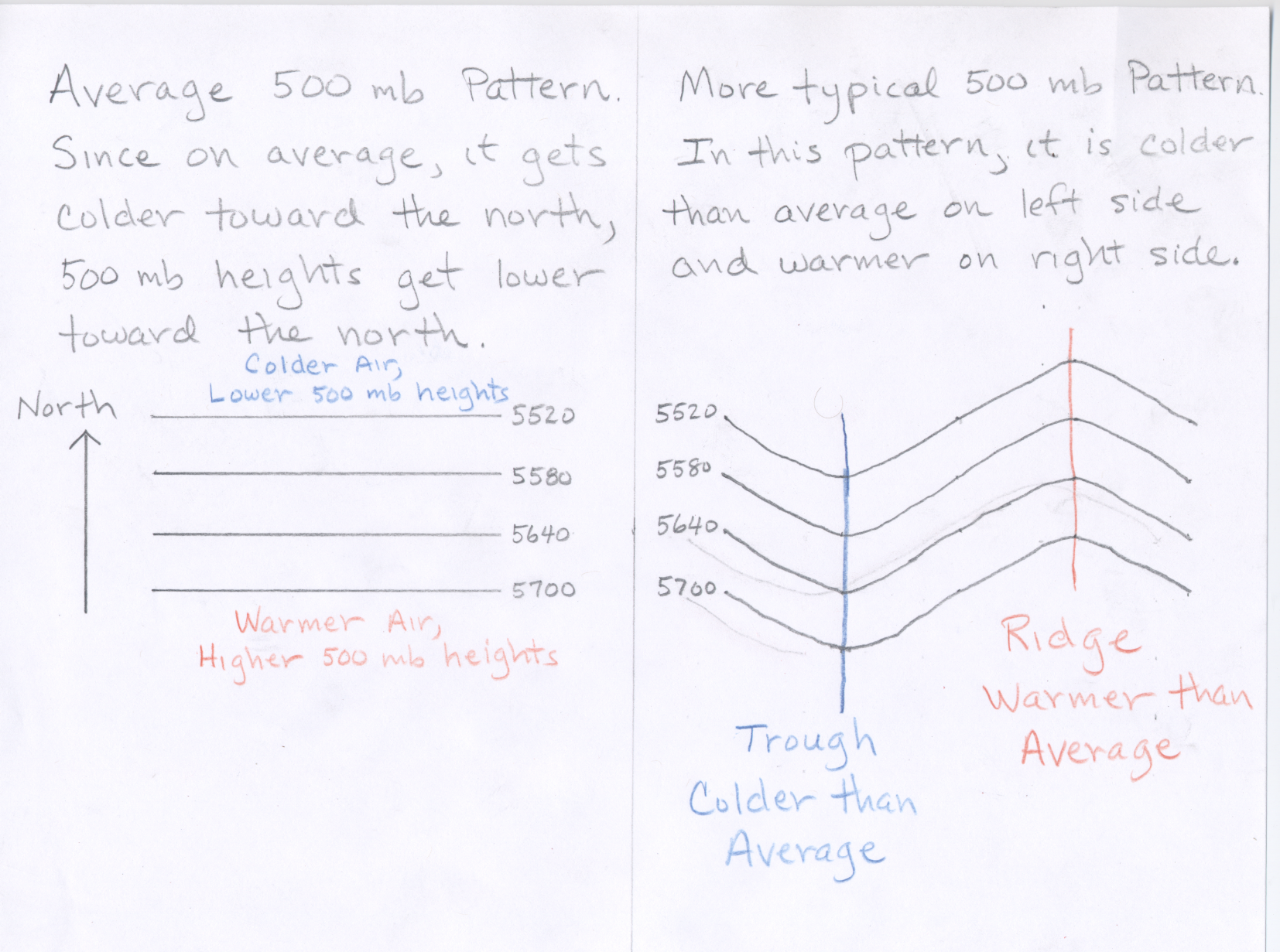
Consider what the 500 mb pattern would look like if air temperatures decreased steadily from the equator toward the north pole. (Note this is what you might guess based on the fact that the Sun's heating is strongest toward the south and weakest toward the north.) In that case the height contours would be concentric circles around the north pole with the highest heights to the south (toward the equator). While this is generally true, the actual pattern at any given time is wavy. Where the height lines bow northward (a ridge), warm air has moved north; and where the height lines bow southward (a trough), cold air has moved south. Therefore, in general warmer than average temperatures can be expected underneath ridges and colder than average temperatures can be expected underneath troughs (See Figure). The more pronounced the ridge (or trough), the more above (or below) average the temperatures will be.
The terminology "trough" and "ridge" is related to the fact that the contour lines often look like waves. A "ridge" is the high point of a wave, and a "trough" is the low point of a wave. A simple diagram is shown below.
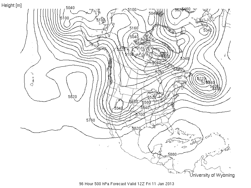
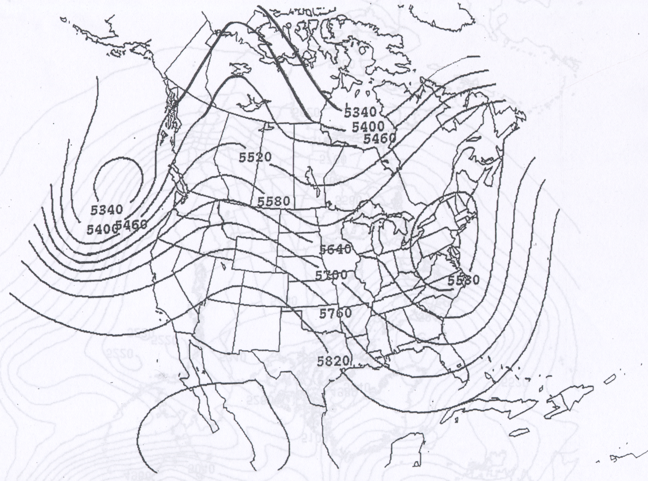
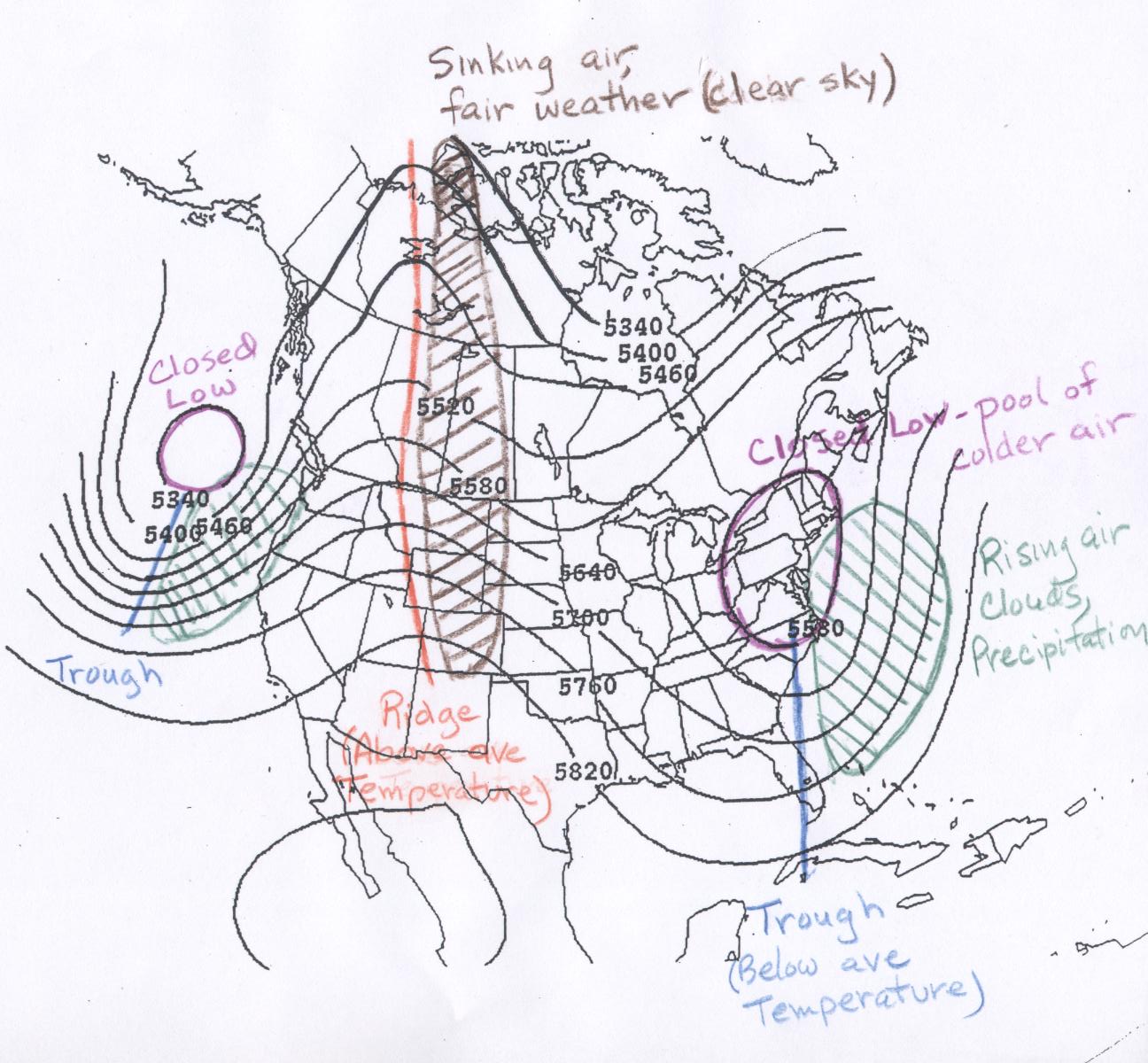
One other feature in the 500 mb pattern worth pointing out are closed contours. A closed contour line is one which closes in on itself, often making a circular or oval shape. There are both closed lows and closed highs. A closed low on a 500 mb height map is a region of low heights around which one or more closed height contours are drawn. A closed low indicates a pool of colder air surrounded by warmer air. Two closed lows are indicated on this sample 500 mb map highlighting closed lows. Closed lows are most often found near the base of troughs as in the example, but not always. Depending of the strength of the closed low there can be more than one closed contour line encircling the center of lowest height, which is sometimes marked with and 'L' on the maps. Closed lows are often associated with precipitation and a change toward colder conditions, and thus are important features in the weather pattern. There are also closed highs, which are centers of high heights surrounded by one or more closed contours. Closed highs are commonly found near the apex of a ridge. Depending of the strength of the closed high there can be more than one closed contour line encircling the center of highest height, which is sometimes marked with an 'H' on the maps. Closed highs generally indicate warm and fair conditions. However, the position of a closed high, called the monsoon high, is important in determining where monsoon season rain will fall in the southwestern US and northernwestern Mexico. A 500 mb map containing several closed highs and closed lows is shown below. There are two closed highs on the map: a 5820 meter closed high in the Pacific Ocean and a 5880 meter closed high centered over Cuba. There are several closed lows on the map below. The two most southerly of these are a 5340 meter closed low over Utah and 5220 meter closed low off the east coast of North America. Notice that the 5220 meter closed low also has closed contours at 5280, 5340, 5400, and 5460 meters.
Some students have trouble distinguishing closed lows from closed highs. Start at the center of a closed contour. As you move away from the center, determine if the 500 mb heights are increasing (a closed low) or decreasing (a closed high). If there are multiple closed contours around the center, then it is quite easy to tell if the heights are getting larger or smaller as you move outward. For a single closed contour, it can be more difficult to tell. Continue moving outward past the closed contour until you hit the next contour line. For closed lows, the adjacent contour lines will be the same and higher heights than the closed contour line, while for closed highs, the adjacent contour lines will be the same and lower heights than the closed line.
 |
| Example 500 mb map to showing several closed lows and closed highs |
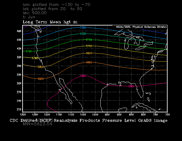
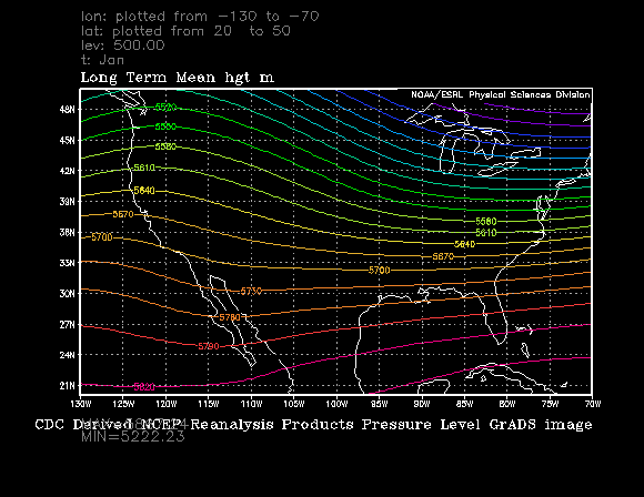
Having said all that, in the summer months, there is generally much less structure in the 500 mb height pattern as compared with the colder months, thus features like troughs, rigdes, and closed highs and lows are often harder to pick out. The reason for this is simple. The tropics remain warm throughout the year, while there is a huge seasonal change in temperature for locations closer to the north pole. Therefore, in winter there is a very large difference in 500 mb heights between the warm tropics and very cold Arctic, while in summer, there is a much smaller difference in temperature and hence 500 mb heights between the warm tropics and the now relatively warm Arctic. For example compare the average summer 500 mb heights with the average January 500 mb heights given in the links below. Note there is little change between summer and winter in 500 mb height (and thus average temperature) in tropical regions, but a large change between summer and winter at higher latitudes.
Below are some links to the averge long-term 500 mb heights over the United States
for the months June through September. There is also a link for the month of January for
comparison with a winter month. The seasonal change in average 500 mb heights, from higher in
summer to lower in winter, that comes about because the air temperature is warmer in summer and
colder in winter can be easily seen by comparing the summer season maps with the January map.
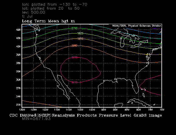
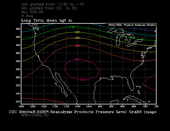
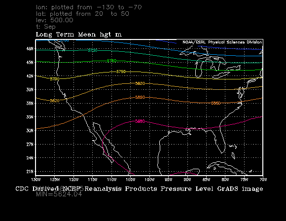
Specifically for Tucson, Arizona, located at about 32° north latitude and 111° west longitude,
notice that the average 500 mb height in Tucson for January is about
5700 meters, while in the much warmer months of June and September it is about 5870 meters and in even
warmer months of July and August when the average 500 mb heights are 5920 and 5910 meters respectively.
This is an indication that the average air temperature between the ground and the 500 mb pressure level is much warmer
in the summer season compared with the winter season.
June 500 mb height climatology (long-term average)
(Labeled contours run from 5700 meters to 5880 meters, spacing every 30 meters)
July 500 mb height climatology (long-term average)
(Labeled contours run from 5790 meters to 5910 meters, spacing every 30 meters. Notice the 5910 meter closed high.)
August 500 mb height climatology (long-term average)
(Labeled contours run from 5790 meters to 5910 meters, spacing every 30 meters. Notice the 5910 meter closed high. )
September 500 mb height climatology (long-term average)
(Labeled contours run from 5700 meters to 5880 meters, spacing every 30 meters)
January 500 mb height climatology (long-term average)
(Labeled contours run from 5520 meters to 5820 meters, spacing every 30 meters)
Large scale features like troughs and ridges provide a look at the general temperature pattern, i.e., cold in troughs and closed lows, warm in ridges and closed highs, and near average in flat height patterns without pronounced troughs and ridges. If you want to make a specific temperature forecast for a given location, like Tucson, you should compare the 500 mb heights from a current or forecast map to the long-term average or "climatological" 500 mb heights for that day. These maps for the months June - September and January were shown in the section above. For a given location and time of the year, if the 500 mb height on the map is close to average, then the temperature is expected to be about average. If the 500 mb height is lower than the average height, then lower than average temperatures are expected. If the 500 mb height is higher than the average height, then higher than average temperatures are expected. The further the 500 mb height is away from average the more the temperature is expected to be away from average. For example, if you compare the actual (measured) 500 mb height over Tucson for a given day (say August 30) to the average 500 mb height, which is about 5910 meters for Tucson based on the August 500 mb height climatology (long-term average), you can estimate whether or not the air temperature for the day will be above average, below average, or near average.
Keep in mind that this is a way to estimate the local temperature relative to the average air temperature for that location and time of year. The 500 mb height by itself does not tell us what the exact air temperature will be at the ground surface. This is because there are many local factors that go into determining the surface air temperature, such as the type of ground surface (desert rock and sand warms more quickly than wet soils), amount of water vapor in the air (dry desert air warms more easily during day and cools more easily at night compared with more humid air), and other factors. Thus the same 500 mb heights over two locations does not mean those two places are expected to have the same near ground air temperature. The best we can do is say whether or not the local temperature is expected to above or below the local average for that day. Returning to the example posed in the last paragraph. Suppose on date August 30 of this year, the 500 mb map shows that the 500 mb height over Tucson is 5940 meters above sea level. Since this is higher than the average for Tucson in August, which is 5910 meters, we expect the the air temperature in Tucson to be above average for the day. You could then look up the fact that the average high temperature for Tucson is late August is 97°F. Based on the 500 mb height, you expect a hot day, with a the high temperature above 97°F.
Here is a link to the current 500 mb height pattern. Notice that the 500 mb height contours are labled with 3 digits instead of 4 digits as seen on the other maps we have looked at. On some maps the last zero in the 500 mb height is not displayed on the contour lines (in other words the units on the contour lines are in decameters instead of meters). Just realize that 500 mb heights will be in thousands of meters above sea level, not hundreds of meters. It is expect that you can estimate the 500 mb height over Tucson or any other point on the map based on the contour pattern. You should also be able to determine if the current 500 mb height is above or below the long-term average 500 mb height for this month.
This is a simplistic method. The 500 mb height actually tells you about the average air temperature in the vertical column of air between the ground surface and 4.6 - 6.0 km (2.9 - 3.8 miles) above sea level. Often this provides a good estimate of how warm or cold the air temperature is near the ground where we live. However, the vertical column of air from ground to 3 miles above sea level does not have to be uniformly warm or cold. There can be smaller (in vertical extent) layers of relatively warm air and relatively cold air. Sometimes there will be shallow (small in vertical dimension) layers of warm or cold air just above the ground. In these cases, the corresondence between the 500 mb height and surface air temperature will not work as well. In addition, factors like cloud cover, precipitation, and the type of ground surface (dry desert, moist soil, snow cover, etc.) also influence the temperature of the air at the surface. A good example of this occurs in Tucson during the summer. The average high temperature in Tucson is higher in June than it is in August, even though the average 500 mb height is lower in June. The reason for this is that most June days are sunny and dry, while during August it is more common for there to be clouds and precipitation, which tend to reduce the high temperature. Thus, using the 500 mb heights to estimate surface temperatures is not exact. However, as you will see, the 500 mb maps often provide a very good overview of the pattern of warm and cold conditions near the ground surface.
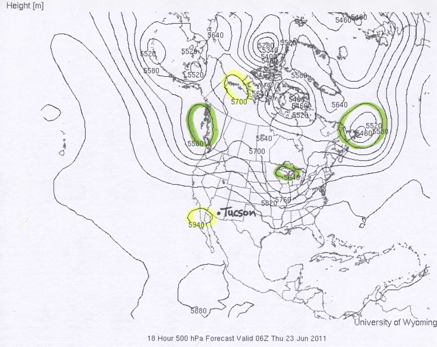
The first example is a 500 mb map valid for 06Z (0600 GMT), Thursday, June 23, 2011. You should realize that the local time in Tucson is 7 hours earlier than GMT time, which is 2300 (11 PM local) on Wednesday, June 22. This map has several examples of closed highs and closed lows in the height pattern. Two closed highs are highlighted in yellow and three closed lows are highlighted in green. The height in Tucson is approximately 5930 meters. This can be compared with the average 500 mb height in Tucson of around 5870 meters as shown in the June 500 mb height climatology linked above. Thus, well above average temperatures would be expected in Tucson. The high temperature in Tucson for June 22 and June 23 2011 was 109°F. Concerning other features of interest for the United States. It looks rather warm through the Rocky Mountain states under a 500 mb ridge. Cool with a closed low and trough over the Pacific northwest. Cool also for the great lake states down the Mississippi River valley associated with another closed low and trough.
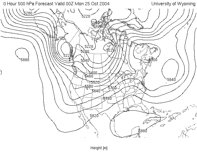
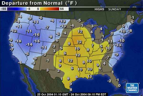
Below are two examples that were used in previous classes. Both of these examples were taken from the colder season. We are not going to study winter-time maps like this until later in the semester, but these examples are shown as it may help you better understand how to interpret the relationship between a 500 mb height map and expected temperature. The first is the 500 mb height map for the time 00Z on Monday, October 25, 2004 (This corresponds to a local Tucson time of 5 PM on Sunday, October 24). Next to the 500 mb map is the high temperature relative to average for the day Sunday, October 24. Notice that below average temperatures occured in the western US (associated with the trough over this region), while above average temperatures occured over the midwest southward to the southern great plains and lower Mississippi valley (associated with the ridge over this region), and below average temperatures over parts of the east coast (associated with the trough centered just offshore).
|
|
|
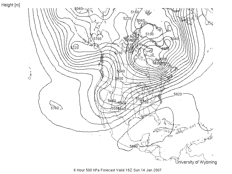
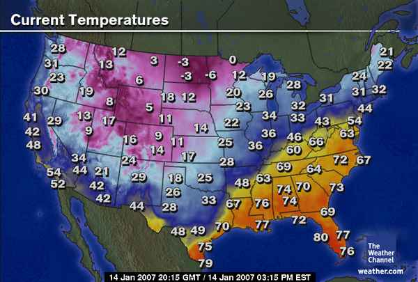
The next example is from January 14, 2007. The 500 mb map is valid for Sunday, January 14, 2007 at 18Z (this corresponds to 11 AM local Tucson time). Next to the 500 mb map is a map showing the surface temperatures across the United States at 20:15 GMT (or 20:15 Z, which is 13:15 (i.e., 1:15 PM) local time). Again, notice that temperatures are cool or cold near the trough in the western United States, for example 42°F in Tucson at 1:15 PM local time. In most of the southeastern United States, temperautures are much warmer in association with a broad ridge and higher 500 mb heights.
|
|
|
![]()
![]()
![]()