Tue., Sep. 24, 2013
The London Symphony Orchestra playing George Gershwin's Rhapsody in
Blue before class today.
The Optional
Assignment turned in last Thursday has been graded and was
returned. If your paper does not have a grade marked on it
you received full credit (0.5 extra credit points). Answers
to all the questions are available online.
The Experiment #1 reports were due today (unless you were told
otherwise). If you haven't do so already please bring back
your experiment materials. The graduated cylinders need to
be cleaned so that they can be handed out on Thursday to students
doing Experiment #2.
Quiz #1 is Thursday this week. We'll aim to start the quiz
about 5 minutes after the start of class. Use the Study
Guide to focus your efforts. Reviews are scheduled for Tue.
and Wed. afternoon from 2-3:15 pm in Saguaro 225.
We're starting a new topic today - weather maps and some
of what you can learn from them.
We began by learning how weather data are entered onto surface
weather maps.
Much of our weather is produced by relatively large
(synoptic scale) weather systems - systems that might cover
several states or a significant fraction of the continental
US. To be able to identify and characterize these weather
systems you must first collect weather data (temperature,
pressure, wind direction and speed, dew point, cloud cover, etc)
from stations across the country and plot the data on a map.
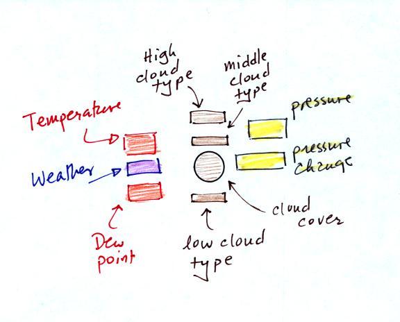
The large amount of data requires that the information be plotted
in a clear and compact way. The station model notation is
what meteorologists use.
We worked
through this material one step at a time (refer to p. 36 in
the photocopied ClassNotes). The figures below were
borrowed from a previous semester or were redrawn and may
differ somewhat from what was drawn in class.
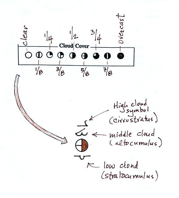
The center circle is filled in to indicate the portion of the
sky covered with clouds (estimated to the nearest 1/8th of the
sky) using the code at the top of the figure (which you can
quickly figure out). 3/8ths of the sky is covered with
clouds in the example above.
Then symbols are used to identify the actual types of high,
middle, and low altitude clouds observed in the sky. Later
in the semester we will learn the names of the 10 basic cloud
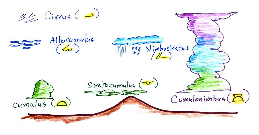
types. Six of them are sketched above and symbols for them
are shown. Purple represents high altitude in this
picture. Clouds found at high altitude are composed of ice
crystals. Low altitude clouds are green in the figure.
They're warmer than freezing are composed of just water
droplets. The middle altitude clouds in blue are
surprising. They're composed of both ice crystals and water
droplets that have been cooled below freezing but haven't frozen.
A copy of the handout passed out in class can be found here.
Click here
to see a cloud chart with actual photographs of the various cloud
types and the symbols used for each.
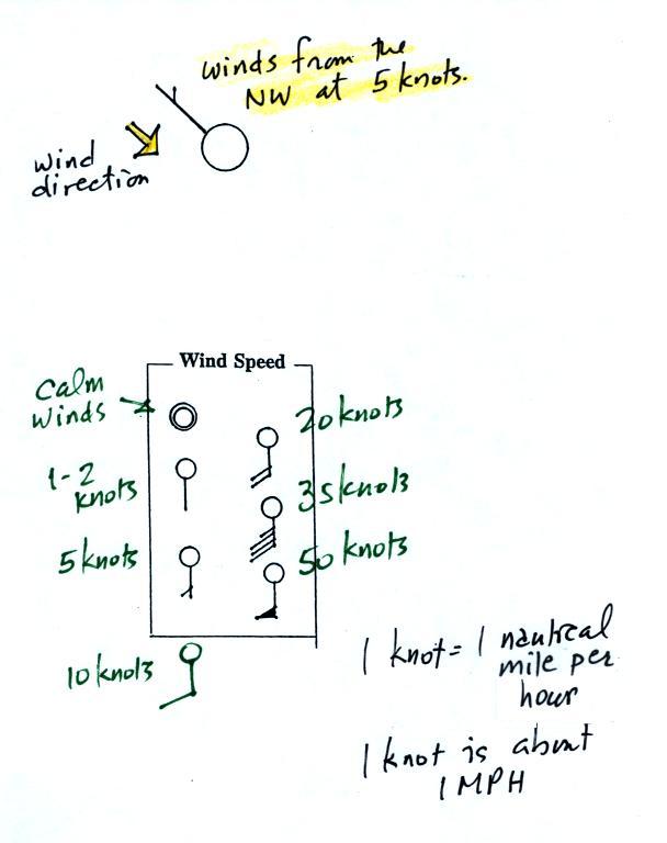
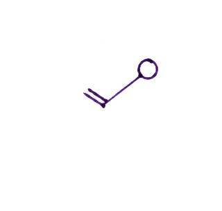
A straight line extending out from the center circle shows the
wind direction. Meteorologists always give the direction the
wind is coming from.
In the uppermost example the winds are blowing from the NW toward
the SE at a speed of 5 knots. A meteorologist would call
these northwesterly winds.
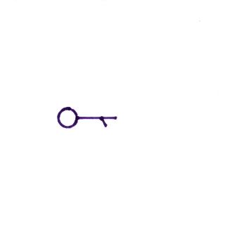
Winds in the bottom set of examples are all coming from the
south. Small "barbs" at the end of the straight line give
the wind speed in knots. Each long barb is worth 10 knots,
the short barb is 5 knots. Knots are nautical
miles per hour. One nautical mile per hour is 1.15 statute
miles per hour. We won't worry about the distinction in this
class, we will just consider one knot to be the same as one mile
per hour.
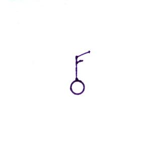
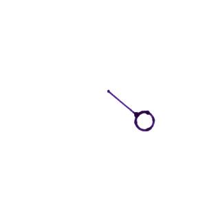
Here are four more examples to practice with. Determine
the wind direction and wind speed in each case. Click here for the answers.
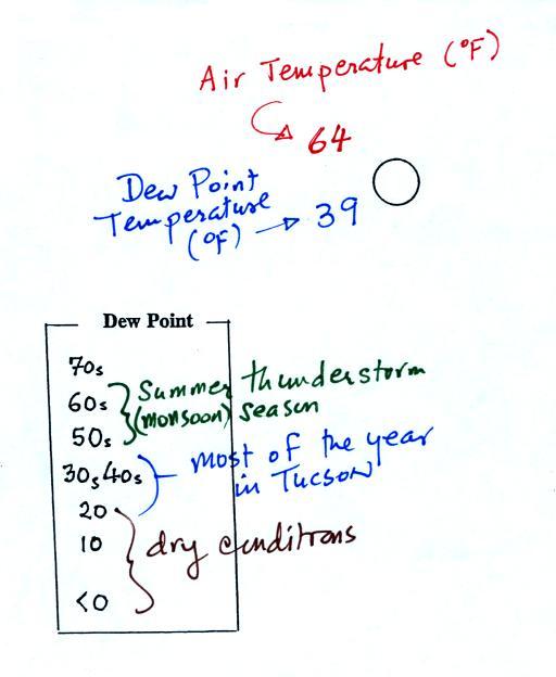
The air temperature and the dew point temperature are probably
the easiest data to decode.
The air temperature in this
example was 64o F (this is plotted above and to the
left of the center circle). The dew point temperature was
39o F and is plotted below and to the left of the
center circle. The box at lower left reminds you that dew
points range from the mid 20s to the mid 40s during much of the
year in Tucson. Dew points rise into the upper 50s and 60s
during the summer thunderstorm season (dew points are in the 70s
in many parts of the country in the summer). Dew points
are in the 20s, 10s, and may even drop below 0 during dry
periods in Tucson.
And maybe the most interesting part.
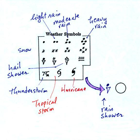
A symbol representing the weather that is currently occurring
is plotted to the left of the center circle (in between the
temperature and the dew point). Some of the common weather
symbols are shown. There are about 100
different weather symbols that you can choose from (here's a
nicer
version of the list). There's no way
I could expect you to remember all of those weather symbols.
The pressure data is usually the most confusing and most
difficult data to decode.
The sea level pressure is shown above and to the right of the
center circle. Decoding this data is a little "trickier"
because some information is missing. We'll look at this in
more detail momentarily.
Pressure change data (how the pressure has changed during
the preceding 3 hours) is shown to the right of the center
circle. We didn't discuss this in class. You must
remember to add a decimal point. Pressure changes are
usually pretty small.
Here's what you need to know about the pressure data.
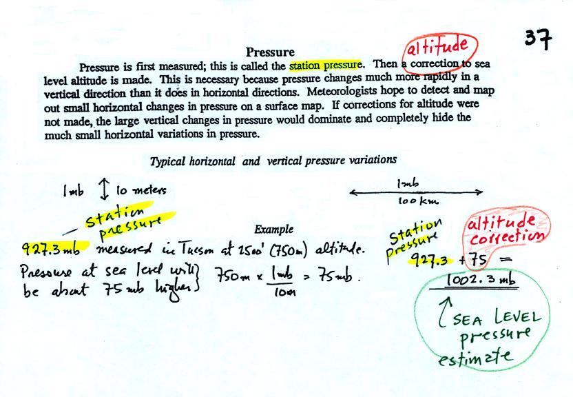
Meteorologists hope to map out small horizontal pressure changes
on surface weather maps (that produce wind and storms).
Pressure changes much more quickly when moving in a vertical
direction. The pressure measurements are all corrected to
sea level altitude to remove the effects of altitude. If
this were not done large differences in pressure at different
cities at different altitudes would completely hide the smaller
horizontal changes.
In the example above, a station pressure value of 927.3 mb was
measured in Tucson. Since Tucson is about 750 meters above
sea level, a 75 mb correction is added to the station pressure (1
mb for every 10 meters of altitude). The sea level pressure
estimate for Tucson is 927.3 + 75 = 1002.3 mb. This sea
level pressure estimate is the number that gets plotted on the
surface weather map.
Do you need to remember all the
details above and be able to calculate the exact correction
needed? No. You should remember that a
correction for altitude is needed. And the correction needs
to be added to the station pressure. I.e. the sea-level
pressure is higher than the station pressure.
The calculation above is shown in a picture below
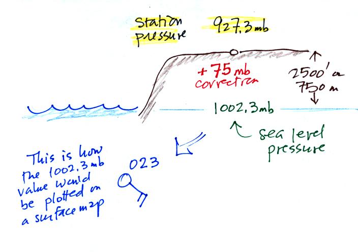
The full 1002.3 mb value
wouldn't be plotted on a surface map. Here are some
examples of coding and decoding the pressure data.
First of all we'll take some sea level
pressure values and show what needs to be done before the
data is plotted on the surface weather map. These
should be the same numbers that we used in class.
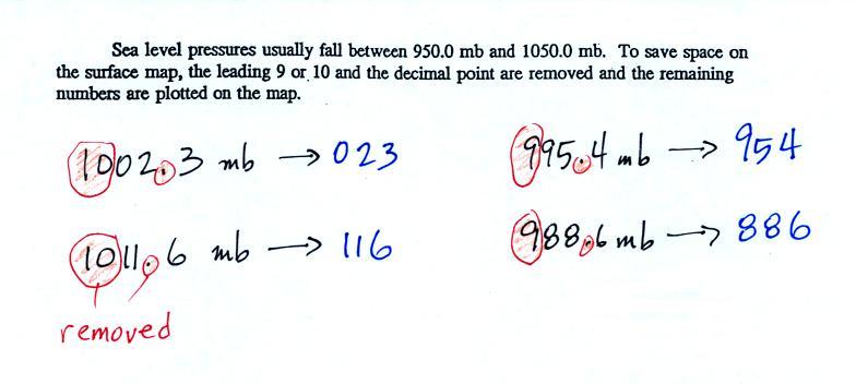
Sea level pressures generally
fall between 950 mb and 1050 mb. The values always start
with a 9 or a 10. To save room, the leading 9 or 10 on
the sea level pressure value and the decimal point are removed
before plotting the data on the map. For example the 10 and the decimal pt in 1002.3 mb would be removed; 023
would be plotted on the weather map (to the upper right of the
center circle). Some additional examples are shown
above.
You'll mostly have to go the other way - read data off a
map and figure out what the sea level pressure is. This
is illustrated below.
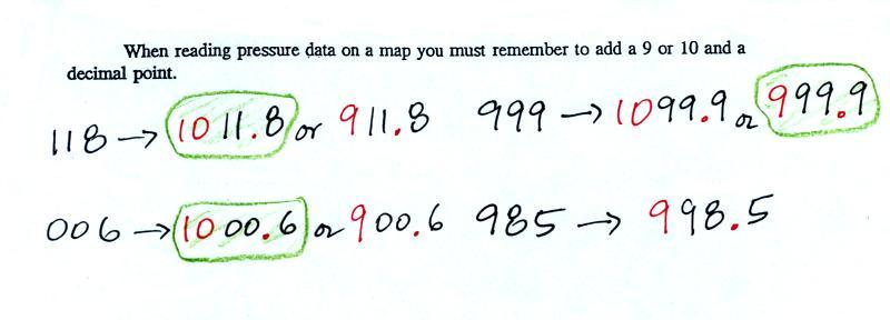
118 could be either 911.8 or 1011.8 mb. You pick the value that falls closest
to 1000 mb average sea level pressure. (so 1011.8 mb would be the
correct value, 911.8 mb would be too low).
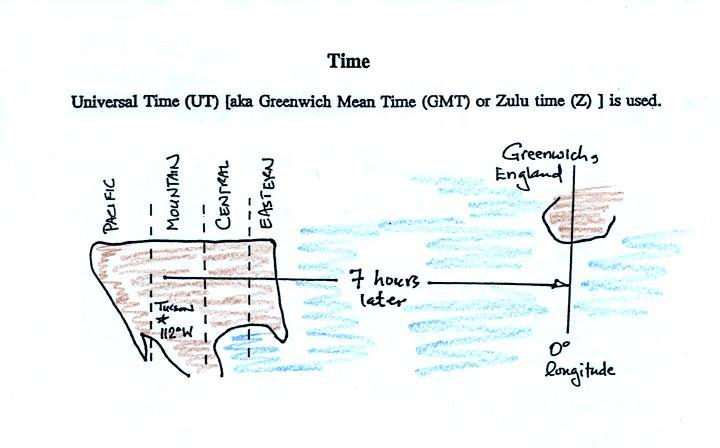
Another important piece of information on a surface map is the
time the observations were collected. Time on a
surface map is converted to a universally agreed upon time zone
called Universal Time (or Greenwich Mean Time, or Zulu time). That is the
time at 0 degrees longitude, the Prime
Meridian. There is a 7 hour time zone difference between
Tucson and Universal Time (this never changes because
Tucson stays on Mountain Standard Time year round).
You must add 7 hours to the time in Tucson to obtain
Universal Time.
Here are several examples of conversions between MST and UT
to convert from MST (Mountain Standard Time) to UT (Universal
Time)
10:20 am MST:
add the 7 hour time zone correction
---> 10:20 + 7:00 = 17:20 UT (5:20 pm in
Greenwich)
2:45 pm MST :
first convert to the 24 hour
clock by adding 12 hours 2:45 pm MST + 12:00 = 14:45 MST
add the 7 hour time zone correction
---> 14:45 + 7:00 = 21:45 UT (7:45 pm in England)
7:45 pm MST:
convert to the 24 hour clock by
adding 12 hours 7:45 pm MST + 12:00 = 19:45 MST
add the 7 hour time zone correction ---> 19:45 + 7:00 = 26:45
UT
since this is greater than 24:00 (past midnight) we'll subtract
24 hours 26:45 UT - 24:00 = 02:45 am the next day
to convert from UT to MST
18Z:
subtract the 7 hour time zone correction
---> 18:00 - 7:00 = 11:00 am MST
02Z:
if we subtract the 7 hour time
zone correction we will get a negative number.
So we will first add 24:00 to 02:00 UT then subtract 7 hours
02:00 + 24:00 = 26:00
26:00 - 7:00 = 19:00 MST on the previous day
2 hours past midnight in Greenwich is 7 pm the previous day
in Tucson
Next we'll start to see what analysis of that data can
start to tell you about the weather.
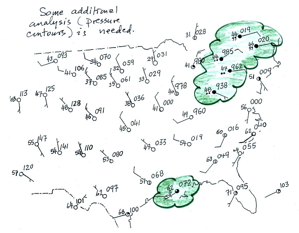
A bunch of weather data has been plotted (using the station
model notation) on a surface weather map in the figure below (p.
38 in the ClassNotes).
Plotting the surface weather data on a map is just
the beginning. For example you really can't tell what is
causing the cloudy weather with rain (the dot symbols are
rain) and drizzle (the comma symbols) in the NE portion of the
map above or the rain shower along the Gulf Coast. Some
additional analysis is needed. A meteorologist would
usually begin by drawing some contour lines of pressure
(isobars) to map out the large scale pressure pattern.
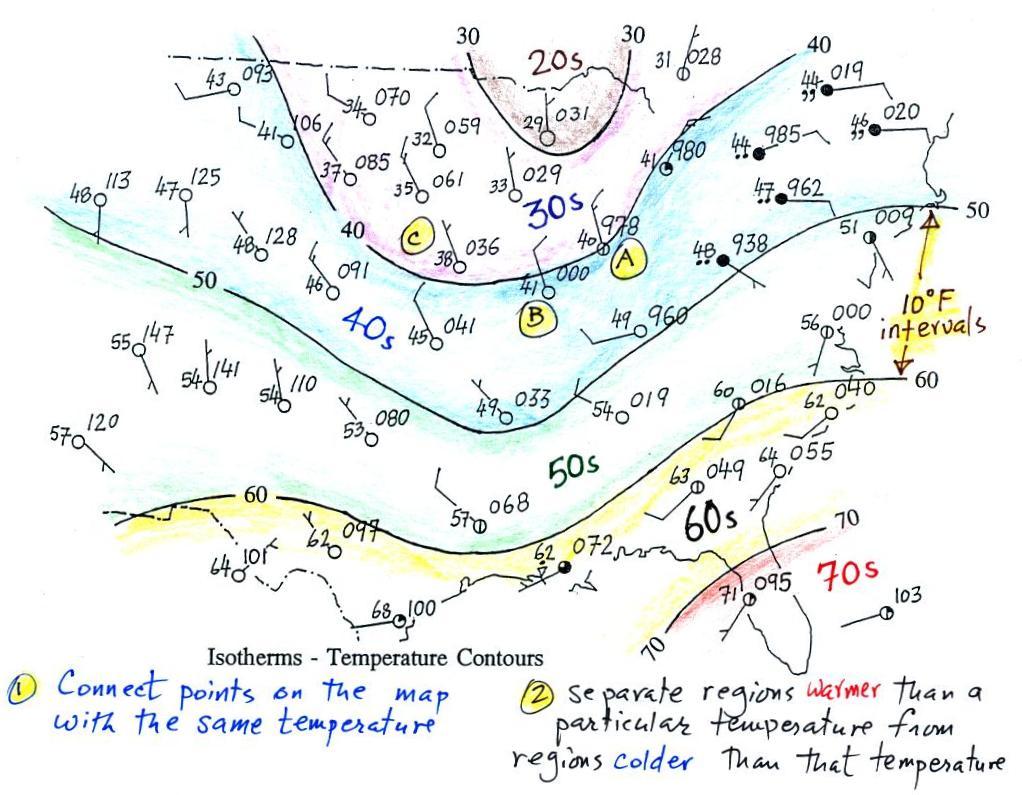
We will look first at contour lines of temperature, they are a
little easier to understand (the plotted data is easier to
decode and temperature varies across the country in a more
predictable way).
Isotherms, temperature contour lines, are
usually drawn at 10o
F intervals. They do two things: (1) connect points on
the map that all have the same temperature, and (2) separate
regions that are warmer than a particular temperature from regions
that are colder. The 40o
F isotherm above passes through a city which is reporting a
temperature of exactly 40o
(Point A). Mostly it goes between pairs of cities: one with
a temperature warmer than 40o (41o at
Point B) and the other colder than 40o (38o
F at Point C). Temperatures generally decrease
with increasing latitude: warmest temperatures are usually in the
south, colder temperatures in the north.
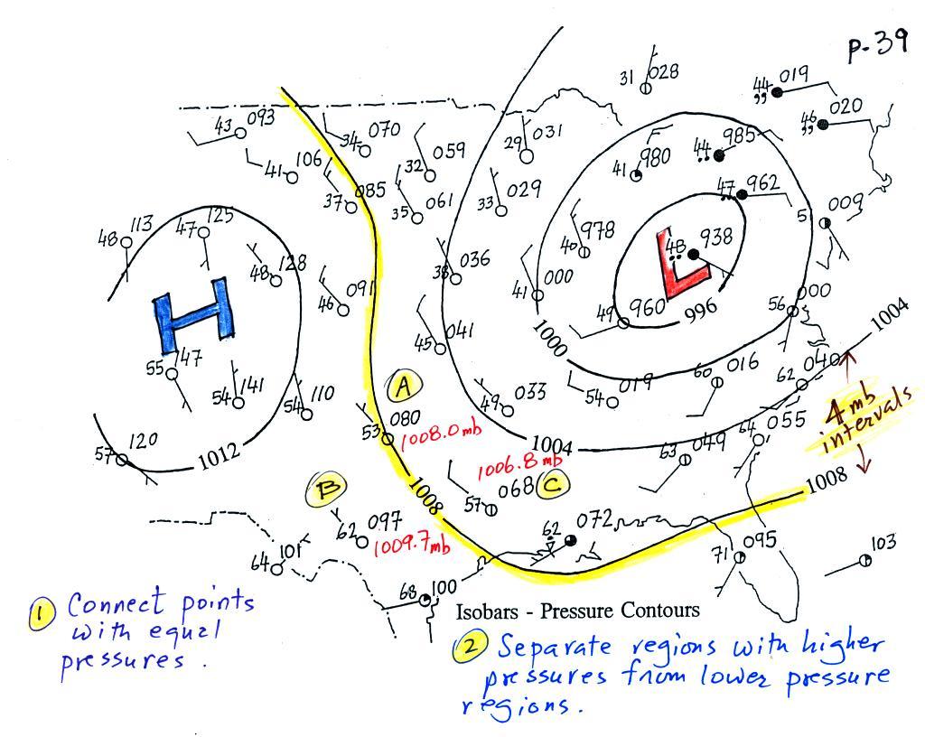
Now the same data with isobars drawn in. Again they
separate regions with pressure higher than a particular value from
regions with pressures lower than that value.
The isobars also enclose areas of high pressure and low
pressure. Isobars are generally drawn at 4 mb intervals
(starting with a base value of 1000 mb). Isobars also connect points on the
map with the same pressure. The 1008 mb isobar
(highlighted in yellow) passes through a city at Point A where the pressure is
exactly 1008.0 mb. Most of the time the isobar will pass
between two cities. The 1008 mb isobar passes between cities
with pressures of 1009.7 mb at Point
B and 1006.8 mb at Point
C. You would expect to find 1008 mb somewhere in
between those two cites, that is where the 1008 mb isobar goes.
The pressure pattern is not as predictable as the isotherm
map. Low pressure is found on the eastern half of this map
and high pressure in the west. The pattern could just as
easily have been reversed.
This
site (from the American Meteorological Society) first shows
surface weather observations by themselves (plotted using the
station model notation) and then an analysis of the surface data
like what we've just looked at. There are links below each
of the maps that will show you current surface weather data.
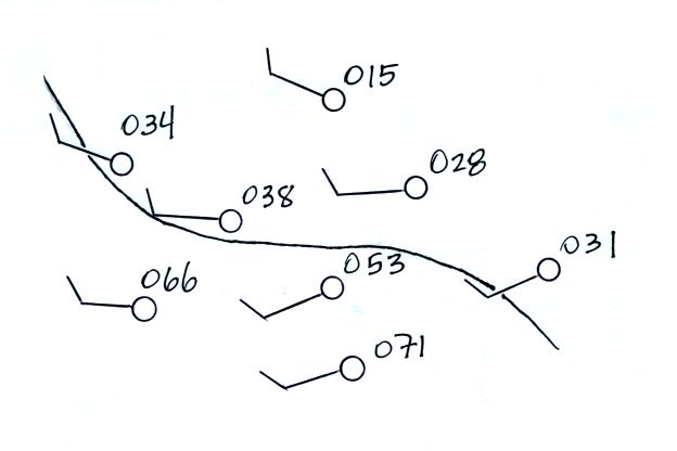
Here's a little practice
Is this the 1000, 1002, 1004, 1006, or 1008 mb isobar? (you'll
find the answer below)
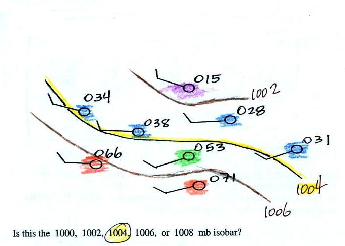
Pressures lower than 1002 mb are colored purple.
Pressures between 1002 and 1004 mb are blue. Pressures
between 1004 and 1006 mb are green and pressures greater than
1006 mb are red. The isobar appearing in the question is
highlighted yellow and is the 1004 mb isobar. The 1002
mb and 1006 mb isobars have also been drawn in (because
isobars are drawn at 4 mb intervals starting at 1000 mb, 1002
mb and 1006 mb isobars wouldn't normally be drawn on a map)