Tuesday Jan. 30, 2007
The first optional assignment was collected in class
today.
Answers to the questions were handed out in class that you can use to
study for the Practice Quiz this coming Thursday. A copy of the
Practice Quiz Study Guide was handed out in class.
The Monday (and Tuesday) afternoon reviews for the Practice Quiz were
cancelled.

We'll cover the ideal gas law in class on Thursday before the
Practice Quiz. Some reference to the first of the ideal gas
law equations should be made in the Experiment #1 reports.
The ideal gas law is another way of thinking about and
understanding pressure.
We'll
start some new material today. This week we'll learn how
weather data is
entered onto surface weather maps and learn about some of the analyses
of the data that are done. We'll also have a brief look at upper
level weather maps.
Much of our weather is produced by relatively large
(synoptic scale)
weather systems. To be able to identify and characterize these
weather systems you must first collect weather data (temperature,
pressure, wind direction and speed, dew point, cloud cover, etc) from
stations across the country and plot the data on a map. The large
amount of data requires that the information be plotted in a clear and
compact way. The station model notation is what is used.

meterologists
use.
A small circle is plotted on the map at the location where the
weather
measurements were made. The circle can be filled in to indicate
the amount of cloud cover. Positions are reserved above and below
the center circle for special symbols that represent different types of
high, middle,
and low altitude clouds (a handout with many of these symbols was
distributed in class). The air temperature and dew point
temperature are entered
to the upper left and lower left of the circle respectively. A
symbol indicating the current weather (if any) is plotted to the left
of the circle in between the temperature and the dew point (weather
symbols were included on the class handout). The
pressure is plotted to the upper right of the circle and the pressure
change (that has occurred in the past 3 hours) is plotted to the right
of the circle.
Here is the example we studied in class.

Starting at the top of the page you can see the symbols used
to
indicate the cloud cover. You leave the circle blank if the skies
are clear. You fill in
the circle completely if the skies are
overcast (that was the case Tuesday morning). The symbols for
1/4, 1/2, and 3/4 are pretty
straightforward. You try to estimate to the nearest eighth how
much of the sky is covered with clouds.
The air temperature in this example was 48o F (this is
plotted above and to the right of the center circle). The dew
point
temperature was 42o F and is plotted below and to the left
of the center circle. The box at lower left reminds you that dew
points in the 30s and 40s occur much of the year in Tucson. Dew
points rise into the upper 50s and 60s during the summer thunderstorm
season (dew points are in the 70s in many parts of the country in the
summer). The 42 F dew point Tuesday morning was up considerably
from a 20 F dew point on Monday afternoon when this material was
covered in the MWF section of the class.
Some of the common weather
symbols are
shown. A symbol representing the current weather is plotted to
the left of the center circle. There are about 100 different
weather symbols that you can choose from.
You can see and hopefully start to understand how the wind speed and
direction are
plotted. A straight line extending out from the center circle
shows the wind direction. Meteorologists always give the
direction the wind is coming from. In this example the winds are
blowing from the NE toward the SW. A meteorologist would call
these northeasterly winds. Small barbs at the end of the straight
line give the wind speed in knots. Here are some additional wind
examples (that weren't shown in
class):

In (a) the winds are from the NE at 5 knots, in (b) from the
SW at 15
knots, in (c) from the NW at 20 knots, and in (d) the winds are from
the NE at 1 to 2 knots.
Knots are nautical miles per hour. One nautical mile per hour is
1.15 statute miles per hour. We won't worry about the distinction
in this class, you can just pretent that one knot is the same as one
mile per hour.
Pressure change data (how the pressure has changed during the preceding
3 hours) is shown to the right of the center circle. You must
remember to add a decimal point. Pressure changes are usually
pretty small. The pressure tendency symbols are explained
below:

In (a) the pressure rose then started to fall, the overall
change is a
drop in pressure. In (b) the pressure has been falling
steadily. In (c) the pressure fell then started to rise, the
overall change is an increase in pressure. Steadily rising
pressure is shown in (d).
The sea level pressure is shown above and to the right of
the center
circle. Decoding this data is a little "trickier" because some
information is missing. Decoding the pressure is explained on p.
37 in the photocopied notes.

Meteorologists hope to map out small horizontal pressure
changes on
surface weather maps. Pressure changes much more quickly when
moving in a vertical direction. The pressure measurements are all
corrected to sea level altitude to remove the effects of
altitude. If this were not done large differences in pressure at
different cities at different altitudes would completely hide the
smaller horizontal changes. In the example above, a station
pressure value of 927.3 mb was measured in Tucson. Since Tucson
is about 750 meters above sea level, a 75 mb correction is added to the
station pressure (1 mb for every 10 meters of altitude). The sea
level pressure for Tucson is 927.3 + 75 = 1002.3 mb.
To save room, the leading 9 or 10 on the sea level pressure value and
the decimal
point are removed before plotting the data on the map. For
example the 10 and the . in 1002.3 mb would be removed; 023
would be plotted on the weather map (to the upper right of the center
circle). Some additional examples are shown above:
When reading pressure values off a map you must remember to add a 9 or
10 and a decimal point. For example
203 could be either 920.3 or 1020.3 mb. You pick the value that
falls between 950.0 mb and 1050.0 mb (so 1020.3 mb would be the correct
value, 920.3 mb would be too low). 185 could be either 918.5
mb or 1018.5 mb. The correct
pressure in this case would be
1018.5 mb. 995 could be either 999.5 mb or 1099.5 mb, the correct value is
999.5 mb.
We didn't have time to cover the last section on p. 27. Time on a
surface map is converted to a universally agreed upon time zone called
Universal Time (or Greenwich Mean Time, or Zulu time).
That is the time at 0 degrees longitude. There is a 7 hour time
zone difference between Tucson (Mountain
Standard Time year round) and Universal Time. You must add 7
hours to the time in Tucson to obtain Universal Time.
To convert 1 pm MST to Universal Time, you first convert the MST to the
24 hour clock format. 1 pm MST is 13:00 MST. Then you add 7
hours. 13:00 + 7:00 = 20:00 UT.
To convert 15Z to MST (the example shown above) you subtract 7
hours. 15:00 - 7:00 = 8:00
am MST.
Here are some links to surface weather maps with data
plotted using the
station model notation: UA Atmos. Sci.
Dept. Wx page, National
Weather Service Hydrometeorological Prediction Center, American
Meteorological Society.
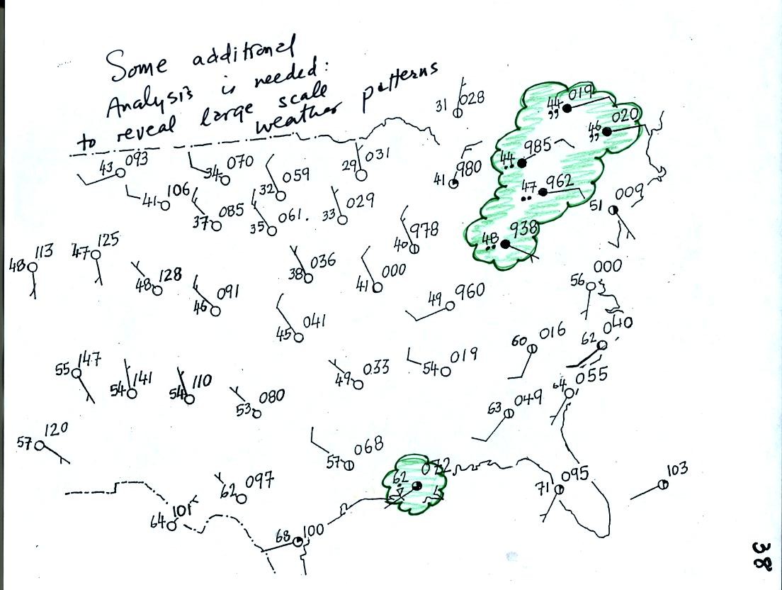
Plotting the surface weather data on a map is just the
beginning.
For example you really can't tell what is causing the cloudy weather
with rain and drizzle in the NE portion of the map above or the rain
shower at the location along the Gulf Coast. Some additional
analysis is needed. A meteorologist would usually begin by
drawing some contour lines of pressure to map out the large scale
pressure pattern. We will look first at contour lines of
temperature, they are a little easier to understand.
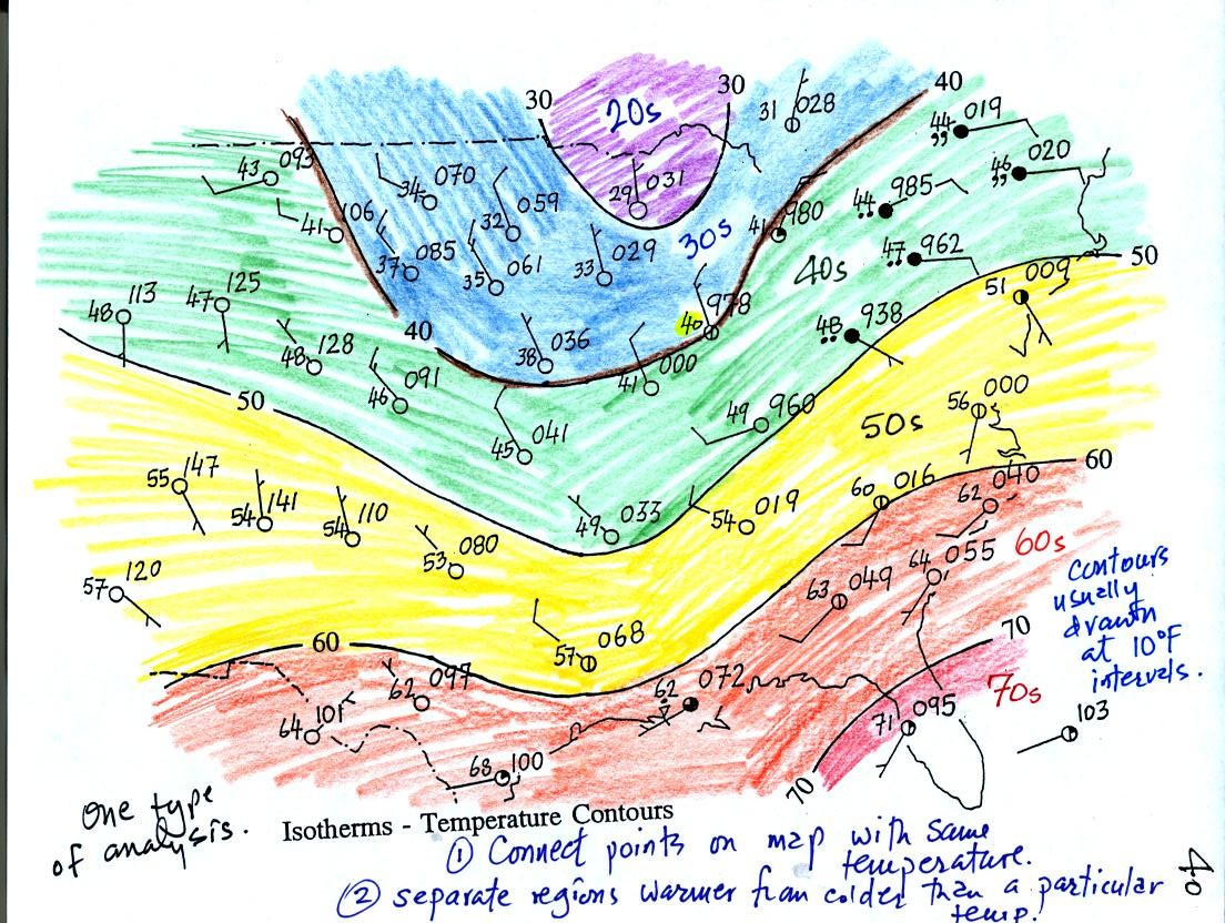
Isotherms, temperature contour lines, are drawn at 10 F
intervals.
They do two things: (1) connect points on the map that all
have the same temperature, and (2) separate regions that are warmer
than a particular temperature from regions that are colder. The
40o F isotherm highlighted in brown above passes through
one city
reporting a temperature of exactly 40o (highlighted in
yellow). Mostly it goes
between pairs of
cities: one with a temperature warmer than 40o and the other
colder
than 40o. Temperatures generally decrease with
increasing
latitude.
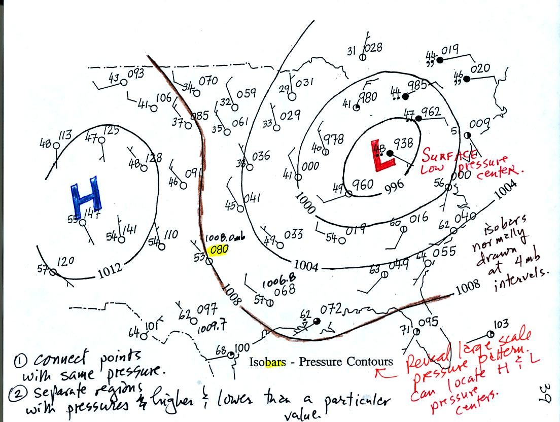
Now the same data with isobars drawn in. Again they
separate
regions with pressure higher than a particular value from regions with
pressures lower than that value.
Isobars are generally drawn at 4 mb intervals. Isobars also connect points on the map
with the same pressure. The 1008 mb isobar (highlighted in
brown) passes through a city where the pressure is exactly
1008.0 mb (highlighted in yellow). Most of the time the isobar
will pass between two
cities. The 1008 mb isobar passes between cities with pressures
of 1006.8 mb and 1009.7 mb. You would
expect to find 1008 mb about halfway between
those two cites, that is where the 1008 mb isobar goes.
Next we'll look at what you can expect to see in the vicinity of
centers of Low and High pressure.

Winds spin in a counterclockwise direction around surface low pressure
centers. The winds also spiral inward toward the center of the
low, this is called convergence. [winds spin clockwise around low
pressure centers in the southern hemisphere but still spiral inward]
The convergence causes the air to rise at the center of the low.
Rising air expands and cools. If the air is sufficiently moist
clouds can form and begin to rain or snow. Thus you often see
cloudy skies and stormy weather associated with surface low pressure.

Everything is pretty much the opposite with surface high pressure
centers. Winds spin clockwise and spiral outward
(divergence). Air sinks in the center of surface high pressure to
replace the diverging air. The sinking air is compressed and
warms. This keeps clouds from forming so you associated clear
skies with high pressure.