Fri., Feb. 9, 2007
We'll start some new material in
Chapter 2 next week. That new material won't be on Quiz #1.
Previously
in NATS 101. We didn't quite finish the section on upper level
charts. Here's a reminder of what we were covering.
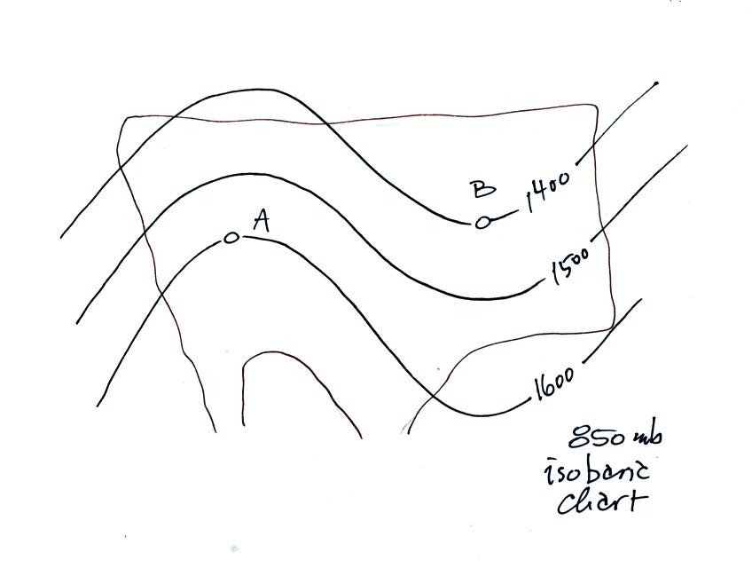
This is an example of an upper level chart. Point A is in a
ridge, Point B is in a trough. Relatively warm air would be found
between the ground and Point A. Colder air would be found between
the ground and Point B.
The contours connect points on the map with the same altitude, not
pressure. Point A is 1600 meters above sea level. Point B
is closer to the ground.
Winds would blow parallel to the contours from the west to east.
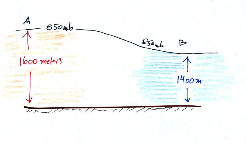
Here's a crossectional view. Point A is found at
higher
altitude because pressure decreases relatively slowly in warm low
density air. You need to go higher before pressure decreases from
near 1000 mb at sea level to 850 mb. Pressure decreases more
rapidly with altitude in the cold dense air found on the right side of
the chart. That's why Point B is closer to the ground.
About half of the material covered in Friday's class was stuck
onto the end of Wednesday's notes. Click here
to go back to the notes
from Wednesday's class. Look for some text highlighted in
red. Once you have read through that come back to today's Feb. 9
notes.
The
following figure (from p. 41 in the photocopied notes) shows some of
the relationships that exist between surface and upper level weather
map features (this figure was
redrawn after class for improved clarity)
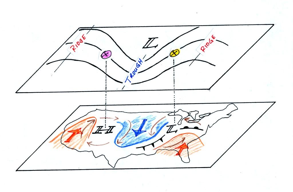
On the surface map you see centers of HIGH and LOW
pressure.
The low pressure center, together with the cold and warm fronts, is a
middle latitude storm.
Note how the counterclockwise winds spinning around the LOW
move warm
air northward (behind the warm front on the eastern side of the LOW)
and cold air southward (behind the cold front on the western side of
the LOW). Clockwise winds spinning around the HIGH also move warm
and cold air. The winds are shown with thin brown arrows on the
surface map.
Note the ridge and trough features on the upper level
chart. We
learned that warm air is found below an upper level ridge. Now
you can begin to see the source of this warm air. Warm air is
found west of the HIGH and to the east of the LOW. This is
where the two ridges on the upper level chart are also found. You
expect to find cold air below an upper level trough. This cold
air is being moved into the middle of the US by the northerly winds
that are found between the HIGH and the LOW.
Note the yellow X marked on the upper level chart directly
above the
surface LOW. This is a good location for a surface LOW to develop
and strengthen. We will find that this is frequently a location
where there is upper level divergence. Similary the pink X is
where you often find upper level convergence. This could
cause surface high pressure to get even higher.
Now we'll
see how upper level divergence at the yellow X can cause a surface low
to intensify (the surface low pressure will get even lower)
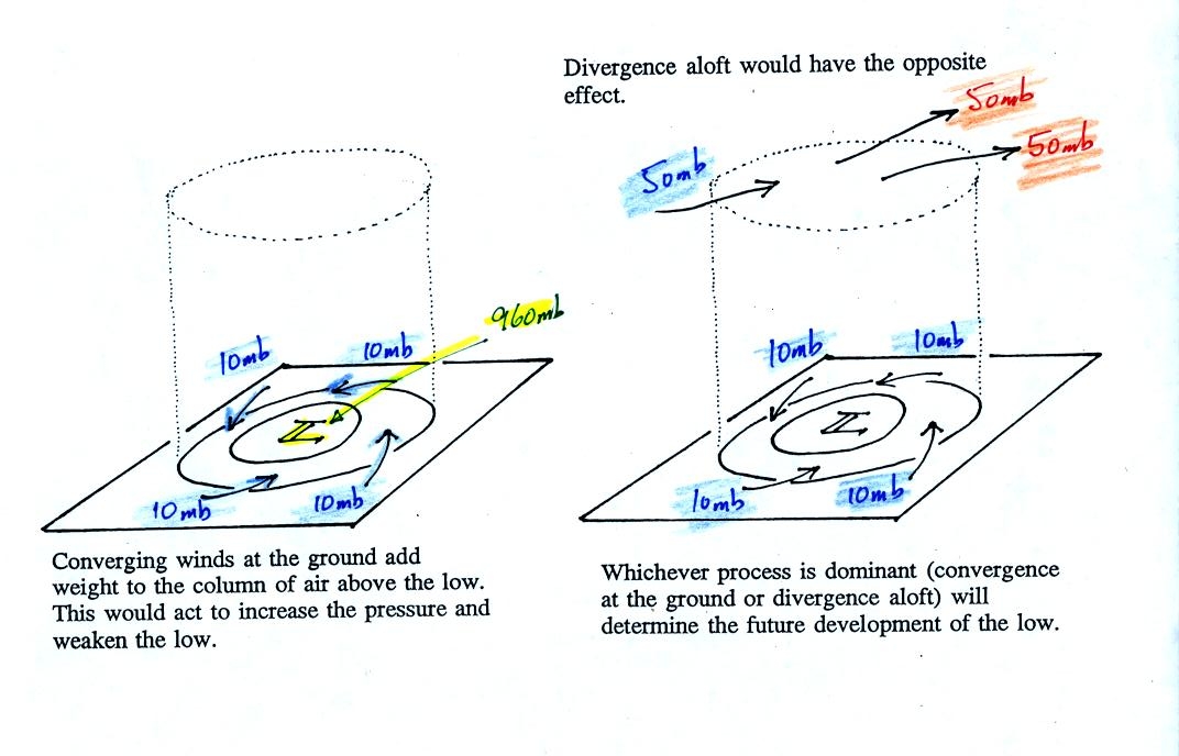
This figure is on p. 42 in the photocopied notes (it was redrawn after class for improved
clarity)
We'll start with the figure at left. We will assume the
surface low has 960 mb
pressure. Winds are spinning counterclockwise and spiraling in
toward (converging) the center of the low. These surface winds
are moving air into the column of air and (as explained on the figure)
should cause the pressure in the center of the LOW to increase.
Imagine that each arrow brings in enough air to increase the pressure
at the center of the LOW by 10 mb. You would expect the pressure
at the center of the LOW to increase from 960 mb to 1000 mb. What
if the central pressure actually decreased? How would you explain
that?
This is just like a bank account. You have $960 in the bank and
make four $10 dollar deposits. You would expect your bank account
balance to increase from $960 to $1000. What if your account
balanced dropped? How would you explain that?
The right hand figure shows what is going on. This figure
includes the effects of addition and removal of air at upper
levels.
Imagine that 50 mb worth of air are added to the column and 50+50=100
mb worth of air are removed. That's a net removal (net
divergence) of 50 mb.
So now we have 40 mb worth of air being added at the ground (surface
convergence) and 50 mb worth being removed at upper levels (upper level
divergence). The grand total is 10 mb of removal. The
surface pressure will decrease slightly (from 960 mb to 950 mb).
You can apply the numbers in the right hand picture to the bank account
problem. You have $960 in the bank and make 4 $10 deposits.
However you forget that you made some kind of automatic direct deposit
arrangement that puts $50 dollars into your account. And you
forgot that two of your utility bills are being deducted from your
account. We'll assume there are two $50 withdrawals. That's
a total of $90 being deposited ($40 + $50) and
$100 being withdrawn. Your bank account goes down $10 from $960
to $950..
In a case like this where upper
level divergence > surface convergence, the surface LOW
pressure will get even lower (the low will "deepen") and the storm will
strengthen. Click here if
you dare and if you would like to see what could happen next.
The other possibility is that the upper level divergence <
surface convergence. In this case the LOW pressure will
increase (the low will "fill") and the storm will weaken.
Click here for some additional
examples. By working through some additional examples you might
increase your understanding of this material and build up your
confidence (of course there's always a chance that more examples will
just make this topic more confusing - the choice is yours)
We're
almost done, one last figure (it's the figure on p. 41 in the
photocopied Class Notes again with some new information added, again redrawn after class for clarity)
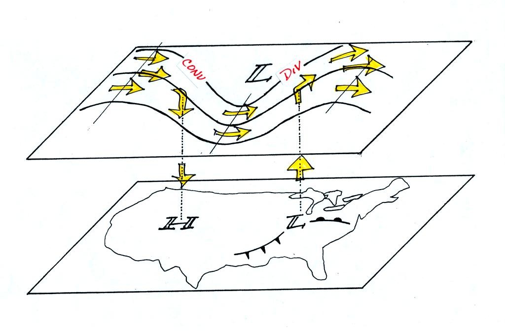
Now that you
have some idea of what upper level divergence looks like
you are in a position to understand another one of the relationships
between the surface and upper level winds.
One of the things we have learned about surface LOW pressure is that
the converging surface winds create rising air motions. The
figure above gives you an idea of what can happen to this rising air
(it has to go somewhere). Note the upper level divergence in the
figure: two arrows of air coming into the point "DIV" and three arrows
of air leaving (more air going out than coming in is what makes this
divergence). The rising air can, in effect, supply the extra
arrow's worth of air.
Three arrows of air come into the point marked "CONV" on the upper
level chart and two leave (more air coming in than going out).
What happens to
the extra arrow? It sinks, it is the source of the sinking air
found above surface high pressure.
We
finished class by looking at a time lapse video tape of a cold front
racing through Tucson.
You can see the video by clicking here.