Tuesday, Feb. 7, 2006
The Experiment #1 reports were collected today. It takes
about a
week to grade these reports - so you should expect to get yours back
next Tuesday. Distribution of the Expt. 2 materials will begin on
Thursday.
The Practice Quiz has been graded and was returned in class.
You'll find a link to answers to the Practice Quiz on the class home
page. The first Optional Assignment was returned today. See
the Optional Assignments link for some
comments concerning grading. Some of the 1S1P reports have been graded and were
returned in class.
A new Optional Assignment was handed out in class, it is due next
Tuesday. You will receive answers to the assignment at that time
so that you can review the material in time for Quiz #1 (Thur. Feb. 16).
A handout discussing Archimedes Law was handed out in class. This
is another way of explaining why warm air rises and cold air sinks.
Much of our weather is produced by relatively large
(synoptic scale)
weather systems. To be able to identify and characterize these
weather systems you must first collect weather data (temperature,
pressure, wind direction and speed, dew point, cloud cover, etc) from
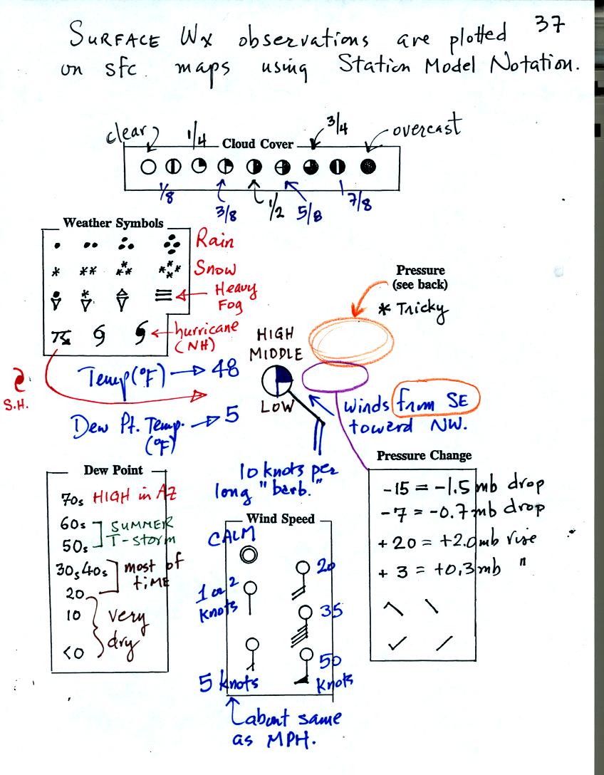
stations across the country and plot the data on a map. The large
amount of data requires that the information be plotted in a clear and
compact way. The station model notation is what meterologists
use.
A small circle is plotted on the map at the location where the weather
measurements were made. The circle can be filled in to indicate
the amount of cloud cover. Symbols for the types of high, middle,
and low altitude clouds present are plotted above and below the
circle. The air temperature and dew point temperature are entered
to the upper left and lower left of the circle respectively. A
symbol indicating the current weather (if any) is plotted to the left
of the circle in between the temperature and the dew point. A
handout with the cloud and weather symbols was distributed in class.
A line showing the wind direction (meterologists always specify the
direction the wind is coming from) extends outward from the center
circle. Barbs at the end of the wind line give the wind speed
. Pressure is plotted to the upper right of the circle and the
pressure change to the right of the circle below the pressure.
The pressure data requires some decoding as explained on the next page.
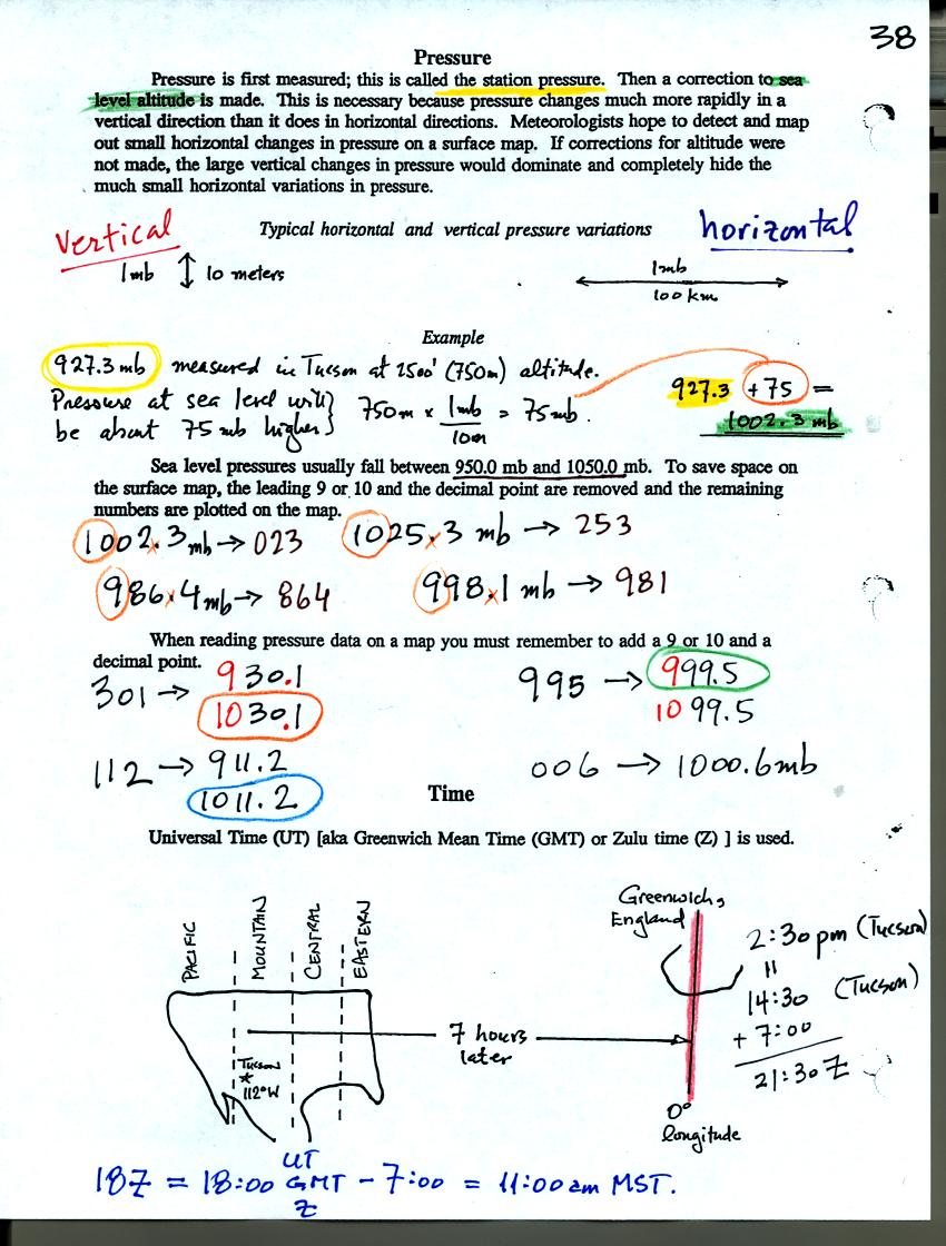
Meteorologist hope to map out small horizontal pressure changes on
surface weather maps. Pressure changes much more quickly when
moving in a vertical direction. The pressure measurements are all
corrected to sea level altitude to remove the effects of
altitude. If this were not done large differences in pressure at
different cities at different altitudes would completely hide the
smaller horizontal changes..
The leading 9 or 10 on the sea level pressure value and the decimal
point are removed before plotting the data on the map. For
example the 10 and the . in 1002.3 mb would be removed; 023
would be plotted on the weather map (to the upper right of the circle).
When reading pressure values off a map you must remember to add a 9 or
10 and a decimal point. For example
128 could be either 912.8 mb or 1012.8 mb. You pick the value
that falls between 950.0 mb and 1050.0 mb, the usual range of sea level
pressure values. Thus the correct pressure in this case would be
1012.8 mb.
Time on a surface weather map is usually given in Universal Time.
Here are some links to surface weather maps with data plotted using the
station model notation: UA Atmos. Sci.
Dept. Wx page, National
Weather Service Hydrometeorological Prediction Center, American
Meteorological Society.
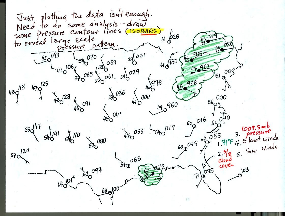
Plotting the surface weather data on a map is just the
beginning.
For example you really can't tell what is causing the cloudy weather
with rain and drizzle in the NE portion of the map above or the rain
shower at the location along the Gulf Coast. Some additional
analysis is needed. In particular you need to map out the
pressure pattern. This means some pressure contour lines,
isobars, must be drawn in.
Before considering isobars, we will look at isotherms, contour lines of
constant temperature.
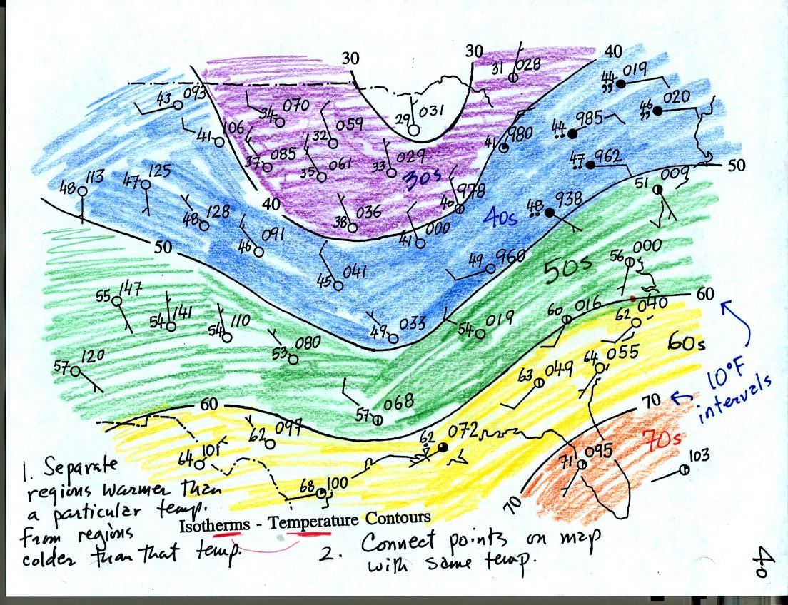
The isotherms, temperature contour lines, are drawn at 10 F intervals.
They do two things: separate regions warmer than a particular
temperature from regions colder than that temperature. The 70 F
isotherm separates the orange (temperatures in the 70s) and yellow
(temperatures in the 60s) regions on the map. Isotherms also
connect points on the map that have a temperature of exactly 70 F.
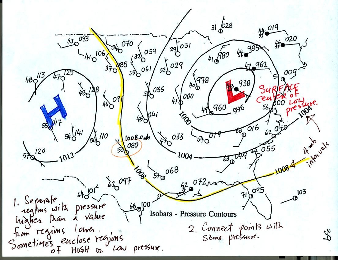
Now the same data with isobars drawn in. Again they separate
regions with pressure higher than a particular value from regions with
pressures lower than that value. The isobars often completely
enclose a relatively circular LOW or HIGH pressure center.
Isobars are generally drawn at 4 mb intervals.
Here are three or four different representations of the winds
associated with surface low pressure centers:
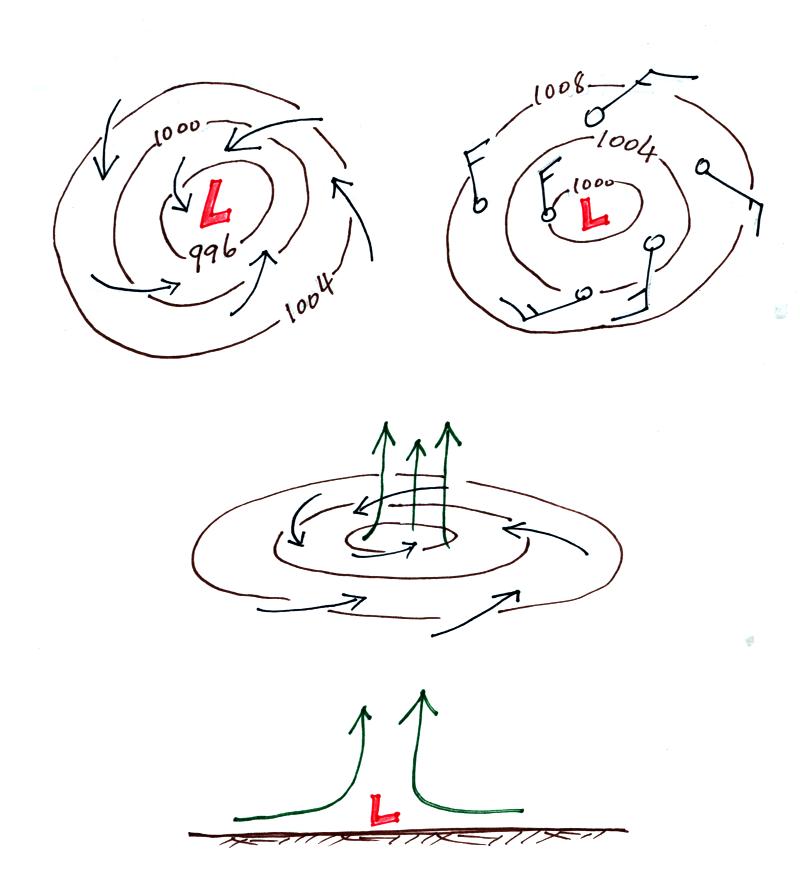
And here are some of the things you can say about horizontal and
vertical winds motions associated with a surface low
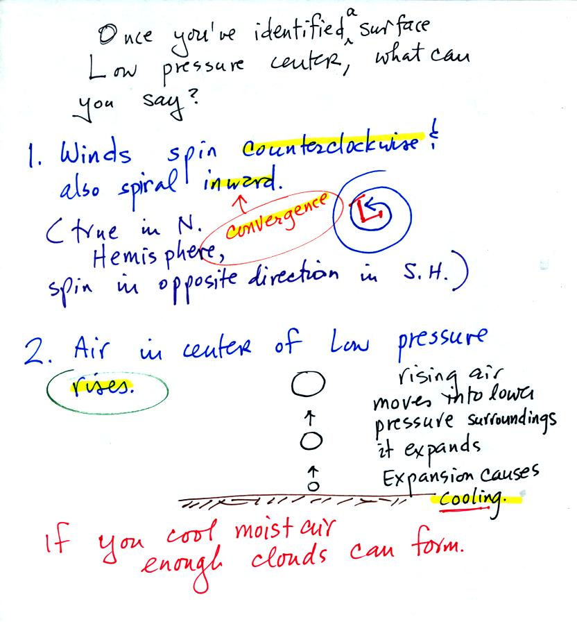
Surface winds converge into surface low pressure centers. The air
in the center of the low rises. Rising air cools. Cooling
is what you need to make clouds. Thus cloudy stormy weather is
found with surface lows.
Here's what a surface high pressure center looks like:
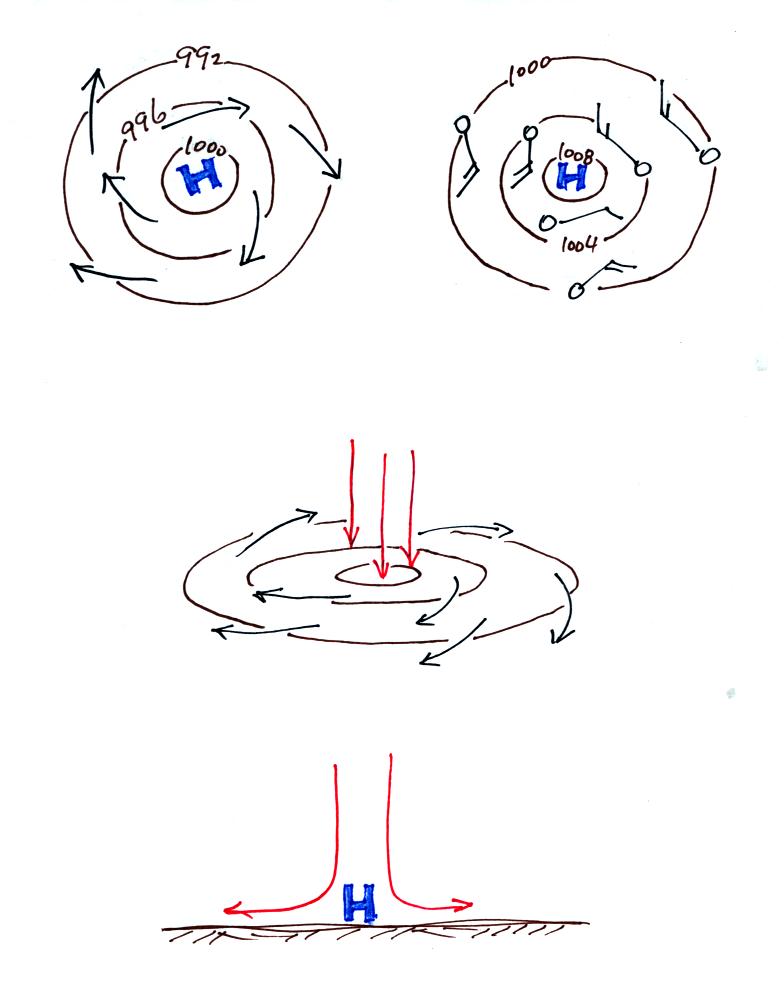
And here's what you would expect to find in the vicinity of a high.
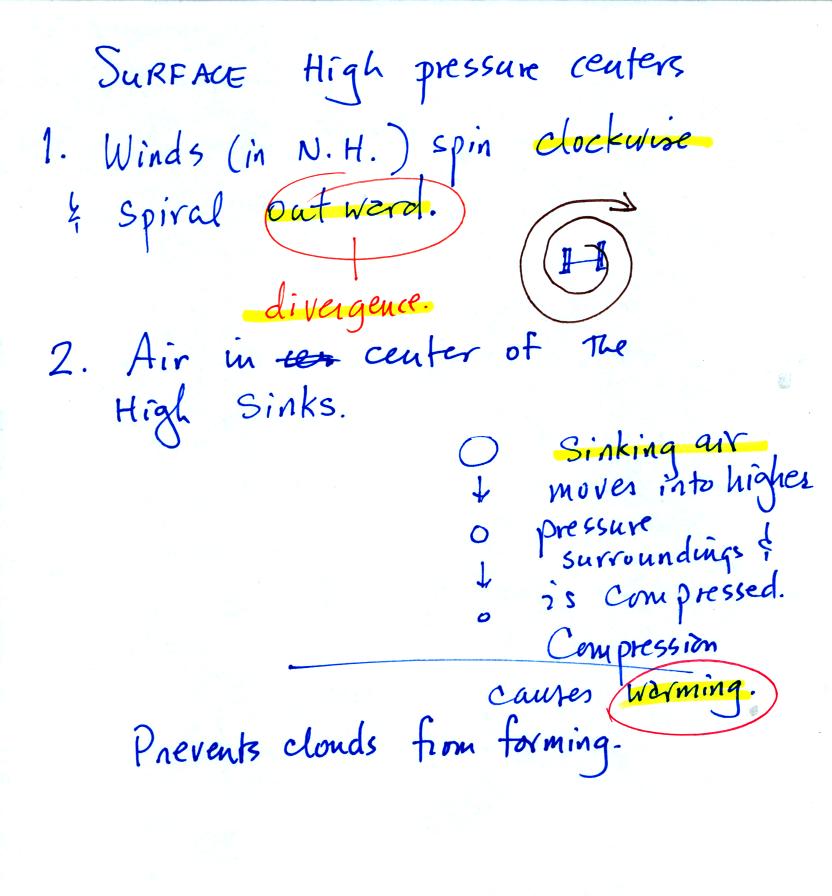
Sinking air motions in the center of a surface high generally mean
clear skies.