Wed., Jan. 18, 2006
The Experiment #1 materials were
distributed in class.
Handouts concerning the Donora Pennsylvania air pollution disaster and
SO2 pollution in Russia were distributed in class.
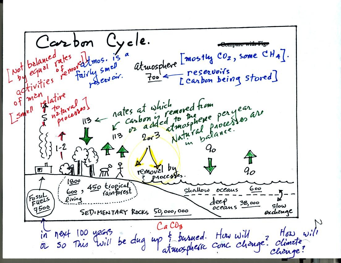
The carbon cycle shows the rates at which carbon (mostly in the
form of
CO2) is added to and removed from the atmosphere. It
also shows
various places where carbon is stored (underlined numbers).
The atmosphere contains only about 700 units of carbon (mostly CO2
but
also some CH4, methane). The deep oceans contain
38,000 units of
carbon, 50 million units are stored in sedimentary rock. There
are 7500 units of carbon in the form of fossil fuels waiting to be dug
up.
Natural processes such as respiration and decay add 113 units of carbon
to the atmosphere every year. 113 units are removed by
photosynthesis. The oceans add and remove 90 units of carbon per
year. Notice the natural processes are in balance - they would
not change the atmospheric CO2 concentration.
Activities of man such as burning fossil fuels and deforestation add a
total of 6 to 7 units (5 + 1 or 2 units) of CO2 to the
atmosphere every
year. This is fairly small compared to the CO2 added
by natural
processes, however the manmade contributions are not balanced by equal
rates of removal. About one-half of what man adds every year is
removed. Exactly how this is done is not known. It is this
imbalance that is causing atmospheric CO2 to increase.
There are 7500 units of carbon in the form of fossil fuels that will
probably be burned in the next 100 years or so. This is 7500
units of carbon that will be added to the atmosphere. You can see
that this could have a big effect on atmospheric CO2
concentration. There is a lot of research being done at present
to try to
figure out how the atmospheric concentration will change over time, and
also how
changing atmospheric concentration of CO2 (and other
greenhouse gases)
will change climate.
I tried to
improve the presentation of some of the following material in the T Th
section of the class. Some of the following figures have
been borrowed from the T Th class and were not shown in class on
Wednesday.
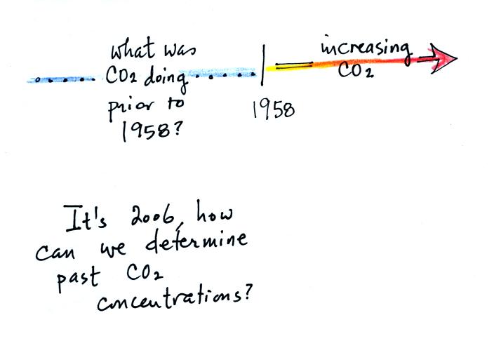
The Keeling curve shows us that the atmospheric CO2
concentration has
been increasing since 1958. What was happening before that?
How can we determine atmospheric concentrations in the past anyways?
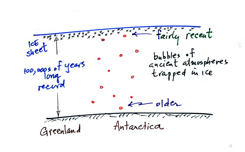
Ice has been accumulating in Antarctica and Greenland for hundreds of
thousands
perhaps millions of years. The ice sheets are two miles thick in
some locations. As this ice was deposited (in the form of snow)
small volumes of the ancient atmosphere were also trapped in bubbles in
the ice. Scientists have drilled into the ice sheets and removing
cores of ice. They have then been able to extract and analyze the
gases in the bubbles. They are actually able to measure CO2
concentrations in past atmospheres.
A small portion of what they have found is shown in the following
figure (the top of p. 3 in the photocopied notes).
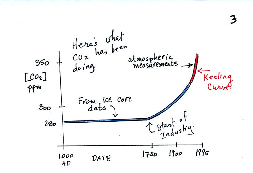
The red portion of the graph above shows the Keeling curve measurements
that were made starting in 1958. The blue portion shows CO2
concentration measurements based on ice cores. You can see that
CO2 concentration was fairly constant up until 1750 or
so. That
is about the time of the start of the "Industrial Revolution."
Burning fossil fuels to power machines and factories began adding
larger amounts of CO2 to the atmosphere.
The figure below shows that other greenhouse gases (methane [CH4]
and
nitrous oxide [N2O]) have also been increasing since the
start of the
industrial revolution.
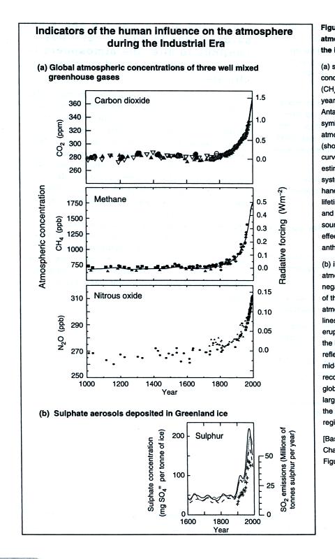
This figure is from "Climate Change 2001: The Scientific Basis,"
published by the Intergovernmental Panel on Climate Change
(www.ipcc.ch).
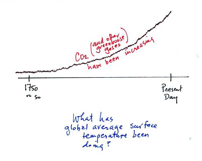
OK if greenhouse gas concentrations have been increasing since about
1750, What has the global average surface temperature been doing during
this same time period? The overall change in shown on the bottom part
of p. 3 in the photocopied notes.
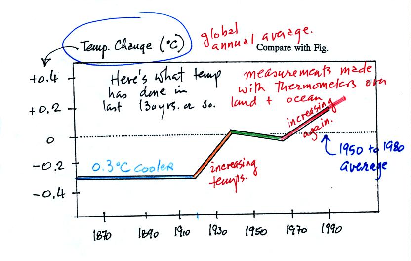
This figure doesn't show the average temperature rather how the average
temperature has changed
over the past 130 or 140 years. The
change is relative to the 1950 to 1980 30-year average (the dotted
line). Between 1860 and about 1920 the global average temperature
was about 0.3o C cooler than the 1950 to 1980 average.
The
temperature rose between 1920 and 1940. The 1940 to 1970 section
is somewhat puzzling. The exact cause of this slight cooling is
unknown. Temperatures have increased from 1970 to the present
day. Many scientists think that this second period of warming can
be attributed to increasing greenhouse gas concentrations.
Detecting such a small overall change in temperature for the earth is
difficult. Instruments and locations at which measurements were
made have changed (imagine how Tucson has changed in the last 130 years
or so). There is also a considerable amount of year to year
variation. About 70% of the earth is covered by oceans and
measurements over oceans are more difficult to make.
The graph above was smoothed to show the overall change. The top
figure below shows the actual year to year variation (red bars) and
gives you an idea of the uncertainly in the yearly average temperature
measurements (black vertical lines).
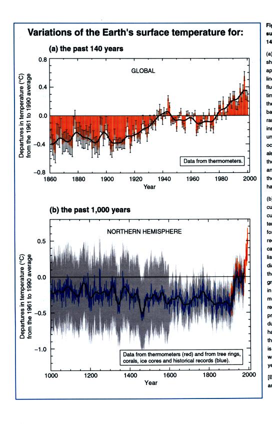
The lower curve shows estimates of global average surface temperature
for times before 1860. This is more difficult. This is not
based on actual measurements of temperature. We can't
directly measure the temperature of the air trapped in the bubbles of
polar ice (like can be done with CO2 concentration), the
temperature
has changed. Scientists have come up with other techniques to try
to indirectly determine temperatures in the past. We will
probably discuss some of this work later in the semester. [These
two figures are also from the Intergovernmental Panel on Climate Change
report].