Friday Feb. 10, 2006
Optional Assignment due next Monday at the beginning of class.
You should have the assignment completed before coming to class.
The crossectional structure of warm and cold fronts was discussed
briefly. That information was tacked on at the end of the Feb. 8
class notes.
A short time lapse video of a cold front passing through Tucson
on Easter Sunday, 1999 was showed in class.
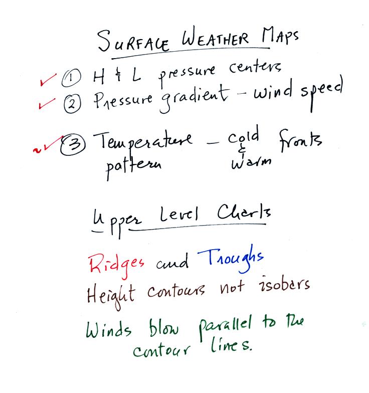
We have covered some of the important features found on surface weather
maps. Today we will look at upper level charts. Before that
however we will return to the surface map that has been used as an
example.
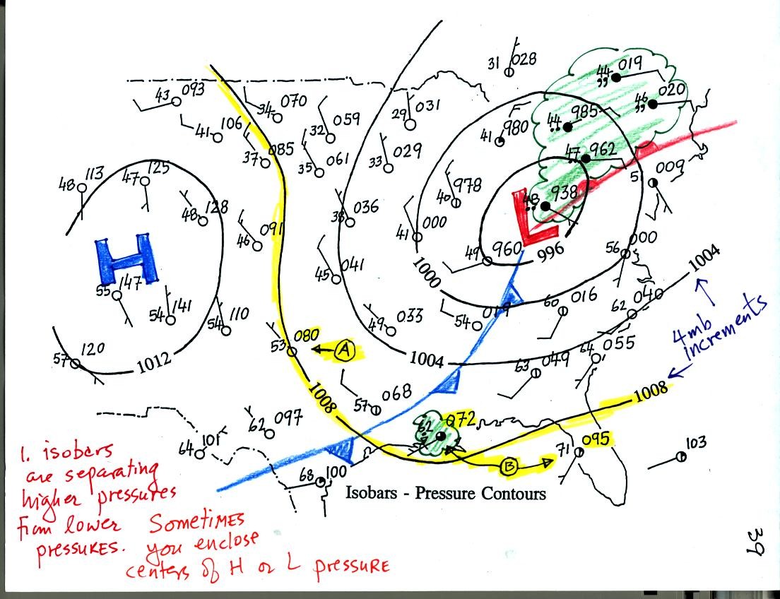
A warm and cold front have been added to the surface weather map.
The approaching cold front is probably what is causing the rain shower
at the city along the Gulf Coast. The clouds, rain, and drizzle
in the NE corner of the map is what you might expect to find ahead of a
warm front. Some of the stormy weather is probably being caused
by the nearby surface low pressure center (converging winds will
produce rising air motions, rising air motions can produce clouds and
precipitation)
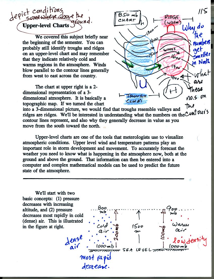
Now we'll take a look at upper level charts, charts
that depict atmospheric conditions above the ground. Before you
go any further you need to remember that
pressure decreases with increasing altitude in the atmosphere (pressure
at any level is determined by the weight of the air overhead, as you
move upward there is less and less air left overhead and pressure
decreases). Also, the rate of pressure decrease depends on the
air's density (if you move upward through dense air you are quickly
moving weight from overhead and putting it underneath you; this causes
a rapid rate of pressure decrease).
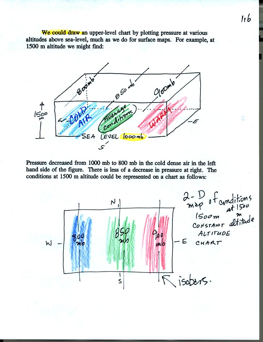
One way of depicting upper level conditions would be
to measure
pressure values at some fixed altitude above the ground. The
pressure pattern could then be plotted on a constant altitude chart
using isobars. Note the lowest pressures would be found in the
cold air, higher pressures would be found in the warm air.
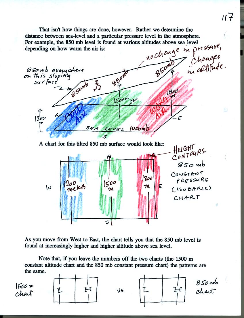
Rather than plotting conditions at a constant altitude
above the
ground, meterologists measure and plot conditions at a particular
reference pressure level above the ground. Every point on the
sloping surface above has the same pressure, 850 mb. The altitude
above the ground is what is changing. You would find contours of
altitude or height contours plotted on a one of these constant pressure
charts.
Note, at the bottom of the figure above, that the the two kinds of
upper level charts (constant altitude vs constant pressure) have the
same overall pattern.
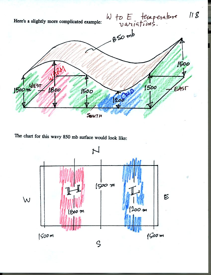
A slightly more complicated example - a wavy surface
instead of a flat
sloping surface.
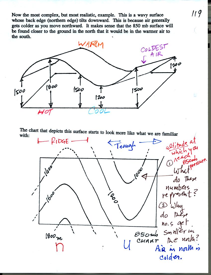
In this last example we have added a south (warm) to
north (cold)
temperature change to the west to east temperature variations that were
in the last example. We end up with a wavy surface that slopes
from front to back (high in the south, closer to the ground in the
north). The "topographic map" that represents this surface is
much different from our earlier examples but resembles more closely
what you would see on a real upper level weather map. Ridge and
trough features are clearly defined. You can now understand why
the ridges are called ridges. They should have called troughs
valleys.
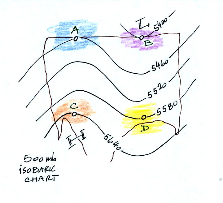
A final example not
shown in class that you can
use to check your
understanding of upper level charts. This is a 500 mb constant
pressure chart not an 850 mb chart like shown in the previous
section. The numbers on the contours are altitudes in
meters. The 500 mb pressure level is found at higher altitude
than the 850 mb pressure level.
Pressure at sea level is typically around 1000 mb. You find the
850 mb level at about 1500 meters altitude, the 700 mb level at 3000
meters and the 500 mb level at around 5500 meters altitude.
All four points on the map above have one thing in common: the pressure
at all four points is 500 mb.
Points C and D lie at about the same latitude. Point C is found
at higher altitude (5640 m) than Point D (5580 m). The air below
Point C is warmer than the air below Point D. Similarly the air
below Point A is warmer than the air below Point B.
Points A and C both lie in a ridge. The altitude at Point A (5460
m) is lower than the altitude at Point C (5640 m). The air below
Point A in the north is colder than the air below Point C near the
southern edge of the map. Similarly the air below Point B is
colder than the air below Point D. Both Points B and D lie in a
trough.
Pressure is decreasing most rapidly in the cold dense air below Point
B. Point B is closest to the ground. Pressure is decreasing
most slowly with increasing altitude in the warm low density air below
Point C. Point C is furthest from the ground.