![]()
![]()
![]()
In this class we will mainly be viewing what are called 500 mb height maps (mb stands for millibars, which is a unit for measuring air pressure). These maps are very good for getting a large-scale picture of the "weather pattern" over the United States, North America, or even the Northern Hemisphere. 500 mb maps are most applicable for studying winter time weather patterns in the middle latiutudes (between about 30° and 60° latitude). This is why we are introducing them at the beginning of the semester. As we go through the first part of this course, you will better understand what is plotted on the maps and why the maps look like they do. The purpose of this page is to begin to show you how to interpret the height patterns (contour lines) that are plotted on the maps.
If you do a web search for weather maps, you will find hundreds (maybe thousands) of sites containing maps. If you are interested, you should check some out. You should go through this exercise of looking at maps. I will expect you to be able to answer simple questions about how to do this on the exam. If you become interested in looking at these maps, you can continue to visit the site listed below outside of this class.
I suggest using the University of Wyoming's weather model plotting page.
I will give you some directions on how to use the plotting software to make
500 mb maps.
Open another browser window and type in the following address, then follow the instructions:
http://weather.uwyo.edu/models/fcst
After you are familiar with how to use the map page, follow the link below to directly connect: University of Wyoming's weather model page
The height contours on the map are actually the height of the 500 mb pressure surface above sea level. The average air pressure near the ground is about 1000 mb, and since air pressure decreases as one moves upward, at some altitude the air pressure will fall to 500 mb. The details of air pressure will be explained in subsequent lectures, so don't worry if you don't understand it right now. Notice that the height contours generally fall into the range 4600 - 6000 meters.
For now, I want you to be able to estimate the pattern of air temperatures based on the pattern of height contours shown on the map. The height of the 500 mb surface is directly related to the temperature of the atmosphere below 500 mb -- the higher the temperature, the higher the height of the 500 mb level. In other words, the 500 mb height at any point on the map tells us about the average air temperature in the vertical column of air between the ground surface and the 500 mb height plotted at that point. The height pattern tells us where the air is relatively cold and where it is relatively warm.
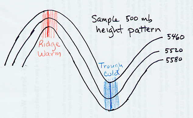
Consider what the 500 mb pattern would look like if air temperatures decreased steadily from the equator toward the north pole. (Note this is what you might guess based on the fact that the Sun's heating is strongest toward the south and weakest toward the north.) In that case the height contours would be concentric circles around the north pole with the highest heights to the south (toward the equator). While this is generally true, the actual pattern at any given time is wavy. Where the height lines bow northward (a ridge), warm air has moved north; and where the height lines bow southward (a trough), cold air has moved south. Therefore, in general warmer than average temperatures can be expected underneath ridges and colder than average temperatures can be expected underneath troughs. The more pronounced the ridge (or trough), the more above (or below) average the temperatures will be.
The terminology "trough" and "ridge" is related to the fact that the contour lines often look like waves. A "ridge" is the high point of a wave, and a "trough" is the low point of a wave. A simple diagram is shown below. Additional maps and diagrams will be used in lecture to help you understand what is meant by this.
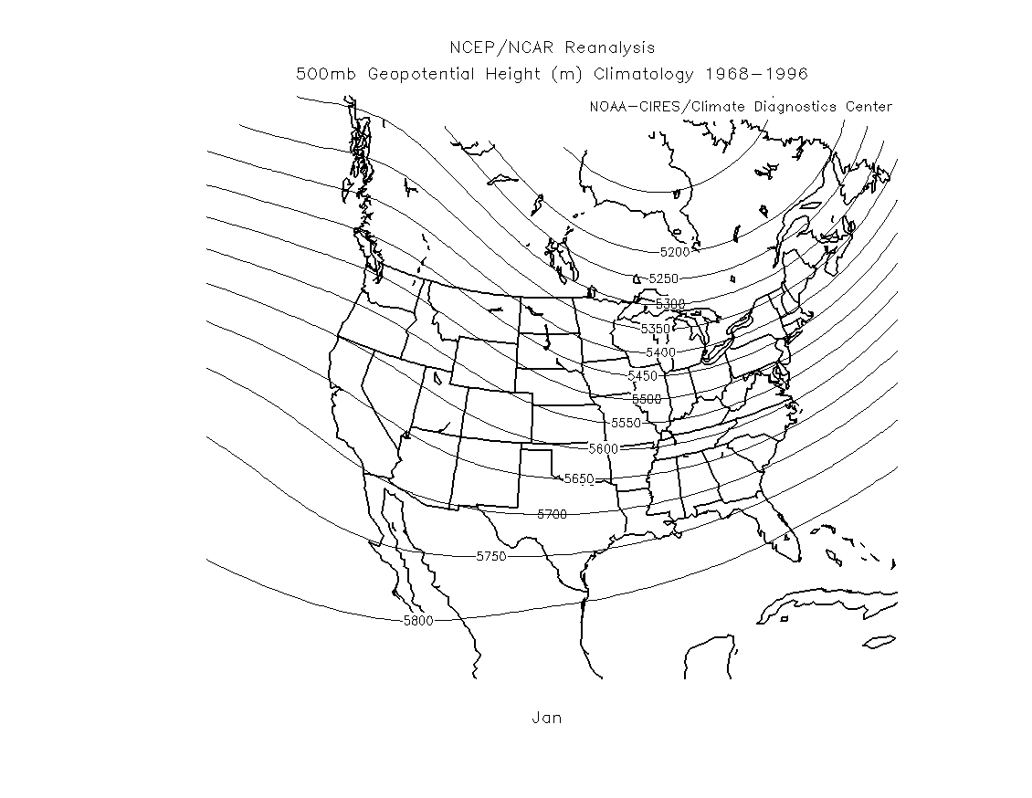
To be a little more precise in estimating expected temperature compared to average, we should compare the actual 500 mb heights from a map to the long-term average or "climatological" 500 mb heights. For a given location, if the 500 mb height on the map is close to average, then the temperature is expected to be about average. If the 500 mb height is lower than the average height, then lower than average temperatures are expected. If the 500 mb height is higher than the average height, then higher than average temperatures are expected. The further the 500 mb height is away from average the more the temperature is expected to be away from average. For example, if you compare the actual 500 mb height over Tucson for a given day (say January 18) to the average 500 mb height (from the link below), you can estimate whether or not the air temperature for the day will be above or below average.
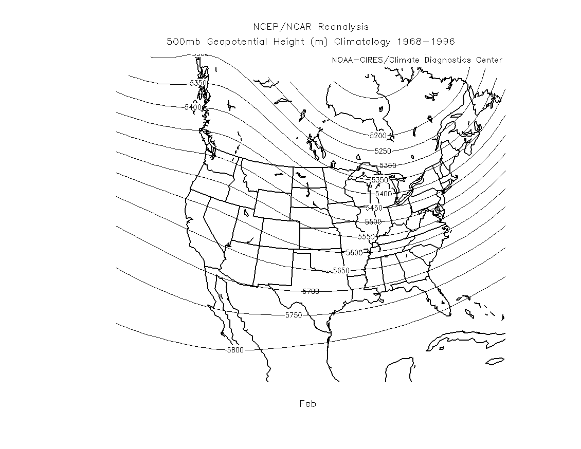
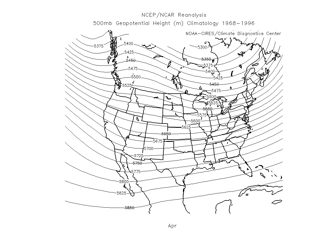
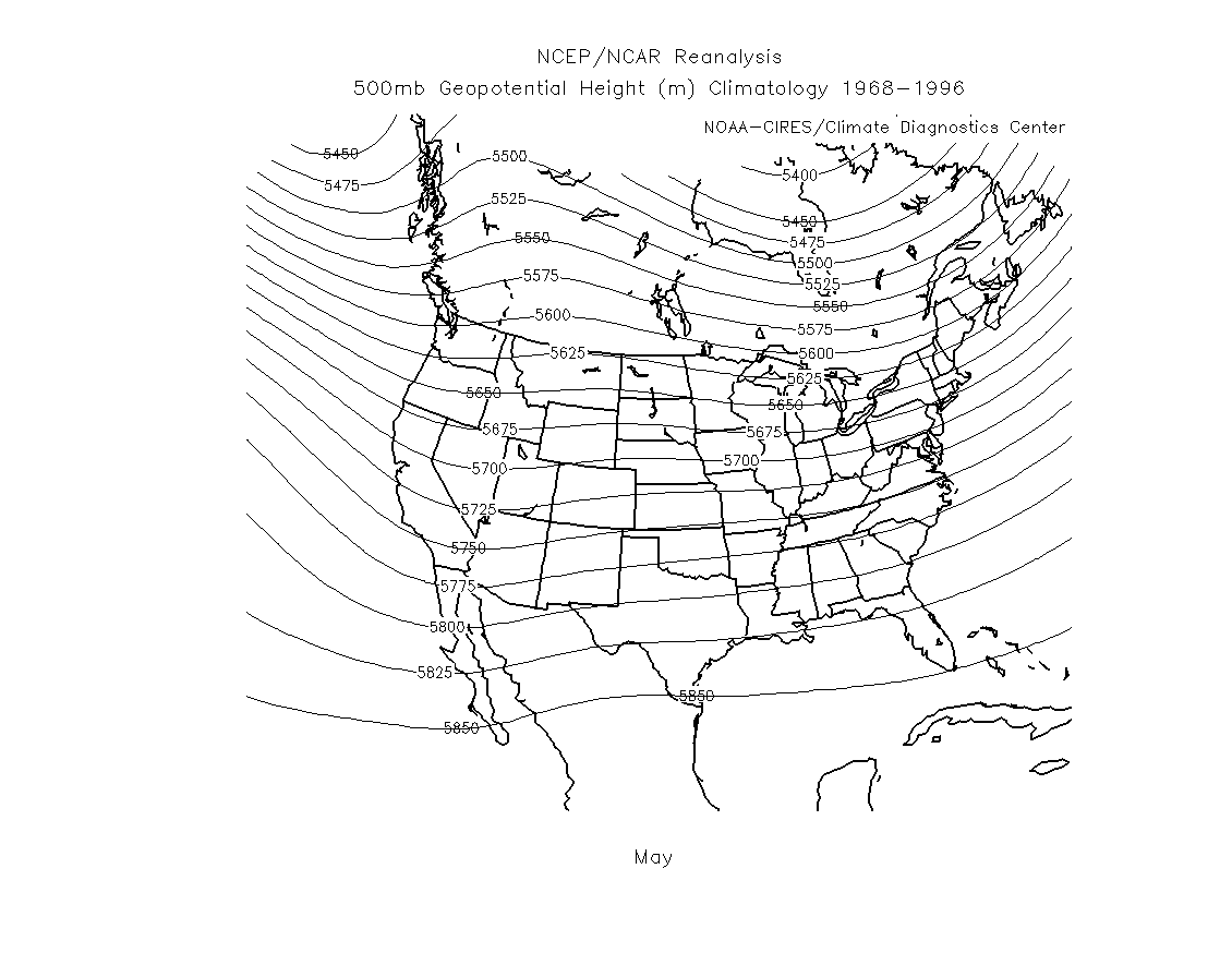
Below are some links to the averge long-term 500 mb heights over the United States
for the months January through May. If you focus on one place, for example Tucson, notice
the significant increase in 500 mb height in May as compared with January. This is expected
since air temperature is much higher in May as compared with January.
January 500 mb height climatology (long-term average)
February 500 mb height climatology (long-term average)
March 500 mb height climatology (long-term average)
April 500 mb height climatology (long-term average)
May 500 mb height climatology (long-term average)
NOTE OF CAUTION: This is a simplistic method. The 500 mb height actually tells you about the average air temperature in the vertical column of air between the ground surface and 4.6 - 6.0 km above sea level. Often this provides a good estimate of how warm or cold the air temperature is near the ground where we live. But factors like cloud cover, precipitation, and the type of ground surface (dry desert, moist soil, snow cover, etc.) also influence the temperature of the air at the surface. Thus, using the 500 mb heights to estimate surface temperatures is not exact. However, as you will see, the 500 mb maps often provide a very good overview of the pattern of warm and cold conditions near the ground surface.
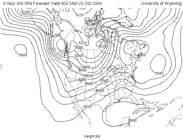
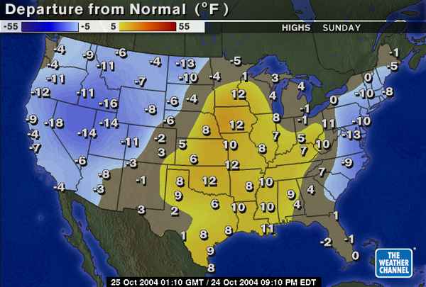
Below are two maps that we used in last semester's class. The first is the 500 mb height map for the time 00Z on Monday, October 25, 2004 (This corresponds to a local Tucson time of 5 PM on Sunday, October 24). Below that is the high temperature relative to average for the day Sunday, October 24. Notice that below average temperatures occured in the western US (associated with the trough over this region), while above average temperatures occured over the midwest southward to the southern great plains and lower Mississippi valley (associated with the ridge over this region), and below average temperatures over parts of the east coast (associated with the trough centered just offshore).
![]()
![]()
![]()