![]()
![]()
![]()
![]()
The plots of global temperature changes prior to 1860 (i.e., before the period of instrumental records) provided in the previous lecture about the Holocene Epoch should not be interpreted as a literal and exact reconstruction of global average temperature changes. There is a great deal of difficulty and uncertainty in trying to reconstruct global average temperature changes based on proxy data. One thing we can say with some certainty is that global average temperatures have fluctuated all throughout Earth's history, including the last 2000 years. Prior to 1900, we can safely say that the changes were not caused by anthropogenic additions of greenhouse gases, but were natural fluctuations.
The plots previously provided to you are only one estimation for global average temperature change and do not give you any indication about the uncertainty. Other research groups have come up with different reconstructions based on their interpretation of available proxy evidence for global average temperature changes. The figure below gives some indication of the unceratainty as it shows 15 different published global temperature reconstructions for the last 2,000 years (the colored lines; note that some of the reconstructions shown do not extend back a full 2,000 years). Please understand that there is not one single correct reconstruction. Most of these reconstructions show a clear Medieval Warm Period and a clear Little Ice Age. Presently, we are interested in the reconstructions prior to about 1950. The black lines represent the observed change in northern hemisphere temperature based on measured data. A big problem is that it is difficult to tell where the recently observed temperatures (black lines) sit relative to the proxy temperature reconstructions. In other words, it is difficult to determine where today's northern hemisphere temperature fits in an absolute sense. The point of the figure is to indicate the uncertainty in reconstructing past temperature changes based on proxy evidence. You should not use this plot to compare the current temperature with these reconstructed temperatures over the last 2000 years. For example, do not use this plot as hard evidence that the current global average temperature is higher than it was during the Medieval Warm Period. A big issue is that proxy-derived estimates of past temperature have low time resolution, while the measured temperature record has high time resolution. This means that proxy reconstructions provide a time-smoothed version of temperature changes that are unable to resolve short time scale temperature spikes and dips. Meanwhile the measured temperature record does resolve short time scale temperature spikes and dips. Adding recent, high time resolution temperature observations to the end of a low time resolution proxy record can make it appear that the recent temperature is increasing at a faster rate and has become warmer than it was in the past, when in fact information concerning the magnitude and rate of temperature changes has been smoothed out of the past, proxy-derived temperature reconstruction. In other words, we are unable to conclude that it is warming faster now than it ever was during the proxy time period since the high time resolution information we would need is not available from the proxy records. See this document, which contains a further discussion of this issue with a simple illustration.
![[NH Temperature from ipcc]](ipcc_ar5_fig_5_7_temp_reconstruction_past_200_years_modified.png)
|
| This is Figure 5.7a from chapter 5 of the IPCC report Climate Change 2013: The Physical Science Basis. The non-black lines show various reconstructions of Northern Hemisphere temperature based on proxy data. Please see source for information about each one. The black lines are based on observations (direct measurements) of surface temperature after 1850. |
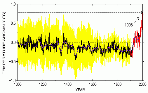
Each year I debate whether to keep this section in the course notes. While this study was originally done over 20 years ago, it is still common to find references to a "hockey-stick" type change in global average temperature with the inflection point around the year 1900.
One of the most controversial (and often referenced) reconstructions was first released by Michael Mann and co-authors in the 1998 article, Global-scale temperature patterns and climate forcing over the past six centuries, which appeared in the journal Nature. This particular reconstruction has been labeled the "Hockey stick" (see image below) because of the hockey stick shape of the trend lines: gradual cooling from 1000 - 1900 AD, followed by a sharp warming after 1900. This reconstruction makes the medieval warm period and little ice age look insignificant compared with the rapid increase in global average temperature since 1900. (NOTE: based on written historical evidence, we can be fairly certain that these periods were relatively warm and cold throught much of Europe. Mann's study indicates that global average temperature did not behave like that of Europe.) Although the authors of this study tried to properly merge proxy-record information (tree rings, corals, ice cores, boreholes, etc) prior to 1900 with the measured temperature record after 1900, this is quite challenging and uncertain. As discussed above, it is very difficult to try to compare temperatures from proxy records with observed temperature from today in an absolute sense. Again, one cannot scientifically conclude that the global average temperature in the year 1998 (based on thermometer measurements) was 0.7°C warmer than the global average temperature in the year 1000 based on proxy inferences.
|
| "Hockey stick" reconstruction of global average temperature changes over 1000 years (ending in 1998). Reconstruction performed using proxy data before 1900 and instrumental data after 1900. Yellow and red shading show author's estimation of uncertainty in the reconstruction. |
It is difficult to decide which, if any, of the reconstructions of global mean temperature is the most accurate reflection of temperature fluctuations during the last 1000 years. However, it is likely that such reconstructions, accurate or not, will play a significant role in the ongoing discussions of global climate change and global warming.
If you "believe" the temperature reconstruction presented on the previous reading page, then global average temperature seemed to be relatively warm during the medieval warm period, generally cooling into the little ice age period, then warming after the little ice age. This may lead some to conclude that the present warm conditions are not extraordinary when viewed in the context of the last 1000 years. In other words there are recent natural climate fluctations in global average temperature very close to what we are observing today, and the human influence on global aveage temperature changes may be small.
If you "believe" the hockey stick reconstruction, then the current global average temperature is much warmer than at any time over the last 1000 years and much of the warming began after 1900, which coincides with the increase in human emissions of greenhouse gases. This can lead to the conclusion that the conditions today are extraordinarily warm compared with the recent past and more likely can be attributed to anthropogenic greenhouse gas increases.
The debate about the validity of the hockey stick reconstruction still continues more than 20 years after its initial publication. The graph has been used almost as an icon of global warming due to human emissions of greenhouse gases. It was published in the 2001 IPCC report as "evidence" that the increase in global average temperature since 1900 was unprecendented over the last 1000 years . However, I believe that we can now say that the methodology used to create the original hockey stick graph was flawed. The biggest problem is due to mathematical and statistical errors in Mann's method that were discoverd and proven to exist. This is discussed in a non-technal manner in this article, A Global Warming Bombshell: A prime piece of evidence linking human activity to climate change turns out to be an artifact of poor mathematics written by Richard Muller, who says he is concerned about global warming and thinks that human-added carbon dioxide has largely contributed to the recently measured warming (after 1900). In the article, Muller makes the point that a blind belief about the implications of the hockey stick could actually weaken the case of human-caused gloabal warming if the Earth were to begin a period of global cooling. If one were to claim, based on the hockey stick graph, that greenhouse gas increases are the main driver of recent climate changes, it would be would be difficult to explain a period of global cooling (or even an extended period with no global warming, such as the recent period from about 2000 to 2013) during a time when greenhouse gas concentrations in the atmosphere are increasing. A brief history of the hockey stick controversy is provided in Unscientific hockey sticks and hidden data and The rise and fall of the Hockey Stick. It is interesting how quickly the hockey stick graph spread through the IPCC, world governments, and the media, even though some had reasonable doubts about the data and methods. The journal Nature, which published the paper, did not do a good peer review of the manuscript and along with Michael Mann did not provide other scientists access to the data or methods. This is generally required for all scientific papers ... once a paper is published, other scientists are able to verify or disprove the results. In the instance of the hockey stick, it tooks years via legal action to get access to information that should have been made readily available. Once access to the data and methods were granted, it took only a matter of weeks for the hockey stick graph to be scientifically and mathematically invalidated. The hockey stick shows how personal beliefs and politics can blind people with respect to this issue of possible global warming due to human emissions of greenhouse gases. Since many wanted to believe the implications of the hockey stick, they failed to question the validity of the study. This group included scientists who should know better. The fact that the hockey stick graph has been invalidated, though, does not mean significant global warming and climate changes have not happened or will not happen due to human emissions of greenhouse gases. However, the best scientific assessment of available proxy data does not support the temperature changes indicated by the hockey stick no matter how much some want it to be true.
Another criticism of Mann's work is that the results are highly influenced by the use of tree ring proxy data. It can be difficult and misleading to interpret past temperatures based on tree ring data. For one, the yearly growth of a tree depends on more than just temperature changes, e.g., rainfall, availablity of nutrients, etc., making it easy to mistake a change in rainfall for a change in temperature for example. Another reason is that for each tree there is likely some optimum growing temperature. If it is warmer or colder than the optimum less growth will occur, which can make it difficult to interpret the growth ring in terms of temperature changes. Note that the hockey stick graph was not included in the 2007 IPCC report or the latest 2013 report, which further indicates that even those concerned about climate change have realized the graph cannot be scientifically justified.
For balance, even though the methodology used to create the original hockey stick was flawed, there are researchers who believe that the original hockey stick was actually a decent representation for changes in global average temperature over the last several hundred years. Today, there are many more proxy estimates of past temperature changes available and some claim these support the general conclusions drawn from the original hockey-stick study. Most importantly that the recent century is the warmest over at least the past several hundred years and the current rate of warming is fastest in the past several hundred years. However, it remains difficult to compare the global average temperature today to the global average temperature during the medieval warm period 1000 years ago in an absolute sense. If you are interested, here is a link to a page on skeptical science that makes arguments in support of the general findings of the original hockey stick study, titled What evidence is there for the hockey stick? There is no expectation that students read that material.
It is also possible that cooling would have been the natural cycle of climate change, but that is being altered by human activity mainly by the emission of greenhouse gases into the atmosphere. Just for comparison, below is a published reconstruction of the inferred temperature on Greenland over the last 10,000 years based on ice core data. This reconstruction implies that the current warm period is not outside the range of natural variability and in fact is not nearly as warm as past periods within the Holocene Epoch, which is the period beginning after the end of the last ice age about 15 thousand years ago. The plot further implies that on long time scales, the Earth seems to be more likely heading toward a colder glacial period, rather than an historically warm period. This record ends around 1900. There has likely been some additional warming on Greenland since 1900, which may be due to greenhouse gas increases. The point here is that some proxy records do not indicate the the modern time is the warmest period of the Holocene Epoch, as is often stated. Keep in mind that temperature reconstructions based on proxy records are uncertain and other studies may interpret the data differently. Unlike most of the other plots discussed, this one shows infers an actual temperature, rather than just changes in temperature, but only for Greenland, so it is not changes in global average temperature.
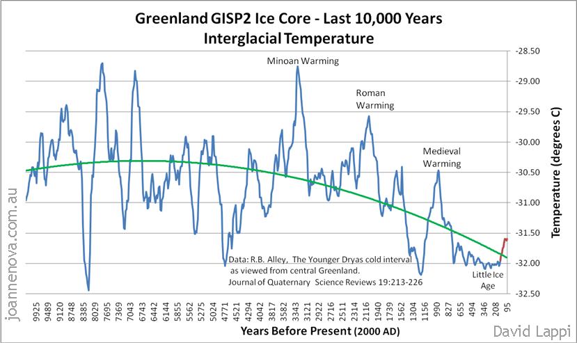 |
| Change in air temperature on Greenland based on one interpretation of ice core data. Data reference provided on image above. Plot obtained from The big picture: 65 million years of temperature swings. |
We certainly cannot resolve this issue here. There is lively debate on these reconstructions even among the "experts". In any case, all reconstructions of global average temperature based on proxy data are so uncertain that one cannot be used to disprove another. As with many other issues in the global warming debate, we are forced to decide how to act based on uncertain information.
![]()
![]()
![]()
![]()