![]()
![]()
![]()
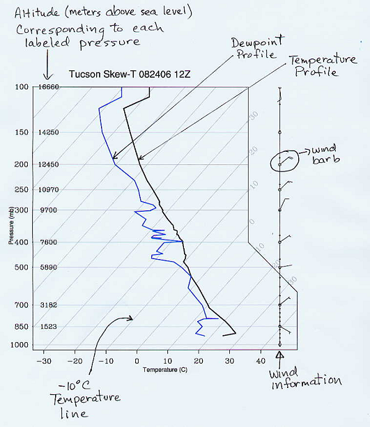
The Skew-T diagram gives a "snapshot" picture of air temperature, dew point temperature, air pressure, and winds in the atmosphere above a particular point on the Earth's surface. The data is measured by launching hydrogen or helium filled balloons carrying weather instrument packages called radiosondes. As the balloon rises, the measurements are transmitted to a ground receiver. Twice a day, at 0000 and 1200 UTC (Universal Coordinated Time), about 800 radiosondes are launched worldwide, including two from Tucson, which are launched from the roof of the Arizona ENR Building (corner of 6th and Park). (NOTE: 0000 UTC corresponds to 5 P.M. local Tucson time and 1200 UTC corresponds to 5 A.M. local Tucson time. Tucson local time is always 7 hours earlier than UTC.) The measured data is then plotted on a skew-T diagam. Skew-T diagrams are used by meteorologists to help determine atmospheric stability and to assess the possibility for the development of severe thunderstorms.
In this class we are going to use stripped-down, skew-T diagrams to visualize the vertical structure of the atmosphere. This page describes how to read some of the information contained in the diagram. The first skew-T diagram we are going to study is shown in the figure box below and was generated based on measurements over Tucson on August 24, 2006 at 1200 UTC (labeled as 12Z, often 0000 UTC is labeled as 00Z and 1200 UTC as 12Z). The bold black line is a plot of the vertical temperature above Tucson and the bold blue line is a plot of the vertical dewpoint temperature above Tucson. The vertical axis is the air pressure in millibars (mb), and the horizontal lines on the graph are lines of constant pressure. The numbers printed on top of these pressure lines indicate the height above sea level in meters (m) at each of the pressure levels. For example, on this day and time, when the radiosonde balloon reached 5890 m above sea level, the measured air pressure was 500 mb. As expected air pressure must decrease as you move upward in the atmosphere.
The tricky part about reading the skew-T diagram is that the lines of constant temperature are not vertical as in most graphs, but "skewed" at an angle of 45° from vertical. These lines are spaced on the graph every 10° C. To help you see this, the constant temperature lines are labeled on both the bottom and right axes of the plot. For example, at 700 mb (3182 m above sea level), the air temperature above Tucson was 10° C, since the bold, black temperature plot lies right over the 10° C constant temperature line. Now follow the bold, black line upward from there. Notice that the atmospheric temperature drops to the freezing level (0° C) somewhere between 700 mb and 500 mb (3182 m and 5890 m). Continuing upward to where the air pressure is 500 mb, hopefully you can see that air temperature at this point in the atmosphere is approximate -7° C.
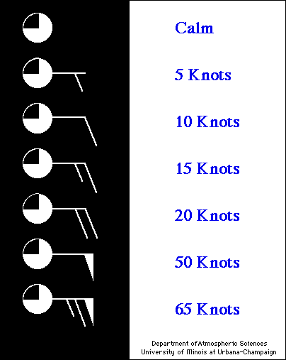
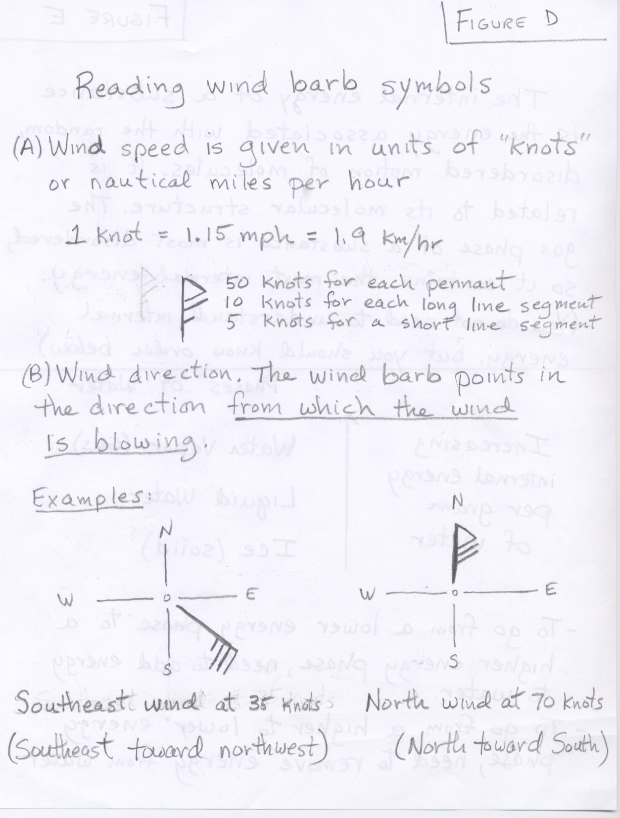
The final bit of information on the skew-T diagram is the wind information shown along the right side of the diagram. The "wind barbs" indicate both the wind speed and wind direction at the corresponding air pressure and altitude. The wind barb points in the direction from which the wind is coming, with respect to standard compass directions. For a wind from the north the barb sticks straight up, from the east the barb points right, from the south the barb points straight down, and from the west the barb points left. For example the circled wind barb indicates that the measured wind at 200 mb was from the northeast. Wind speed is indicated by the line segments and flags attached to the end of the barb. There are long and short line segments. Each long line segment represents 10 knots of wind (there can be up to 4 long line segments). A short line segments represents an additional 5 knots of wind. For example the circled wind barb indicates a wind speed of 20 knots, whereas the wind barb directly below the circled wind barb indicates a wind speed of 15 knots. Each Flag on a wind barb represents 50 knots of wind speed. In the example all of the winds were too light to need a flag. A legend for wind speed is shown below on the right. (By the way a knot is a nautical mile per hour. 1 knot = 1.15 miles per hour). (See Figure D for further explanation)
 |
 |
These next examples are typical skew-T diagrams for winter in Tucson. Click on the links below to open diagrams in separate browser windows or tabs
as you read the discussion below:
Tucson Skew-T January 14, 2012 at 00Z
Tucson Skew-T January 14, 2012 at 12Z
Tucson Skew-T January 16, 2012 at 00Z
Tucson Skew-T January 16, 2012 at 12Z
North American 500 mb map for January 16, 2012 at 12Z
You should be able to determine the local Tucson time corresponding to the skewt diagrams above. For example, the local Tucson time corrsponding to January 14, 2012 at 00Z is 5 PM on January 13. Notice that there is a temperature inversion just above the ground in the January 14 12Z Tucson skew-T diagram. Remember that it is common to have a temperature inversion form just above the ground in the early morning hours just before sunrise, especially when skies are clear as they were overnight on January 13 into the morning on January 14. A comparison of the 00Z and 12Z skew-T diagrams for January 14 shows that the lower atmosphere above the ground surface was considerably colder at 5 AM than it was at 5 PM the day before, from 20°C [68°F] to 6°C [43°F]. Higher up there was little change in temperature between morning and evening. Note the 500 mb height on the January 14 skew-T diagrams are 5740 and 5760 meters. These are above the January average 500 mb height in Tucson of 5680 meters and thus one would expect warmer than average temperature. The average high in Tucson on January 14 is 65°F and the high on January 14, 2012 was 72°F.
Rain showers fell in Tucson during the night of January 15 and the morning of January 16, which corresponds with the January 16 00Z and 12Z skew-T diagrams above. One indication of clouds and rain is having relative humidity values close to 100%. Clouds exist where the relative humidity is close to 100%. Although we have not yet covered relative humidity, the relative humidity is 100% where the air temperature and the dew point temperature are the same. On the Tucson skew-T diagram for January 16, 2012 at 00Z, there is a cloudy layer near 3100 meters above sea level (air pressure about 700 mb), where the air temperature and the dew point temperature are close in value. At this time on Sunday evening, some light rain was just beginning to fall around the area. The Tucson skew-T diagram for January 16, 2012 at 12Z shows a large region of high relative humidity air from near the ground to about 4000 meters above sea level. Rain had fallen during the night and there were still showers around in the morning. The high relative humidity is characteristic of clouds and rain falling to the ground.
The Tucson skew-T diagram for 12Z January 16 clearly shows the troposphere and tropopause. The tropopause runs from the ground upward to about 10470 meters above sea level where the air pressure is about 250 mb. This is the altitude where the air temperature stops decreasing with height and becomes constant at a temperature of about -53°C. The constant temperature layer tropopause extends upward from there.
Looking at the Tucson 12Z skew-T for January 16, the winds at the 500 mb pressure level are from the west-southwest at 60 knots and the 500 mb height is 5660 meters. You should be able to verify that this 500 mb wind direction and height over Tucson is consistent with the height pattern shown in the 500 mb map. Additionally, the position of a 500 mb trough centered just to the west of Tucson places Tucson in a favorable position for rain, which was happening at the time.
Click on the links below to open diagrams in separate browser windows or tabs
as you read the discussion below:
Tucson Skew-T August 28, 2012 at 00Z
Tucson Skew-T August 28, 2012 at 12Z
North American 500 mb map for August 28, 2012 at 12Z
You should be able to tell the local Tucson time corresponding to the skewt diagrams above. For example, the local Tucson time corrsponding to August 28, 2012 at 00Z is 5 PM on August 27. A comparison of the 00Z and 12Z skew-T diagrams for August 28 shows that the lower atmosphere above the ground surface was considerably colder at 5 AM than it was at 5 PM the day before, from about 40°C [104°F] to 28°C [82°F]. Higher up there was little change in temperature between morning and evening. Notice also that there is a hint of a temperature inversion just above the ground surface at 5 AM. Remember that it is common to have a temperature inversion layer above the ground in the early morning hours just prior to sunrise. Temperature inversions are much more pronounced during the winter months when the nights are longer. Pronounced ground level temperature inversions were clearly seen on the 12 Z (5 AM local) skew-T diagrams for January 14 and 16, 2012 discussed above.
The tropopause is typically found at a higher altitude in summer, which indicates that the troposphere (or "Overturing Layer") extends to higher altitudes in summer. Both August 28, 2012, skew-T diagrams indicate the position of the top of the troposphere and the lower part of the tropopause. This happens where the air temperature stops decreasing and becomes nearly constant as you move upward. On the 00Z skew-T this transition takes place just above the 150 mb pressure level, which is estimated to be around 14500 meters above sea level. On the 12Z skew-T this transition takes place near the 120 mb pressure level, which is estimatated to be around 15500 meters above sea level.
As mentioned above, the radiosonde balloon can pass through clouds as it rises upward. There was apparently a cloudly layer in the 00Z sounding between the 700 mb and 500 mb pressure surfaces, where the air temperture and the dew point temperature come close together. We have not covered relative humidity yet, but when the air temperture and the dew point temperature are the same, the relative humidity is 100%. The relative humidity in clouds is always near 100%.
Finally, an indicator of the southwest monsoon season over Southern Arizona is a reversal of the prevailing 500 mb winds from generally westerly (west toward east) most of the year to generally easterly (east toward west) during the summer monsoon season. We will come back to that topic later in the semester. Also notice that the 500 mb height is much higher in the summer skew-T diagrams, which reflects the warmer, more expanded air below 500 mb. Looking at the Tucson 12Z skew-T for August 28, the winds at the 500 mb pressure level are from the east at 20 knots and the 500 mb height is 5920 meters. You should be able to verify that this 500 mb wind direction and height over Tucson is consistent with the height pattern shown in the corresponding 500 mb map for 12Z. The 5940 meter closed contour over Colorado is a closed high, which is known as the monsoon high to local weather forecasters. The wind flow around the closed high is clockwise, which results in easterly 500 mb winds over Tucson. This 500 mb height pattern (and winds) are favorable for monsoon season thunderstorm activity in southern Arizona. The 5760 meter closed low in the northern Gulf of Mexico is the location of Hurricane Isaac.
The skew-T diagrams shown above have been simplified. There are many other lines on a full skew-T diagram, which are used by meteorologists to do things like assess the possibility for thunderstorms. These exercises are beyond the scope of this course. The only lines shown on the diagrams above are horizontal lines to represent constant air pressure and the skewed lines to represent constant temperature. These are the only ones that you will be asked to use in this class to be able to read the air temperature and dew point temperature at different pressure levels and altitudes. Other lines shown on a standard skew-T diagram were removed to make it easier to focus on the pressure and skewed temperature lines. However, if you request a skew-T diagram from a web site, it will contain all of the other lines, which can be confusing for a student just learning how to read the air temperature and dew point temperature from the diagrams. The Univerisity of Wyoming's link provided below is a great place to get current and historical skew-T diagrams. A brief explanation for how to use the site and determine temperature information is discussed at the bottom.
The most current skew-T diagrams from stations in North America and Hawaii is available
from the NCAR Real-Time Weather Data Page
for Upper-Air Soundings. Click on any station to bring up the most recent skew-T.
These diagrams
include some additional lines that we will not use in this class.
Please do not let these confuse you. You can still see the skewed
constant temperature lines, which are shown in light blue. The thick red
line shows the air temperature and the thick green line shows the dew point
temperature. The wind barb symbols are sometimes difficult to read on these plots.
Latest Tucson Skew-T diagram from the NCAR Real-Time Weather Data
The Department of Atmospheric Science at the University of Wyoming provides
a link to view the Skew-T diagram for any station on Earth
for any day since 1973. You may be asked to do this as part of a
weekly discussion exercise. More detailed instructions are provided
below the link.
After you click the link below, you must specify
a geographical region and date for the sounding you want. You should also
select Skew-T for the type of plot. This will bring up a map with all
sounding stations for the specifed region and time. Click on the station you
want and the corresponding Skew-T diagram will be drawn. Again these diagrams
will have more lines than the stripped down versions that are shown above,
but don't let that confuse you. You should be able to
find the skewed temperature lines and read the vertical profile of air temperature
and dew point temperature.
University of Wyoming's
Sounding Data
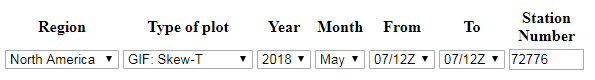
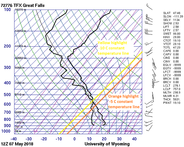
Click on the link above to open a new tab at the University of Wyoming's sounding request page. The upper image below shows the menu selection items at the top of the page. Use the drop down menus to select the geographical region of interest and the date range for the skew-T diagrams. If the date range selected includes more than one skew-T diagram, then a movie of the skew-T diagrams from the start to the end time will be shown. The default time setting is for the latest available skew-T diagrams. For the type of plot, Select "GIF: Skew-T" or PDF: Skew-T" to produce images in either GIF or PDF format. After the selections are made, click on a station location within the map to produce the skew-T diagams. An example is shown in the lower image below. After choosing the settings shown in the menu above the skew-T, the station location for Great Falls, Montana was selected to produce the skew-T image shown. You will notice many additional lines on the diagrams that were not discussed above. You just need to be able to find the skewed temperature lines to read the air temperature and dew point temperature from these plots. On these plots, skewed temperature lines are shown every 5°C, rather than every 10°C. The constant temperature lines are thin, straight blue lines that begin at the labeled temperature at the bottom of the graph and run up and to the right at a 45° angle from vertical. The -10°C constant temperature line is highlighted in yellow and the -5°C constant temperature line is highlighted in orange on the example skew-T diagram obtained from the University of Wyoming that is shown at the bottom.
|
|
![]()
![]()
![]()