![]()
![]()
![]()
![]()
The previous page described the concept of 500 mb height in the atmosphere. In this class we will be viewing and interpreting what are called 500 mb height maps (mb stands for millibars, which is a unit for measuring air pressure). When you encounter the words "500 mb map" in the reading pages, you should say "500 millibar map." These maps are very good for getting a large-scale picture of the "weather pattern" over the United States, North America, or even the Northern Hemisphere. 500 mb maps are probably most useful for studying cool season weather patterns in the middle latiutudes (between about 30° and 60° latitude). However, it is important to look at current maps and this class begins during the summer season, so we will first focus on using the maps to help visualize the wind shift that occurs during the southwest monsoon season and to tell us something about the chances for monsoon season thunderstorms in Arizona. We will return to 500 mb maps again later in the semester to study cooler season weather patterns. As we go through the first part of this course, you will better understand what is plotted on the maps and why the maps look like they do. The purpose of this page is to begin to show you how to interpret the height patterns (contour lines) that are plotted on the maps. A 500 mb height map from June 26, 2017 is shown below. For now, notice the labeled contour lines, which show the 500 mb height pattern, and do not worry about the color shading.
![[sample]](June26_2017_500mb_anomaly_small.png)
|
| 500 mb height map at 12Z on June 26, 2017. Height contours on this map are labeled in decameters (dam). Simply add a zero to the end of each number to get the 500 mb height in meters (m). For example 576 dam = 5760 m. The color shading shows the height anomaly in dam, which is the observed 500 mb height minus the average 500 mb height for each location. |
With experience one can easily visualize the large scale weather pattern by looking at the 500 mb height pattern. This is nice when looking at computer-generated forecast maps of the 500 mb height pattern predicted for some time into the future to get an idea of what the computer model predicts the future weather to be. We will look at forecasts of the 500 mb height pattern during the semester. The sections below begin to describe how to read and interpret the contour pattern on 500 mb height maps. The next paragraph describes the time stamp information on the maps. Following that a quick link to a weather forecast of 500 mb height maps is provided.
All weather observations taken around the Earth need to be coordinated to a common time. The world's time standard is called Coordinated Universal Time (UTC). It is important that all weather observations use UTC so that the state of the atmosphere can be measured all around the globe at the same time. The measured, or observed, state of the atmosphere is used as a starting point for weather forecast models. Historically, UTC was set to the timezone for the the 0° longitude line, which includes the city of Greenwich, England, and for this reason it is sometimes still called Greenwich Mean Time (GMT). The military uses the name "Zulu Time" or "Z Time" to denote this standard time, where Zulu is the military phonetic name for the letter "Z", which in this case stands for the time at the Zero meridion (0° longitude). In specifying time, UTC, GMT, and Z all mean the same thing. Z time also uses the 24 hour military clock, e.g., 00Z is midnight, 06Z is 6 AM, 12Z is noon, 18Z is 6:00 PM, and 23Z is 11:00 PM.
Most of the weather maps and charts that we will have a military-Zulu timestamp that indicates the standard time for which the map or chart is valid. Look at the 500 mb height map shown above. The map time is indicated after "Valid:" in the label on the upper left side of the image. This can be read as Monday, June 26, 2107 at 12Z. 12Z indicates the hourly UTC time, which is noon. You should realize that the local time in your location will be different from UTC time that is shown on the maps (unless you live in the time zone that includes Greenwhich, England). You can determine your local time based on the time offset in hours between your location and UTC time. Go to the link timeanddate.com to find the time offset between your location and GMT. (Note. The link is set for North American cities, so you will need to switch to another region if you want the time offset for other parts of the world.) For example, the time offset listed for Tucson, AZ is -7 hours. Thus, the local time in Tucson is 7 hours earlier than the time stamped on a 500 mb height map. You will be expected to determine the local Tucson time from the time stamp information given on weather maps and charts. For the map above, 12Z is 12 noon UTC. The local Tucson time is 7 hours earlier, which is 5 AM on June 26, 2017. One tricky item is that moving back 7 hours may change the local time to the previous day. For example 00Z is midnight UTC. The local time in Tucson is 5 PM on the previous day, which is determined by counting back 7 hours from midnight.
Here is a link to a recent forecast loop of 500 mb height maps. The link should open in a new tab or window. Use the video control buttons above the maps to play the forecast movie or move frame by frame. Notice how the valid time for each map image changes. The 3 digit number after the F indicates the number of hours into the future for which the forecast map is valid. For example "F120" means that the map is a forecast for 120 hours (5 days) after the model started running. For now, just go through this exercise of looking at some forecast maps. If you are interested you may wish to further explore the weather products available from the Pivotal Weather site. Forecasts from several weather models are available.
You should go through the exercise of viewing some maps. Don't worry if you do not understand the first few 500 mb height maps that you look at. You are not expected to be able to interpret the weather based on the maps until after you study and read over the explanation provided in the next few reading pages.
After studying over the next couple of reading pages, you should:
The contours on the map are actually the altitude of the 500 mb pressure surface in meters above sea level (mb stands for millibars, which is a unit for measuring pressure, just like meters is a unit for measuring distance). The average air pressure near the ground at an elevation of sea level is about 1000 mb (you should remember this number), and since air pressure decreases as one moves upward in the atmosphere above the ground (you should remember this as well), at some altitude the air pressure will fall to 500 mb. At the top of the atmophere the air pressure is zero. The height above sea level where the air pressure is 500 mb is simultaneously measured at many locations around the globe by sending instrumented weather balloons upward. The data from around the world is collected and maps of the current 500 mb height are generated. Computer weather forecast models predict the future pattern of 500 mb heights. The actual pattern of the 500 mb heights changes (evolves) in both time and space. A given 500 mb height map is a snapshot of the 500 mb height pattern at the time specified on the time label on the map. The pattern of the 500 mb heights can be used to interpret weather conditions at the surface.
The first step is to be able to determine the 500 mb height at all points on a 500 mb height map. The map from June 26 is shown again below. Four points, a, b, c, and d have been marked on the map.
![[sample]](June26_2017_500mb_contour_small.png)
|
| Same 500 mb height map as shown above, but with labeled points a, b, c, and d |
The height contours on a 500 mb map will generally be in the range from 4600 - 6000 meters above sea level. The labeled contours on the map above are in units of decameters (1 decameter = 10 meters). Just add a zero to the labeled contours for the 500 mb height in meters. The contour interval (height difference from one contour line to the next) on the 500 mb height map shown above is 3 decameters (abbreviated as 3 dam) or 30 meters (abbreviated as 30 m). Contour maps of 500 mb height are interpreted in the same way as topographic maps of ground surface elevation. Every point on the same contour line has the same 500 mb height. For example, locate the 585 dam line on the map above. This line snakes across the continental United States. Every location on this line has a 500 mb height of 5850 meters above sea level. Point a is on the 585 dam contour line, thus the 500 mb height at point a is 5850 meters. Above (or generally north) of the 585 dam line, the 500 mb heights are lower than 5850 meters, and below (or generally south) of the 585 dam line, the 500 mb heights are higher than 5850 meters. Point b is located between the 558 dam and 561 dam lines, which means the 500 mb height at point b is between 558 and 561 dam. Since point b is slightly closer to the 558 dam line, a good estimate for the 500 mb height is 559 dam (or 5590 meters above sea level). Point c marks the position of Tucson. The 500 mb height at point c is about 593 dam (5930 meters) above sea level. Point d is located at the center of a closed contour. Closed contour lines literally close onto themselves, often forming irregularly shaped circles or ovals. In this case, the closed contour line around point d is not labeled with a 500 mb height. It is fairly common to plot 500 mb height maps without showing height labels on every contour. In most cases, it is relatively easy to determine the value of unlabeled contours. We know the contour interval on this map is every 3 dam. Notice that the 500 mb height is getting lower as you move toward the closed contour and point d. Thus, the unlabeled closed contour around point d is 555 dam, which is 3 dam lower than the adjacent contour line labeled with 558 dam. The 500 mb height at point d must be between 552 and 555 dam. It is lower than 555 dam, since it is on the lower height side of the 555 dam closed contour, but it must be higher than 552 dam, which would be the next lower contour line.
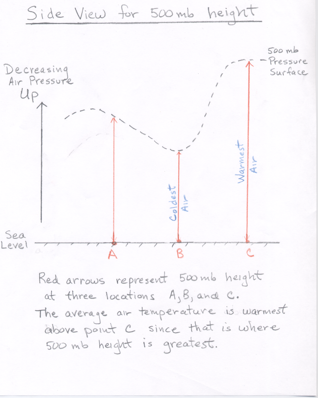
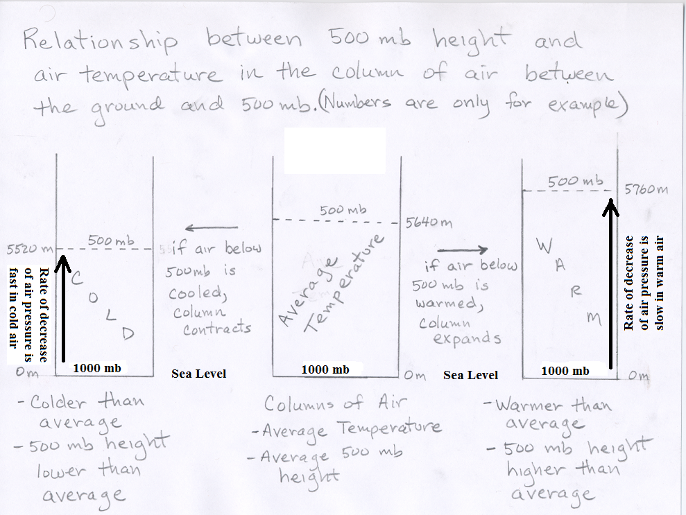
We will now use the 500 mb height contour pattern to estimate the pattern of air temperature. The height of the 500 mb surface is related to the temperature of the atmosphere below 500 mb -- the higher the temperature, the higher the height of the 500 mb level. In other words, the 500 mb height at any point on the map tells us about the average air temperature in the vertical column of air between the ground surface and the 500 mb height plotted at that point. The height pattern tells us where the air is relatively cold and where it is relatively warm (see 500 mb side view.) As a vertical column of air warms up (temperature increases), it expands upward, which raises the 500 mb height. Conversely, as a vertical column of air cools down (temperature decreases), it compacts downward, which lowers the 500 mb height. Therefore air pressure decreases more slowly as you ascend through a warm column of air, compared to a cold column of air . (See Figure showing air expands when warmed and contracts when cooled).
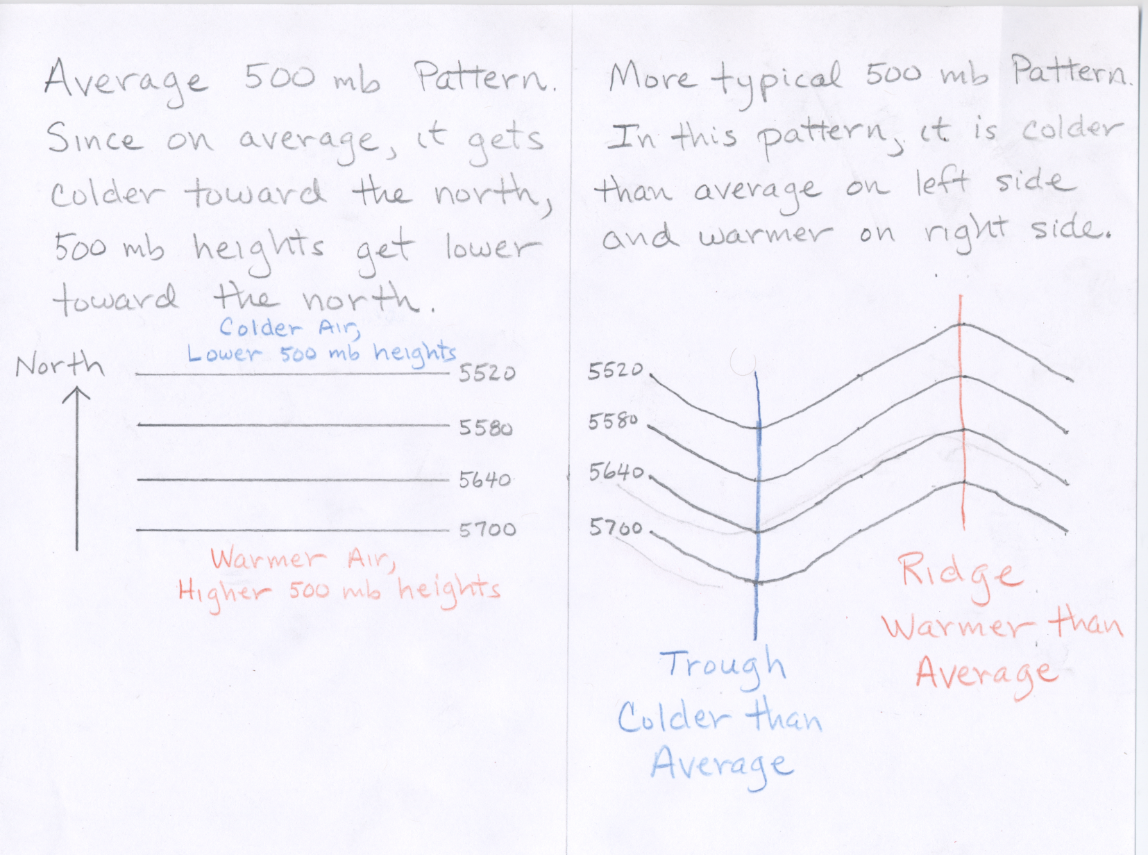
Consider what the 500 mb pattern would look like if air temperatures decreased steadily from the equator toward the north pole. (Note this is what you might guess based on the fact that the Sun's heating is strongest toward the south and weakest toward the north.) In that case the height contours would be concentric circles around the north pole with the highest heights to the south (toward the equator). While this is generally true (e.g., the general decrease in 500 mb height from south to north depicted on the map above), the actual pattern at any given time is wavy (e.g., as on the map above). Where the height lines bow northward (a ridge), warm air has moved north; and where the height lines bow southward (a trough), cold air has moved south. Therefore, in general warmer than average temperatures can be expected underneath ridges and colder than average temperatures can be expected underneath troughs (See Figure). The more pronounced the ridge (or trough), the more above (or below) average the temperatures will be.
The terminology "trough" (pronounced trôf) and "ridge" is related to the fact that the contour lines often look like waves. A "ridge" is the high point of a wave, and a "trough" is the low point of a wave. A simple diagram is shown below on the left. The figure on the right shows the 500 mb height map for June 26 with the positions of two troughs and one ridge marked.
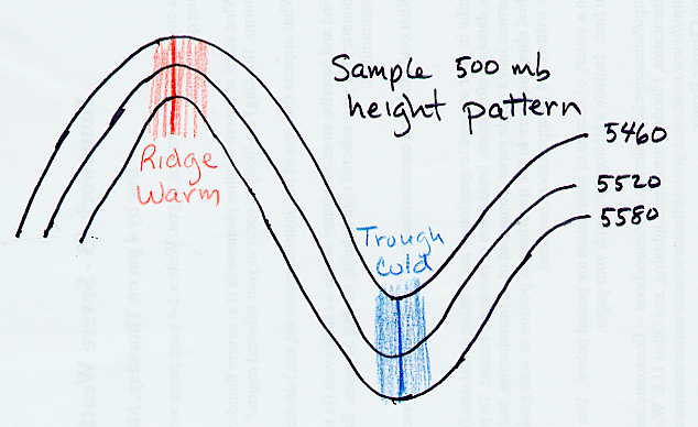
Idealized 500 mb height pattern. The 500 mb height pattern is commonly wave-like. High points in the waves are called ridges and low points in the wave are called troughs. Generally ridges correspond with relatively warm air temperature, while troughs correspond with relatively cold air. |
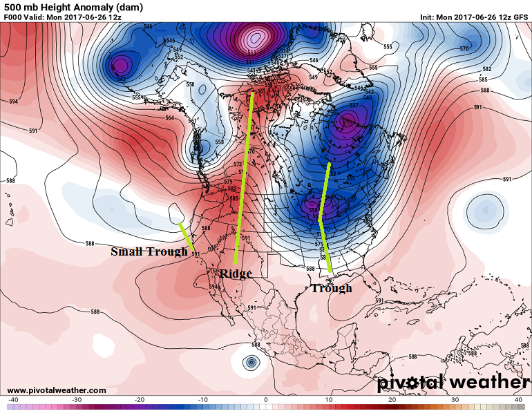
Same 500 mb height map shown above for 12Z on June 26, but with centers of two troughs and one ridge marked. |
One other feature in the 500 mb pattern worth pointing out are closed contours. A closed contour line is one which closes in on itself, often making a circular or oval shape. There are both closed lows and closed highs. A closed low on a 500 mb height map is a region of low heights around which one or more closed height contours are drawn. A closed low indicates a pool of colder air surrounded by warmer air. Depending of the strength of the closed low there can be more than one closed contour line encircling the center of lowest height, which is sometimes marked with and 'L' on the maps. Closed lows are often, but not always, associated with a trough. There are also closed highs, which are centers of locally high 500 mb height surrounded by one or more closed contours. A closed high indicates a pool of warmer air surrounded by cooler air. Depending of the strength of the closed high there can be more than one closed contour line encircling the center of highest height, which is sometimes marked with an 'H' on the maps. Closed highs are often, but not always, associated with a ridge. Closed highs generally indicate warm and fair conditions. However, the position of a closed high, called the monsoon high, is important in determining where monsoon season rain will fall in the southwestern US and northernwestern Mexico. This will be discussed on the next reading page. The 500 mb height map for June 26 is shown again below with the centers of 5 closed lows and one closed high marked in green. It is relatively easy to determine that the 4 most northerly closed centers on the map are closed lows (the ones north of the continental United States). This is because the 500 mb heights increase as you move away from the centers. The closed center over Baja California is a closed high because the 500 mb heights decreases as you move away from the center. The closed low over the Pacific Ocean just off the Califonia and Oregon coasts is more difficult to determine and is explained in the next paragraph. Tropical storms and hurricanes often show up as compact closed lows on 500 mb height maps. The position of Tropical Storm Dora is pointed out on the map. we will cover hurricanes early in the semester. You would not be expected to identify that feature as a closed low or tropical storm based on what has been covered up to this point.
![[sample]](June26_2017_500mb_closed_contours_small.png)
|
| Same 500 mb height map as shown above, but with closed lows and highs labeled. Green L's are used to denote the center of closed lows, while a green H is used to denote the center of a closed high. |
At first, some students have trouble distinguishing closed lows from closed highs. Start at the center of a closed contour. As you move away from the center, determine if the 500 mb heights are increasing (a closed low) or decreasing (a closed high). If there are multiple closed contours around the center, then it is quite easy to tell if the heights are getting larger or smaller as you move outward. For a single closed contour, it can be more difficult to tell. Continue moving outward past the closed contour until you hit the next contour line. For closed lows, all adjacent contour lines will be the same or higher heights than the closed contour line. If any adjacent contour line is lower than the closed contour, then it must be a closed high, not a closed low. Find the marked closed low located over the Pacific Ocean just off the California and Oregon coasts. If this map were used on an exam, you would be given the height of the unlabeled closed contour, which is 579 dam. Start at the center of the closed contour and move outward. After crossing the closed 579 dam contour, the next adjancent contour lines are 579 dam to the north and 582 dam to the south. Becasue there are no adjacent contour lines that are lower than the closed contour, this is a closed low. You can also determine that it is a closed low because one of the adjacent contour lines is higher than the closed contour.
For closed highs, all adjacent contour lines will be the same or lower heights than the closed contour. If any adjacent contour line is higher than the closed contour, then it must be a closed low, not a closed high. I realize that you are not experts in analyzing 500 mb height maps, so on exams, you will not be given maps with closed contours that are difficult to specify as closed highs or closed lows.
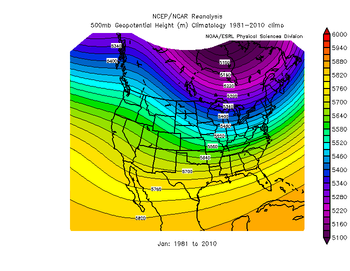
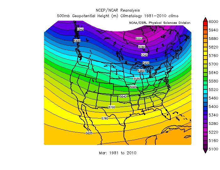
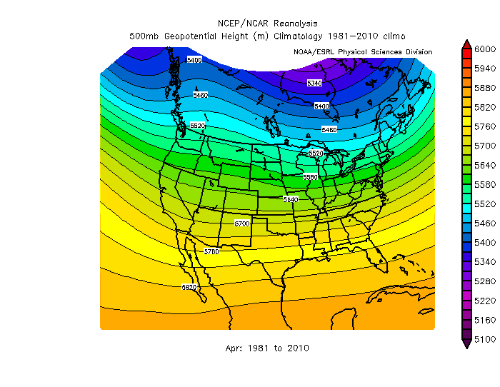
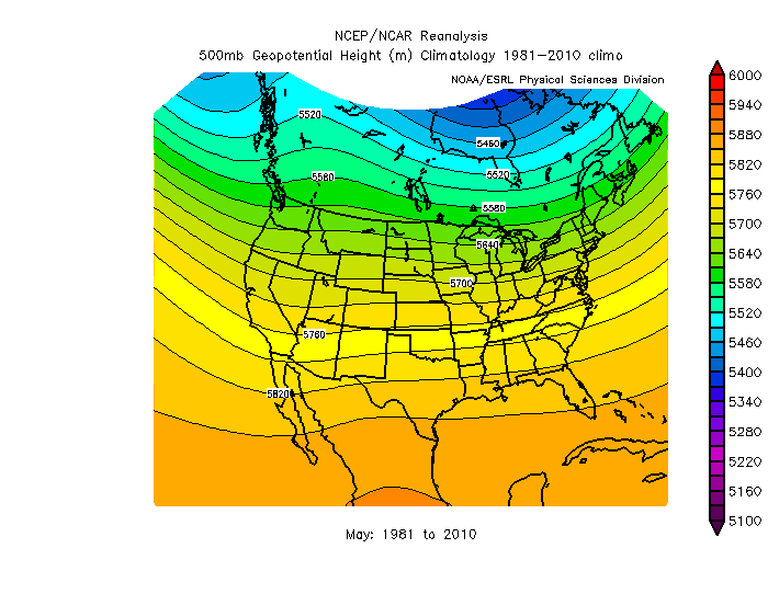
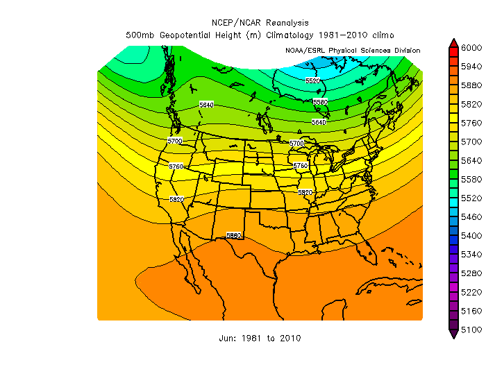
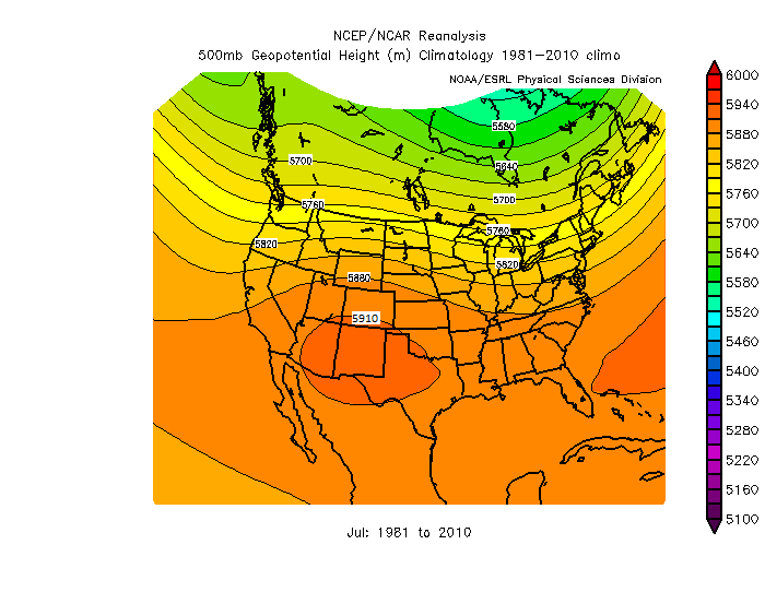
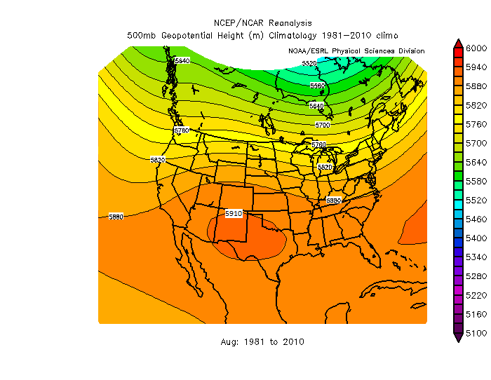
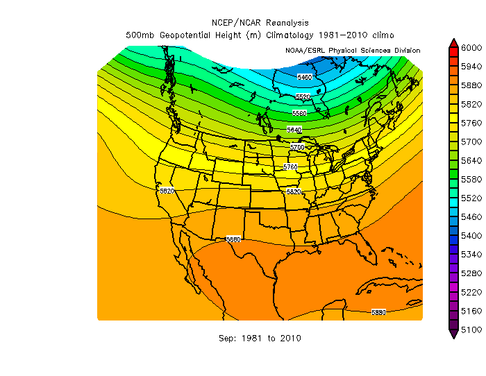
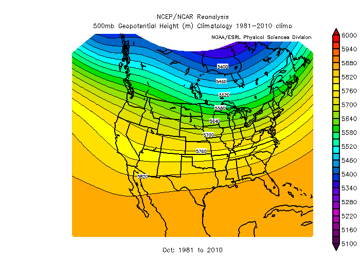
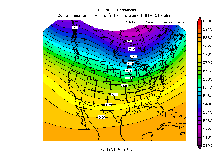
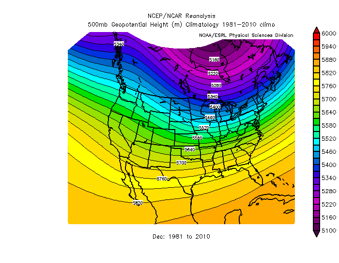
Having said all that, in the summer months, there is generally much less structure in the 500 mb height pattern as compared with the colder months, and features like troughs, rigdes, and closed highs and lows are often harder to pick out. The reason for this is simple. The tropics remain warm throughout the year, while there is a huge seasonal change in temperature for locations closer to the north pole. Therefore, in winter there is a very large difference in 500 mb heights between the warm tropics and very cold Arctic, while in summer, there is a much smaller difference in temperature and hence 500 mb heights between the warm tropics and the now relatively warm Arctic. For example compare the average summer 500 mb heights with the average January 500 mb heights given in the links below. Note there is little change between summer and winter in 500 mb height (and thus average temperature) in tropical regions, but a large change between summer and winter at higher latitudes both in 500 mb height and air temperature.
| Monthly Average 500 mb heights (climatology) over the United States | |||
| Jan | Feb | Mar | Apr |
| May | Jun | Jul | Aug |
| Sep | Oct | Nov | Dec |
Large scale features like troughs and ridges provide a look at the general temperature pattern, i.e., cold in troughs and closed lows, warm in ridges and closed highs, and near average in flat height patterns without pronounced troughs and ridges. If you want to make a specific temperature forecast for a given location, like Tucson, you should compare the 500 mb height from a current or forecast map to the long-term average or "climatological" 500 mb height for that day. Long-term average maps of 500 mb heights over the United States for each month are provided in the section above. For a given location and time of the year, if the 500 mb height on the map is close to average, then the temperature is expected to be about average. If the 500 mb height is lower than the average height, then lower than average temperatures are expected. If the 500 mb height is higher than the average height, then higher than average temperatures are expected. The further the 500 mb height is away from average the more the temperature is expected to be away from average. For example, if you compare the actual (measured) 500 mb height over Tucson for a given day (say August 30) to the average 500 mb height, which is about 5910 meters for Tucson based on the August 500 mb height climatology (long-term average), you can estimate whether or not the air temperature for the day will be above average, below average, or near average. Similarly, if you compare a forecast of the 500 mb height over Tucson (from a weather forecast model) to the average, you can determine if the model is predicting above or below average 500 mb height and temperature.
Keep in mind that this is a way to estimate the local temperature relative to the average air temperature for that location and time of year. The 500 mb height by itself does not tell us what the exact air temperature will be at the ground surface. One reason is because there are many local factors that go into determining the surface air temperature, such as the type of ground surface (desert rock and sand warms more quickly than wet soils), amount of water vapor in the air (dry desert air warms more easily during day and cools more easily at night compared with more humid air), and other factors. Thus the same 500 mb heights over two locations does not mean those two places are expected to have the same near ground air temperature. The best we can do is say whether or not the local temperature is expected to above or below the local average for that day. Returning to the example posed in the last paragraph. Suppose on date August 30 of this year, the 500 mb map shows that the 500 mb height over Tucson is 5940 meters above sea level. Since this is higher than the average for Tucson in August, which is 5910 meters, we expect the the air temperature in Tucson to be above average for the day. You could then look up the fact that the average high temperature for Tucson is late August is 97°F. Based on the 500 mb height, you expect a hot day, with a the high temperature above 97°F.
Here is a link to the current 500 mb height pattern over the United States with the height contours labeled in decameters. The contour spacing on this map is 6 dam (60 meters). It is expected that you can estimate the 500 mb height over Tucson or any other point on the map based on the contour pattern. You should also be able to determine if the current 500 mb height is above or below the long-term average 500 mb height for the corresponding month. Based on this information, you can make a prediction for below or above average temperature.
In order to make comparisons to the average easier, most of the 500 mb height maps that we will use in this class directly show the difference between the 500 mb height plotted on the map and the long-term average 500 mb height for that location. Scroll up to the first map shown on this page, which is for 12Z on June 26. The labeled contour lines show the 500 mb height pattern at the valid time marked on the map. The color shading, with the color key at the bottom, shows the 500 mb height anomaly, which is defined as the 500 mb height on the map minus the average 500 mb height at each location. Positive height anomalies, which are shown using red and orange colors, indicate locations where the 500 mb height is above average. In these areas, above average temperature is expected. The more above average the heights, the more above average is the expected temperature. Negative height anamolies, which are shown using blue and purple colors, indicate locations where the 500 mb height is below average. In these areas, below average temperature is expected. Notice that in general, below average heights are associated with troughs and closed lows and above average heights are associated with ridges and closed highs as expected.
Remember that troughs and ridges are defined based on the shape of the contour pattern, not based on the height anamoly. Thus, it is possible for there to be above average heights in troughs and below average heights in ridges, though not common. If available, it is best to consider the height anamoly, rather than just the positions of troughs and ridges, when estimating the temperature relative to the average temperature for a given location. As an example, consider Tucson, which is marked by point c on one of the June 26 maps above. Based on the color shading for height anomaly, the height in Tucson was about 5 decameters (50 meters) above average and above average temperature is expected. This can also be determined by comparing the 500 mb height over Tucson, which is about 5830 meters, with the average 500 mb height for the month of June, which is about 5870 meters based on the June 500 mb height climatology (long-term average).
This is a simplistic method. The 500 mb height actually tells you about the average air temperature in the vertical column of air between the ground surface and 4.6 - 6.0 km (2.9 - 3.8 miles) above sea level. Often this provides a good estimate of how warm or cold the air temperature is near the ground where we live. However, the vertical column of air from ground to 3 miles above sea level does not have to be uniformly warm or cold. There can be smaller (in vertical extent) layers of relatively warm air and relatively cold air. Sometimes there will be shallow (small in vertical dimension) layers of warm or cold air just above the ground. In these cases, the corresondence between the 500 mb height and surface air temperature will not work as well. In addition, factors like cloud cover, precipitation, and the type of ground surface (dry desert, moist soil, snow cover, etc.) also influence the temperature of the air at the surface. A good example of this occurs in Tucson during the summer. The average high temperature in Tucson is higher in June than it is in August, even though the average 500 mb height is lower in June. The reason for this is that most June days are sunny and dry, while during August it is more common for there to be clouds and precipitation, which tend to reduce the high temperature. Thus, using the 500 mb heights to estimate surface temperatures is not exact. However, as you will see, the 500 mb maps often provide a very good overview of the pattern of warm and cold conditions near the ground surface.
This section includes some examples of 500 mb height maps that were used in previous semesters. These 500 mb maps were obtained from a different source and do not show the height anomaly. Hopefully, you will be able to understand the explanations provided. Please do not panic if you have trouble understanding it all. I think these examples will be beneficial for some students.
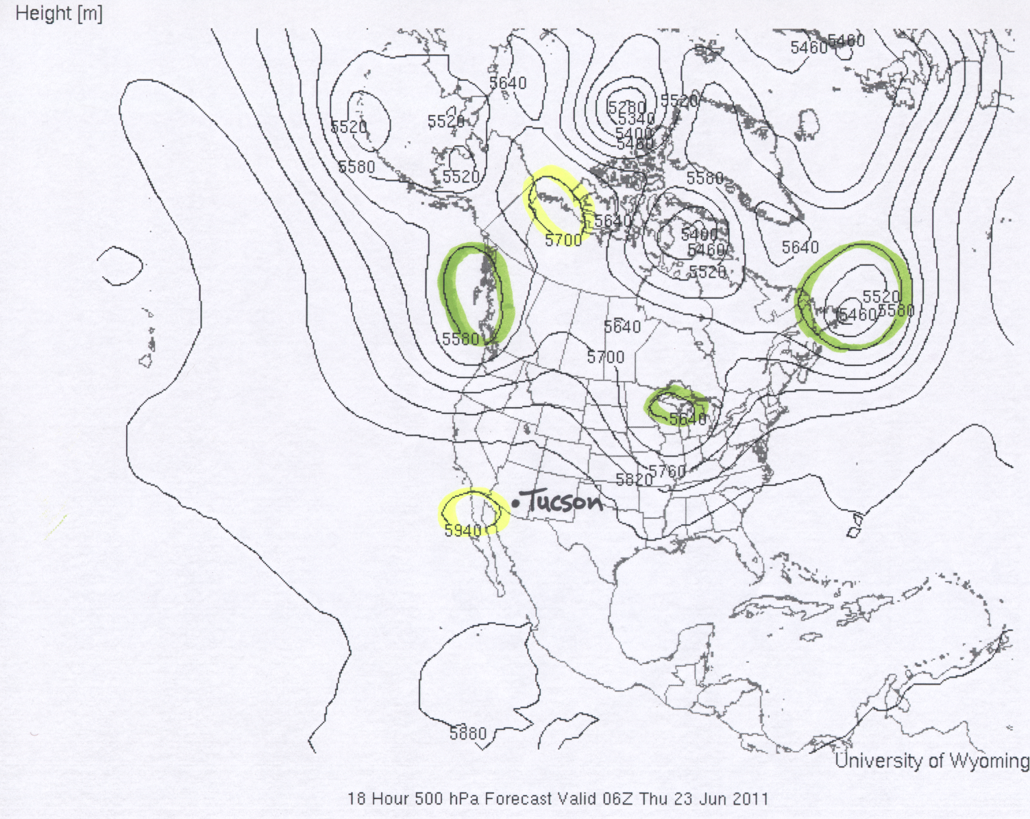
Here is an example of a 500 mb map valid for 06Z (0600 GMT), Thursday, June 23, 2011. You should realize that the local time in Tucson is 7 hours earlier than GMT time, which is 2300 (11 PM local) on Wednesday, June 22. This map has several examples of closed highs and closed lows in the height pattern. Two closed highs are highlighted in yellow and three closed lows are highlighted in green. The height in Tucson is approximately 5930 meters. This can be compared with the average 500 mb height in Tucson of around 5870 meters as shown in the June 500 mb height climatology linked above. Thus, well above average temperatures would be expected in Tucson. The high temperature in Tucson for June 22 and June 23 2011 was 109°F. Concerning other features of interest for the United States. It looks rather warm through the Rocky Mountain states under a 500 mb ridge. Cool with a closed low and trough over the Pacific northwest. Cool also for the great lake states down the Mississippi River valley associated with another closed low and trough.
The remaining examples were taken from the colder season. We are not going to study winter-time maps like this until later in the semester, but these examples are shown as it may help you better understand how to interpret the relationship between a 500 mb height map and expected temperature.
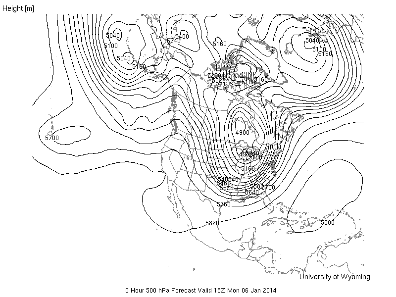
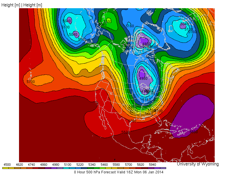
The first example shows the extreme cold outbreak that took place over the eastern part of the United States in early January of 2014. The 500 mb height map for January 6 at 18 Z (11 AM local time in Tucson) is shown below. The map on the right side is the color-filled contour image. Note this is not the height anomaly. In this case the 500 mb height pattern is color filled. Notice the large trough covering much of the eastern part of the United States. The closed low centered over lake Michigan shows a 4980 meter contour. It is rare for the continental US to have 500 mb heights below 5000 meters. Based on the January 500 mb height climatology map discussed above, the average 500 mb height over lake Michigan is about 5400 meters. Thus, the 500 mb height over lake Michigan on January 6 was amazingly more than 400 meters below average! If you remember this trough was resonsible for record cold temperatures over much of the eastern United States. At the same time, there is a strong ridge over the western United States, which produced above average temperatures. I would estimate the 500 mb height over Tucson to be about 5780 meters. This is about 80 meters above average and thus much above average temperature would be expected in Tucson based on the map.
|
|
|
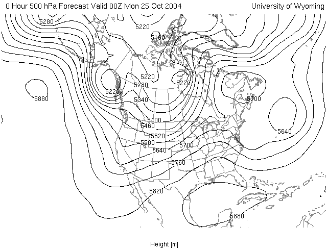
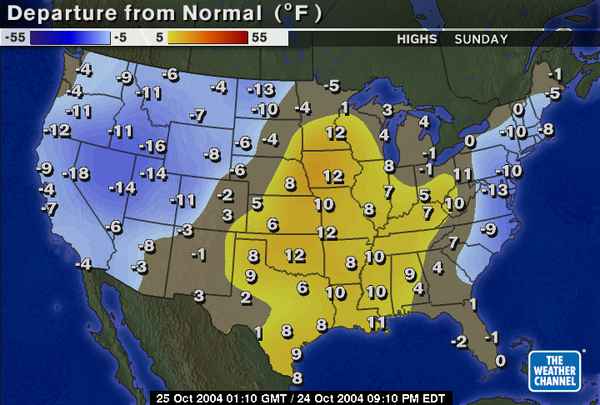
The next example is the 500 mb height map for the time 00Z on Monday, October 25, 2004 (This corresponds to a local Tucson time of 5 PM on Sunday, October 24). Next to the 500 mb map is the high temperature relative to average for the day Sunday, October 24. Notice that below average temperatures occured in the western US (associated with the trough over this region), while above average temperatures occured over the midwest southward to the southern great plains and lower Mississippi valley (associated with the ridge over this region), and below average temperatures over parts of the east coast (associated with the trough centered just offshore).
|
|
|
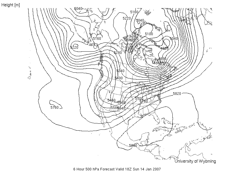
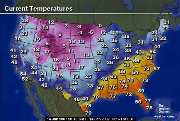
The final example is from January 14, 2007. The 500 mb map is valid for Sunday, January 14, 2007 at 18Z (this corresponds to 11 AM local Tucson time). Next to the 500 mb map is a map showing the surface temperatures across the United States at 20:15 GMT (or 20:15 Z, which is 13:15 (i.e., 1:15 PM) local time). Again, notice that temperatures are cool or cold near the trough in the western United States, for example 42°F in Tucson at 1:15 PM local time. In most of the southeastern United States, temperautures are much warmer in association with a broad ridge and closed high over the Gulf of Mexico with higher 500 mb heights.
|
|
|
![]()
![]()
![]()
![]()