![]()
![]()
![]()
![]()
In this class we will mainly be viewing what are called 500 mb height maps (recall that mb stands for millibars, which is a unit for measuring air pressure). These maps are very good for getting a large-scale picture of the "weather pattern" over the United States, North America, or even the Northern Hemisphere. We have already looked at 500 mb height maps in relation to the southwest monsoon season. Much of the information below is a review of what was covered at the beginning of the semester.
500 mb maps are best for studying cool season weather patterns in the middle latiutudes (between about 30° and 60° latitude). This is why I waited until mid to late October to revisit this topic. We are going to use 500 mb height maps to look at the current and forecasted weather both in Tucson and throughout the continental United States. This time through the material pay more attention to the trough and ridge patterns on 500 mb height maps.
To begin we review how to interpret the height patterns (contour lines) that are plotted on the maps. With experience one can easily visualize the large scale weather pattern by looking at the 500 mb height pattern. This is nice when looking at computer-generated forecast maps of the 500 mb height pattern predicted for some time into the future to get an idea of what the computer model predicts the future weather to be.
The height contours on the map are actually the height of the 500 mb pressure surface in meters above sea level. The average air pressure near the ground is about 1000 mb, and since air pressure decreases as one moves upward, at some altitude the air pressure will fall to 500 mb. You will notice that the height contours generally fall into the range 4600 - 6000 meters above sea level.
![[sample]](500mb_contour_ex1_small.png)
|
| Example 500 mb map showing height contours |
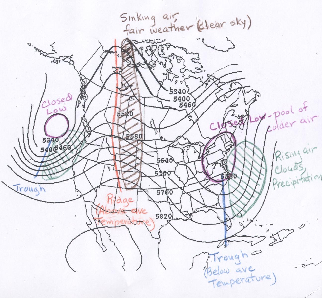
The contour maps of 500 mb height are interpreted in the same way as topographic maps of ground surface elevation. The line highlighted in pink on the sample map is the 5700 meter contour line. The height of the 500 mb surface is 5700 for all points along the line. Above (or generally north) of the line the 500 mb heights are lower than 5700 meters and below (or generally south) of the line the 500 mb heights are higher than 5700 meters. I expect that you can determine the 500 mb height at any point on a map like this. Four points A - D are marked on the map. Point A is located about halfway between the 5760 m line and the 5820 m line, so a good estimate of the 500 mb height at that point would be 5790 m. Point B marks the location of Tucson. All we can say here is that the height at point B is greater than 5820 m, but less than 5880 m. The contour lines on these plots are spaced every 60 m. Point B is definitely higher than 5820 m, but is not enclosed by a 5880 m line. Point C is located between the 5640 m and 5700 m lines, but much closer to the 5640 m line, so the height at point C is about 5650 m. Point D is located in the center of a closed low (described below). The 500 mb height at point D is certainly lower than 5580 m, but not at low as 5520 m, since that contour does not show up within the closed low.
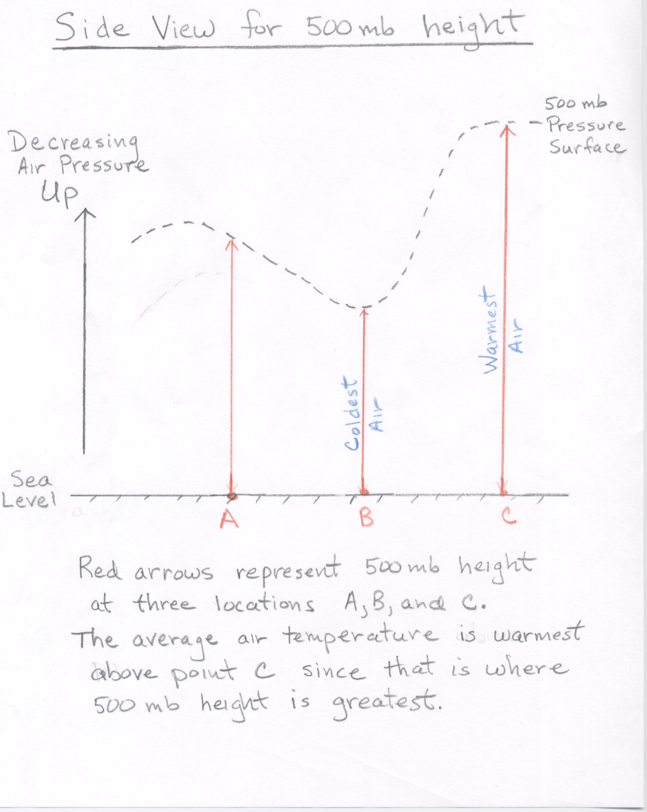
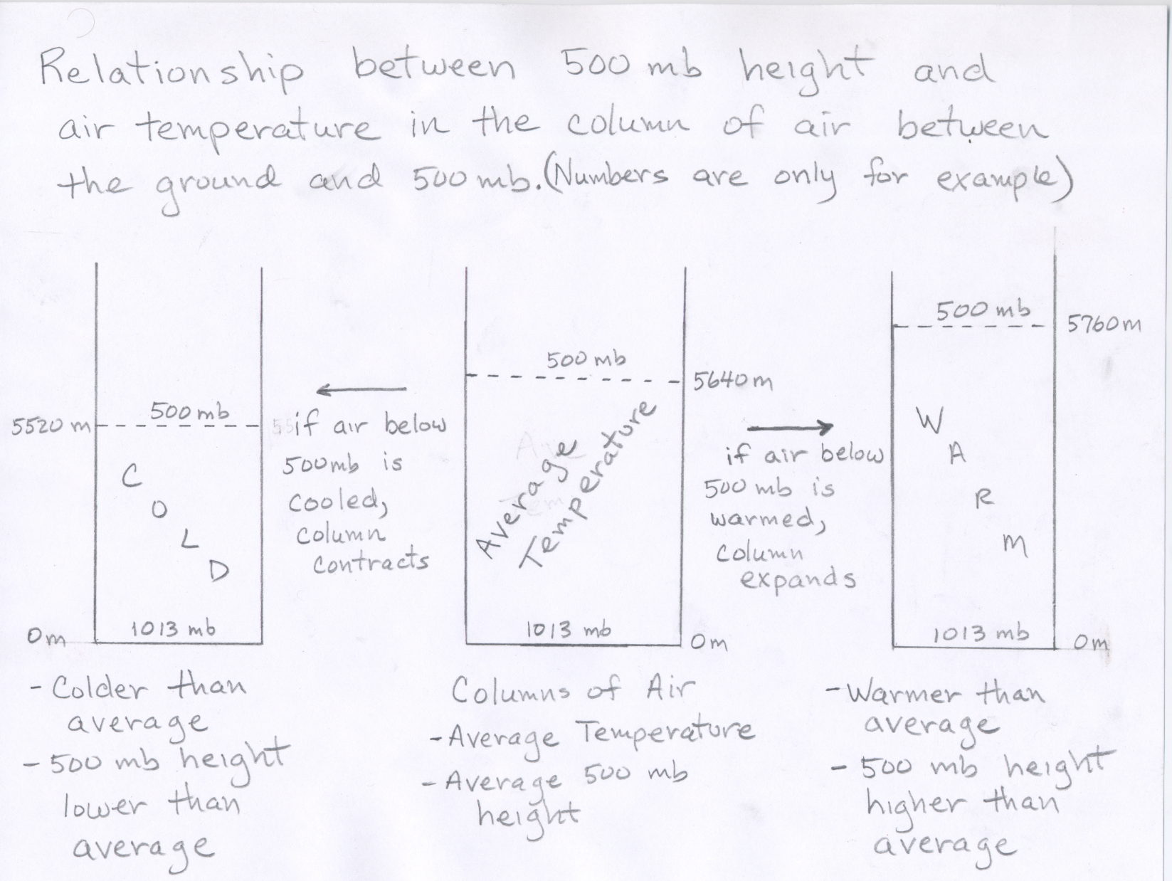
For now, I want you to be able to estimate the pattern of air temperatures based on the pattern of height contours shown on the map. The height of the 500 mb surface is related to the temperature of the atmosphere below 500 mb -- the higher the temperature, the higher the height of the 500 mb level. In other words, the 500 mb height at any point on the map tells us about the average air temperature in the vertical column of air between the ground surface and the 500 mb height plotted at that point. The height pattern tells us where the air is relatively cold and where it is relatively warm (see 500 mb side view.) We already discussed this when we were going over hurricanes. Here, we briefly review that concept. If you warm a column of air, it expands, therefore air pressure decreases more slowly as you ascend through a warm column of air, compared to a cold column of air. Another way to think about it is that as air is warmed, it expands, and if the air in a vertical column of air is warmed, the column expands upward. Therefore air pressure decreases more slowly as you ascend through a warm column of air, compared to a cold column of air. (See Figure).
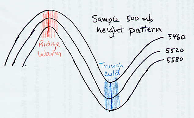
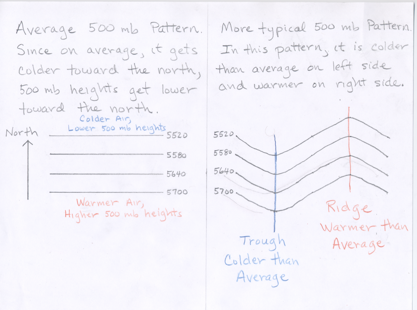
Consider what the 500 mb pattern would look like if air temperatures decreased steadily from the equator toward the north pole. (Note this is what you might guess based on the fact that the Sun's heating is strongest toward the south and weakest toward the north.) In that case the height contours would be concentric circles around the north pole with the highest heights to the south (toward the equator). While this is generally true, the actual pattern at any given time is wavy. Where the height lines bow northward (a ridge), warm air has moved north; and where the height lines bow southward (a trough), cold air has moved south. Therefore, in general warmer than average temperatures can be expected underneath ridges and colder than average temperatures can be expected underneath troughs (See Figure). The more pronounced the ridge (or trough), the more above (or below) average the temperatures will be.
The terminology "trough" and "ridge" is related to the fact that the contour lines often look like waves. A "ridge" is the high point of a wave, and a "trough" is the low point of a wave. A simple diagram is shown below. Additional maps and diagrams will be used in lecture to help you understand what is meant by this.
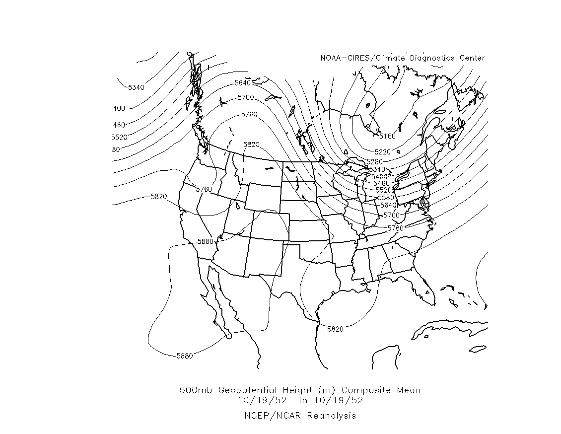
One other feature in the 500 mb pattern worth pointing out are closed lows and closed highs. A closed low on a 500 mb height map is a region of low heights around which one or more closed height contours are drawn. A closed contour line is one which closed in on itself, often making a circular or oval shape. A closed low indicates a pool of colder air surrounded by warmer air. Two closed lows are indicated on this sample 500 mb map. Closed lows are most often found near the base of troughs as in the example. Depending of the strength of the closed low there can be more than one closed contour line encircling the center of lowest height, which is sometimes marked with and 'L' on the maps. Closed lows are often associated with precipitation and a change toward colder conditions, and thus are important features in the weather pattern. There are also closed highs, which are centers of high heights surrounded by one or more closed contours. Closed highs are commonly found near the apex of a ridge. A large closed high assoicated with a huge ridge covers much of Arizona on this 500 mb map for October 19, 1952. Closed highs generally indicate warm and fair conditions.
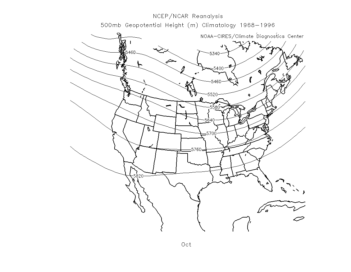
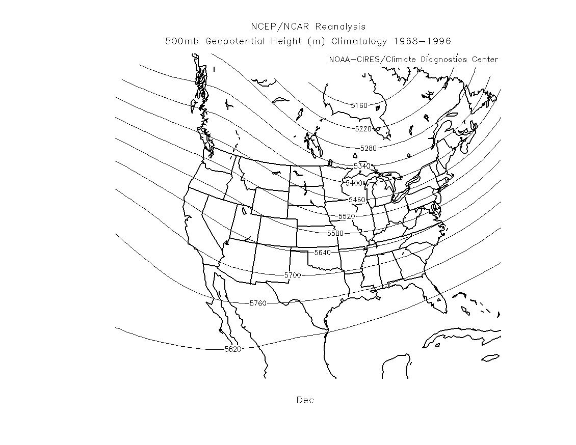
To be a little more precise in estimating expected temperature compared to average, we should compare the actual 500 mb heights from a map to the long-term average or "climatological" 500 mb heights. For a given location, if the 500 mb height on the map is close to average, then the temperature is expected to be about average. If the 500 mb height is lower than the average height, then lower than average temperatures are expected. If the 500 mb height is higher than the average height, then higher than average temperatures are expected. The further the 500 mb height is away from average the more the temperature is expected to be away from average. For example, if you compare the actual 500 mb height over Tucson for a given day (say October 11) to the average 500 mb height (from the link below), you can estimate whether or not the air temperature for the day will be above or below average.
Below are some links to the averge long-term or climatological 500 mb
heights for North America
for the months October, November, and December.
October 500 mb height climatology (long-term average)
November 500 mb height climatology (long-term average)
December 500 mb height climatology (long-term average)
Notice (from looking at the links above) that the average 500 mb heights get lower as the winter season approaches. For example, over Tucson, the average heights fall from about 5800 m in October to about 5750 m in November to about 5700 m in December.
To give you an idea about how the 500 mb heights are related to temperature,
we will look at the 500mb map for October 19, 1952. On that day the record high temperature
for Tucson (for October 19) was recorded. It reached 99°F. The 500mb
height over Tucson on October 19, 1952 was about 5900 m. This is well above the
average of 5800 m for the month of October. The unusually high 500 mb height,
corresponds with a very warm day.
500 mb map for October 19, 1952
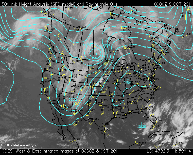
A second example was a local cold weather event from fall 2011. The high temperature on campus
Friday, October 7, 2011 was 72°F, which was 16°F below the average high temperature for the date.
The map below shows the 500 mb height pattern at 00Z, October 8 (local time 5 PM October 7). The 500 mb
height over Tucson was about 5640 meters, which is well below the average of 5800 meters for the
month of October. The unusually low 500 mb height corresponded with a very cold day.
500 mb map for 00Z October 8, 2011
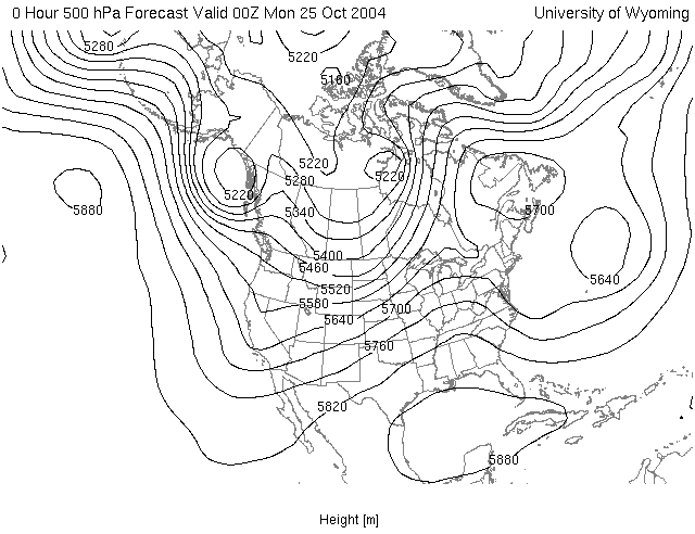
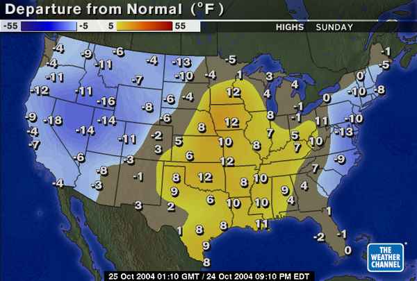
Below are two additional examples that were used in previous classes. The first is the 500 mb height map for the time 00Z on Monday, October 25, 2004 (This corresponds to a local Tucson time of 5 PM on Sunday, October 24). Next to the 500 mb map is the high temperature relative to average for the day Sunday, October 24. Notice that below average temperatures occured in the western US (associated with the trough over this region), while above average temperatures occured over the midwest southward to the southern great plains and lower Mississippi valley (associated with the ridge over this region), and below average temperatures over parts of the east coast (associated with the trough centered just offshore).
|
|
|
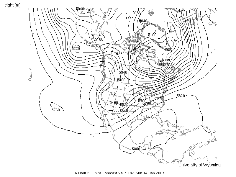
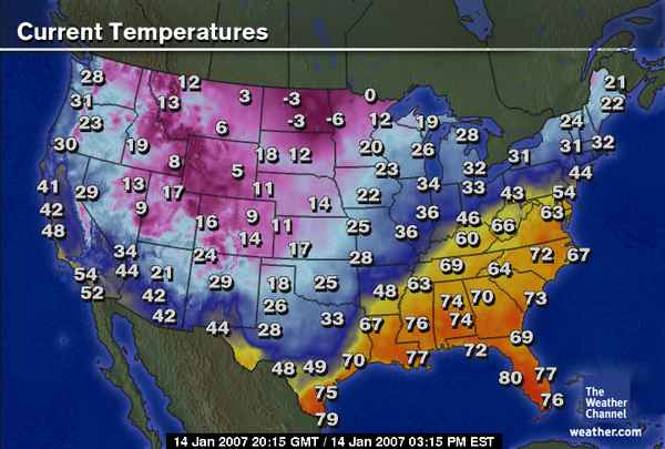
The next example is from January 14, 2007. The 500 mb map is valid for Sunday, January 14, 2007 at 18Z (this corresponds to 11 AM local Tucson time). Next to the 500 mb map is a map showing the surface temperatures across the United States at 20:15 GMT (or 20:15 Z, which is 13:15 (i.e., 1:15 PM) local time). Again, notice that temperatures are cool or cold near the trough in the western United States, for example 42°F in Tucson at 1:15 PM local time. In most of the southeastern United States, temperautures are much warmer in association with a broad ridge and higher 500 mb heights.
|
|
|
Additional examples will be provided in lecture.
This is a simplistic method. The 500 mb height actually tells you about the average air temperature in the vertical column of air between the ground surface and 4.6 - 6.0 km (2.9 - 3.8 miles) above sea level. Often this provides a good estimate of how warm or cold the air temperature is near the ground where we live. However, the vertical column of air from ground to 3 miles above sea level does not have to be uniformly warm or cold. There can be smaller (in vertical extent) layers of relatively warm air and relatively cold air. Sometimes there will be shallow (small in vertical dimension) layers of warm or cold air just above the ground. In these cases, the corresondence between the 500 mb height and surface air temperature will not work as well. In addition, factors like cloud cover, precipitation, and the type of ground surface (dry desert, moist soil, snow cover, etc.) also influence the temperature of the air at the surface. Thus, using the 500 mb heights to estimate surface temperatures is not exact. This is explained in more detail in the next section. However, as you will see, the 500 mb maps often provide a very good overview of the pattern of warm and cold conditions near the ground surface.
This section was included at the bottom of the page on the kinetic model for gases. It is repeated below.
Although we will continue to use the 500 mb height to estimate the pattern of air temperature in the lower troposphere (just above the ground surface where we live), it is not exact. In this section, we will discuss a couple of reasons why the 500 mb height is not completely determined by the air temperature in the lower troposphere. In other words, we will point out why the 500 mb height can sometimes be misleading with regard to air temperature just above the ground.
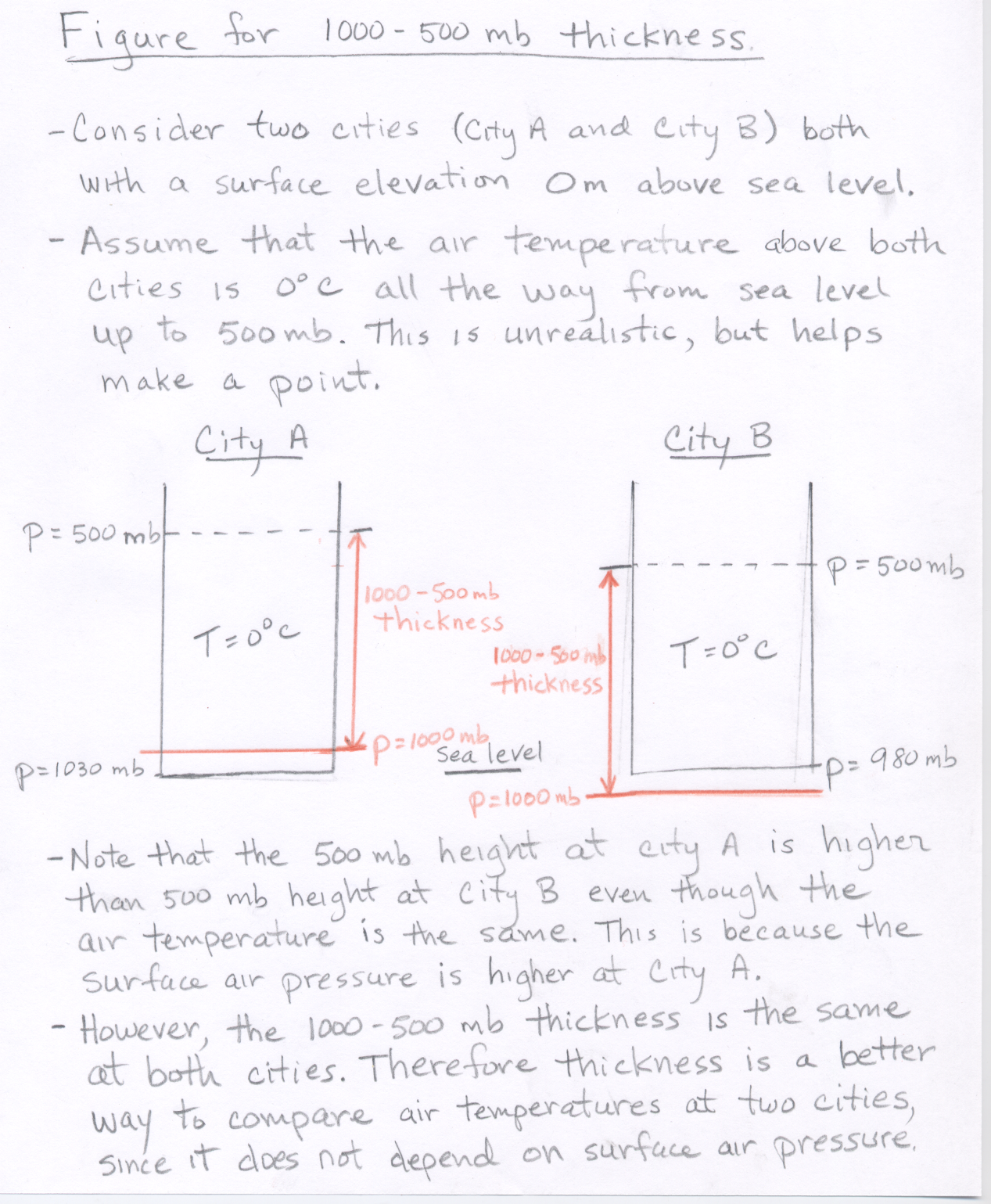
One issue is that the 500 mb height does depend on the sea level air pressure, i.e., the air pressure at ground level. While the average air pressure at sea level is 1013 mb, the actual sea level pressure at a given location and time varies, typically within the range from 983 - 1043 mb. Thus relatively high sea level pressure tends to raise the 500 mb height since the pressure drop from sea level pressure to 500 mb is greater compared to a case where the sea level pressure is lower. To overcome this dependence on sea level pressure, meteorologists often use a measurement called 1000 mb to 500 mb thickness. This is a measure of the vertical distance between the 1000 mb pressure surface and the 500 mb pressure surface. The 1000 - 500 mb thickness is directly related to the average air temperature between 1000 mb and 500 mb without being influenced by variations in surface pressure (see 1000 - 500 mb thickness figure). Therefore, thickness is a better indicator of how warm or cold the air is in a vertical column above a given location. Note that contour maps of 1000 - 500 mb thickness can be plotted using the University of Wyoming's weather model plotting page.
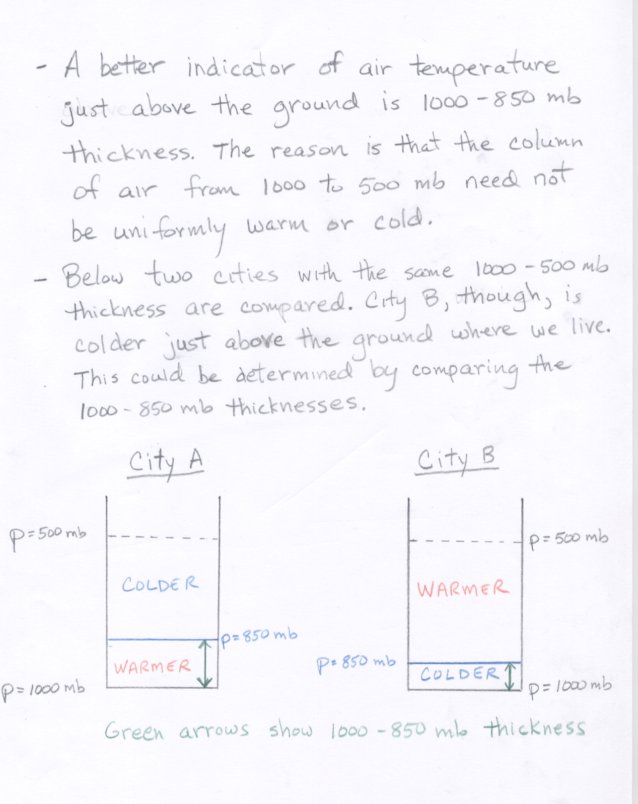
Another potential problem for interpreting surface air temperature even if using the 1000 - 500 mb thickness is that the 1000 - 500 mb thickness is generally in the range from 4800 to 5700 meters (or about 3 to 3.5 miles). This entire vertical extent need not be uniformly warm or cold, i.e., there can be sublayers of smaller vertical extent that are both relatively warm and relatively cold. For surface temperature, we need to know how warm or cold it is at the bottom of the air column. A better estimate of surface temperature could be obtained by looking at the thickness of a shorter column of air just above the ground surface. For this purpose, meteorologists will look at the 1000 - 850 mb thickness, which is more closely related to the air temperature just above the ground (see 1000 - 850 mb thickness figure).
In general, the vertical height between any two pressure levels in the atmosphere is related to the temperature of the air between the two pressure levels. The warmer the air, the lower the air number density, and the greater the vertical distance between the two pressure levels.
![]()
![]()
![]()
![]()