![]()
![]()
![]()
![]()
One of the nice things about being able to interpret 500 mb height maps is that one can can easily visualize the large-scale weather patterns that are forecasted by computer-generated numerical weather prediction models. There are dozens of groups worldwide that run different numerical models for weather forecasting and hundreds of web sites that display this data. The fact that each model produces different forecasts indicates that there is uncertainty in making numerical weather forecasts. You probably realize from your own experiences that weather forecasts are not exact and can sometimes be way off. When different forecast models make different predictions of future weather, your local weather forecaster has to decide which to believe in making his personal forecast. Generally numerical weather forecast models in the winter season are quite accurate for 1-5 days into the future, somewhat less accurate for 6-9 days into the future, sometimes helpful for 10-12 day forecasts, and have little skill in forecasting more than 12 days into the future. We will cover material discussing limitations on the accuracy of numerical weather forecasting in later lectures.
On this page you will learn how to get numerical weather forecasts from two different sources and how to interpret the 500 mb height maps produced. We will also use maps from these sources for a homework assignment. Out of the numerous web pages containing numerical weather forecast information, a major reason for selecting the three sites below is that those sites allow the user to create forecast maps that clearly show the 500 mb height pattern. Most of the maps that are produced by other sites cram much more information (in addition to 500 mb heights) onto the plots, which can make it difficult for a beginner to concentrate on the 500 mb height pattern. If you become interested in looking at numerical weather forecast information, then I encourage you to visit other sites as well.
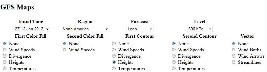
This site was mentioned on the introductory lecture page on 500 mb maps that was covered during the first week of the semester. Click on http://weather.uwyo.edu/models/ (link should open a new tab or browser window) and follow these instructions. You must first select a model. In class we will use either the GFS (Global Forecast System) or Medium Range Forecast (MRF) both run in the United States by NOAA. You must fill in the drop-down menus and dots to select the maps you want to display. For now select the latest possible initial time (default value) and set the other items as shown below
If you are interested you can use this site to produce other forecast images. We will not have time to do much of this as part of the class, but feel free to explore and ask questions. One item that I sometimes choose to add to the 500 mb maps is to select precipitation as one of the color fills to see where and how much precipitation is forecast by the model.
This site will be used in this class to get 500 mb height forecasts from both the US GFS Model and the ECMWF (European Centre for Medium Range Forecasting) model. Unfortunately, for the United States, our operational weather forecasting models generally do not perform as well the the ECMWF model. This was publicly discussed with regard to the forecasts of hurricanes Sandy (in 2012) and Joaquin (in 2015) as the long range ECMWF forecasts were more accurate than the GFS forecasts. There are many weather forecasters who consider the ECMWF the best performing weather forecast model on Earth. Thus, it is worth comparing the GFS forecasts with those made by ECMWF. It can be difficult to find ECMWF forecast information without paying for it. Unlike the United States, which freely diseminates information from government-run weather forecast models, the European Centre only provides a small subset of the model output for free and charges high rates for access to all the model forecast data. You will notice within Pivotal Weather that there are fewer model output fields to plot from ECMWF compared with the GFS. In addition model forecasts are only available once every 24 hours compared with every three hours for the GFS forecasts. We are going to use maps generated by Pivotal Weather for the 500 mb forecasting project.
Here is a link to Pivotal Weather's Models Page. Instructions are provided for generating 500 mb height maps from the GFS and ECMWF models. If you are interested, you are encouraged to look at some other models and model output. After you have loaded the pivotal weather model homepage, select the ECMWF or GFS model link. Select "Anomalies" under the parameter list on the left side of the page, and then "500 mb Height Anomaly" from the submenu. You can then select the initial time of the model run and the forecast length (on left side of page above the parameter list) to get the map you desire. You are also able to use the control buttons in the upper right portion of the page to play a movie loop of the forecast for all times.
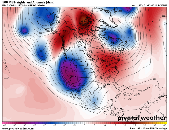
Sample 500 mb height anamoly maps are shown below. The maps show contours of 500 mb height as in the maps we have studied. The heights are labeled in decameters (dam), where 1 dam = 10 meters. To get the 500 mb height in meters, just add a zero on to the end of the number labeled on the contours. The labeled height lines show the 500 mb pattern of troughs, ridges, and closed contours. The color shading on the map shows the 500 mb height anomaly, which is the difference between the 500 mb height and the average 500 mb height for each point on the map. The height anomaly is very useful in determining where above and below average temperature is expected based on the 500 mb height pattern. Note that positive height anomalies (and expected warmer than average conditions) are generally associated with ridges, while negative height anamolies (and expected cooler than average conditions) are generally associated with troughs. The key at the bottom is in units of decameters. So a height anomaly of -20 dam means the 500 mb height in that region is 200 meters below average (and you would expect well below average temperature for that region). The time label is the second line in the upper left. "Fttt" gives the forecast time in hours. For example F240 on the map shown on the left indicates that the map is a forecast for 240 hours into the future. The time after "Valid" tells you the time and date of the forecast. For example, the map on the left indicates the forecast map is for 12Z on Monday, February 1, 2016. The label on top right of the image tells you the time the model forecast was initialized or when it began running, and which weather forecast model is displayed. The map on the left shows the initial time was for this model run 12Z on January 22, 2016 and that it is the ECMWF model.
An analysis of the map on the left side for the continental United States indicates a sharp and deep trough over the western United States with a large 5340 meter closed low centered over the state of Idaho. Some areas have 500 mb heights over 300 meters below average and well below average temperature would be forecasted based on this map. There is a ridge over the Great Lakes region with above average heights (and expected temperature) for much of the northeastern quarter of the continental United States. A good chance for precipitation would be forecasted for regions just downwind of the trough axis and in the vicintiy of the large closed low.
 |
 |
| Example of an ECMWF 240 hour forecast of 500 mb heights and height anomalies valid at 12UTC (12Z) Monday, February 1, 2016. |
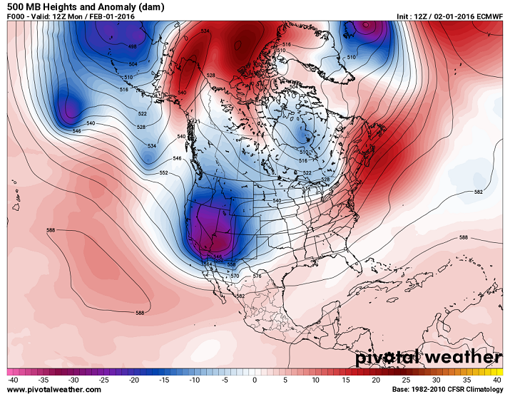
True (actual) 500 mb heights and height anomalies at 12Z on Monday, February 1, 2016. This map can be used to evaluate the accuracy of the forecast map on the left. |
One way to evaluate the accuracy of a weather forecast is to compare the forecasted 500 mb height pattern for a specific time with the true or actual 500 mb height pattern that is measured at that time. For example, we can compare the forecasted 500 mb height pattern for 12Z, Monday, February 1, which is shown in left panel of the figure in the section above, with the measured 500 mb height pattern at 12Z, Monday, February 1, which is shown in the right panel of the figure. A perfect forecast would mean the maps would look identical. In this example the 240 hour (10 day) forecast was somewhat accurate in that it predicted a trough in the western US and a ridge in the eastern US, however, the placement and strength of those features are off. The actual trough (map on the right) was not as large as forecasted and the 5340 meter closed low is not there. Therefore, the forecasted patterns of temperature and precipitation would have been incorrect for the western US. The ECMWF forecast for the eastern US (map on the left) was too warm with a pronounced ridge over the great lakes. In reality (map on the right), the ridge was much weaker and was centered well to the east of its predicted position. In fact the true map indicates a trough over the northern Great Lakes and southern Canada (map on right), while the forecast (map on left) called for a ridge over this region.
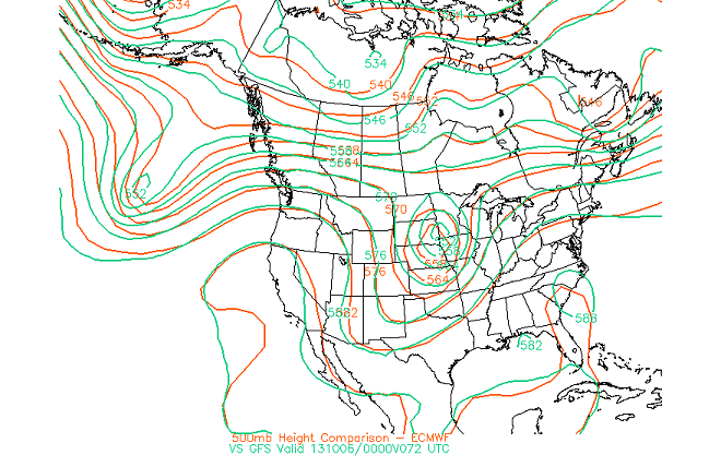
It is also interesting to compare forecasts made by different numerical models. A really nice set of maps comparing the ECMWF and GFS forecasts of 500 mb height is made available from San Jose State University's ECMWF model output page. Select the "500 mb hght comparison ECMWF - GFS" to start a movie of the comparison. Typically you will find that the two models have nearly identical forecasts for 24 to 72 hours, but beyond that the forecasts diverge from each other as the forecast is extended in time. The one drawback of these comparison maps is that they are only produced for forecasts out to 168 hours (7 days) because it is instructive to see how much the forecasts differ from each other as the forecast period is extended to 10 days and beyond. At 10 days and beyond the forecasts are often wildly different. This is an indication that there is a limit over which accurate weather forecasts can be made. Two example comparison maps are shown below. The left panel is a comparison of the 500 mb height patterns forecasted by the ECMWF and GFS models for 72 hours (3 days into the future). Notice that the forecasts are very similar. The right panel shows the comparison for a 168 hour (7 days into the future) forecast. At this point there are significant differences between the model forecasts. While both models predict trough in the western US and a ridge in the eastern US, the ECMWF forecasts a stronger and deeper trough in the west with a closed 5640 meter low centered over Las Vegas, while the GFS forecasts a weaker trough (e.g., compare the position of the 5640 meter height line). The ECMWF model also predicts a stronger ridge in the eastern US extending into Canada, e.g., compare the positions of the 5820 and 5760 meters lines across the northern US and southern Canada.
 |
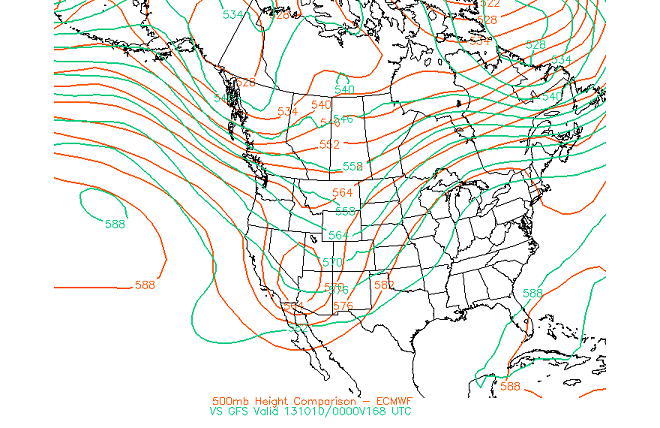 |
| Comparison of a 72 hour Forecast | Comparison of a 168 hour Forecast |
![]()
![]()
![]()
![]()