![]()
![]()
![]()
![]()
One of the nice things about being able to interpret 500 mb height maps is that one can can easily visualize the large-scale weather patterns that are forecasted by computer-generated numerical weather prediction models. There are dozens of groups worldwide that run different numerical models for weather forecasting and hundreds of web sites that display this data. The fact that each model produces different forecasts indicates that there is uncertainty in making numerical weather forecasts. You probably realize from your own experiences that weather forecasts are not exact and can sometimes be way off. When different forecast models make different predictions of future weather, your local weather forecaster has to decide which to believe in making his personal forecast. Generally numerical weather forecast models in the winter season are quite accurate for 1-5 days into the future, somewhat less accurate for 6-9 days into the future, sometimes helpful for 10-12 day forecasts, and have little skill in forecasting more than 12 days into the future. We will cover material discussing limitations on the accuracy of numerical weather forecasting in later lectures.
On this page you will learn how to get numerical weather forecasts from two different sources and how to interpret the 500 mb height maps produced. We will also use maps from these sources for a homework assignment. Out of the numerous web pages containing numerical weather forecast information, a major reason for selecting the three sites below is that those sites allow the user to create forecast maps that clearly show the 500 mb height pattern. Most of the maps that are produced by other sites cram much more information (in addition to 500 mb heights) onto the plots, which can make it difficult for a beginner to concentrate on the 500 mb height pattern. If you become interested in looking at numerical weather forecast information, then I encourage you to visit other sites as well.
This site was mentioned on the introductory lecture page on 500 mb maps. Click on http://weather.uwyo.edu/models/ (link should open a new tab or browser window) and follow these instructions. You must first select a model. In class we will use either the GFS (Global Forecast System) or Medium Range Forecast (MRF) both run in the US by NOAA. You must fill in the drop-down menus and dots to select the maps you want to display. For now select the latest possible initial time (default value) and set the other items as shown below
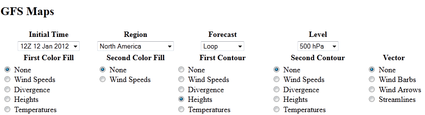
If you are interested you can use this site to produce other forecast images. We will not have time to do much of this as part of the class, but feel free to explore and ask questions. One item that I sometimes choose to add to the 500 mb maps is to select precipitation as one of the color fills to see where and how much precipitation is forecast by the model.
This site will be used to get 500 mb height forecasts from the ECMWF (European Centre for Medium Range Forecasting) model. Unfortunately, for the United States, our operational weather forecasting models generally do not perform as well the the ECMWF model. This was publicly discussed with regard to the forecasts of hurricanes Sandy (in 2012) and Joaquin (in 2015) as the long range ECMWF forecasts were more accurate than the GFS forecasts. There are many weather forecasters who consider the ECMWF the best performing weather forecast model on Earth. Thus, it is worth comparing the GFS forecasts with those made by ECMWF. It can be difficult to find ECMWF forecast information without paying for it. Unlike the United States, which freely diseminates information from government-run weather forecast models, the European Centre only provides a small subset of the model output for free and charges high rates for access to all the model forecast data. The web site that I used to access ECMWF information in past semesters has changed from a free to a pay site, so I now direct you to the official ECMWF webpages.
The homepage for ECMWF forecasts is http://www.ecmwf.int/en/forecasts (link should open a new tab or browser window). However, it is a bit tricky to navigate the site. From the forecasting homepage, Click on "Medium-range" under the "Charts" column to take you to the "Charts catalogue" page. Click on the image under "High Resolution Forecast" heading. An image of a map will be displayed. The next step is to set the Forecast base time, Area, and Parameter using the drop down menus at the top. For this exercise, set Forecast base time to the latest available, set Area to North America, and set Parameter to Geopotential 500 hPa and Temperature at 850 hPa. You should now see a map centered over North America with 500 mb height contours shown in decameters and shading based on the air temperature at the 850 mb pressure level. The controls below the image allow you to step through the forecast, day by day, or start a movie of the forecast. You can also go directly to latest forecast over North America using this link to latest ECMWF forecast of 500 mb heights. ECMWF provides good descriptions of the 500 mb height and 850 mb temperature fields below the forecast maps. Note that hPa (hectopascals) and mb (millibars) are identical units and can be used interchangeably. Millibars are commonly used in the US, while hectopascals are the more standard international unit for pressure.
An example of a forecast image obtained from the ECMWF pages is shown in the left panel of the figure below. The information label above the image contains the starting time for the model forecast, which is Sunday, September 27, 2015 at 12UTC (or 12Z), followed by the forecast length, which is t+168 for 168 hours after the time the model was started, and the actual time of the forecast, which is Sunday, October 4, 2015 at 12Z. The 500 mb height pattern is shown with the contour lines. The color shading is the air temperature at the 850 mb pressure level. We will focus on the 500 mb height pattern. Some of the height contours have labels indicating the height on the contour line in decameters. Just add a zero to the end of these numbers to get the height in meters (basically multiplying the number by 10). Even though only not all contours are labeled, you should easily be able to determine the height of each contour line. Height contours are shown every 6 decameters (every 60 meters). Notice the contour line label of 576 right in the middle of the continental United States. Follow this contour line to the west near the closed low centered along the California coast. Moving in toward the closed low, the contour lines decrease in value by 6 decameters, i.e., 576, 570, 564 (which is labeled), 558, 552, and 546. Now start at the 576 line in the center of the US and move south toward the closed high in the Gulf of Mexico. You will have to cross the unlabeled 582 line, then the labeled 588 line before reaching the high center marked by an H. The 500 mb height labels are plotted right on top of contour lines in the same color as the lines. There are also labels for the 850 mb temperature, which should not be confused with the height contour lables. The 850 mb temperature interval is every 4°C and the temperature pattern is shown with color shading.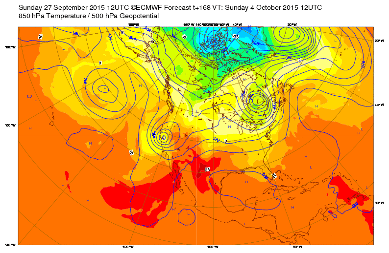 |
 |
| Example of an ECMWF 168 hour forecast of 500 mb heights valid at 12UTC (12Z) Sunday, October 4, 2015. |
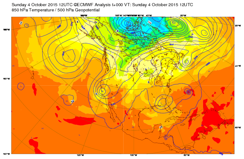
True (actual) 500 mb heights at 12Z on Sunday, October 4, 2015. This map can be used to evaluate the accuracy of the forecast map on the left. |
One way to evaluate the accuracy of a weather forecast is to compare the forecasted 500 mb height pattern for a specific time with the true or actual 500 mb height pattern that is measured at that time. For example, we can compare the forecasted 500 mb height pattern for 12Z, Sunday, October 4, which is shown in left panel of the figure in the section above, with the measured 500 mb height pattern at 12Z, Sunday, October 4, which is shown in the right panel of the figure. A perfect forecast would mean the maps would look identical. In this example the 168 hour (7 day) forecast was somewhat accurate for the western United States, but not very good for the eastern part of the country. The closed low forecasted along the California coast is nearly in the right position. However, the 500 mb height at the center of the actual closed low (on the right) is not as low as the forecast on the left. The innermost contour on the forecast map is 5460 meters, while it is only 5520 meters on the true map. The forecast for the eastern US was way off. Instead of a closed high in the Gulf of Mexico, as forecasted, there is actually a closed low in the southeastern US. The forecast map has a closed low in southeastern Canada, while the true map does not have this feature. The forecast over the Atlantic Ocean was not good either.
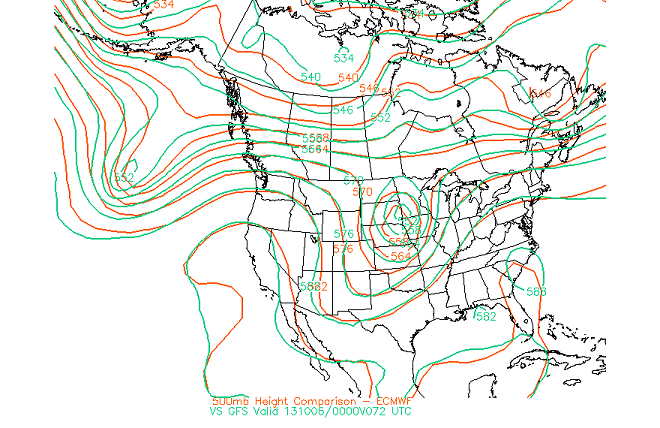
It is also interesting to compare forecasts made by different numerical models. A really nice set of maps comparing the ECMWF and GFS forecasts of 500 mb height is made available from San Jose State University's ECMWF model output page. Select the "500 mb hght comparison ECMWF - GFS" to start a movie of the comparison. Typically you will find that the two models have nearly identical forecasts for 24 to 72 hours, but beyond that the forecasts diverge from each other as the forecast is extended in time. The one drawback of these comparison maps is that they are only produced for forecasts out to 168 hours (7 days) because it is instructive to see how much the forecasts differ from each other as the forecast period is extended to 10 days and beyond. At 10 days and beyond the forecasts are often wildly different. This is an indication that there is a limit over which accurate weather forecasts can be made. Two example comparison maps are shown below. The left panel is a comparison of the 500 mb height patterns forecasted by the ECMWF and GFS models for 72 hours (3 days into the future). Notice that the forecasts are very similar. The right panel shows the comparison for a 168 hour (7 days into the future) forecast. At this point there are significant difference between the model forecasts. While both models predict trough in the western US and a ridge in the eastern US, the ECMWF forecasts a stronger and deeper trough in the west with a closed 5640 meter low centered over Las Vegas, while the GFS forecasts a weaker trough (e.g., compare the position of the 5640 meter height line). The ECMWF model also predicts a stronger ridge in the eastern US extending into Canada, e.g., compare the positions of the 5820 and 5760 meters lines across the northern US and southern Canada.
 |
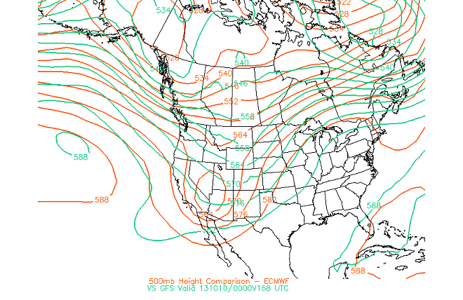 |
| Comparison of a 72 hour Forecast | Comparison of a 168 hour Forecast |
![]()
![]()
![]()
![]()