![]()
![]()
![]()
In this class we will mainly be viewing what are called 500 mb height maps (mb stands for millibars, which is a unit for measuring air pressure). These maps are very good for getting a picture of the large-scale "weather pattern" over the United States, North America, or even the Northern Hemisphere. 500 mb maps are especially nice for studying winter time weather patterns in the middle latiutudes (between about 30° and 60° latitude). This is why we are introducing them at the beginning of the semester. As we go through the first part of this course, you will better understand what is plotted on the maps and why the maps look like they do. The purpose of this page is to begin to show you how to interpret the height patterns (contour lines) that are plotted on the maps in terms of expected weather conditions (see sample 500 mb height map).
With experience one can easily visualize the large-scale weather pattern by looking at the 500 mb height pattern. This is nice when looking at computer-generated (predicted) forecast maps of the 500 mb height pattern, as it tells us what the computer model predicts the future weather to be. By the way all weather forecasting today relies on computer models. The next section explains how to get current and forecasted 500 mb maps via the University of Wyoming's Atmospheric Sciences webpages. You should go through the exercise of viewing some maps. You are not expected to be able to interpret the weather based on the maps until after you read over the sections yet as that will be explained in later sections. After studying over the first few lecture pages, though, you should be able to understand the relationship between 500 mb height and air temperature, determine the general temperature pattern, i.e., where it is above and below average, determine the general wind pattern at 500 mb, and identify regions where there is a good chance for precipitation.
If you do a web search for weather maps, you will find hundreds (maybe thousands) of sites containing maps. If you are interested, you should check some out. You should go through this exercise of looking at maps. If you become interested in looking at these maps, you can continue to visit the site listed below or another of your choosing outside of class.
I suggest using the University of Wyoming's weather model plotting page because it is generally easy to use and is capable of producing simple maps that only show the 500 mb height pattern like the example shown in the previous section. It is common to plot more information than just the 500 mb height contours on these maps, but that makes it more difficult to focus on and interpret the height pattern, especially for beginners.
I will give you some directions on how to use the plotting software to make 500 mb maps. I suggest that you right click on the link below or open another browser window or tab and enter the address provided below:
http://weather.uwyo.edu/models/
At this point, you now know how to get 500 mb height maps. The following sections start to explain how to interpret the maps in terms of expected weather conditions.
As you study this material for the first time, concentrate mostly on how to interpret the 500 mb map pattern in terms of expected weather conditions. Some of the underlying physics describing what determines the 500 mb map pattern are provided in the reading, but it is ok to not fully understand the physics at first. A more complete physical explanation will be provided in later lectures. You should still be able to relate the pattern on the map with the expected weather conditions.
The height contours on the map are actually the height of the 500 mb pressure surface in meters above sea level. The average air pressure near the ground is about 1000 mb, and since air pressure decreases as one moves upward, at some altitude the air pressure will fall to 500 mb. If one were to continue upward the air pressure would fall to near zero at the top of the atmosphere. The height above sea level of the 500 mb pressure surface is measured at many locations around the globe by sending instrumented weather balloons upward. The data from around the world is collected and maps of the current 500 mb height are generated. Computer weather forecast models predict the future pattern of 500 mb heights. The actual pattern of the 500 mb heights changes (evolves) daily.
The details of air pressure will be explained in subsequent lectures, so don't worry if you don't understand it right now. A simple analogy with liquid water may help. Water pressure is the force per area exerted by water on any object submerged and surrounded by water. As you dive downward into water, the water pressure increases since there is an increasing weight of water above you (think about swimming downward in a pool of water). The same basic concept happens with air. The highest air pressure is found at the bottom of the atmosphere (at the ground surface) because the weight of all the air in the atmosphere sits above the surface (like at the bottom of a pool of water). Moving upward in the atmosphere, the air pressure decreases since there is less weight of air above (just like swimming upward from the bottom of a pool of water). At the top of the atmosphere, where it merges with outer space, the air pressure falls to zero since there is no longer any weight of air above the top, just like water pressure will fall to zero as you emerge from the top of a pool of water. So again, since the total weight of the air in the atmosphere results in about 1000 mb of air pressure at sea level, there will be some height above sea level where the air pressure is 500 mb.
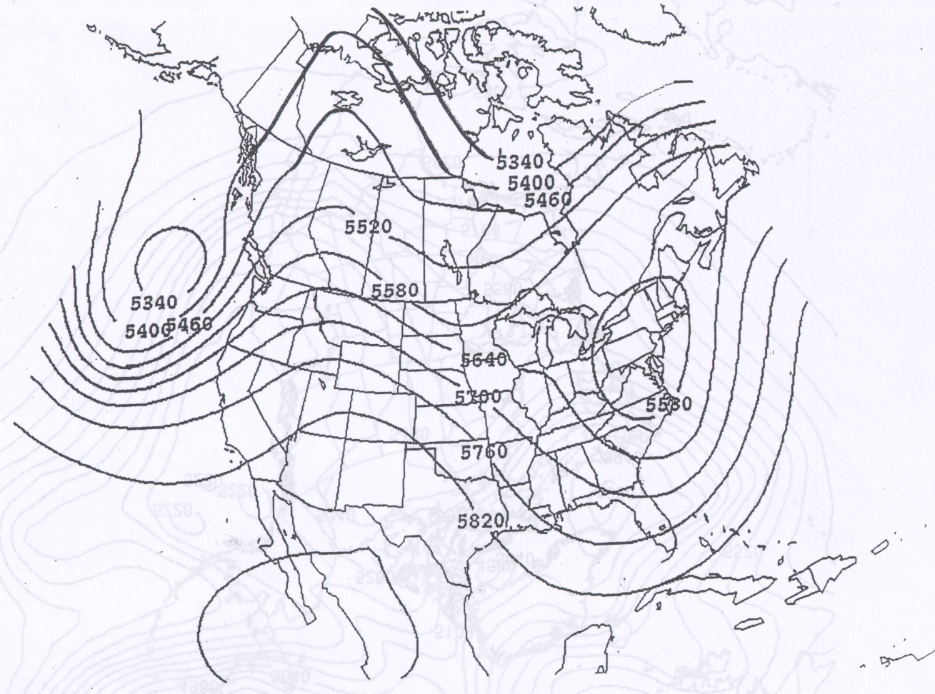
Notice that the height contours generally fall into the range 4600 - 6000 meters (see sample 500 mb height map). You may want to right click on the image link and choose to open the link in a new tab or a new window, so that you can view the image as you read the text below. Most commonly, the contour interval (height difference from one contour line to the next) on 500 mb height maps is 60 meters as in the figure above.
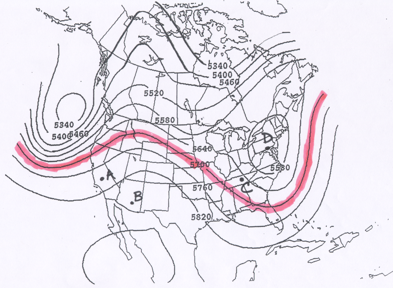
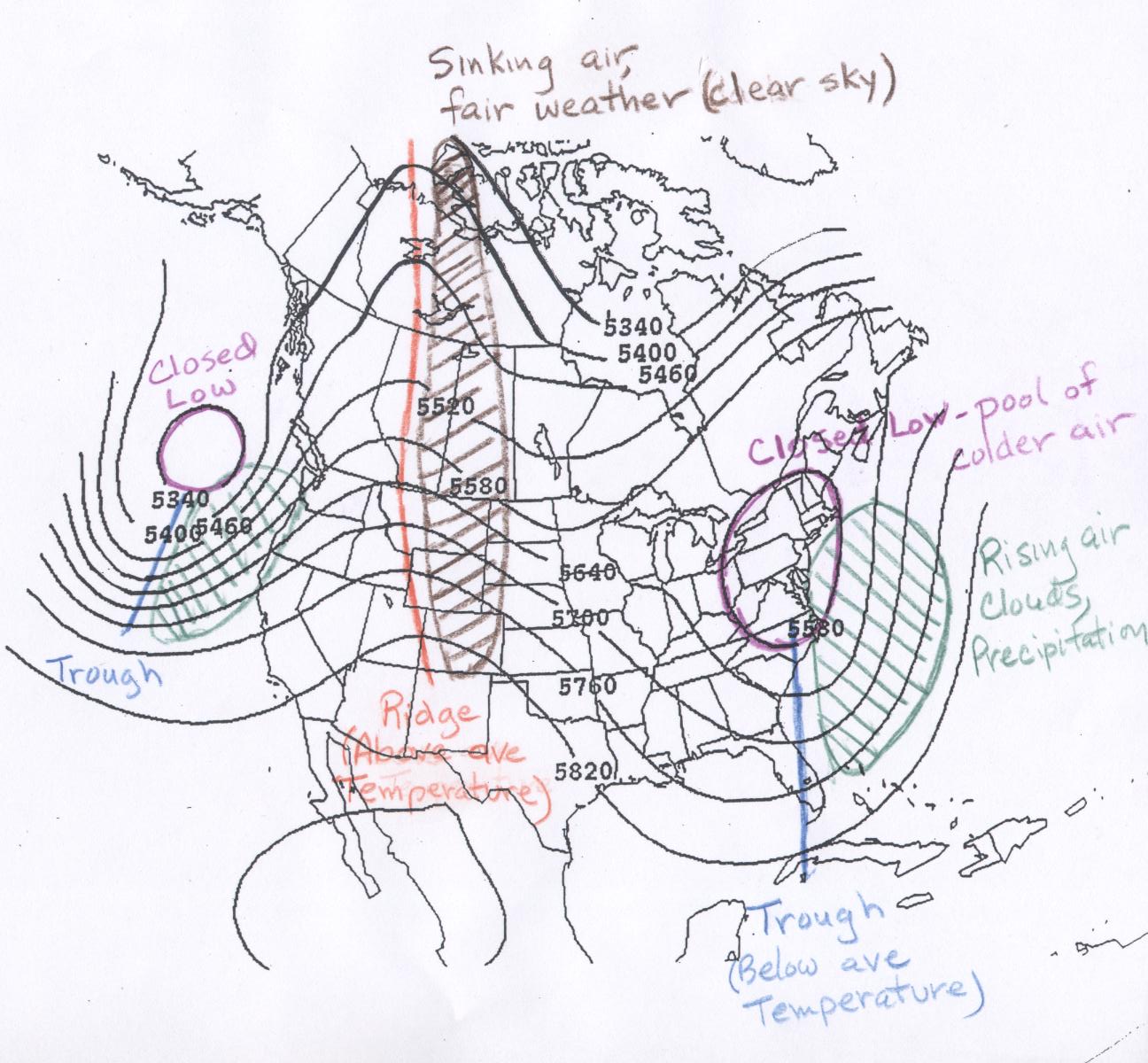
The contour maps of 500 mb height are interpreted in the same way as topographic maps of ground surface elevation. The line highlighted in pink on the sample map is the 5700 meter contour line. The height of the 500 mb surface is 5700 meters above sea level for all points along the line. Above (or generally north) of the line the 500 mb heights are lower than 5700 meters and below (or generally south) of the line the 500 mb heights are higher than 5700 meters. I expect that you can determine the 500 mb height at any point on a map like this. Four points A - D are marked on the map. Point A is located about halfway between the 5760 m line and the 5820 m line, so a good estimate of the 500 mb height at that point would be 5790 m. Point B marks the location of Tucson. All we can say here is that the height at point B is greater than 5820 m, but less than 5880 m. The contour lines on these plots are spaced every 60 m. Point B is definitely higher than 5820 m, but is not enclosed by a 5880 m line. Point C is located between the 5640 m and 5700 m lines, but much closer to the 5640 m line, so the height at point C is about 5650 m. Point D is located in the center of a closed low (described below). The 500 mb height at point D is certainly lower than 5580 m, but not at low as 5520 m, since that contour does not show up within the closed low.
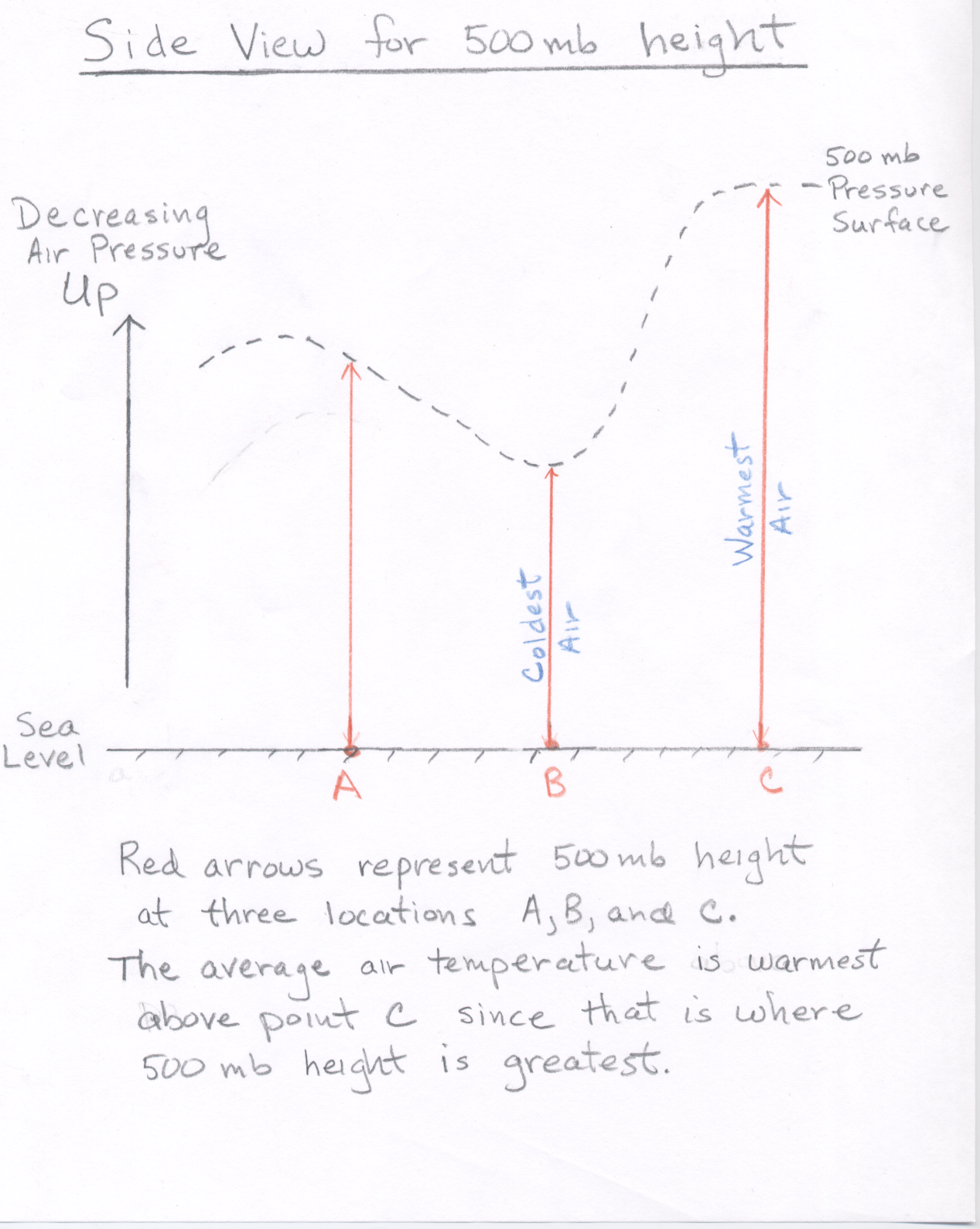
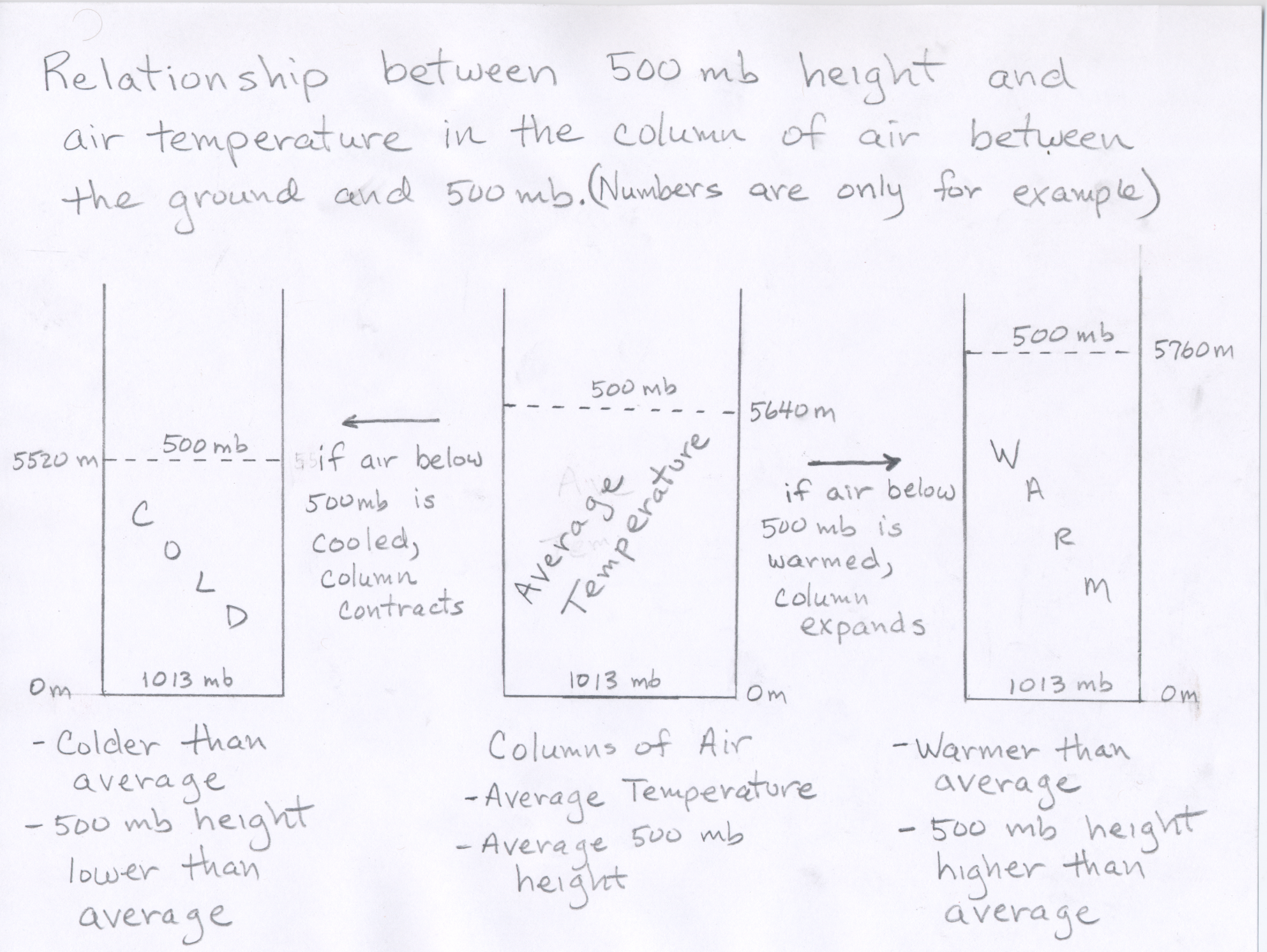
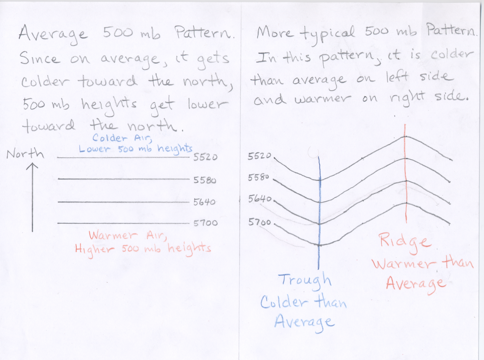
For now, I want you to be able to estimate the pattern of air temperatures based on the pattern of height contours shown on the map. The height of the 500 mb surface is related to the temperature of the atmosphere below 500 mb -- the higher the temperature, the higher the height of the 500 mb level. In other words, the 500 mb height at any point on the map tells us about the average air temperature in the vertical column of air between the ground surface and the 500 mb height plotted at that point. The height pattern tells us where the air is relatively cold and where it is relatively warm (see 500 mb side view.) Another way to think about it is that as air is warmed, it expands, and if the air in a vertical column of air is warmed, the column expands upward. Therefore air pressure decreases more slowly as you ascend through a warm column of air, compared to a cold column of air. (See Figure).
Consider what the 500 mb pattern would look like if air temperatures decreased steadily from the equator toward the north pole. (Note this is what you might guess based on the fact that the Sun's heating is strongest toward the south and weakest toward the north.) In that case the height contours would be concentric circles around the north pole with the highest heights to the south (toward the equator). While this is generally true, the actual pattern at any given time is wavy. Where the height lines bow northward (a ridge), warm air has moved north; and where the height lines bow southward (a trough), cold air has moved south. Therefore, in general warmer than average temperatures can be expected underneath ridges and colder than average temperatures can be expected underneath troughs (See Figure). The more pronounced the ridge (or trough), the more above (or below) average the temperatures will be.
The terminology "trough" and "ridge" is related to the fact that the contour lines often look like waves. A "ridge" is the high point of a wave, and a "trough" is the low point of a wave. A simple diagram is shown below.
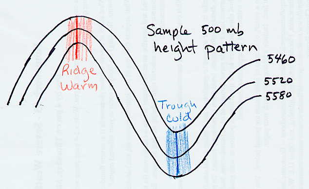
Another feature in the 500 mb pattern worth pointing out are closed lows and closed highs. A closed low on a 500 mb height map is a region of low heights around which one or more closed height contours are drawn. A closed contour line is one which closes in on itself, often making a circular or oval shape. A closed low indicates a pool of colder air surrounded by warmer air. Two closed lows are indicated on this sample 500 mb map. Closed lows are most often found near the base of troughs as in the example. Depending of the strength of the closed low there can be more than one closed contour line encircling the center of lowest height, which is sometimes marked with and 'L' on the maps. Closed lows are often associated with precipitation and a change toward colder conditions, and thus are important features in the weather pattern. There are also closed highs, which are centers of high heights surrounded by one or more closed contours. Closed highs are most often found near the apex of a ridge. Closed highs generally indicate warm and fair conditions. There are two closed highs on the map shown below: a 5820 meter closed high in the Pacific Ocean and a 5880 meter closed high centered over Cuba. There are several closed lows on the map below. The two most southerly of these are a 5340 meter closed low over Utah and 5220 meter closed low off the east coast of North America. Notice that the 5220 meter closed low also has closed contours at 5280, 5340, 5400, and 5460 meters.
|
|
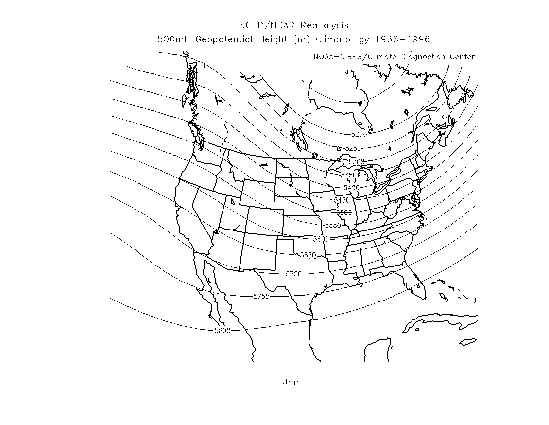
To be a little more precise in estimating expected temperature compared to average, we should compare the actual 500 mb heights from a map for a given day and location to the long-term average or "climatological" 500 mb heights for that day and location. For a given location, if the 500 mb height on the map is close to average, then the temperature is expected to be about average. If the 500 mb height is lower than the average height, then lower than average temperatures are expected. If the 500 mb height is higher than the average height, then higher than average temperatures are expected. The further the 500 mb height is away from average the more the temperature is expected to be away from average. For example, if you compare the actual 500 mb height over Tucson for a given day (say January 18) to the average 500 mb height (from the link below), you can estimate whether or not the air temperature for the day will be above or below average.
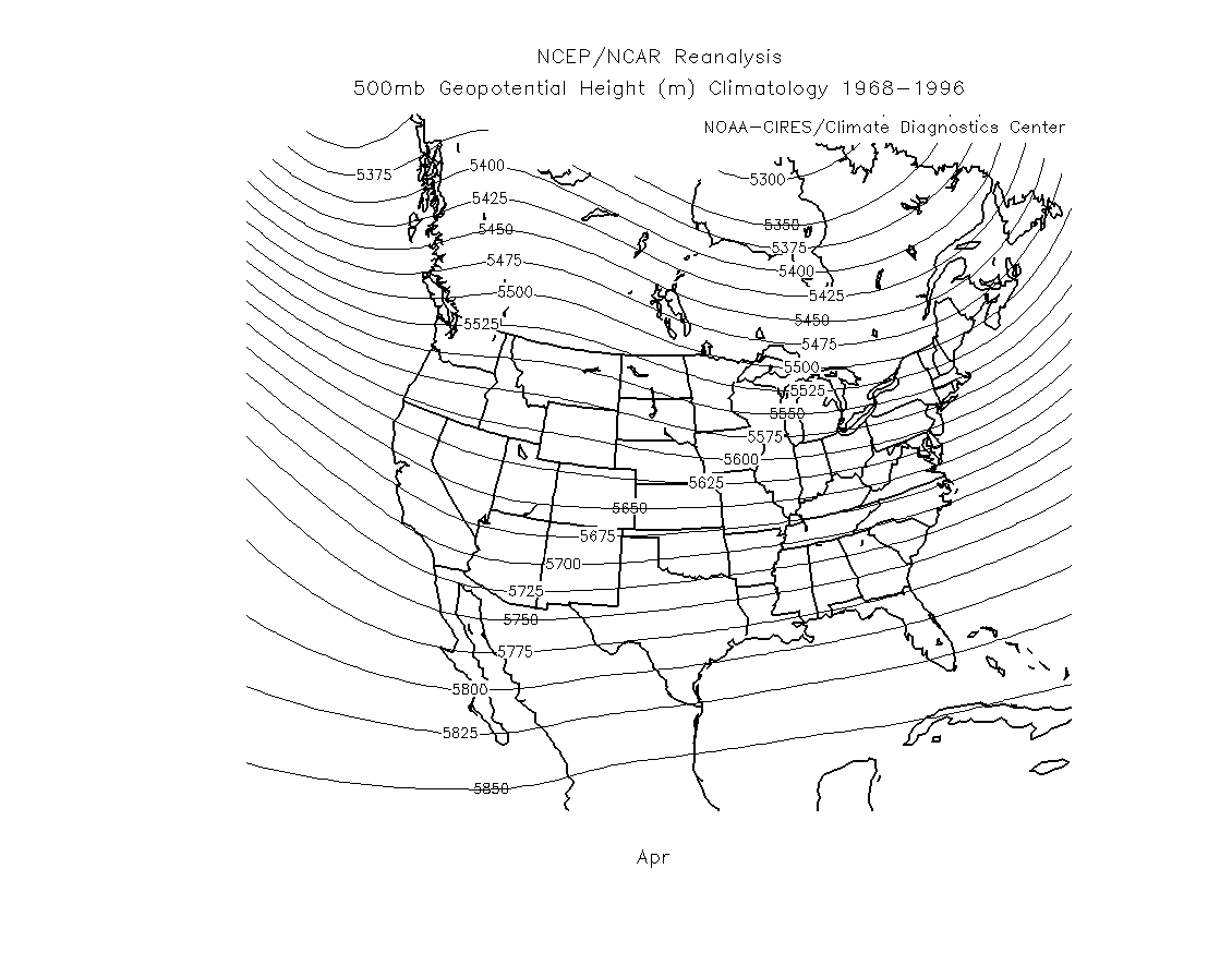
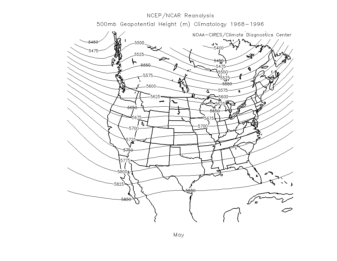
Below are some links to the averge long-term 500 mb heights over the United States
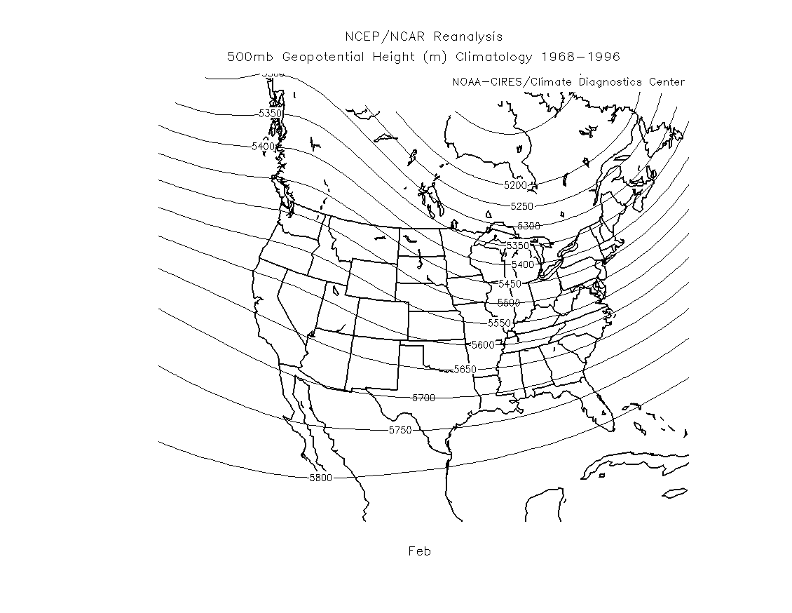
for the months January through May. If you focus on one place, for example Tucson, notice
the significant increase in 500 mb height in May as compared with January. This is expected
since air temperature is much higher in May as compared with January. You should take note of the
average 500 mb height over Tucson for the months of January and February, which is about 5680 meters.
When looking at a 500mb height map during this time of year, if the 500 mb height over Tucson is above 5680 meters,
we expect above average temperture and if the 500 mb height over Tucson a below 5680 meters, we expect
below average temperature. Generally speaking, when 500 mb heights are within about 20 meters of average
expect near average temperature, when 500 mb heights are 30-60 meters above or below average, expect
moderately above or below average temperature, and when 500 mb heights are 80 or more meters above or below
average, expect well above or below average temperature.
January 500 mb height climatology (long-term average)
February 500 mb height climatology (long-term average)
March 500 mb height climatology (long-term average)
April 500 mb height climatology (long-term average)
May 500 mb height climatology (long-term average)
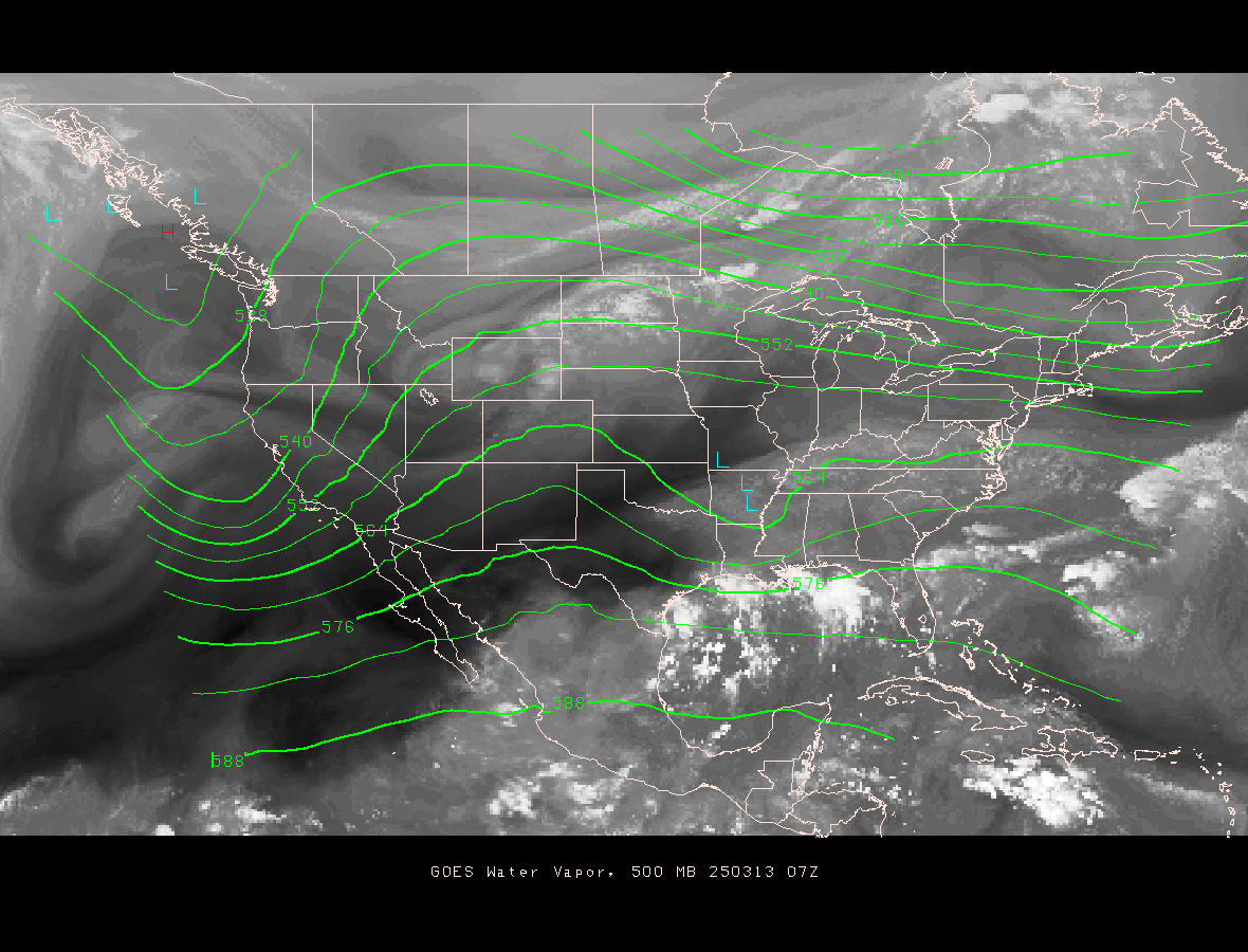
Here is a link to the current 500 mb height pattern. Notice that the 500 mb height contours are labled with 3 digits instead of 4 digits as seen on the other maps we have looked at. On some maps the last zero in the 500 mb height is not displayed on the contour lines (in other words the units on the contour lines are in decameters instead of meters). Just realize that 500 mb heights will be in thousands of meters above sea level, not hundreds of meters. I expect that you can estimate the 500 mb height over Tucson or any other point on the map based on the contour pattern. You should also be able to tell me if the current 500 mb height is above or below the long-term average 500 mb height for this month.
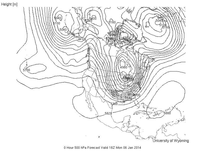
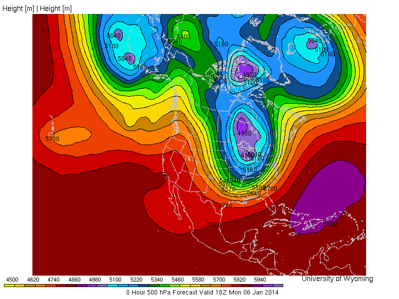
Do you remember the extreme cold outbreak that took place over the eastern part of the United States back in early January? The 500 mb height map for January 6 at 18 Z (11 AM local time in Tucson) is shown below. The map on the right side is the color-filled contour image. Notice the large trough covering much of the eastern part of the United States. The closed low centered over lake Michigan shows a 4980 meter contour. It is rare for the continental US to have 500 mb heights below 5000 meters. Based on the January 500 mb height climatology map discussed above, the average 500 mb height over lake Michigan is about 5400 meters. Thus, the 500 mb height over lake Michigan on January 6 was amazingly more than 400 meters below average! If you remember this trough was resonsible for record cold temperatures over much of the eastern United States. At the same time, there is a strong ridge over the western United States, which produced above average temperatures. I would estimate the 500 mb height over Tucson to be about 5780 meters. This is about 100 meters above average and thus much above average temperature would be expected in Tucson based on the map.
|
|
|
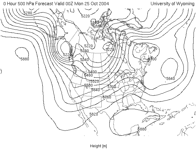
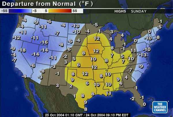
Below are two examples that were used in previous classes. The first is the 500 mb height map for the time 00Z on Monday, October 25, 2004 (This corresponds to a local Tucson time of 5 PM on Sunday, October 24). Next to the 500 mb map is the high temperature relative to average for the day Sunday, October 24. Notice that below average temperatures occured in the western US (associated with the trough over this region), while above average temperatures occured over the midwest southward to the southern great plains and lower Mississippi valley (associated with the ridge over this region), and below average temperatures over parts of the east coast (associated with the trough centered just offshore).
|
|
|
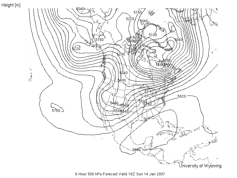
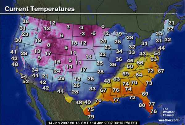
The next example is from January 14, 2007. The 500 mb map is valid for Sunday, January 14, 2007 at 18Z (this corresponds to 11 AM local Tucson time). Next to the 500 mb map is a map showing the surface temperatures across the United States at 20:15 GMT (or 20:15 Z, which is 13:15 (i.e., 1:15 PM) local time). Again, notice that temperatures are cool or cold near the trough in the western United States, for example 42°F in Tucson at 1:15 PM local time. In most of the southeastern United States, temperautures are much warmer in association with a broad ridge and higher 500 mb heights.
|
|
|
This is a simplistic method. The 500 mb height actually tells you about the average air temperature in the vertical column of air between the ground surface and 4.6 - 6.0 km (2.9 - 3.8 miles) above sea level. Often this provides a good estimate of how warm or cold the air temperature is near the ground where we live. However, the vertical column of air from ground to 3 miles above sea level does not have to be uniformly warm or cold. There can be smaller (in vertical extent) layers of relatively warm air and relatively cold air. Sometimes there will be shallow (small in vertical dimension) layers of warm or cold air just above the ground. In these cases, the corresondence between the 500 mb height and surface air temperature will not work as well. In addition, factors like cloud cover, precipitation, and the type of ground surface (dry desert, moist soil, snow cover, etc.) also influence the temperature of the air at the surface. Thus, using the 500 mb heights to estimate surface temperatures is not exact. However, as you will see, the 500 mb maps often provide a very good overview of the pattern of warm and cold conditions near the ground surface.
![]()
![]()
![]()