Tuesday Sept. 25, 2012
click here to
download today's notes in a more printer friendly format
You
heard just a single song ("Oaxaca") from an
interesting group
called Maserati before class today.
Quiz #1 has been graded and was returned in class today.
Please
check the grading carefully and see that the points are added up
correctly.
The 1S1P reports on the 2012 North American Drought have also been
graded. There is now a link on the class homepage where you can
keep track of report grading status.
Several sets of experiment materials were returned today so I should
have 5 or 6 sets of Expt. #2 materials that I can checkout in class on
Thursday. I am planning on having the Expt. #1 reports graded in
time to return in class on Thursday also.
Threee new Optional Assignments are going to be appearing in the next
couple of classes. First, a "Surface Weather Map Analysis"
assignment is
online. It's an optional assignment with a twist: you can earn
either 1S1P points or extra credit.
The assignment is due at the start of class next Tuesday (Oct.
2). There'll
be another optional assignment on Thursday where you'll have the
opportunity to
earn extra credit or a "Green Card".
And
finally
an
Optional
Assignment made during class today that will be
due at the start of class on Thursday (Sept. 27). This latter
assignment has two parts as shown below.
You should find everything you need to know for Assignment #3 in
today's lecture notes.
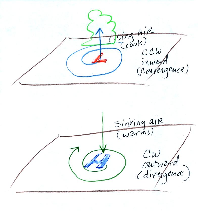
Before the quiz we learned that drawing isobars on a surface
weather map allows you to locate centers of high and low
pressure. Here's a pictorial summary of what we learned about the
winds that blow around centers of high and low pressure.
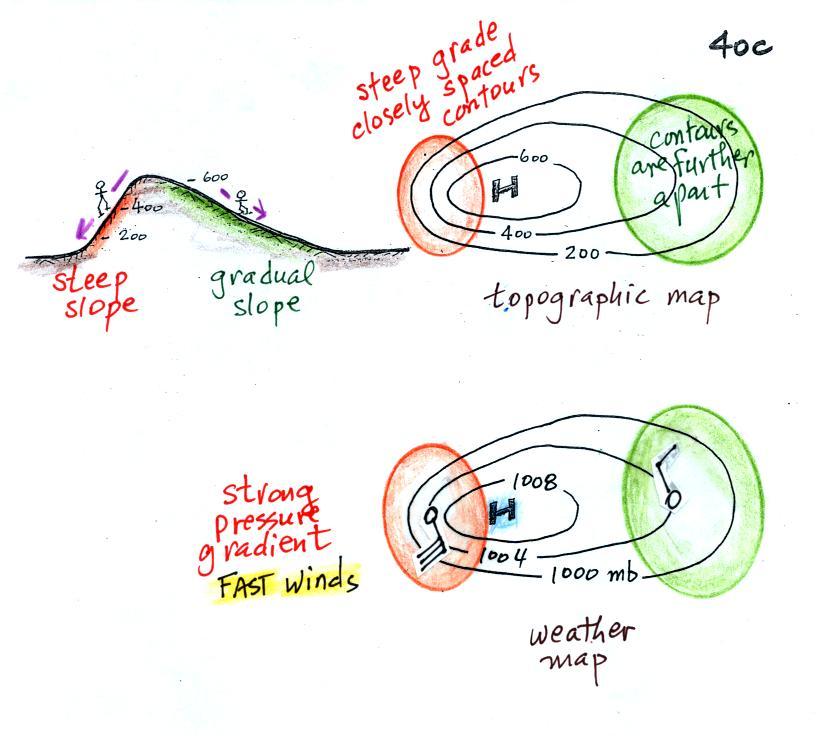
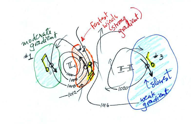
The
pressure pattern will also tell you something about where you might
expect to find fast or slow winds. In this case we look for
regions where
the isobars are either closely spaced together or widely spaced.
A picture of a hill is shown above
at left. The map to its right is a topographic map that
depicts the hill (the numbers on the contour lines are altitude).
Below that is a weather map with pressure contours (isobars). The
center of high pressure on a weather map could have exactly the same
appearance as the topographic map.
On a topographic map, closely spaced contours indicate a steep slope or
steep grade. If you were hiking and happened to fall you quickly
roll downhill. The contours are further apart on the right side
of the topographic map because the slope is more gradual. Here
you'd roll downhill more slowly.
On a weather map closely spaced isobars means
pressure is changing
rapidly
with
distance. This is known as a strong pressure gradient and
produces fast winds.
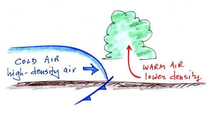
The winds are spinning clockwise
and
spiraling outward slightly as they blow around the high pressure
center. Note the different wind speeds (30
knots and 10 knots plotted using the station model notation).
Fast winds where to contours are close together and slower winds where
they are further apart.
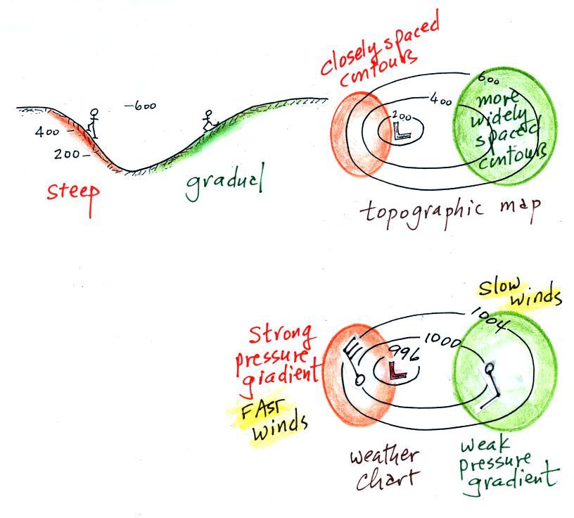
Winds spin counterclockwise and
spiral inward around
low
pressure
centers. The fastest winds are again found where the pressure
gradient is strongest, that is where the contour lines are close
together.
Now you can test yourself.
This figure is found at the bottom
of p. 40 c in the photocopied ClassNotes. You should be able to
sketch in the direction of the wind at each of the three
points and determine where the fastest and slowest winds would be
found. (you'll find the answer at the end of today's notes).
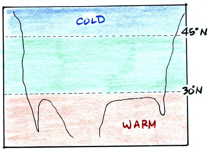
Next we'll see that once the winds start to blow they can
affect and
change
the temperature pattern. The figure below shows the
temperature pattern you would
expect to see if the wind wasn't blowing at all or if the wind was
just blowing straight from west to east. The bands of different
temperature are aligned parallel to the lines of latitude.
Temperature changes from south to north but not from west to
east.
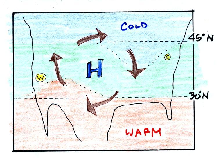
This
picture
gets a
little
more interesting if you put centers of high or low pressure in the
middle.
In the case of high pressure, the
clockwise spinning winds
move warm air to
the north on
the western
side of the High. The front edge of this northward moving air is
shown with a dotted line (at Pt. W) in the picture above. Cold
air moves toward the south on the eastern
side of the High (another dotted line at Pt. C). The diverging
winds also move the warm and cold
air away from the center of the High. Now you would experience a
change in temperature if you traveled from west to east across the
center of the picture.
The transition from warm to cold along the boundaries (Pts. W and
C) is spread out over a fairly long distance and is gradual. This
is because the winds around high pressure blow outward away from the
center of high pressure. There is also some mixing of the
different temperature air along the boundaries.
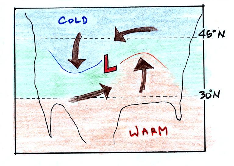
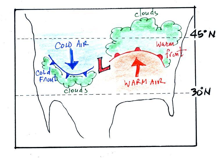
The
converging winds in the case of low pressure will move the air
masses of different temperature in toward the center of low
pressure. The transition zone between different temperature air
gets squeezed and compressed. The change from warm to cold occurs
in a shorter distance and is more abrupt. Solid lines have been
used to delineate the boundaries above. These sharper and more abrupt
boundaries between are called fronts.
A cold front is drawn at the front edge of the southward moving
mass of cold air on the west side of the Low. Cold fronts are
generally drawn in blue on a surface weather map. The small
triangular symbols on the side of the front identify it as a
cold front and show what direction it is moving. The fronts are
like spokes on a wheel. The "spokes" will spin counterclockwise
around the low pressure center (the axle).
A warm front (drawn in red with half circle symbols) is shown on
the
right hand side of the map at front edge of the northward moving mass
of. A warm front is usually drawn in red and has half circles on
one side of the front to identify it and show its direction of motion.
Both types of fronts cause rising air motions. Fronts are
another way of causing air to rise. Rising air expands and
cools. If the air is moist and cools enough, clouds can form.
The storm system
shown in the picture above (the Low together with the fronts) is
referred to
a middle latitude storm or an extratropical cyclone. Extra
tropical means outside the tropics, cyclone means winds spinning
around low pressure (tornadoes are sometimes called cyclones, so are
hurricanes). These storms form at middle latitudes
because that is where air masses coming from the polar regions to the
north and the more tropical regions to the south can collide.
Large
storms that form in the tropics (where this mostly just warm air) are
called tropical cyclones or, in our part of the
world, hurricanes.
And
speaking of hurricanes. You can find the latest
information about Hurricane Miriam at the National Hurricane Center website.
We'll be looking in more detail at the structure
of
warm and cold fronts and the weather changes that can occur as they
approach and pass through. We'll also look at how you might go
about locating fronts on a surface weather map.
A vertical slice through a cold front is shown below at left. Pay
particular attention to the shape of the advancing edge of the cold air
mass. Friction with the ground causes the front edge to "bunch
up" and gives it the blunt shape it has. You'd see something
similar if you were to pour something thick and gooey on an inclined
surface and watch it roll downhill.
The cold dense air mass behind a
cold front moves into a region occupied by warm air. The warm air
has lower density and will be displaced by the cold air mass. In
some ways its analogous to a big heavy Cadillac plowing into a bunch of
Volkswagens.

The VWs would be thrown up into the air by the Cadillac.
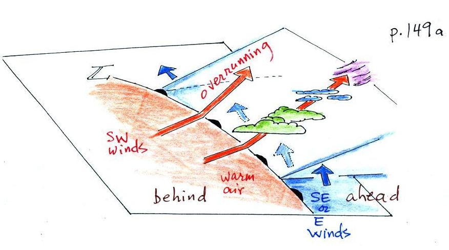
A sort of 3-dimensional crossectional view of a cold
front is shown below (we've jumped to p.
148a in the photocopied ClassNotes)
The person in the figure is positioned ahead of an approaching cold
front. It might be the day before the front actually passes
through.
The warm air mass ahead of the front has just been sitting there and
temperatures are pretty uniform throughout. The air behind the
front might have originated in Canada. It might have started out
very cold but as it travels to a place like Arizona it can change
(warm) considerably. The air right behind the front will have
traveled
the furthest and warmed the most. That's the reason for the
cool, cold, and colder temperature gradient behind the front.
Here are some of the specific weather changes that might precede and
follow a cold front
Weather
variable
|
Behind
|
Passing
|
Ahead
|
Temperature
|
cool, cold, colder*
|
|
warm
|
Dew Point
|
usually much drier
|
|
may be moist (though that
is often
not the case here in the desert southwest)
|
Winds
|
northwest
|
gusty winds (dusty)
|
from the southwest
|
Clouds,
Weather
|
clearing
|
rain clouds, thunderstorms
in
narrow band along the front
(if the warm air mass is moist)
|
might see some high clouds
|
Pressure
|
rising
|
reaches a minimum
|
falling
|
*
the
coldest
air
might
follow
passage
of
a
cold
front
by
a day
or two. Nighttime temperatures often plummet in the cold dry air
behind a cold front.
A temperature drop is probably the most obvious change associated with
a cold front. Here is southern Arizona, gusty winds and a wind
shift are also often noticeable when a cold front passes.
The pressure changes that precede and follow a cold front are not
something we would observe or feel but are very useful when trying to
locate a front on a weather map.
We watched a couple of short video segments at this point.
The first was a time lapse movie of an
actual cold front that passed through Tucson on Easter Sunday, April 4,
in 1999. It actually snowed for a short time during the passage
of the cold front (hard to imagine cold weather and snow on a day as
warm and nice as it is today). Click here
to see the cold front video (it may take a minute or two to transfer
the data from the server computer in the Atmospheric Sciences Dept., be
patient). Remember the video shows a time
lapse movie of the frontal passage. The front seems to race
through Tucson in the video, it wasn't moving as fast as the video
might lead you to believe. Cold fronts typically move 15 to 25
MPH.
The 2nd
video was another cold
front passage that occurred last spring on February 12.
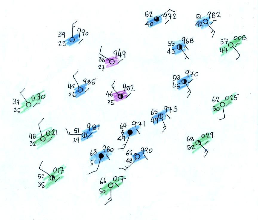
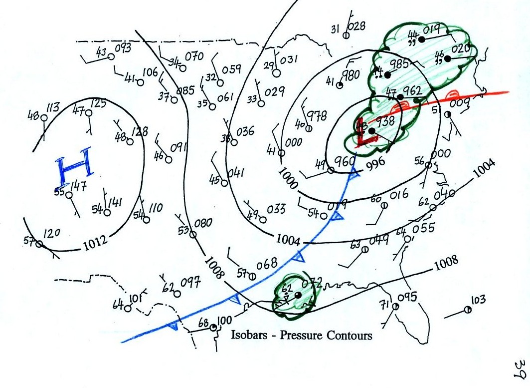
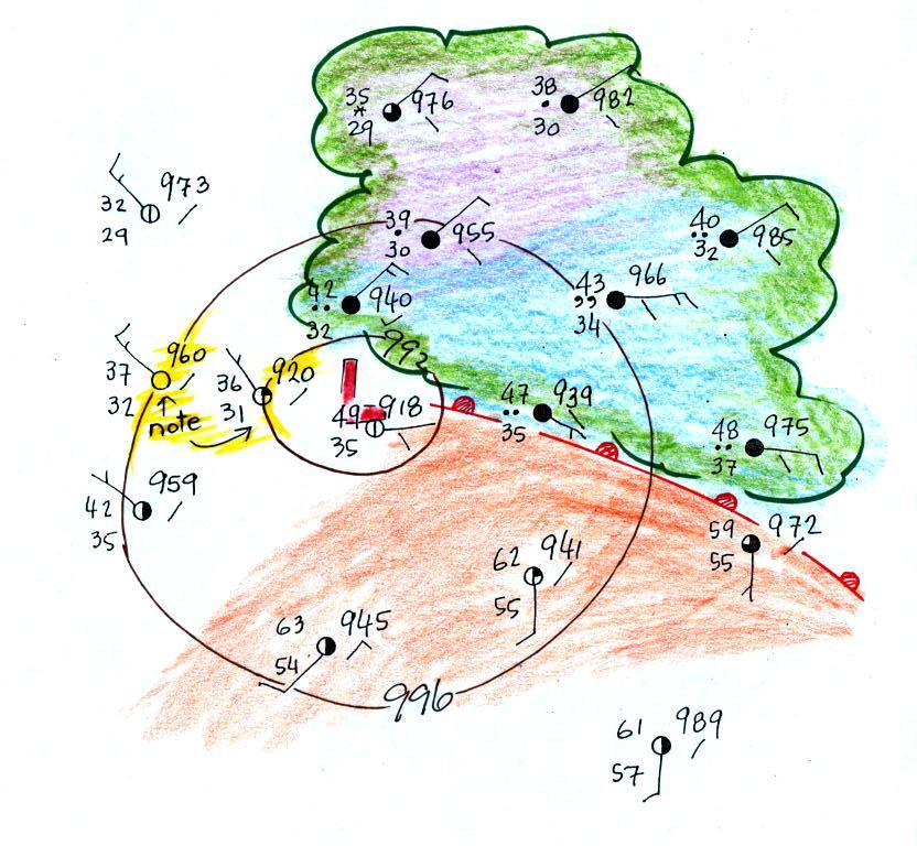
In the next figure we started with
some weather data
plotted on a
surface map using the station model notation. We'll try to make a
little more sense of this data.

Before trying to locate a cold front, we needed to draw in a few
isobars and map out the pressure pattern. In some respects fronts
are like spokes on a wheel - they rotate counterclockwise around
centers of low pressure. It makes sense to first determine the
location of the low pressure center.
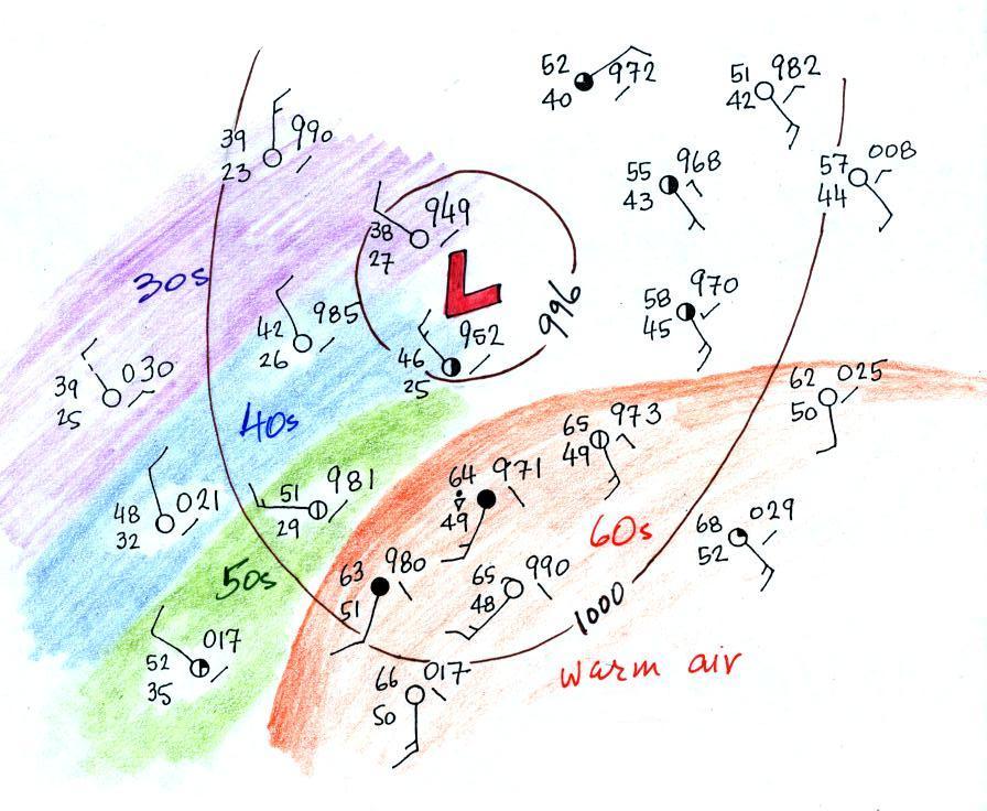
Isobars are drawn at 4 mb increments above and below a starting value
of 1000 mb. Some
of the allowed values are shown on the right side of the figure (992,
996, 1000, 1004, 1008 etc).
The highest pressure on the map is 1003.0 mb, the lowest is 994.9
mb. You must choose from the allowed list of isobar values and
pick only the values that fall between the high and low pressure values
on the map. Thus we need to draw in 996 mb and 1000 mb
isobars.
The next two
figures weren't shown in class. I've included them here
to give you a little bit better idea of how you going about drawing in
isobars. You'll find
another example in the Surface Weather Map
Analysis Example that accompanies the assignment mentioned at the
top of today's lecture notes.
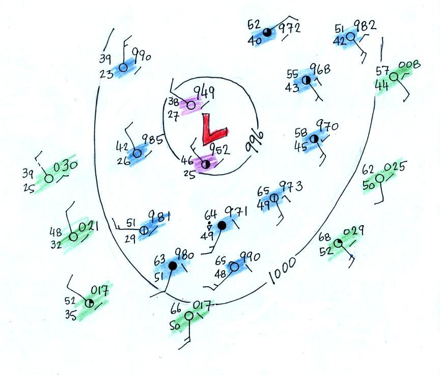
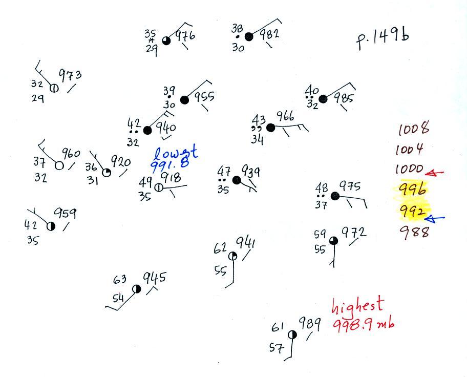
In the figure below stations with pressures lower than 996 mb have been
colored in purple. These will be enclosed by the 996 mb
contour. Pressures between 996 and 1000 mb have been colored
blue. These stations will lie outside the 996 mb contour but
inside the 1000 mb isobar. Finally stations with pressures
greater than 1000 mb have been colored green. The 1000 mb isobar
will separate the blue stations from the green stations.
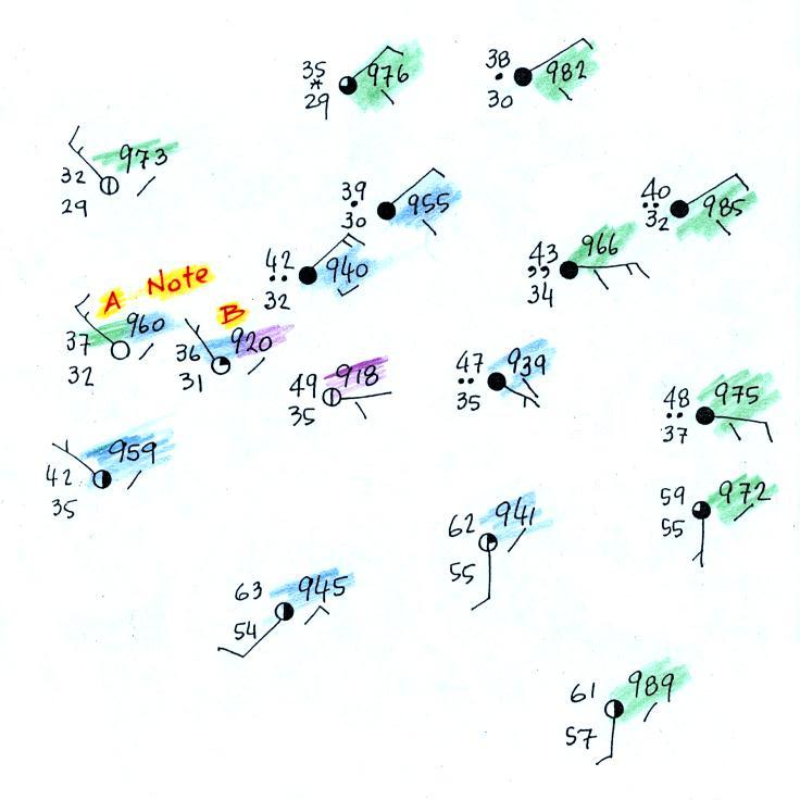
The map below shows the same picture with the 996 mb
and 1000 mb contours drawn in.
The next step was to try to locate
the warm air mass
in the
picture. We've left the isobars in the figure below but now have
used colors to identify air masses with different temperatures.
Temperatures are in the 60s in the lower right portion
of the map; this area has been circled in orange. Cooler air to
the west of the Low pressure center has also been identified.
Based on just the temperatures just should have a pretty good idea
where a cold front would be found.
The cold front on the map seems to be properly postioned. Note
how
the
cold
front
is
positioned
at
the
leading
edge
of
the
cold
air mass, not necessarily in
front of the coldest air in the cold air mass.
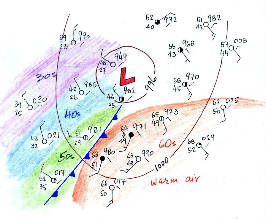
3
of
the
stations
from
the
bottom
portion
of
the
map
have
been redrawn
below.
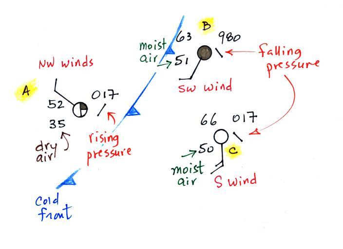
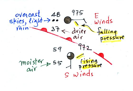
The air
ahead of the front (Pts. B & C) is warm, moist, has winds blowing
from the S or SW,
and the pressure is falling. These are all things you would
expect to find ahead of a cold front.
Overcast skies are found at Pt. B. very near the front.
The air behind the front at Pt. A is colder, drier, winds are blowing
from the
NW, and the pressure is rising.
Next we'll have a look at a warm front. Now we're looking at
warm air overtaking a slowly retreating cold air mass.
In the case of the car analogy it is like the Volkswagen about to catch
up with a Cadillac.
What will happen when they catch the Cadillac?
The Volkswagens are still not nearly as heavy as the
Cadillac. They'll overrun the Cadillac.
The same happens along a warm front. The
approaching warm air is still less dense than the cold air and will
overrun the cold air mass.
The back edge of a retreating cold mass has a much different shape than
the advancing edge. The advancing edge bunches up and is
blunt. The back edge gets stretched out and has a ramp like
shape. The warm air rises more slowly and rises over a much
larger area out ahead of the warm front. This is an important
difference between warm and cold fronts.
Here's the 3-dimensional view again
that's in the ClassNotes.
And the weather
changes found in advance of and following the frontal
passage.
Weather
Variable
|
Behind
(after)
|
Passing
|
Ahead
(before)
|
Temperature
|
warmer
|
|
cool
|
Dew point
|
may be moister
|
|
drier
|
Winds
|
SW, S, SE
|
|
from the East or SE
|
Clouds, Weather
|
clearing
|
|
wide variety of clouds that
may precede arrival of the front by a day or two
clouds may produce a wide variety of types of precipitation also
(snow, sleet,
freezing rain, and rain)
|
Pressure
|
rising
|
minimum
|
falling
|
Probably the key
difference between warm and cold fronts (other than a cold-to-warm
rather than a warm-to-cold change) is the wide variety of clouds that a
warm front cause to form cover a much larger area out ahead of the
front. Clouds associated with a cold front are usually found in a
fairly narrow band along the front.
Now we'll
follow the same procedure and try to locate a warm front on a surface
weather map. This is the first part of the Optional Assignment.
We'll start by drawing some isobars to map out the pressure
pattern. A partial list of allowed isobars is shown at the right
side of the map above (increments of 4 mb starting at 1000 mb).
We've located located the highest
and lowest pressure values on the map. Then we choose allowed
isobar values that fall between these limits. In this case we'll
need to draw 992 mb and 996 mb isobars.
Here's the map with color coded pressures. Pressures less
than 992 mb are purple, pressures between 992 and 996 mb are blue, and
pressures greater than 996 mb are green.
Note that station B has a pressure of exactly 992.0 mb, the 992 mb
isobar will go through that station. The 996 mb isobar will go
through station A because it has a pressure of exactly 996.0 mb.
Here's the map with the isobars drawn in. On the map below we use
colors to locate the warm and cooler air masses.

The warm air mass has been
colored in orange. Cooler air east of the low pressure center is
blue. Can you see where the warm front should go?
The station north of the front has cooler and drier air, winds are
from the east, skies are overcast and light rain is falling. The
pressure is falling as the warm front approaches. These are all
things you'd expect to find ahead of a warm front. Behind the
front at the southern station pressure is rising, the air is warmer and
moister, winds have shifted to the south and the skies are starting to
clear.
Here's the picture again with an additional front drawn in.
There's pretty good evidence of a cold front on the left portion
of the map.
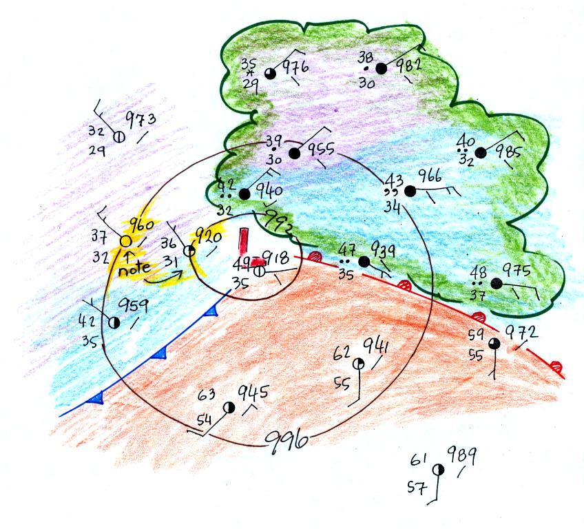
One last picture, we go back to the map on p. 39 in the ClassNotes.
This is one of the maps that we looked at at the start of this
section of material. One of the questions we had was what might
be causing the clouds,
rain, and drizzle in the northeastern part of the country, and the rain
shower along the Gulf Coast. The cold front is almost certainly
the cause of the rain shower and much of the wet weather in the NE is
probably being caused by the warm front.
This is already way too many notes for one class, so I've moved
the Fall Equinox material to a
separate
location. You'll need to have a quick look at that if you
want to answer the second question on the Optional Assignment.
There was a question earlier in today's notes about wind directions and
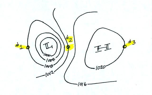
wind speeds. Here's the answer to the question.
The winds are blowing from the NNW
at Points 1 and 3. The winds are blowing from the SSE at Point
2. The fastest winds (30 knots) are found at Point 2 because that
is where the isobars are closest together (strongest pressure
gradient). The slowest winds (10 knots) are at Point 3.
Notice also how the wind direction can affect the temperature
pattern. The winds at Point 2 are coming from the south and are
probably warmer than the winds coming from the north at Points 1 &
3.