This is the 2nd part of our coverage of climate change.  In the first lecture we learned that the atmospheric concentration of CO2 has been increasing since the mid 1700s and that there has been almost a 1o C increase in the earth's global average surface temperature over the past 150 years or so.  Many scientists believe the increase in CO2 (together with increasing amounts of other greenhouse gases) has caused the warming.  Even though that can't be established with certainty it is appropriate to ask what might happen next.  In this lecture we will examine a few additional aspects of climate change and we'll look at some of the predictions for the next 100 years or so. 

Predicted Changes in Atmospheric CO2 Concentrations


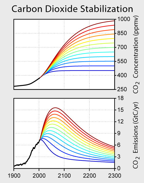
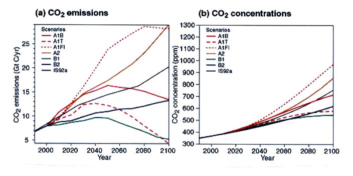
Atmospheric carbon dioxide concentrations are currently about 385 ppm (ppm stands for parts per million, 385 ppm is equivalent to 0.0385% concentration).  The computer model predictions above
show that this could increase to between about 550 and 950 ppm by 2100 (source)The amount of increase will depend on future changes in population and how quickly we can develop new technologies and shift to alternative sources of energy (the various scenarios used in the predictions are described in more detail here).      

The right graph above shows that atmospheric CO2 concentration keeps increasing for the next century even with fairly significant cuts in CO2 emission amounts during the next century.  To see when atmospheric CO2 amounts might eventually stabilize at a constant level you need to look further out in time as in the figure below (created by Robert A. Rohde for Global Warming Art).


Keeping
CO2 concentration below 1000 ppm will require that CO2 emissions peak before the end of the 21st century and that they eventually be cut to less than present day emission rates.  The most optimistic scenario (the lower-most curve on the graph) shows that with an immediate cut in CO2 emissions and a decrease to about 25% of current values would result in concentrations stabilizing at about 450 ppm.

Global Temperature

Sophisticated computer models are used to forecast changes in climate.  Before we look at model results we should first ask whether we have any confidence in the ability of these models to be able to accurately make predictions.  One test would be to see if the computer models are able to accurately reproduce changes in the earth's temperature that have already occurred.  The figure below shows results from 58 such simulations using 14 different climate models (source).


The model results are the light gold colored lines, the red line shows the mean of the model simulations, and the black line the observed temperature variations (temperature change values on the y-axis are relative to the 1901-1950 mean).  Both natural and anthropogenic factors have been included.  The four vertical lines indicate major volcanic eruptions, natural processes that cause short duration cooling. 

The relatively good agreement between predictions and observations adds some support to the claim that the models are able to realistically simulate the complex physical processes that determine climate. 

The figure below shows predicted increases in global average surface temperature relative to the 1980-1999 mean (source).  Estimates range from about a 0.6o C increase (the orange line which assumes that future greenhouse concentrations remain at the 2000 levels, a best case scenario) to about 4o C (the A1F1 scenario which assumes continued intensive use of fossil fuels, a worst case estimate).  These are the same emissions scenarios mentioned earlier (described in detail here ).


The warming isn't expected to be uniform but will occur mainly over land and at higher latitudes (the figure above was prepared for Global Warming Art by Robert A. Rohde).


Melting of Snow and Ice, Sea Level Rise
The images that global warming most often brings to mind perhaps are melting glaciers and polar ice, rising sea level, and flooding of coastal communities. 


Pederson Glacier is in the Kenai Fjords National Park, Alaska (this is another of the images created by Robert A. Rohde for Global Warming Art).

Ice (found mostly in Antarctica and Greenland) covers about 10% of the earth's land surface and about 7% of the earth's oceans (much of this is at the N. Pole).  Snow covers almost half of North America in the winter.


Melting of glacial ice, snow, and land ice in the figure above will cause sea level to rise.  Melting of sea ice (floating ice) will not.  This is something you can verify for yourself by putting several ice cubes in a glass then filling up the glass to the brim with water.  The glass won't overflow once all the ice has melted.

Observations do indicate that the amounts of ice and snow have been decreasing, especially since about 1980.  During the 1993-2003 time period,  melting of ice and snow were increasing sea level by 0.6 to 1.8 millimeters (mm) per year.  Past, present, and predicted sea levels are shown in the next figure (source)


We should mention that the predicted rise in sea level comes not only from melting ice but also from thermal expansion of the ocean water. 

Several hundred million people live in coastal areas that are at risk from rising sea level (see this gallery of images).  Rising sea level can contaminate coastal supplies of fresh water and can harm coastal ecosystems. 
In addition to causing sea level to rise, a decline in mountain snow and ice could also cause a serious shortages in freshwater supplies for nearby communities and cities.


Changes in Climate and Frequency of Extreme Weather Events
The table below lists some of the changes that may already have occured and/or are expected to occur in the next 100 years or so (source of the information).

Condition or event
Have changes already occurred?
Have human activities contributed to the observed change?
Is the observed change expected to continue during the 21st century?
Fewer cold days & nights over land areas
very likely
likely
virtually certain
More frequent hot days & nights over land areas
very likely
likely (warmer nights)
virtually certain
More frequent warm spells/heat waves
likely
more likely than not
very likely
Frequency of heavy precipitation events increases
likely
more likely than not
very likely
Increase in area affected by droughts.
likely in many areas since 1970
more likely than not
likely


The graphs below show changes in the frequency of unusually cold nights and unusually warm nights.  Data come from about 200 weather stations located around the world.  The black, blue, and red curves are for the time periods 1901-1950, 1951-1978, and 1979-2003, respectively.  The red curve lies to the left of the other two curves on the plot at left.  This indicates that cold nights were less frequent for the 1979-2003 period than for the other two time periods.  The red curve has moved to the right of the other two curves in the figure at right.  Warm nights were more frequent in the 1979-2003 time period than in the other two periods. (source of these data)


Extreme cold and excessive heat are the two deadliest weather-related causes of death in the US (though there is some uncertainty about which is deadlier).  The Chicago Heat Wave of 1995 killed approximately 750 people, the 2003 European Heat Wave killed approximately 40,000 people.  It is tempting to use the data above to suggest that the incidence of cold events might decrease while the occurrence of heat spells might increase.  This is an example of both good and bad effects coming from climate change.  While something like the 2003 event cannot be blamed on climate change, the possibility similar situations might become more common in the future should lead to advance preparations that might minimize the effects they have. 


During the past 100 years or so there appears to have been an increase in precipitation amounts observed over land north of 30o N latitude.  Globally there has not been a significant increase in precipitation observed.


This figure shows changes in precipitation amounts over the US for the time period 1901to 2005 (source).  Somewhat surprisingly, Hawaii is the only location where there has been an overall decrease in precipitation.

There is concern that dry regions might become even drier (warmer temperatures would increase evaporation) and that wet regions could become wetter (increased evaporation will add more moisture to the air, warmer air can hold more moisture when saturated)


Here is an example of model precipitation predictions from the NOAA Geophysical Fluid Dynamics Laboratory (source).  This model predicts a global increase in precipitation, an increase in precipitation near the equator and at middle latitudes.  The subtropics will experience a decrease in precipitation.

There is some concern that global warming will make hurricanes stronger and more frequent.  We will consider that question in the section on hurricanes.