Much of our weather is produced by relatively large
(synoptic scale)
weather systems. To be able to identify and characterize these
weather systems you must first periodically collect weather data
(temperature,
pressure, wind direction and speed, dew point, cloud cover, etc) from
stations across the country and plot the data on a map. The large
amount of data requires that the information be plotted in a clear and
compact way. The station model notation is what meterologists
use.
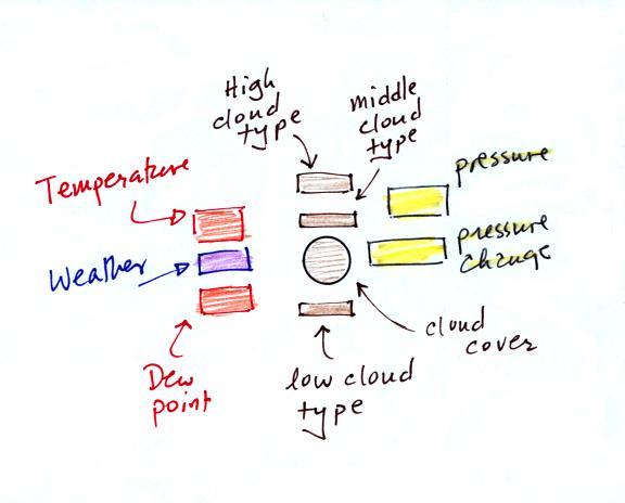
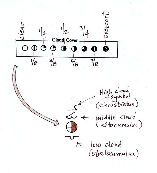
A small circle is plotted on the map at the location where
the
weather
measurements were made. The circle can be filled in to indicate
the amount of cloud cover. Positions are reserved above and below
the center circle for special symbols that represent different types of
high, middle,
and low altitude clouds. The air temperature and dew point
temperature are entered
to the upper left and lower left of the circle respectively. A
symbol indicating the current weather (if any) is plotted to the left
of the circle in between the temperature and the dew point; you can
choose from close to 100 different weather
symbols. The
pressure is plotted to the upper right of the circle and the pressure
change (that has occurred in the past 3 hours) is plotted to the right
of the circle.
We'll work through this material one step, one weather variable, at a
time.
The center circle is filled in to indicate the portion
of
the sky
covered with clouds (estimated to the nearest 1/8th of the sky) using
the code at the top of the figure. 3/8ths of the sky is covered
with clouds in the example above.
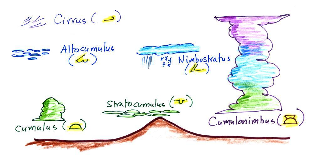
We'll learn how to name and identify clouds later in
the course. In the meantime here are some sketches of common
clouds together with their weather symbols.
Here's a more complete chart
of cloud photographs and also the symbols that can be used to note
the cloud type on a surface weather map.
The air temperature in this example was 64o
F
(this is
plotted above and to the left of the center circle). The dew
point
temperature was 39o F and is plotted below and to the left
of the center circle. The box at lower left reminds you that dew
points range from the mid 20s to the mid 40s during much of the year in
Tucson.
Dew
points rise into the upper 50s and 60s during the summer thunderstorm
season (dew points are in the 70s in many parts of the country in the
summer). Dew points are in the 20s, 10s, and may even drop below
0 during dry periods in Tucson.
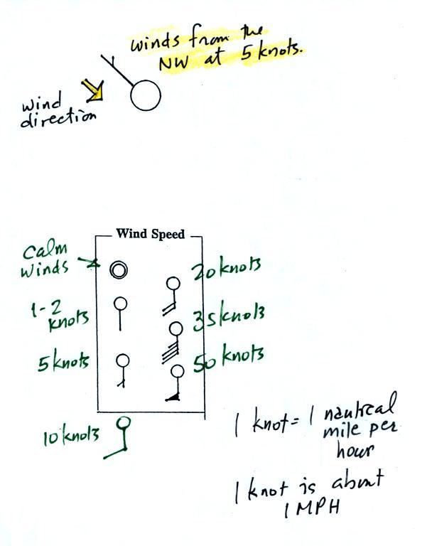
A straight line extending out from the center circle
shows the wind direction. Meteorologists always give the
direction the wind is coming from.
In this example the winds are
blowing from the NW toward the SE at a speed of 5 knots. A
meteorologist would call
these northwesterly winds. Small barbs at the end of the straight
line give the wind speed in knots. Each long barb is worth 10
knots, the short barb is 5 knots.
Knots are nautical miles per hour. One nautical mile per hour is
1.15 statute miles per hour. We won't worry about the distinction
in this class, you can just pretend that one knot is the same as one
mile per hour.
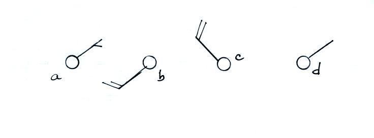
Here are some additional wind
examples
In (a) the winds are from the NE at 5 knots, in
(b) from the
SW at 15
knots, in (c) from the NW at 20 knots, and in (d) the winds are from
the NE at 1 to 2 knots.
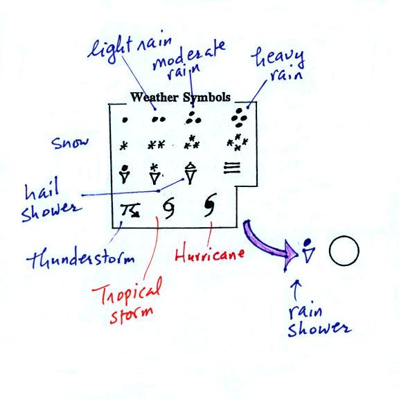
A symbol representing the weather that is currently
occurring is plotted to the left of the center circle (in between the
temperature and the dew point). Some of
the common weather
symbols are
shown. There are about 100 different
weather
symbols that you can choose
from.
The sea level pressure is shown above and to the right
of
the center
circle. Decoding this data is a little "trickier" because some
information is missing. We'll look at this in more detail
momentarily.
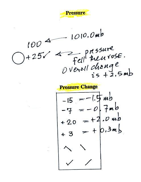
Pressure change data (how the pressure has changed during
the preceding
3 hours)
is shown to the right of the center circle. You must
remember to add a decimal point. Pressure changes are usually
pretty small.
Here are
some links to surface weather maps with data plotted using the
station model notation: University of
Arizona Atmospheric Sciences Department Weasther Page, National
Weather Service Hydrometeorological Prediction Center, American
Meteorological
Society.
We haven't
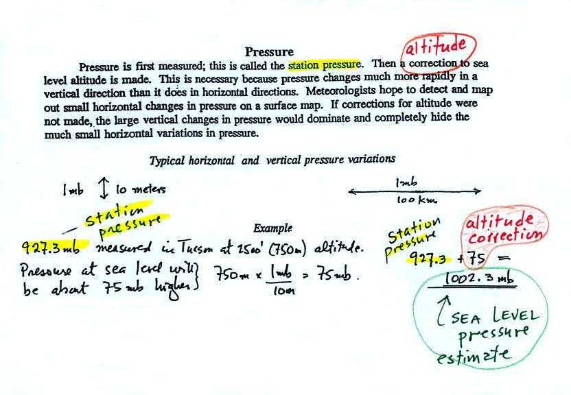
learned how to decode the pressure data yet.
Meteorologists hope to map out small horizontal pressure
changes on
surface weather maps (that produce wind and storms). Pressure
changes much more quickly when
moving in a vertical direction. The pressure measurements are all
corrected to sea level altitude to remove the effects of
altitude. If this were not done large differences in pressure at
different cities at different altitudes would completely hide the
smaller horizontal changes.
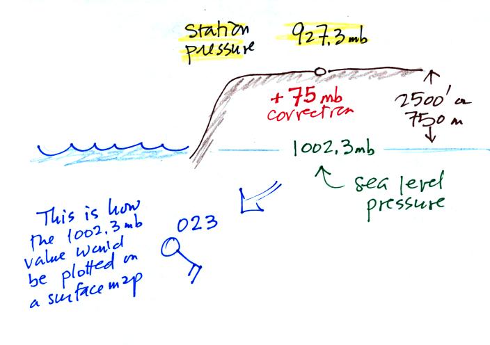
In the example above, a station
pressure value of 927.3 mb was measured in Tucson. Since Tucson
is about 750 meters above sea level, a 75 mb correction is added to the
station pressure (1 mb for every 10 meters of altitude). The sea
level pressure estimate for Tucson is 927.3 + 75 = 1002.3 mb.
This is also shown on the figure below
Here are some examples of coding
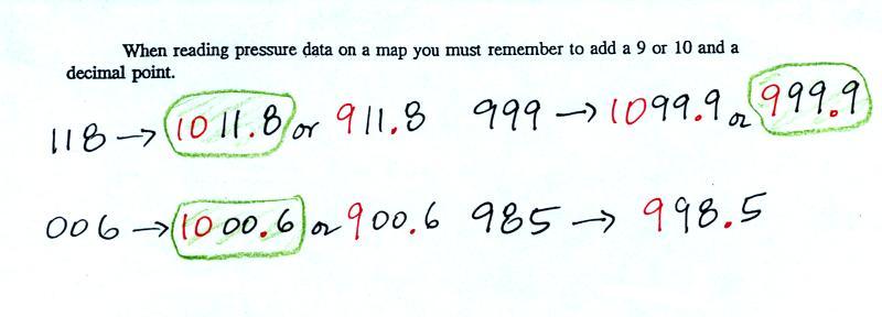
and decoding the pressure data.
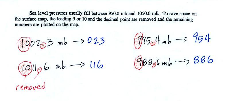
To save room, the leading 9 or 10 on the sea level pressure
value and
the decimal
point are removed before plotting the data on the map. For
example the 10 and the . in
1002.3 mb would
be removed; 023
would be plotted on the weather map (to the upper right of the center
circle). Some additional examples are shown above.
When reading pressure values off a
map you must remember to
add a 9 or
10 and a decimal point. For example
118 could be either 911.8 or 1011.8 mb. You pick the value that
falls between 950.0 mb and 1050.0 mb (so 1011.8 mb would be the correct
value, 911.8 mb would be too low).
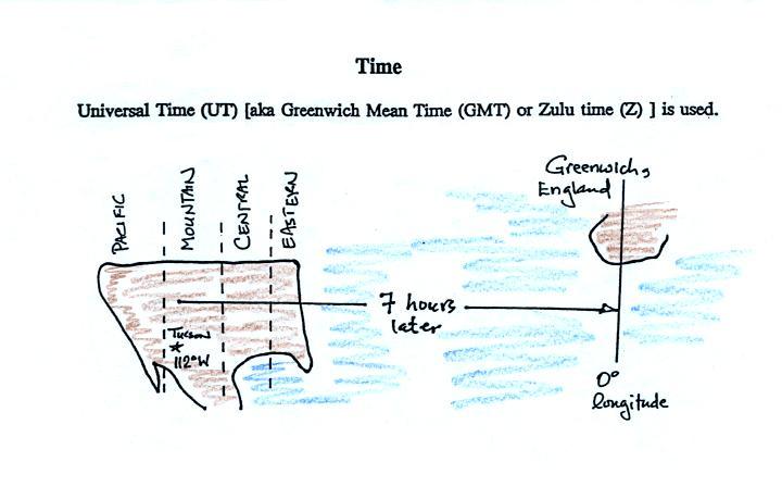
Another
important piece of information that we didn't cover last Friday and
that is included on a surface weather
map is the time the observations were collected. Time on a
surface map is converted to a universally agreed upon time zone called
Universal Time (or Greenwich Mean Time, or Zulu time).
That is the time at 0 degrees longitude. There is a 7 hour time
zone difference between Tucson (Tucson stays on Mountain
Standard Time year round) and Universal Time. You must add 7
hours to the time in Tucson to obtain Universal Time.
Here are some examples
2:45 pm MST:
first convert 2:45 pm to the 24
hour clock format 2:45 + 12:00 = 14:45 MST
then add the 7 hour time zone correction ---> 14:45
+ 7:00 = 21:45 UT (9:45 pm in Greenwich)
9:05 am MST:
add the 7 hour time zone
correction ---> 9:05 + 7:00 = 16:05 UT (4:05 pm in England)
18Z:
subtract the 7 hour time zone
correction ---> 18:00 - 7:00 = 11:00 am MST
02Z:
if we subtract the 7 hour time
zone correction we will get a negative
number.
We will add 24:00 to 02:00 UT then subtract 7 hours
02:00 + 24:00 = 26:00
26:00 - 7:00 = 19:00 MST on the previous day