![]()
![]()
![]()
![]()
In describing weather, wind is generally taken to mean the horizontal movement of air. By convention, the wind direction is the direction from which the wind is blowing (e.g., a north wind means the air is moving from north toward south) and the windspeed is the speed at which the air is moving relative to the ground.
Winds result from horizontal differences in pressure. Basically, air is forced or pushed from high pressure toward lower pressure. This explains why air rushes in when you open a vacuum sealed container (like a jar of food); it explains why air rushes out when you open a carbonated beverage sealed under high pressure (like soda or beer); and how it is that we breath (expanding our lungs initally lowers the air pressure inside, causing higher pressure air outside to rush in). In all cases, air is forced to move from high toward low pressure and the greater the difference in pressure, the faster the air moves.
In the atmosphere, winds result from horizontal differences in air pressure. Recall from previous lectures that the average sea level pressure is 1013 mb, but the actual sea level pressure at any location and time varies. The pattern of sea level pressure is what causes surface winds to blow.
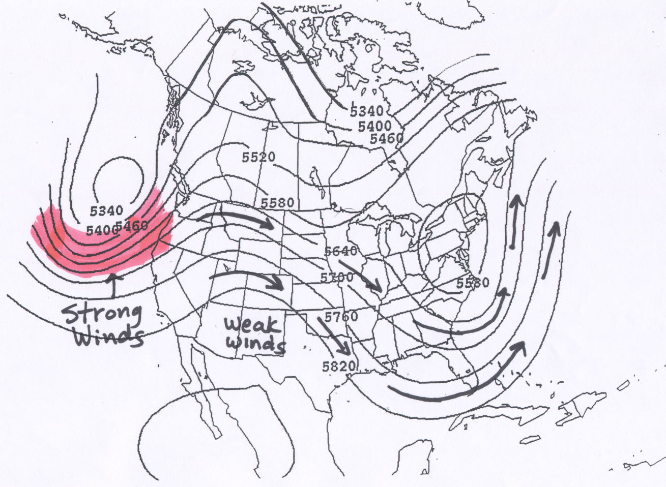
Because the driving force for all wind is the horizontal change in pressure, the greater the horizontal change in pressure (or more precisely the pressure gradient), the greater the windspeed. The pressure gradient is the horizontal change in pressure divided by the horizontal change in distance. On a weather chart, the magnitude of the pressure gradient can be seen by examining the spacing between the contour lines of the map (isobars on the surface map or height contours on the upper air map). Where the lines are closest together, the horizontal change in pressure is stronger, and the winds are stronger. In other words, higher windspeeds are found where the contour lines are closest together.
Over short distance scales, air moves in the direction forced by the horizontal pressure changes, i.e., directly from high toward low pressure. This is the case for the examples of opening a jar of food or a can of soda mentioned above. However, for large-scale air motions (like the ones depicted on weather maps), the actual wind direction is turned away from this direction because the Earth is rotating. This phenonemon is called the Coriolis effect or Coriolis force. On 500 mb weather charts, NOT surface charts, the wind direction is 90 degrees to the right of the pressure force, where the pressure force is directed from high heights (or pressures or contour values) toward low heights (or pressures or contour values). Thus, on upper air charts the wind moves parallel to the height contours, with lower heights to the left of the wind direction.
Because air moving along the ground surface is slowed by friction with the ground, the wind direction is only turned about 60 degrees to the right of the pressure force. Thus, on surface weather charts the wind direction, rather than being parallel to the isobars, points about 30 degrees toward lower pressure. An important consequence of the fact that winds do not blow exactly parallel to the isobars on a surface weather map, but slightly toward low pressure, is that surface winds cause air to converge toward surface low pressure (forcing rising motion) and to diverge away from surface high pressure (forcing sinking motion). Where rising motion is forced, clouds and possibly precipitation may be found, while where sinking motion is forced, fair weather is most likely.
The wind at 500 mb can be determined from the height pattern. The wind blows parallel to the height contours with lower heights to the left of the wind direction. During the winter months across the United States, this means that the 500 mb winds across generally blow from west toward east, but follow the wavy pattern of the height contours. This is because the air temperature generally gets colder as one move toward the north and 500 mb heights generally get lower. This general west to east air motion at the 500 mb height level weakens in the summer as the temperature differences between the tropics and the Arctic becomes weaker. Keep in mind that this is the wind several thousand meters above the Earth's surface and not the wind that would be felt on the ground.
The wind speed is faster where the height lines are closer together, and slower where the height contours are spaced further apart. If this helps, you can think of the 500 mb height lines as channels through which the air moves. The wind follows the wavy pattern of the lines, and gets squeezed together where the lines get closer together, resulting in faster winds. This is just how water would flow in a hypothetical channel. A couple of examples are include below.
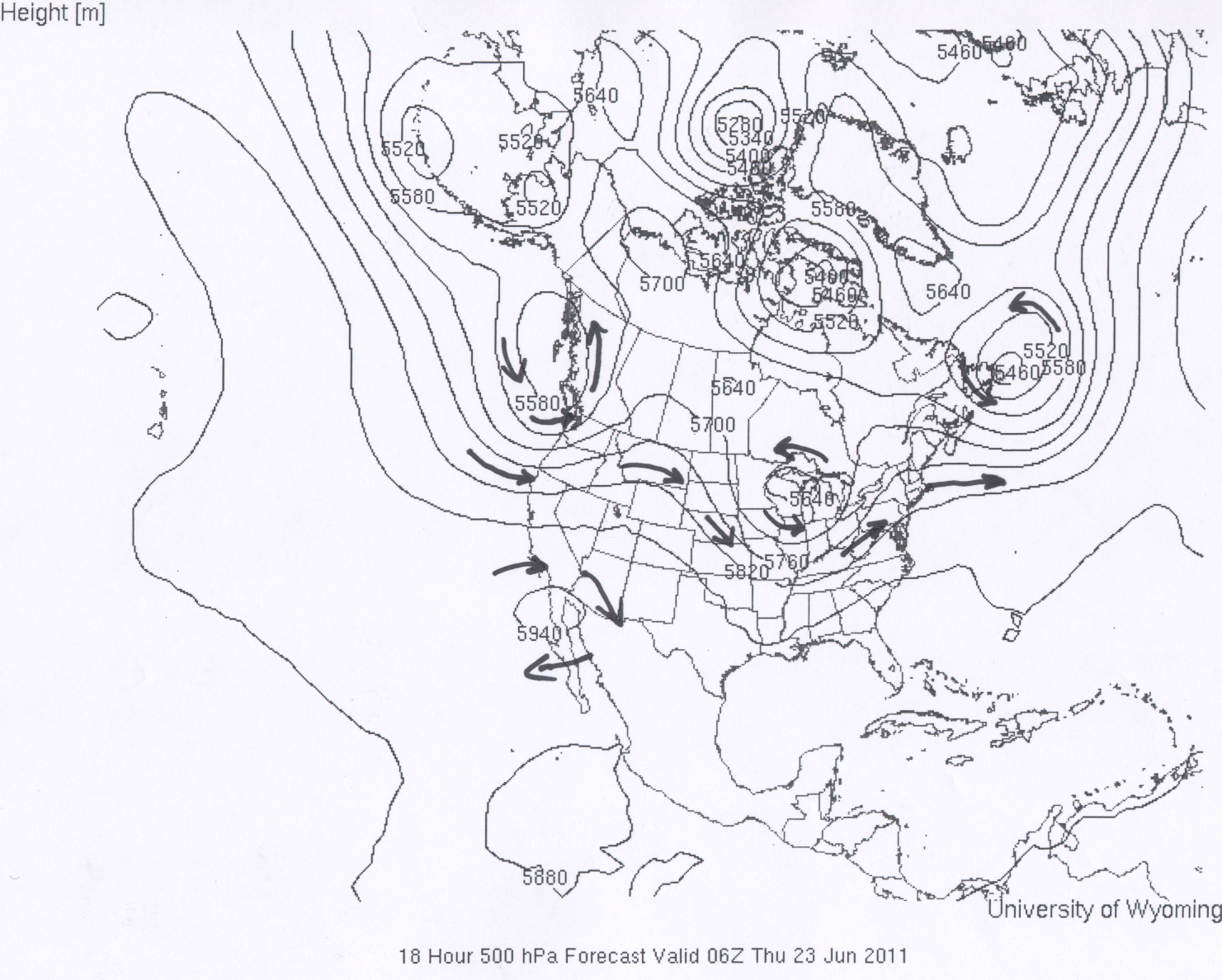
In the first example for 500 mb winds the lines with arrows represent the trajectory of the air flow at various places within the 500 mb height pattern. Regions of strong and weak wind speeds based on the spacing of the height contours are marked on the map. In the second example for 500 mb winds arrows are again used to mark wind trajectories. It is also emphasized that the flow around closed highs is clockwise and the flow around closed lows is counterclockwise.
The 500 mb winds can have a large influence on the motion of smaller-scale weather features, such as the movement of surface low pressure areas, the movement of hurricanes, and the movement of individual thunderstorm cells. In fact where thunderstorms do form, they generally move as a unit in the direction of the winds near the 500 mb pressure level. This is something that we will pay attention to when local (Tucson, AZ) thunderstorms form.
![]()
![]()
![]()
![]()