Tuesday Sep. 20, 2011
click here to
download today's notes in a more printer friendly format
A song from Ziggy Marley ("Dragonfly")
bracked by two songs from Keb' Mo' ("She Just Wants to
Dance" and "Better
Man") to get a busy day in Atmo 170A1 underway.
The Expt. #1 reports were
collected
today. You can expect to get them back next week sometime. Experiment #2 materials will be handed out
before the quiz on Thursday.
The 1S1P Bonus report on Radon was also due today.
There are several reviews today and tomorrow before Thursday's
first real quiz of the semester.
We need to learn how to decode one more piece of station model
notation data, the pressure. The station model notation you may
remember is a compact way of plotting information on a surface weather
map.
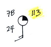
In this example the temperature is 78 F, the dew point is 24 F,
the winds are blowing from the S at 15 knots (about 15 MPH), amd 1/4 of
the sky is covered with clouds. 113 is the pressure data, but
some information is missing (113 wouldn't be a very reasonable sea
level pressure value)
Here's what you need to know about the pressure data.
Meteorologists hope to map out small horizontal pressure
changes on
surface weather maps (the pressure differences produce wind and
storms). Pressure
changes much more quickly when
moving in a vertical direction. The pressure measurements are all
corrected to sea level altitude to remove the effects of
altitude. If this were not done large differences in pressure at
different cities at different altitudes would completely hide the
smaller horizontal changes.
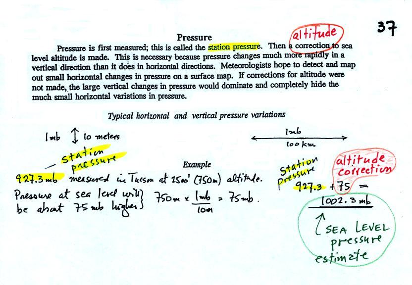
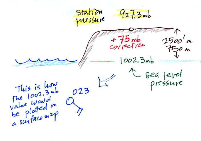
In the example above, a station
pressure value of 927.3 mb was measured in Tucson. Since Tucson
is about 750 meters above sea level, a 75 mb correction is added to the
station pressure (1 mb for every 10 meters of altitude). The sea
level pressure estimate for Tucson is 927.3 + 75 = 1002.3 mb.
This pressure value is the number that gets plotted on the
surface weather map.
Do you need to remember all the
details above and be able to calculate the exact correction
needed? No. You
should remember that a
correction
for altitude is needed.
And the correction needs to
be added to the station pressure.
I.e. the sea-level pressure is higher than the station pressure.
The calculation above is shown in a picture below
Here are some examples of coding
and decoding the pressure data.
First of all we'll take some sea level pressure values and show
what needs to be done before the data is plotted on the surface weather
map.
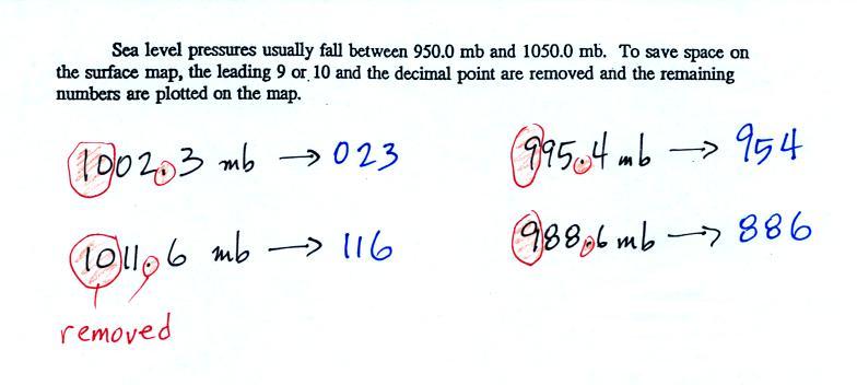
To save room, the leading 9 or 10
on the sea level pressure
value and
the decimal
point are removed before plotting the data on the map. For
example the 10 and the . in
1002.3 mb would
be removed; 023
would be plotted on the weather map (above and to the right of the
center
circle). Some additional examples are shown above.
When reading pressure values off a
map you must remember to
add a 9 or
10 and a decimal point. For example
118 could be either 911.8 or 1011.8 mb. You pick the value that
falls between 950.0 mb and 1050.0 mb (so 1011.8 mb would be the correct
value, 911.8 mb would be too low).
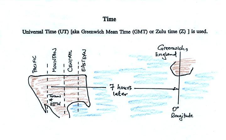
Another
important piece of information on a surface map is the time the
observations were collected. Time on a
surface map is converted to a universally agreed upon time zone called
Universal Time (or Greenwich Mean Time, or Zulu time).
That is the time at 0 degrees longitude, the Prime Meridian.
There is a 7 hour time
zone difference between Tucson and Universal Time (this
never changes because Tucson stays on Mountain
Standard Time year round). You must add 7
hours to the time in Tucson to obtain Universal Time.
Here are several examples of conversions between MST and UT (not done in class).
You
don't really need to know all the details. You should just
remember that Universal Time is later than MST (sometimes even the next
day).
to convert from MST (Mountain Standard Time) to UT (Universal Time)
10:20 am MST:
add the 7
hour time zone correction ---> 10:20
+ 7:00 = 17:20 UT (5:20 pm in Greenwich)
2:30 pm MST:
first convert to the 24 hour clock
by adding 12 hours 2:30 pm MST + 12:00 = 14:30 MST
add the 7 hour time zone
correction ---> 14:30 + 7:00 = 21:30 UT (7:30 pm in England)
7:45 pm MST:
convert to the 24 hour clock by
adding 12 hours 7:45 pm MST + 12:00 = 19:45 MST
add the 7 hour time zone correction ---> 19:45 + 7:00 = 26:45 UT
since this is greater than 24:00 (past midnight) we'll subtract 24
hours 26:45 UT - 24:00 = 02:45 am the next day
to convert from UT to MST
18Z:
subtract the 7 hour time
zone
correction ---> 18:00 - 7:00 = 11:00 am MST
02Z:
if we subtract the 7 hour time
zone correction we will get a negative
number.
We will add 24:00 to 02:00 UT then subtract 7 hours
02:00
+
24:00
=
26:00
26:00 - 7:00 = 19:00 MST on the previous day
2 hours past midnight in Greenwich is 7 pm the previous day in
Tucson
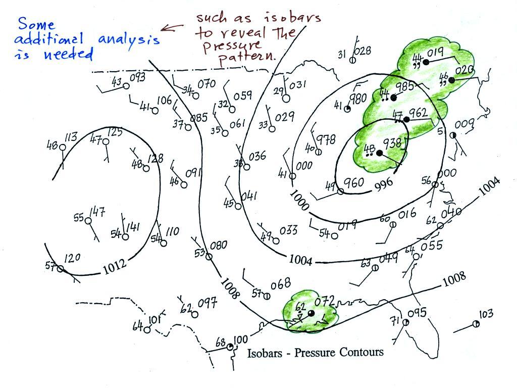
A bunch of weather data has been
plotted (using the station model notation) on a surface weather map in
the figure
below (p. 38 in the ClassNotes).
Plotting the surface weather
data
on a map is
just the
beginning.
For example you really can't tell what is causing the cloudy weather
with rain (the dot symbols are rain) and drizzle (the comma symbols) in
the NE portion of the map above or the rain
shower along the Gulf Coast. Some additional
analysis is needed. A meteorologist would usually begin by
drawing some contour lines of pressure (isobars) to map out the large
scale
pressure pattern. We will look first at contour lines of
temperature, they are a little easier to understand (the plotted data
is easier to decode and temperature varies across the country in a more
predictable way).
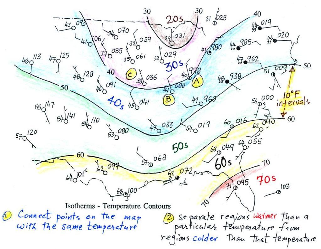
Isotherms, temperature
contour lines, are usually drawn at 10o F
intervals.
They do two things: (1) connect points on the map that all
have the same temperature, and (2) separate regions that are warmer
than a particular temperature from regions that are colder. The
40o F isotherm above passes
through
a city which is reporting a temperature of exactly 40o (Point A).
Mostly
it
goes
between
pairs
of
cities:
one
with
a
temperature
warmer
than
40o (41o at Point B) and
the other
colder
than 40o (38o F at Point C).
Temperatures
generally decrease with
increasing
latitude: warmest temperatures are usually in the south, colder
temperatures in the north.
Now the same data with isobars
drawn in. Again they
separate
regions with pressure higher than a particular value from regions with
pressures lower than that value.
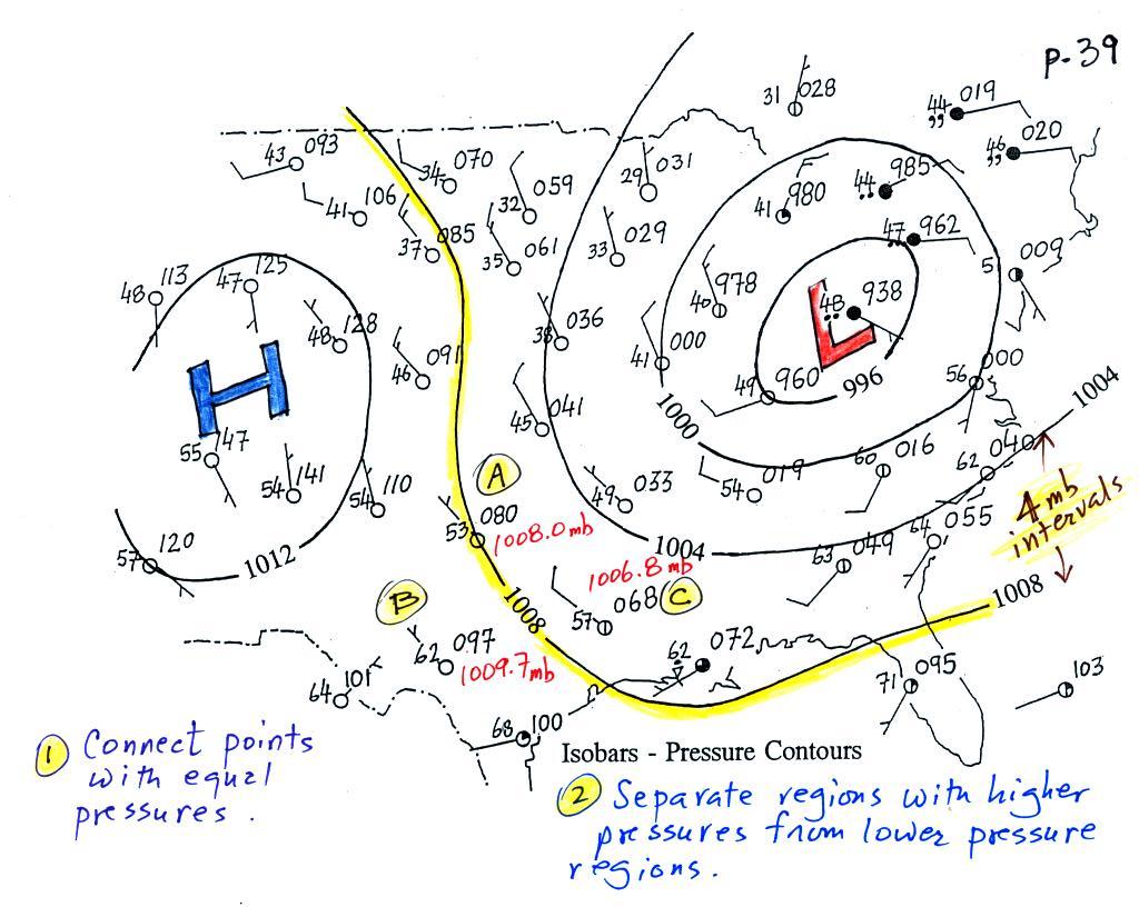
Isobars are generally drawn at 4 mb intervals. Isobars also connect points on the map
with the same pressure. The 1008 mb isobar (highlighted in
yellow) passes through a city at Point
A where the pressure is exactly
1008.0 mb. Most of the time the isobar
will pass between two
cities. The 1008 mb isobar passes between cities with
pressures
of 1009.7 mb at Point B and
1006.8 mb at Point C.
You would
expect to find 1008 mb somewhere in between
those two cites, that is where the 1008 mb isobar goes.
The pressure pattern is not as predictable as the isotherm
map. Low pressure is found on the eastern half of this map and
high pressure in the west. The pattern could just as easily have
been reversed.
Here's a little practice (this figure wasn't
shown in class). Is this the 1000, 1002, 1004,
1006, or 1008 mb isobar? (you'll find the answer at the end of today's
notes)
Just locating closed centers of high and low pressure will already
tell you a lot about the weather that is occurring in their vicinity.
1.
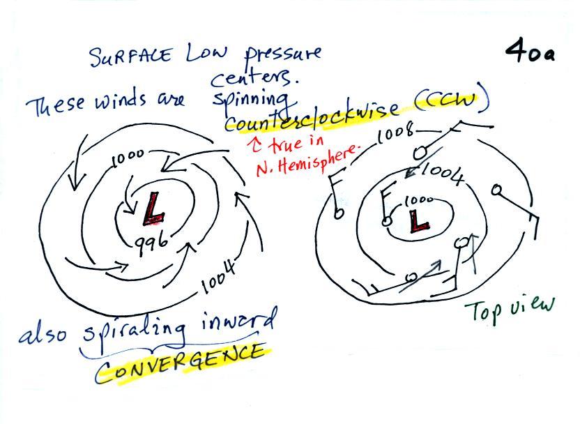
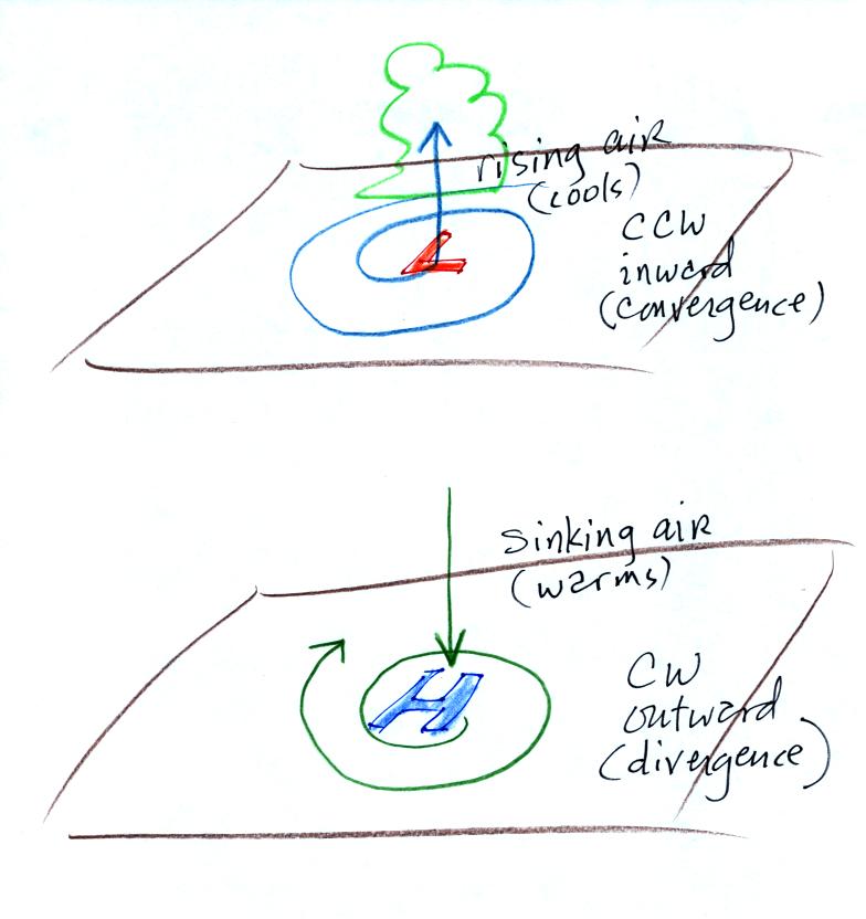
We'll start with the large nearly circular centers of High and Low
pressure. Low pressure is drawn below. These figures are
more neatly drawn versions of what we did in class.
Air will start moving
toward low
pressure (like a rock sitting on a hillside that starts to roll
downhill), then something called the Coriolis force will cause
the
wind to start to spin (we'll learn more about the Coriolis force later
in the semester). In the northern hemisphere winds spin in a
counterclockwise (CCW) direction
around surface
low pressure
centers. The winds also spiral inward toward the center of the
low, this is called convergence. [winds spin clockwise around low
pressure centers in the southern hemisphere but still spiral inward,
don't worry about the southern hemisphere until later in the semester]
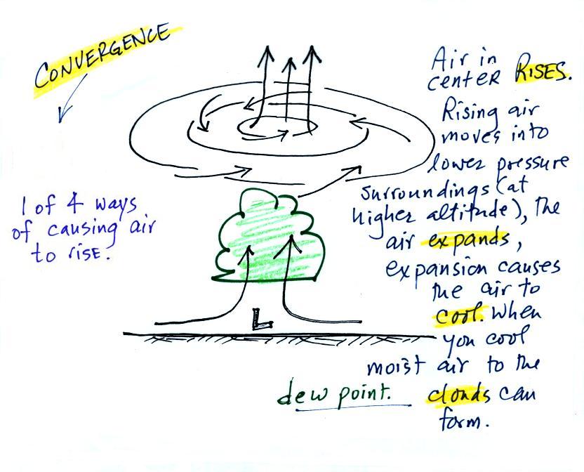
When the converging air reaches the
center of the low it starts to rise.
Rising air expands (because it is moving into lower pressure
surroundings at higher altitude), the expansion causes it to
cool. If the air is moist
and it is cooled enough (to or below the dew point temperature) clouds
will form and may then begin to rain or snow. Convergence is 1 of 4 ways of causing air
to rise (we'll learn what the rest are soon, and, actually, you
already know what one of them is).
You
often
see
cloudy
skies
and
stormy
weather associated with surface low pressure.
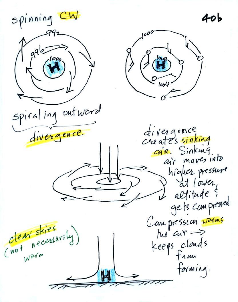
Everything is pretty much the exact opposite in the case of surface
high pressure.
Winds
spin
clockwise
(counterclockwise
in
the
southern
hemisphere)
and spiral outward.
The
outward motion is called divergence.
Air sinks in the center of
surface high pressure to
replace the diverging air. The sinking air is compressed and
warms. This keeps clouds from forming so clear
skies are normally found with high pressure.
Clear skies doesn't necessarily mean warm weather, strong surface high
pressure often forms when
the air is very cold. Also (something not
mentioned in class) sinking air motions can produce a subsidence
inversion layer. An inversion layer, you might remember, is a
stable layer. Subsidence inversions can persist for several days
and trap pollutants in air near the ground. A subsidence
inversion probably contributed to the severity of the Great London Smog
of 1952.
Here's a picture summarizing what we've learned so far. It's
a slightly different view of wind motions around surface highs and low
and wasn't
shown in class.
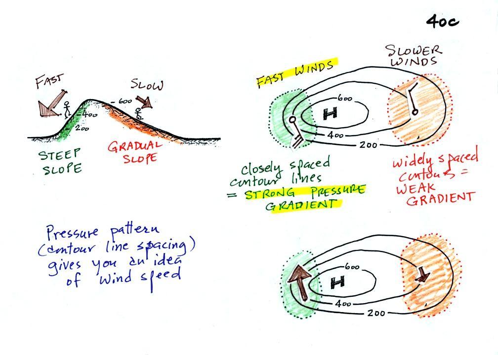
2.
The
pressure pattern will also tell you something about where you might
expect to find fast or slow winds. In this case we look for
regions where
the isobars are either closely spaced together or widely spaced.
The figures below are much more carefully drawn versions of what was
done in class.
Closely spaced contours means
pressure is changing
rapidly
with
distance. This is known as a strong pressure gradient and
produces fast winds. It is analogous to a steep slope on a
hillside. If you trip walking on a hill, you will roll rapidly
down a steep
hillside, more slowly down a gradual slope.
The winds around a high pressure
center are shown above using both the
station model notation and arrows. The winds are spinning clockwise and
spiraling outward slightly. Note the different wind speeds (25
knots and 10 knots plotted using the station model notation)
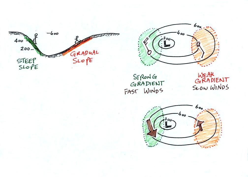
Winds spin counterclockwise and
spiral inward around
low
pressure
centers. The fastest winds are again found where the pressure
gradient is strongest.
This figure is found at the bottom
of p. 40 c in the photocopied ClassNotes. You should be able to
sketch in the direction of the wind at each of the three
points and determine where the fastest and slowest winds would be
found. (you'll find the answer at the end of today's notes).
We finished the day with a little
information about
Archimedes Law. Last Thursday we saw that the
relative
strengths of the
downward graviational force and the upward pressure difference force
determine whether a parcel of air will rise or sink. Archimedes
Law is another, somewhat simpler, way of trying to understand this
topic.
A gallon of
water weighs about 8 pounds (lbs).
If you submerge the gallon jug of water in a swimming pool, the
jug
becomes, for all intents and purposes, weightless. Archimedes'
Law (see figure below, from p. 53a in the photocopied ClassNotes)
explains why this is true.

Archimedes first of all tells you
that the surrounding fluid will exert an upward pointing bouyant force
on the submerged water bottle. That's why the submerged jug can
become weightless. Archimedes law also tells you how to figure
out how strong the bouyant force will be. In this
case the 1 gallon bottle will displace 1 gallon of
pool water. One
gallon of pool
water weighs 8 pounds. The upward bouyant force will be 8 pounds,
the same as the downward force. The two
forces are equal and opposite.
Archimedes law doesn't really tell you what causes the upward
bouyant
force. If you're really on top of this material you will
recognize that it is really
just another name for the
pressure difference force that we covered last Friday (higher pressure
pushing
up on the bottle and low pressure at the top pushing down, resulting in
a net upward force).
Now we imagine pouring out all the water and filling the 1 gallon
jug
with air. Air is about 1000 times less dense than water;compared
to water, the jug
will weigh practically nothing.

If you
submerge the jug of air in a
pool
it will displace 1 gallon of
water
and experience an 8 pound upward bouyant force again. Since there
is no downward force the jug will float.
One gallon of sand (which is about 1.5 times denser than water)
jug weighs 12 pounds (I try to give you accurate information and
actually checked
this out).
The jug of sand will sink because
the downward force is greater
than
the upward force.
You can sum all of this up by saying anything that is less dense
than
water will float in water, anything that is more dense than water will
float in water.
The same reasoning applies to air in the atmosphere.
Air that is less dense (warmer)
than the air around it will
rise.
Air that is more dense (colder) than the air around it will sink.
Here's a little more
information
about
Archimedes that I didn't mention in
class.
There's a colorful demonstration that shows how small differences
in density
can determine whether an object floats or sinks.

A can of regular Coca Cola was
placed in a beaker of water.
The
can
sank. A can of Diet Coke on the other hand floated.
(Coke was used instead of Pepsi because Coke now has the exclusive
franchise
on the U. of A. campus)
Both cans are made of aluminum which has a density almost three
times
higher than water. The drink itself is largely water. The
regular Coke also has a lot of high-fructose
corn
syrup, the diet Coke
doesn't. The mixture of water and corn syrup has a density
greater than plain
water. There is also a little air (or perhaps carbon dioxide gas)
in each can.
The average density of the can of regular Coke (water & corn
syrup
+
aluminum + air) ends up being slightly greater than the density of
water. The average density of the can of diet Coke (water +
aluminum + air) is slightly less than the density of water.
I sometimes repeat the "demonstration" with a can of Pabst Blue
Ribbon
beer. This also floats because the beer doesn't contain any corn
syrup
(I don't think).
In some respects people in swimming pools are like cans of regular
and
diet soda. Some people float (they're a little less dense than
water), other people sink (slightly more dense than water).

Here's the answer to the question earlier about the value of the
isobar drawn on a surface map.
Pressures lower than 1002 mb are colored purple. Pressures
between 1002 and 1004 mb are blue. Pressures between 1004 and
1006 mb are green and pressures greater than 1006 mb are red. The
isobar appearing in the question is highlighted yellow and is the 1004
mb isobar. The 1002 mb and 1006 mb isobars have also been drawn
in.
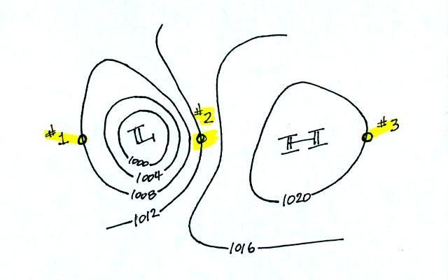
And here's the answer to the question about wind directions and
wind speeds.
The winds are blowing from the NNW
at Points 1 and 3. The winds are blowing from the SSE at Point
2. The fastest winds (30 knots) are found at Point 2 because that
is where the isobars are closest together (strongest pressure
gradient). The slowest winds (10 knots) are at Point 3.
Notice also how the wind direction can affect the temperature
pattern. The winds at Point 2 are coming from the south and are
probably warmer than the winds coming from the north at Points 1 &
3. We'll be looking at this in more detail on Friday after
Wednesday's quiz.