Fri., Nov. 4, 2011
click here to
download today's notes in a more printer friendly format
"Stairway to
Heaven" seemed like an appropriate choice before class this
afternoon with the All
Souls Procession coming up this Sunday evening.
It was preceded by "Bron-Yr-Aur".
Quiz #3 has been graded and was returned in class. The
average was a little low but that seems to be a normal occurrence for
the 3rd quiz of the semester. Quiz scores from the Spring 2011
class and this class are compared below.
|
Spring 2011
|
Fall 2011
|
Quiz #1
|
80%
|
78%
|
Quiz #2
|
75%
|
74%
|
Quiz #3
|
71%
|
71%
|
Quiz #4
|
80%
|
?
|
The 1S1P Assignment #2 reports were collected today. It will
take a while to get all of those graded, so please be patient.
There will be at least one more Bonus Assignment and an Assignment
#3. I will probably put up at least some of the Assignment #3
topics soon so that you can get a head start on your reports before the
end of the semester.
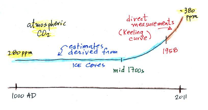
We'll finish up our coverage of climate change today. The figure
below is a summary of what we covered on Monday.
Atmospheric CO2 concentration
was fairly
constant at about 280 parts per million (ppm) between 0 AD and
the mid
1700s. CO2 began increasing at the time of the
"Industrial Revolution" and have been increasing since then.
Current concentration is a little over 380 ppm.
Given the concern that increasing CO2
concentration might strengthen the greenhouse effect and cause global
warming, the obvious question is what has
the temperature of the earth been doing during this period? In
particular
has
there
been
any
warming
associated
with
the
increases
in
greenhouse
gases
that
have
occurred
since
the
mid 1700s?
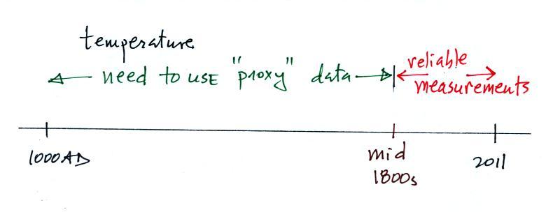
We must address the temperature question in two parts.
First part:
Actual accurate
measurements of temperature (on land and at sea)
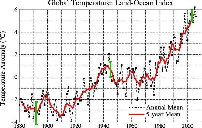
This
figure is
based on actual measurements of temperature made using reliable
thermometers
at many locations on
land and sea around the globe. The left side of the figure shows
how average temperatures at various time compare with the 1961 to 1990
average. The vertical axis on the right side of the plot shows
actual global average surface tempeature values.
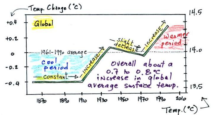
Temperature appears to have
increased 0.7o to 0.8o
C during this
period. The increase hasn't been as steady as you might have
expected given
the steady rise in CO2 concentration (and assuming that
increasing CO2 is what's causing the earth to warm); temperature even
decreased slightly between about 1940 and 1970. We can get some
feel for how significant a 1oC change in global average
temperature is
by looking back perhaps 20,000 years when the earth was in the middle
of a glacial period. At that time global average temperature was
about 5o C cooler than at present and the Laurentide
Ice
Sheet covered most of Canada and a portion of the northern United
States.
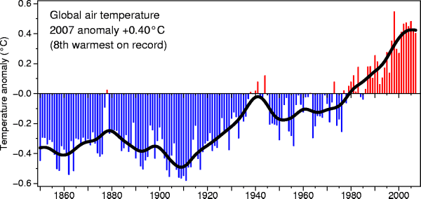
It is very difficult to detect a temperature change this small over
this period of time. The instruments used to measure temperature
have changed. The locations at which temperature measurements
have been made have also changed (imagine what Tucson was like 130
years ago). About 2/3rds of the earth's surface is ocean and
measurements were pretty sparce during much of this time period (sea
surface temperatures can now be
measured using satellites). Average
surface temperatures naturally change a lot
from year to year.
The year to year variation has been left out
of the figure above so that the overall trend could be seen more
clearly. The figure below does show the year to year variation
(dotted black line) and
the uncertainties (the green bars) in the yearly measurements (note how
the uncertainty is lower in the more recent measurements).
These data are from the
NASA Goddard
Institute for Space Studies site.
These
temperatures are
compared to a different, 1951-1980, thirty year mean. Temperatures
prior
to about 1930
were colder than the 1951-1980 mean and temperatures after 1980 were
warmer.
Here's
another
plot
of
global temperature change over a
slightly longer
time period
from the University
of
East
Anglia
Climatic Research Unit
These are global average surface temperatures. The observed
warming has not been uniformly
distributed over the surface of the earth. Data
from the 2000-2009 period shows the that greatest warming occurred
in
the Arctic.
Some new data were
just released in the last week or so by
a scientist that was initially skeptical of global warming.
Second Part
Now it would be
interesting to
know how temperature was changing prior
to the mid-1800s. This is similar to what happened when the
scientists wanted to know what carbon dioxide concentrations looked
like prior to 1958. In that case they were able to go back and
analyze air samples from the past (air trapped in bubbles in ice
sheets).
That doesn't work with temperature. To
understand why, imagine putting some air in a bottle, sealing the
bottle, putting the
bottle on a shelf, and letting it sit for 100 years. In 2111 you
could take the bottle down from the shelf, carefully remove the air,
and measure
what the CO2
concentration in the air had been in 2011 when the air was
sealed in the bottle. You couldn't, in 2111, use the air in the
bottle to determine what the temperature of the air was when it was
originally put into the bottle in 2011.
With temperature you need to use
proxy data.
You need to look for something else whose presence, concentration, or
composition depended on
the temperature at some time in the past.
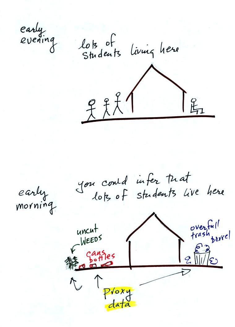
Here's a proxy data "example."
Let's say you want
to determine how many students are living in
a house near a university.
You
could walk by the house late in
the afternoon, when the students would likely be outside, and count
them.
That
would be a direct measurement (this would be like measuring temperature
with a thermometer). There could still be some errors in your
measurement (some students might be inside the house and might not be
counted, some of
the people outside might not live at the house).
If you were to walk by early in the
morning it is likely that the
students would be inside sleeping. In that
case you might
look for other clues (such as the number of empty bottles in the yard)
that might give you an idea of how many students
lived in that house. You would use these proxy data to come up
with an estimate of the number of students inside the house.
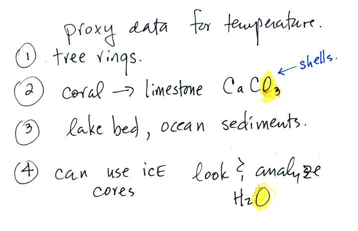
In the case of temperature scientists look
at a variety of
things.
They look at tree rings.
The
width
of
each
yearly
ring
depends
on
the
depends
on
the
temperature
and
precipitation
at
the
time the ring formed.
They
analyze
coral.
Coral
is
made
up
of
calcium
carbonate,
a
molecule
that
contains
oxygen.
The
relative
amounts
of
the oxygen-16 and
oxygen-18
isotopes depends
on the temperature that existed at the time the coral grew.
Scientists
can analyze lake bed and ocean
sediments.
The
types
of
plant
and
animal
fossils
that
they
find
depend
on
the
water
temperature
at
the time. Shells also contain calcium carbonate and can be
analyzed to determine the relative amounts of the O-16 and O-18
isotopes.
They can
even use the ice
cores.
The
ice,
H2O,
contains
oxygen
and the relative
amounts of oxygen and hydrogen isotopes depends on the temperature at
the time the ice
fell from the sky as snow.
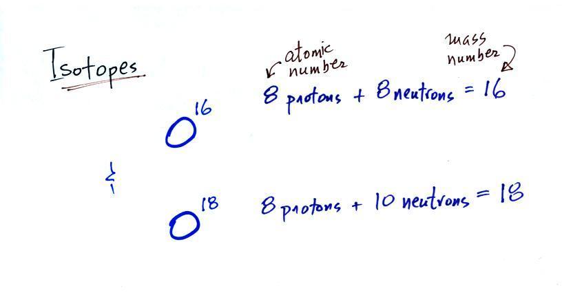
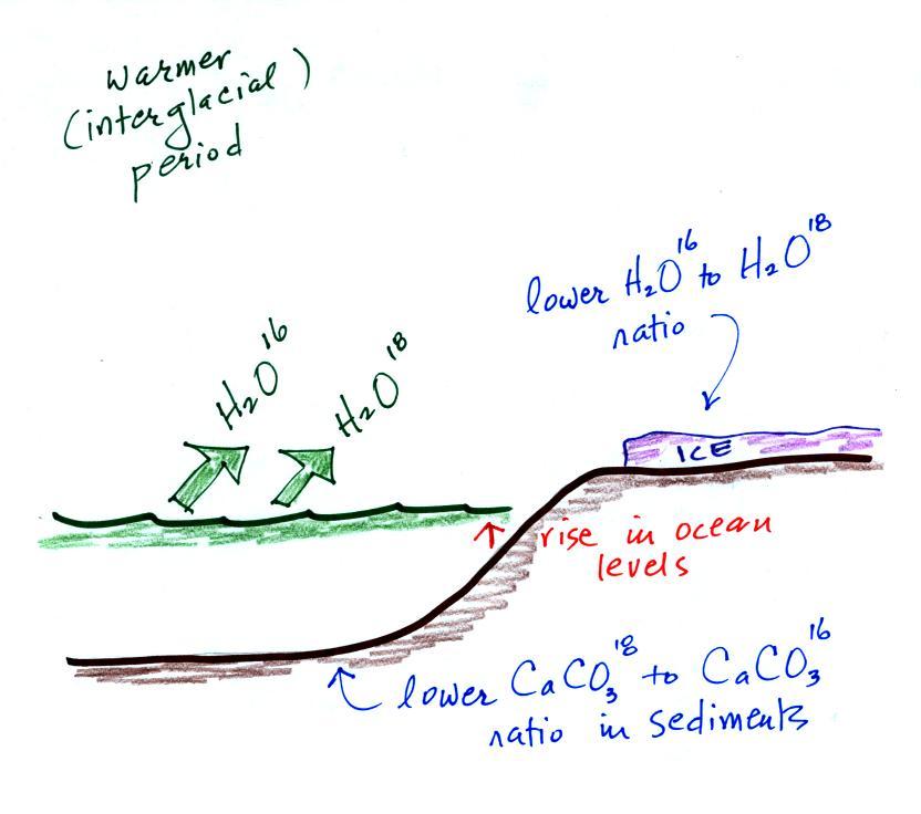
Here's an
idea of how oxygen isotope data
can be used to determine past
temperature.
The
two isotopes
of
oxygen contain different numbers of neutrons in their
nuclei. Both atoms have the same number of protons.
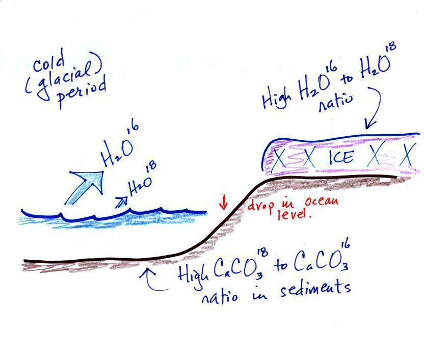
During a cold
period,
the H2O16 form of
water
evaporates more rapidly
than the H2O18
form. You would find
relatively large
amounts of O16 in glacial
ice. Since most of the H2O18
remains in
the ocean, it is found in relatively high amounts in calcium carbonate
in ocean sediments. Note
also the drop in ocean levels during
colder periods when much of the ocean water is found in ice sheets on
land.
The reverse is
true
during warmer periods.
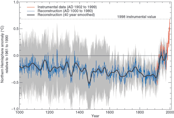
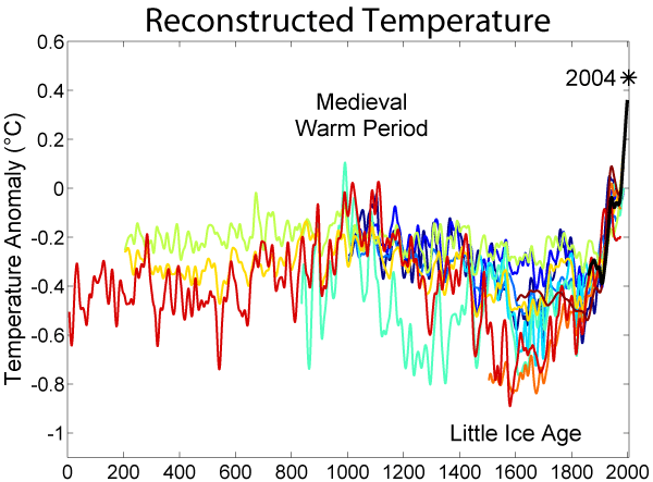
Using
proxy data
scientists have been able to estimate average
surface temperatures for 100,000s of years into the past. The
next figure shows what
temperature has been doing since 1000 AD.
This is for the northern hemisphere only, not the globe.
The
major portion of the figure (shaded in green) shows the estimates of
temperature (again
relative to the 1961-1990 mean) derived from proxy data. The
instrumental measurements (shaded red) were made between about 1850 and
the present
day. The figure above just shows the overall trend in
temperatures during the past 1000 years. The actual data that the
curve above is based on is shown below.
This is the so called "Hockey Stick Plot" originally published in
1999 by Mann,
Bradley,
and
Hughes (and included in Climate
Change 2001 - The Scientific Basis,
Contribution of Working Group I to the 3rd
Assessment Report of the
Intergovernmental Panel on Climate Change
(IPCC)).
Many scientists would argue that this
graph is strong support of a
connection between rising atmospheric greenhouse gas concentrations and
recent global warming. Early in this time interval when CO2
concentration was constant, there were only modest changes in
temperature. The largest overall change in temperature begins in
about
1900 when we know an increase
in atmospheric carbon dioxide concentrations was underway. The
second half of the 20th century is the warmest period in at least the
past 1000 years.
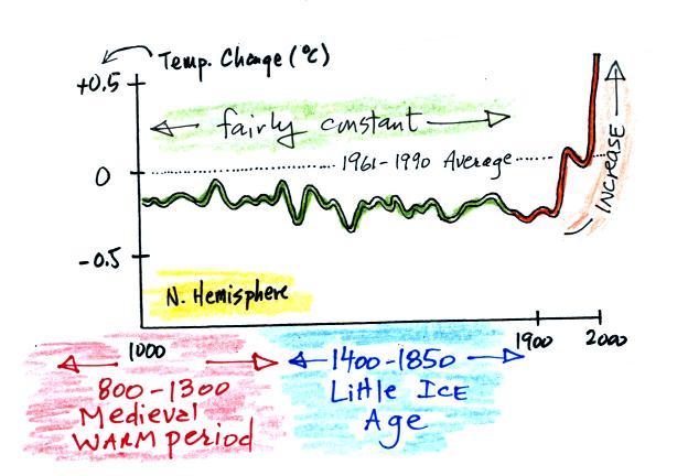
Some scientists have questioned the statistical methods used in the
study. Additionally there is historical evidence in Europe of
a medieval warm period
lasting from 800 AD to - 1300 AD or so and a cold period, the "Little
Ice Age, " which lasted from about 1400 AD to the mid 1800s.
These are not clearly apparent in the temperature plot above.
This leads some scientists to question the validity of this temperature
reconstruction. Scientists also suggest that if large changes in
climate such as the Medieval warm period and the Little Ice Age can
occur naturally, then maybe the warming that is occurring at the
present time also has a natural cause.
Some climate change skeptics even accused climate scientists of
manipulating their data and presenting only data that would support
global warming. You'll see this sometimes referred to as "climategate".
The so-called Year Without
a Summer occurred in 1816, toward the end of the Little Ice
Age. This
wasn't
mentioned in class. The unusally cold summer
temperatures were apparently caused
by a very large volcanic eruption the year before. Here's
a
short
explanation
of
how
volcanoes
can
cause short term climate changes.
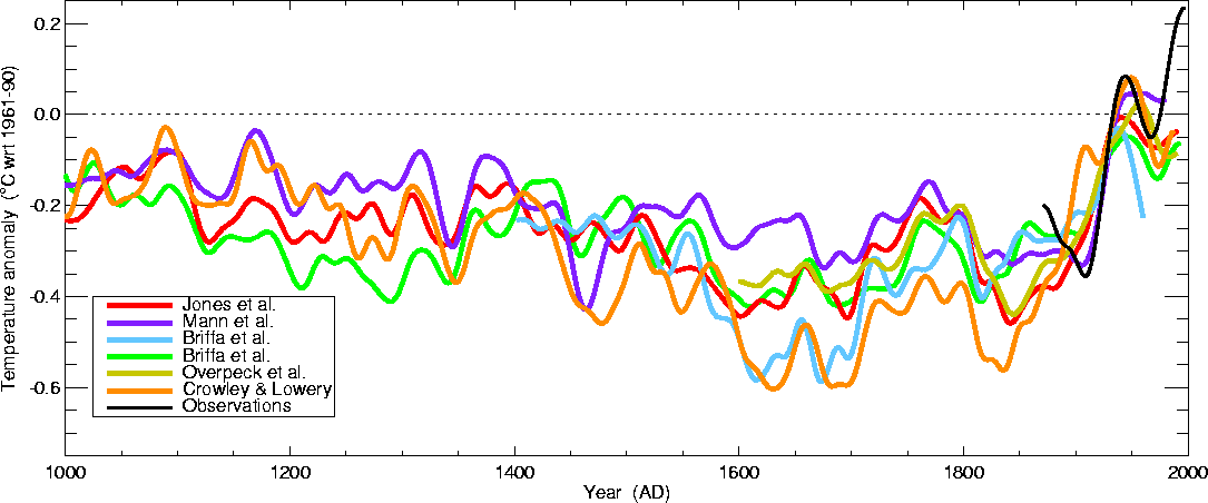
More recent temperature reconstructions
have confirmed the overall trend shown in the figure above.
This is from the University of
East Anglia Climatic Research Unit again. The following
figure (source)
extends
the
temperature
reconstruction
back
2000
years.
There are somewhat larger temperature variations associated with the
Medieval Warm Period and the Little Ice Age (though there is some
question whether these were global and not global events) in these two
figures. In both figures again the late 20th century has the
warmest temperatures in the period.
Next we'll look at some of the predictions for the future. But
first here's a summary of where we stand at this point:
There is pretty general agreement
that atmospheric CO2 and other greenhouse gas
concentrations are
increasing and that the earth is warming.
Not everyone agrees on the causes
(natural or manmade) of the warming.
And certainly not everyone agrees on what might happen next.
Predicted
Changes
in
Atmospheric
CO2
Concentrations
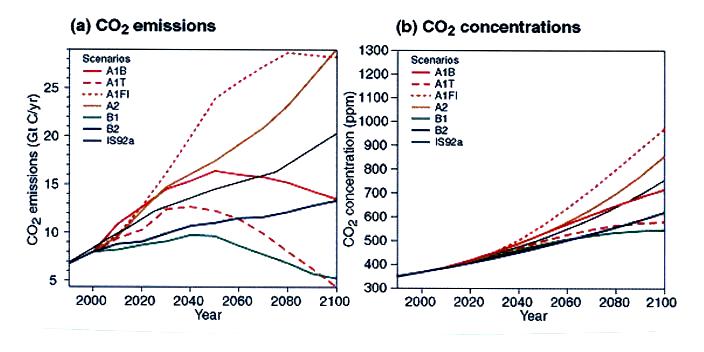
Atmospheric carbon dioxide concentrations are currently about 385 ppm
(ppm stands for parts per million, 385 ppm is equivalent to 0.0385%
concentration). The computer model predictions above show
that
this
could
increase
to
between
about
550
and
950
ppm
by
2100 (source).
The amount of increase will depend on future changes in
population and how quickly we can develop new technologies and shift to
alternative sources of energy. The A1F1 scenario might be
considered a "worst case" scenario in that it assumes continued
intensive use of fossil fuels (a jump in CO2 emissions in 2010 is
reportedly worse than even this). The B1 scenario assumes a shift
to cleaner and more efficient technologies (the various
scenarios used in the predictions are described in more detail here).
The right graph above shows that atmospheric CO2
concentration keeps increasing for the next century
even with fairly significant cuts in CO2 emission amounts during
the next century. To see when atmospheric CO2
amounts might eventually
stabilize at a constant level you need to look further out in time as
in the figure below (created by Robert A.
Rohde for
Global Warming Art).
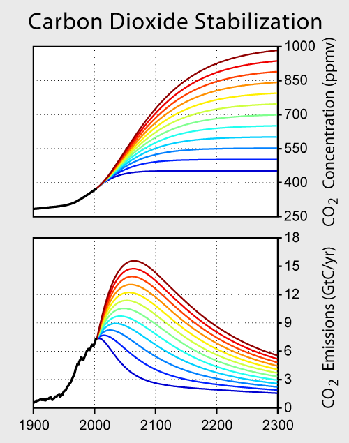
Keeping CO2
concentration below 1000 ppm will require that CO2 emissions
peak before the end of the 21st century and that they eventually be cut
to less than present day emission rates. The most optimistic
scenario (the lower-most curve on the graph) shows that with an
immediate cut in CO2 emissions
and a decrease to about 25% of current values would result
in concentrations stabilizing at about 450 ppm.
Global Temperature
Sophisticated computer models are used to forecast changes in
climate. Before we look at model results we
should first ask whether we have any confidence in the ability of these
models to be able to accurately make predictions. One test
would be to see if the computer models are able to accurately reproduce
changes in the earth's temperature that have already occurred.
The
figure below shows results from 58 such simulations using 14 different
climate
models (source).
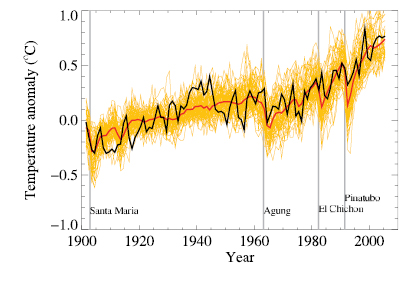
The model results are the light
gold colored lines, the
red line shows the mean of the model simulations, and the black line
the observed temperature variations (temperature change values on the
y-axis are relative to the 1901-1950 mean). Both
natural and anthropogenic factors have been included. The
four
vertical
lines
indicate
major
volcanic
eruptions,
natural
processes
that
cause
short
duration
cooling.
The relatively good agreement between predictions and observations
adds some support to the claim that the models are able to
realistically
simulate the complex physical processes that determine climate.
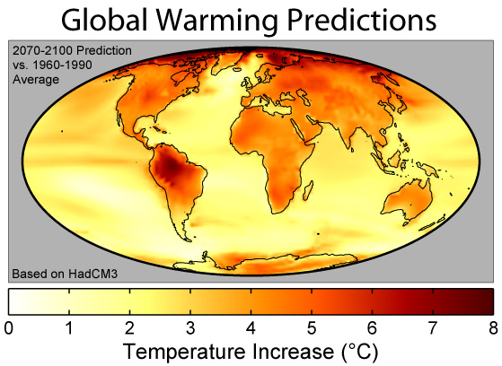
The figure below shows predicted increases in global average surface
temperature relative to the 1980-1999 mean (source).
Estimates
range
from
about
a
0.6o C increase (the orange line which assumes that future
greenhouse
concentrations remain at the 2000 levels, a best case scenario)
to about 4o C (the
A1F1
scenario which assumes continued intensive use of fossil fuels, a worst
case estimate).
These are the same emissions scenarios mentioned earlier (described in
detail here ).
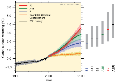
The warming isn't
expected to be uniform but will occur mainly over land and at higher
latitudes (the figure above
was
prepared for Global Warming Art
by Robert A. Rohde).
Melting of Snow and Ice, Sea
Level Rise
The images that global
warming most often
brings to mind perhaps are melting glaciers and polar ice, rising sea
level,
and
flooding of coastal communities.
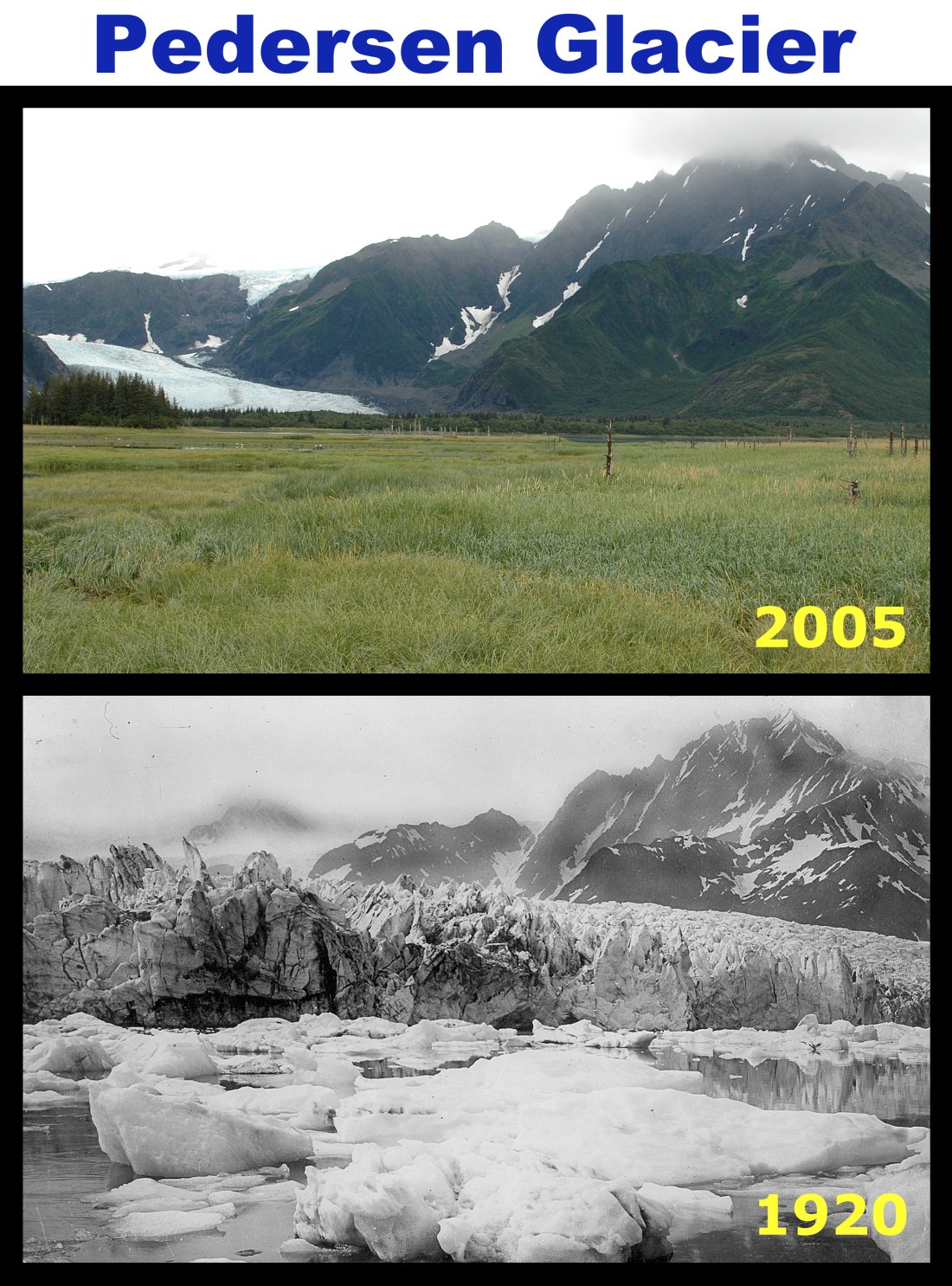
Pederson Glacier is in the Kenai
Fjords National Park, Alaska (this is another of the images
created by Robert A.
Rohde for Global Warming Art
).
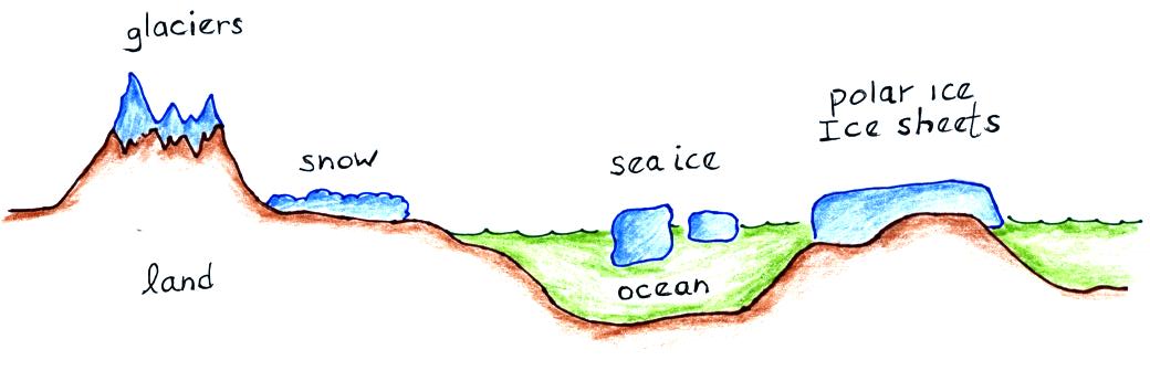
Ice (found mostly in Antarctica and Greenland) covers about 10% of
the earth's land surface and about 7% of the earth's oceans (much of
this is at the N. Pole). Snow covers almost half of
North America in the winter.
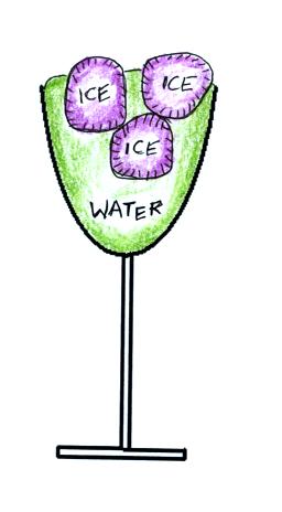
Melting of glacial ice, snow, and land ice in the
figure above will cause sea level to rise. Melting of sea ice
(floating ice) will not. This is something you can verify for
yourself by putting several ice cubes in a glass then filling up the
glass to the brim with water. This is something I'm hoping you
might be interested in checking out for yourself.
Put a few ice cubes into a glass and then fill the glass right up
to the rim with water. Let the ice melt, the glass won't overflow
once that has happened.
Observations do indicate that the amounts of ice and snow have been
decreasing, especially since about 1980. During the 1993-2003
time period, melting of ice and snow were increasing sea level by
0.6 to 1.8 millimeters (mm) per year. Past, present, and
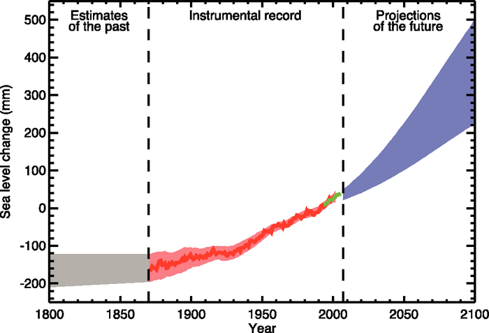
predicted sea levels are shown in the next figure (source).
Several hundred million people live in coastal areas that are at risk
from rising sea level (see this gallery
of
images). Rising sea level can contaminate coastal supplies of
fresh water and can harm coastal ecosystems. In
addition
to causing sea level to rise, a decline in mountain snow
and ice could also cause a serious shortages in freshwater supplies for
nearby communities and cities.
Changes in Climate and Frequency of Extreme
Weather Events
The table below lists some of the changes that may already have
occured and/or are expected to occur in the next 100 years or so (source
of the information).
Condition or event
|
Have changes already
occurred?
|
Have human activities
contributed to the observed change?
|
Is the observed change
expected to continue during the 21st century?
|
Fewer cold days &
nights over land areas
|
very likely
|
likely
|
virtually
certain
|
More frequent hot days
& nights over land areas
|
very likely
|
likely
(warmer nights)
|
virtually
certain
|
More frequent warm
spells/heat waves
|
likely
|
more likely
than not
|
very likely
|
Frequency of heavy
precipitation events increases
|
likely
|
more likely
than not
|
very likely
|
Increase in area affected
by droughts.
|
likely in
many areas since 1970
|
more likely
than not
|
likely
|
Extreme cold and excessive heat are
the two deadliest weather-related causes of death in the US (though
there is some uncertainty about which is deadlier). The Chicago
Heat Wave of 1995 killed approximately 750 people, the 2003
European Heat Wave killed approximately 40,000 people. It is
tempting to use the data above to suggest that the incidence of cold
events might decrease while the occurrence of heat spells might
increase. This is an example of both good and bad effects coming
from climate change. While
something like the 2003 event cannot be blamed on climate change, the
possibility similar situations might become more common in the
future should lead to advance preparations that might minimize the
effects they have.
During the past 100 years or so there appears to have been an increase
in precipitation amounts observed over land north of 30o N
latitude. Globally there has not been a significant increase in
precipitation observed.
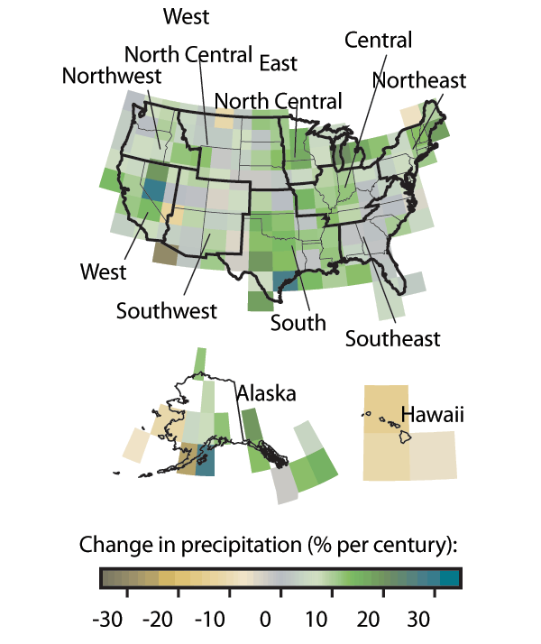
This figure shows changes in precipitation amounts over the US for the
time period 1901to 2005 (source).
Somewhat
surprisingly,
Hawaii
is the only location where there has been
an overall decrease in precipitation.
There is concern that dry regions might become even drier (warmer
temperatures would increase evaporation) and that wet regions could
become wetter (increased evaporation will add more moisture to the air,
warmer air can hold more moisture when saturated).
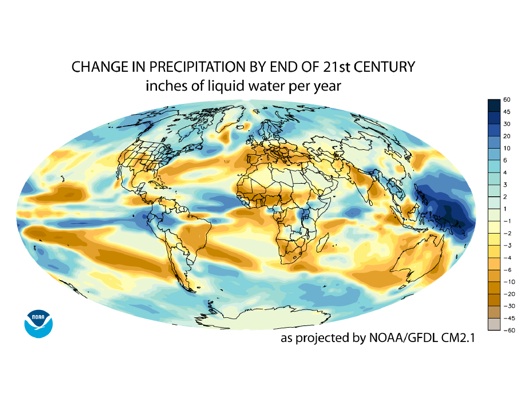
Here is an example of model precipitation predictions from the NOAA
Geophysical Fluid Dynamics Laboratory (source).
This
model
predicts
a
global increase in precipitation, an increase in
precipitation near the equator and at middle latitudes. The
subtropics will experience a decrease in precipitation.
There is some concern that global warming will make hurricanes stronger
and more frequent. We will consider that question in the section
on hurricanes.